広告・ポスター
사극 궁중 로맨스 게임 광고
사극 로맨스 시뮬 광고. 한복 + 궁중 배경 + 한자 풍 한글 타이포. 미스터리 + 멜로 톤.
사극 궁중 로맨스 게임 광고の概要
広告・ポスター画像を作るためのChatGPT画像プロンプトです。主題、背景、スタイル、構図を整理し、すぐに試せるよう構成しています。
関連キーワード: 사극 궁중 로맨스 게임 광고, 사극 궁중 로맨스 게임 광고 프롬프트, 広告・ポスター 프롬프트, 広告・ポスター AI 이미지 프롬프트, ChatGPT 이미지 프롬프트, AI 이미지 생성 프롬프트, AI 프롬프트, 이미지 프롬프트
사극 궁중 로맨스 게임 광고の活用方法
元の構造を保ちながら、被写体、背景、色、構図を変更して別案に展開できます。
- 主題を維持し、ブランドや季節、媒体に合わせて色と背景を変更してください。
- 結果が複雑な場合は背景要素を減らし、被写体、構図、照明を具体化してください。
- コピー後、ChatGPTに媒体、アスペクト比、文字の有無を追加で指定できます。
プロンプト原文
[Input]
- language: Korean
- output_size: 1024x1024

[Purpose]
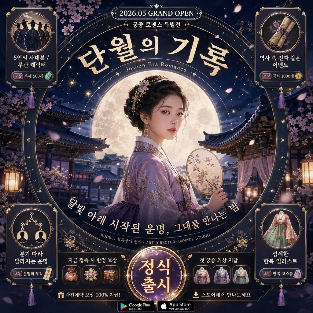
Korean mobile game ad banner for a Joseon-era palace romance simulation, designed as a square social ad with a central spotlight hero, circular radial typography, and rich premium campaign UI details.
Premium historical-fantasy game promo image for app stores, paid social placement, launch announcement, and pre-registration/event promotion, with the feel of a polished real mobile RPG romance advertisement.

[Composition]
- Main subject placement: {캐릭터} occupies the center 50% of the frame inside a soft circular moonlit spotlight; the composition follows concentric rings, not a left-right split.
- Background treatment: {배경} rendered as a layered Joseon palace courtyard with tiled rooftops, carved wooden eaves, silk curtains, stone steps, faint palace screens, haze, lantern glow, and cherry blossom drift, tinted in deep indigo, plum, and ivory with subtle gold-leaf accents.
- Campaign framing: add ornate radial UI rings, embroidered silk textures, small jewel-like dividers, palace-flower motifs, and thin gold constellation lines around the moon circle to make the ad feel like an actual live campaign creative.
- Text framing: the title, subtitle, launch label, event ribbons, and small metadata curve around the hero in a 360° radial layout; keep the typography readable and evenly spaced along the circle.
- Feature placement: the four feature icons are placed in the four corners, balanced symmetrically, each as a small ornate card with an icon, short label, and tiny reward/status tag.
- CTA placement: a large circular CTA button sits bottom-center beneath the hero, aligned to the spotlight axis, surrounded by small download badges, reward chips, and event-date microcopy.
- Use {게임 제목}, {장르 라벨}, {부제}, and {출시 정보} as the primary visible copy elements, supported by realistic small Korean ad copy such as launch event, pre-registration reward, and official channel labels.

[3. CORE STRUCTURE]
1. Center hero: place {캐릭터} in the exact middle, waist-up, with a calm noble expression, slight 3/4 pose, layered hanbok fabric, embroidered collar, ornamental hairpiece, and a fan or lantern held naturally so the silhouette reads clearly inside the moonlit circle.
2. Spotlight ring: build a bright inner halo around the character using layered moonlight, then add a softer outer ring with faint mist, drifting petals, floating dust, subtle bokeh lanterns, and tiny gold flecks to reinforce the circular composition.
3. Curved title band: set {게임 제목} in the upper arc around the hero in a hanja-inspired Korean display style, large enough to anchor the ad; place {장르 라벨} nearby as a smaller curved label like a premium game category tag.
4. Subtitle arc: render {부제} on the lower arc in a refined serif-like Korean type treatment, with tighter tracking and slightly smaller size than the main title for hierarchy.
5. Launch and issue details: add a small top-center date capsule reading '2026.05 GRAND OPEN', a tiny campaign mark '궁중 로맨스 특별전', and a fine-print credit line along the inner ring reading 'MODEL: 월하궁의 연인 · ART DIRECTOR: DANWOL STUDIO'.
6. Corner features: place {feature 1}, {feature 2}, {feature 3}, {feature 4} as four small icon cards in the top-left, top-right, bottom-left, and bottom-right corners, each with delicate line icons, short Korean text blocks, reward chips, and small decorative tassels or silk knots.
7. CTA area: place {출시 정보} inside a large circular bottom-center button, with a strong call-to-action feel, glowing rim, and readable padding; add small supporting labels nearby such as '지금 접속 시 한정 보상', '첫 궁중 의상 지급', and '스토어에서 만나보세요'.
8. Platform badges and campaign metadata: keep Google Play / App Store badges as small secondary elements near the CTA, add a tiny official handle '@danwol_official', a small QR-like promo square, and app-ad micro labels without overpowering the central portrait.
9. Bottom rating line: place the age rating text along the lower edge with clean spacing and high contrast, accompanied by a small legal-style text strip and page-like campaign footer such as 'EVENT 01 · 달빛 연회 업데이트'.

[4. STYLE RULES]
- Typography: use Noto Serif KR for the title and subtitle, with a hanja-inspired high-contrast display feel; use Pretendard Bold for CTA and feature labels, medium-to-large size, crisp edges, and generous line spacing. Use tiny Pretendard Medium for metadata, reward labels, and footer text.
- Color palette: deep indigo #1D2440, plum #5B2B4E, ivory #F4EBDD, moon gold #C9A24A, lantern amber #D8A24A, mist gray #C9CED9.
- UI ornamentation: use lacquered plum panels, translucent ivory text capsules, fine gold filigree, silk-ribbon dividers, bead-like dot separators, and moon-phase icons to create a premium palace-romance mobile ad interface.
- Border/shadow: use a soft circular vignette with a 4px inner glow, 12px blurred drop shadow under the hero cutout, gentle gold rim light on text accents, and layered card shadows under feature panels so the design feels dimensional and finished.
- Realistic ad finish: include high-resolution fabric weave, subtle paper-grain overlay on UI panels, believable lantern bloom, small decorative petals passing in front of and behind text, and polished app-store campaign layout details.

[5. VISUAL STYLE]
- Camera / lens: cinematic 50mm f/1.8 look with a medium-close portrait crop, slightly compressed perspective, and crisp foreground separation.
- Lighting: cool moonlight from upper-left at 45° mixed with warm lantern fill from lower-right, plus a faint rim light around hair, jewelry, fan edge, and hanbok folds.
- Color grade: cool indigo shadows, muted plum mids, warm amber highlights, and restrained ivory highlights to preserve a refined historical-fantasy tone.
- Rendering: realistic editorial game-ad compositing with detailed Joseon costume materials, soft atmospheric depth, glossy UI highlights, ornate icon-card surfaces, and readable Korean typography integrated into the circular campaign layout.

[6. MOOD]
Premium Korean historical romance game ad — resembling a high-end mobile campaign with a Kinfolk-meets-period-drama editorial mood, palace fantasy elegance, dramatic moonlit romance, polished fantasy UI finish, and a real paid-social launch creative full of event, reward, and platform details.

[7. CRITICAL]
- Korean text accuracy: 반드시 정확히 보여야 하는 문자열: '단월의 기록', '달빛 아래 시작된 운명, 그대를 만나는 밤', '정식 출시', '12세 이용가'.
- Additional small Korean ad copy should be legible where used: '2026.05 GRAND OPEN', '궁중 로맨스 특별전', '지금 접속 시 한정 보상', '첫 궁중 의상 지급', '스토어에서 만나보세요', '@danwol_official', 'EVENT 01 · 달빛 연회 업데이트'.
- Layout invariant: the central character must stay inside the circular spotlight and the composition must remain radial; do not use a left-text/right-character split.
- The four feature items must appear in all four corners, and the CTA must be a large bottom-center circle.
- Keep the character’s face elegant and fully readable; hands must be anatomically correct if visible.
- All placeholders must remain visible as written in the design: {게임 제목}, {장르 라벨}, {부제}, {출시 정보}, {캐릭터}, {배경}, {feature 1}, {feature 2}, {feature 3}, {feature 4}.

[8. 🚫 PROHIBITED]
- Fake official seals / certifications
- Broken Korean characters
- Celebrity composites / unauthorized likeness