広告・ポスター
한글 타이포그래피 포스터 (감성 문구)
한글 캘리그래피·타이포그래피 + 미니멀 일러스트의 감성 포스터. 마음에 드는 한글 문구 입력하면 포스터 한 장으로 변환.
한글 타이포그래피 포스터 (감성 문구)の概要
広告・ポスター画像を作るためのChatGPT画像プロンプトです。主題、背景、スタイル、構図を整理し、すぐに試せるよう構成しています。
関連キーワード: 한글 타이포그래피 포스터 (감성 문구), 한글 타이포그래피 포스터 (감성 문구) 프롬프트, 広告・ポスター 프롬프트, 広告・ポスター AI 이미지 프롬프트, ChatGPT 이미지 프롬프트, AI 이미지 생성 프롬프트, AI 프롬프트, 이미지 프롬프트
한글 타이포그래피 포스터 (감성 문구)の活用方法
元の構造を保ちながら、被写体、背景、色、構図を変更して別案に展開できます。
- 主題を維持し、ブランドや季節、媒体に合わせて色と背景を変更してください。
- 結果が複雑な場合は背景要素を減らし、被写体、構図、照明を具体化してください。
- コピー後、ChatGPTに媒体、アスペクト比、文字の有無を追加で指定できます。
プロンプト原文
[Input]
- language: Korean
- output_size: 1024x1536

[Purpose]
Korean typography poster with an emotional quote as the main subject, designed as a print-ready editorial-style wall poster.
Create a realistic vertical art-poster that feels like it belongs to a small Korean indie gallery exhibition, with tactile paper, refined event information, and expressive Hangul typography.

[Composition]
- Main text area: {메인 문구} occupies the center 45–55% of the canvas, with strong visual hierarchy, deliberate line breaks, and the overall flow guided by {문구 배치}.
- Subtitle area: {부제 문구} placed below the main text in a smaller scale, aligned to the main block for a calm, poster-like rhythm.
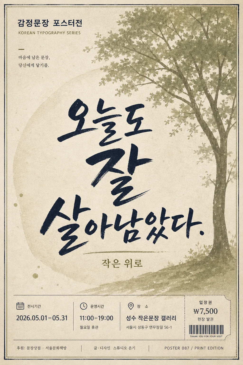
- Poster information layer: add realistic event-poster details around the typography, including a small top label reading "감정문장 포스터전", a date/time/venue line such as "2026.05.01–05.31  11:00–19:00  성수 작은문장 갤러리", and ticket information such as "입장권 ₩7,500 / 현장 발권".
- Background: {배경 스타일} with {배경 오브젝트} integrated as a soft illustrated or photographic motif behind and around the text, using paper grain, ink texture, and a real printed-poster surface.
- Sponsor and credit area: include a small lower poster footer with sponsor-style text such as "후원: 문장상점 · 서울문화책방", designer credit "글·디자인  스튜디오 온기", and a tiny poster code like "POSTER 087 / PRINT EDITION".
- Color usage: build the design around {주요 색상}, allowing natural tonal variations, ink density differences, and paper shadows that make the print feel real.

[3. CORE STRUCTURE]
- Main typography block: render {메인 문구} as the focal point in a large calligraphic Hangul treatment, centered vertically and horizontally, with intentional variation in word size, tilt, brush pressure, and line break rhythm to create a hand-composed poster feel.
- Secondary text block: place {부제 문구} beneath the main phrase in a smaller, quieter style, reading like an emotional footnote while still being part of the finished poster design.
- Event header: place a compact header at the top with "감정문장 포스터전" and a tiny category label such as "KOREAN TYPOGRAPHY SERIES", set in clean sans-serif type to contrast with the main calligraphy.
- Background illustration layer: build {배경 스타일} behind the text with {배경 오브젝트} rendered as a poetic decorative element, such as a soft botanical shadow, folded paper shape, moonlit window, blurred flower stem, ink wash, or subtle object silhouette that supports the mood of the phrase.
- Footer information band: add date/time/venue, ticket info, sponsor line, tiny barcode-like ticket mark, and edition number near the bottom, small but legible, like a real gallery poster.
- Paper and print finish: add an off-white paper texture, visible fiber grain, slight ink absorption at letter edges, faint edge shadow, tiny registration imperfections, and gentle surface waviness so the image feels physically printed rather than digitally flat.
- Balance and legibility: ensure Hangul jamo are clean, proportioned, and fully readable, with no crowding, overlap errors, or broken strokes.

[4. STYLE RULES]
- Typography: use a hand-drawn Hangul calligraphy style for {타이포그래피 스타일}, with bold brush-like strokes, slightly varied baseline, and sizes ranging from 72–160 px equivalent across the phrase; subtitle in Pretendard SemiBold or Noto Sans KR Medium at 28–42 px equivalent.
- Information typography: set the event details, ticket line, sponsor area, and designer credit in small Korean sans-serif type, approximately 16–28 px equivalent, carefully spaced and aligned to the poster grid.
- Color palette: use {주요 색상} as the primary palette; map them to specific tones such as beige #E8DDC8, olive #7A8450, and navy #1E2A3A, with off-white paper #F6F1E8 as the base if needed, plus natural ink-density variation from the same tones.
- Graphic elements: add delicate dividers, small dots, edition marks, ticket/barcode block, thin rule lines, and subtle ink or paper ornaments that feel printed and editorial.
- Border/shadow: add a soft drop shadow around the poster edge, 4 px y-offset, 12 px blur, 15% opacity, plus a very light inner paper shadow for depth.

[5. VISUAL STYLE]
- Camera / lens: realistic flat poster composition photographed top-down with a Canon EOS R5 and RF 50mm f/1.8 lens, preserving a clean graphic-editorial layout without heavy perspective distortion.
- Lighting: diffused softbox lighting from upper-left with a gentle fill from lower-right, creating even tonal separation, faint paper texture highlights, and a soft physical shadow along the paper edge.
- Color grade: muted beige + olive + navy with low saturation, slightly warm paper-white balance, natural ink contrast, and the tactile finish of a high-end Korean graphic design print.

[6. MOOD]
Quiet contemporary Korean design-studio poster — the restrained emotional tone of a typographic print from an indie gallery shop, enriched with realistic exhibition details, tactile paper, and a refined editorial atmosphere.

[7. CRITICAL]
- Korean text accuracy: the following strings must appear exactly and clearly in the final image:
  - 오늘도 잘 살아남았다.
  - 작은 위로
- Additional Korean poster text should be readable and plausible, including short details such as "감정문장 포스터전", "2026.05.01–05.31", "성수 작은문장 갤러리", and "입장권 ₩7,500".
- Hangul legibility: all Korean characters must be fully formed, correctly spaced, and visually balanced; no broken consonants/vowels, no garbled text, no mirrored characters.
- Layout invariant: main phrase must remain the dominant focal point and the subtitle must stay secondary and unobtrusive.

[8. 🚫 PROHIBITED]
- Fake official seals / certifications
- Broken Korean characters