광고/포스터
푸쉬 알림 카드·앱 마케팅 비주얼
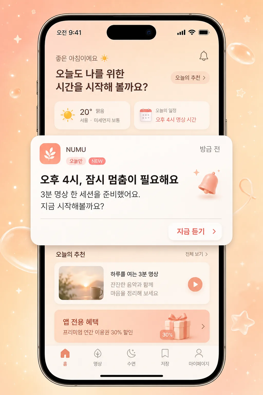
모바일 앱 푸쉬 알림 mockup. 폰 화면 위 알림 카드 + 짧은 카피 + CTA.
푸쉬 알림 카드·앱 마케팅 비주얼 검색 요약
푸쉬 알림 카드·앱 마케팅 비주얼은 광고/포스터 결과물을 만들 때 바로 복사해 활용할 수 있는 ChatGPT 이미지 프롬프트입니다. 주제, 배경, 스타일, 구도 조건을 함께 담아 빠르게 시안을 만들 수 있도록 구성했습니다.
관련 키워드: 푸쉬 알림 카드·앱 마케팅 비주얼, 푸쉬 알림 카드·앱 마케팅 비주얼 프롬프트, 광고/포스터 프롬프트, 광고/포스터 AI 이미지 프롬프트, ChatGPT 이미지 프롬프트, AI 이미지 생성 프롬프트, AI 프롬프트, 이미지 프롬프트
푸쉬 알림 카드·앱 마케팅 비주얼 활용 포인트
원본 구조를 유지하면서 피사체, 배경, 색감, 구도를 바꿔 다양한 시안으로 확장할 수 있습니다.
- 핵심 소재는 유지하고 브랜드, 계절, 채널 목적에 맞는 색감과 배경을 바꿔보세요.
- 결과가 산만하면 배경 요소를 줄이고 피사체, 구도, 조명 조건을 구체화하세요.
- 복사한 뒤 ChatGPT에서 플랫폼, 화면 비율, 텍스트 포함 여부를 추가로 요청할 수 있습니다.
프롬프트 원문
[Input]
- language: Korean
- output_size: 1024x1536

[Purpose]
Korean mobile app push notification and in-app marketing visual mockup, 9:16 vertical phone-screen composition for app promotion and retention campaigns.
Create a realistic premium mobile ad image showing a polished phone lock screen or in-app screen where one featured push notification card feels actionable, timely, and campaign-ready.
Clear system-notification style card designed for social media ads, app onboarding, feature announcement creatives, CRM retention messages, and app-exclusive benefit promotions.

[Composition]
- Main canvas: vertical iPhone screen mockup occupying the full frame, with the phone UI centered for a 9:16 display and realistic device depth.
- Background treatment: {배경} with a pastel peach-to-cream gradient, soft floating star particles, translucent glassy blobs, faint app-themed sparkles, and warm ambient light behind the phone.
- Phone screen environment: show a believable lock-screen or app-home backdrop inside the phone, including status bar, time label “오전 9:41”, date label “5월 1일 금요일”, tiny Wi‑Fi/battery icons, and a subtle home indicator at the bottom.
- Subject placement: one main notification card sits in the central 45% of the screen, slightly raised with a soft shadow; CTA button anchors the right side of the card.
- UI depth: add faint blurred content behind the notification such as a small weather widget, calendar chip, bottom navigation icons, and a soft promotional banner labeled “앱 전용 혜택” so the card feels embedded in a real app ecosystem.
- Spacing and framing: use realistic mobile UI padding around the card; card edges should feel compact and readable, with clear separation between app icon, header, body, timestamp, and CTA.
- Use {앱 이름}, {알림 헤더}, {알림 본문}, {CTA} as the editable Korean content elements.

[3. CORE STRUCTURE]
- Background layer: full-bleed pastel gradient base with tiny star-like speckles, soft bokeh dots, warm cream highlights, and a few subtle rounded geometric accents matching the palette.
- Phone frame layer: realistic iPhone-style device outline and screen area, slim bezels, visible Dynamic Island or notch area, crisp top status bar, and a faint edge reflection on the glass.
- Screen UI layer: softly blurred app interface or lock-screen wallpaper with believable Korean microcopy such as “오늘의 추천”, “방금 전”, “앱 전용 혜택”, “마이페이지”, “쿠폰함”, and small icon placeholders.
- Notification card layer: warm white rounded rectangle centered on the screen, with a soft drop shadow, slight glass highlight, and authentic iOS/Android system-notification proportions.
- Card header row: small square app icon at the upper-left, {앱 이름} aligned beside it in a compact label style, a small timestamp “방금 전” on the upper-right, and {알림 헤더} set below in bold Korean text.
- Body text row: {알림 본문} placed under the header, left-aligned with comfortable line spacing and concise mobile-readable sizing.
- Action area: {CTA} appears as a small right-aligned pill button or text button inside the card, using muted coral or soft pink accent color for quick recognition.
- Supporting details: add a tiny campaign chip “오늘만”, a micro badge “NEW”, a subtle bell icon, and a fine divider line inside the card to make it feel like a real marketing notification.
- Finishing details: preserve the phone status bar icons, keep all Korean text crisp, and ensure the card feels like an authentic app retention notification rather than a generic poster.

[4. STYLE RULES]
- Typography: Pretendard or Noto Sans KR for all UI text; {알림 헤더} in bold 700–800 weight, {알림 본문} in medium 500 weight, {CTA} in semi-bold 600 weight, with mobile-friendly size hierarchy.
- Supporting Korean microcopy should be smaller and realistic: “오전 9:41”, “5월 1일 금요일”, “방금 전”, “오늘만”, “NEW”, “앱 전용 혜택”, “쿠폰함”, “마이페이지”.
- Color palette: peach #F7C9B5, cream #FFF6EC, soft pink #F8DDE4, warm white #FFFFFF, charcoal #2B2B2B, muted coral #FF8A7A.
- Border/shadow: notification card with 20–24px corner radius, soft drop shadow 0px 10px 24px rgba(0,0,0,0.12), faint inner highlight, and a thin translucent edge stroke for a polished UI look.
- App icon: create a generic rounded-square icon using the same palette, with a small abstract symbol or bell motif; it should look like a real app icon without requiring a real brand mark.
- UI realism: include tiny touch-friendly icon sizes, subtle screen glare, rounded widgets, realistic notification padding, and a believable hierarchy between the card, background widgets, and phone frame.

[5. VISUAL STYLE]
- Camera / lens: front-facing product mockup look, equivalent to a 50mm standard lens with low perspective distortion, clean orthographic presentation of the phone screen.
- Lighting: studio softbox from upper-left at 45° with gentle fill from lower-right, producing even screen visibility, delicate phone-edge highlights, and a soft shadow beneath the raised notification card.
- Color grade: pastel peach and cream with a light airy UI finish, slightly desaturated for a premium app-marketing feel.
- Material feel: glossy phone glass, satin metal device edge, soft translucent UI panels, and subtle paper-like warmth in the notification card background.

[6. MOOD]
Premium mobile app marketing visual — clean App Store / iOS promotional card aesthetic with a calm editorial UI finish, warm retention-campaign energy, and a realistic “just received” push notification moment.

[7. CRITICAL]
- Korean text accuracy: the following strings must appear exactly as rendered text:
  - {앱 이름}
  - {알림 헤더}
  - {알림 본문}
  - {CTA}
- Additional Korean UI text may appear as realistic microcopy: “오전 9:41”, “5월 1일 금요일”, “방금 전”, “오늘만”, “NEW”, “앱 전용 혜택”, “쿠폰함”, “마이페이지”.
- The phone mockup must remain vertical 9:16 and the status bar must be visible at the top.
- Notification card layout must clearly separate icon, app name, timestamp, header, body, CTA, and supporting badge elements with legible Korean typography.
- All UI proportions should feel like a real mobile notification inside a phone screen, not a poster or website banner.

[8. 🚫 PROHIBITED]
- Fake official seals / certifications
- Broken Korean characters