廣告/海報
푸쉬 알림 카드·앱 마케팅 비주얼
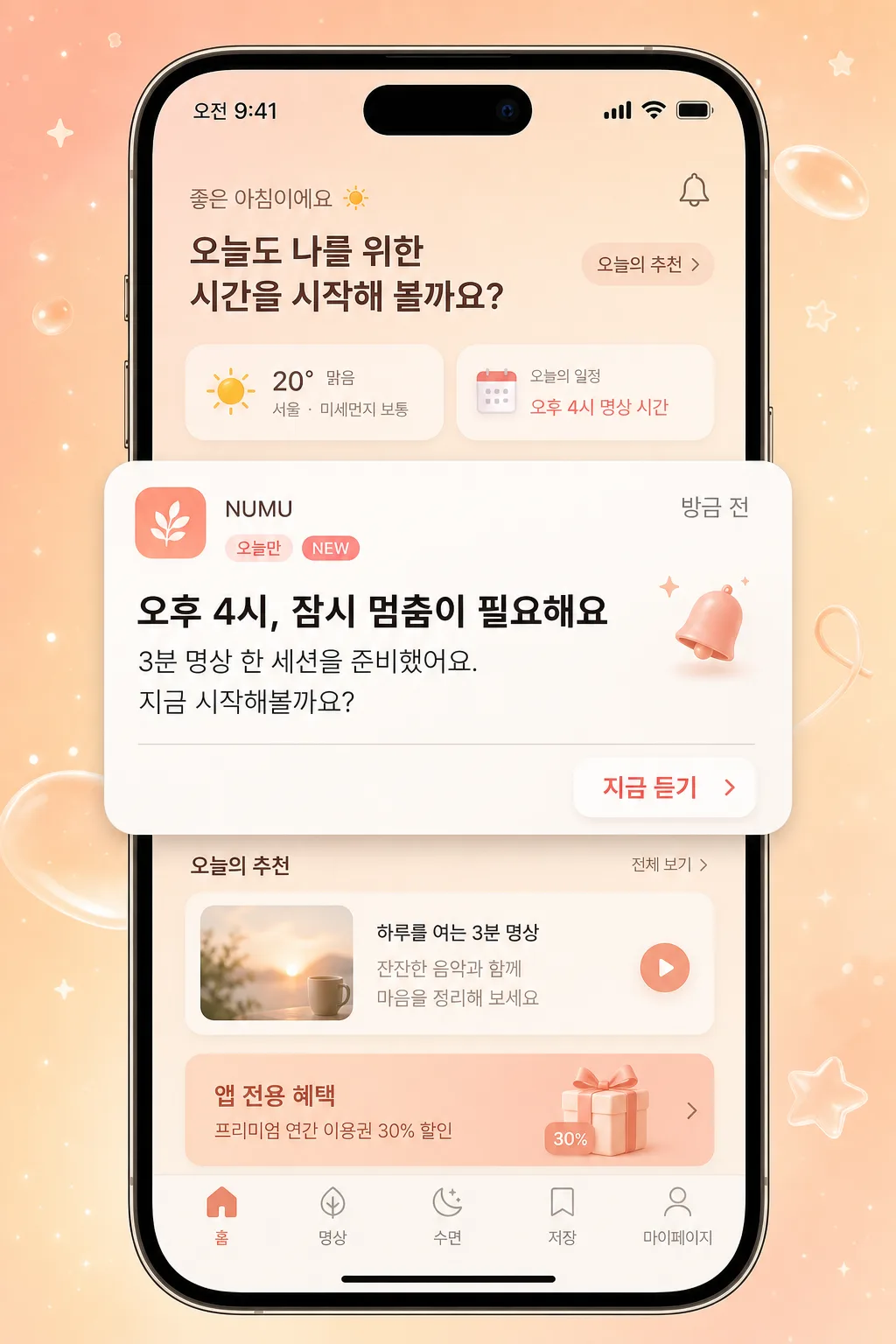
모바일 앱 푸쉬 알림 mockup. 폰 화면 위 알림 카드 + 짧은 카피 + CTA.
푸쉬 알림 카드·앱 마케팅 비주얼摘要
這是用來製作廣告/海報內容的 ChatGPT 圖像提示詞,已整理主題、背景、風格與構圖,方便快速調整。
相關關鍵字: 푸쉬 알림 카드·앱 마케팅 비주얼, 푸쉬 알림 카드·앱 마케팅 비주얼 프롬프트, 廣告/海報 프롬프트, 廣告/海報 AI 이미지 프롬프트, ChatGPT 이미지 프롬프트, AI 이미지 생성 프롬프트, AI 프롬프트, 이미지 프롬프트
푸쉬 알림 카드·앱 마케팅 비주얼使用方式
保留原始結構並替換主體、背景、色彩或構圖,即可延伸出不同版本。
- 保留核心主體,並依品牌、季節或平台調整色彩與背景。
- 如果畫面太複雜,請減少背景元素並具體描述主體、構圖與光線。
- 複製後可要求 ChatGPT 配合平台、長寬比或文字需求調整。
提示詞原文
[Input]
- language: Korean
- output_size: 1024x1536

[Purpose]
Korean mobile app push notification and in-app marketing visual mockup, 9:16 vertical phone-screen composition for app promotion and retention campaigns.
Create a realistic premium mobile ad image showing a polished phone lock screen or in-app screen where one featured push notification card feels actionable, timely, and campaign-ready.
Clear system-notification style card designed for social media ads, app onboarding, feature announcement creatives, CRM retention messages, and app-exclusive benefit promotions.

[Composition]
- Main canvas: vertical iPhone screen mockup occupying the full frame, with the phone UI centered for a 9:16 display and realistic device depth.
- Background treatment: {배경} with a pastel peach-to-cream gradient, soft floating star particles, translucent glassy blobs, faint app-themed sparkles, and warm ambient light behind the phone.
- Phone screen environment: show a believable lock-screen or app-home backdrop inside the phone, including status bar, time label “오전 9:41”, date label “5월 1일 금요일”, tiny Wi‑Fi/battery icons, and a subtle home indicator at the bottom.
- Subject placement: one main notification card sits in the central 45% of the screen, slightly raised with a soft shadow; CTA button anchors the right side of the card.
- UI depth: add faint blurred content behind the notification such as a small weather widget, calendar chip, bottom navigation icons, and a soft promotional banner labeled “앱 전용 혜택” so the card feels embedded in a real app ecosystem.
- Spacing and framing: use realistic mobile UI padding around the card; card edges should feel compact and readable, with clear separation between app icon, header, body, timestamp, and CTA.
- Use {앱 이름}, {알림 헤더}, {알림 본문}, {CTA} as the editable Korean content elements.

[3. CORE STRUCTURE]
- Background layer: full-bleed pastel gradient base with tiny star-like speckles, soft bokeh dots, warm cream highlights, and a few subtle rounded geometric accents matching the palette.
- Phone frame layer: realistic iPhone-style device outline and screen area, slim bezels, visible Dynamic Island or notch area, crisp top status bar, and a faint edge reflection on the glass.
- Screen UI layer: softly blurred app interface or lock-screen wallpaper with believable Korean microcopy such as “오늘의 추천”, “방금 전”, “앱 전용 혜택”, “마이페이지”, “쿠폰함”, and small icon placeholders.
- Notification card layer: warm white rounded rectangle centered on the screen, with a soft drop shadow, slight glass highlight, and authentic iOS/Android system-notification proportions.
- Card header row: small square app icon at the upper-left, {앱 이름} aligned beside it in a compact label style, a small timestamp “방금 전” on the upper-right, and {알림 헤더} set below in bold Korean text.
- Body text row: {알림 본문} placed under the header, left-aligned with comfortable line spacing and concise mobile-readable sizing.
- Action area: {CTA} appears as a small right-aligned pill button or text button inside the card, using muted coral or soft pink accent color for quick recognition.
- Supporting details: add a tiny campaign chip “오늘만”, a micro badge “NEW”, a subtle bell icon, and a fine divider line inside the card to make it feel like a real marketing notification.
- Finishing details: preserve the phone status bar icons, keep all Korean text crisp, and ensure the card feels like an authentic app retention notification rather than a generic poster.

[4. STYLE RULES]
- Typography: Pretendard or Noto Sans KR for all UI text; {알림 헤더} in bold 700–800 weight, {알림 본문} in medium 500 weight, {CTA} in semi-bold 600 weight, with mobile-friendly size hierarchy.
- Supporting Korean microcopy should be smaller and realistic: “오전 9:41”, “5월 1일 금요일”, “방금 전”, “오늘만”, “NEW”, “앱 전용 혜택”, “쿠폰함”, “마이페이지”.
- Color palette: peach #F7C9B5, cream #FFF6EC, soft pink #F8DDE4, warm white #FFFFFF, charcoal #2B2B2B, muted coral #FF8A7A.
- Border/shadow: notification card with 20–24px corner radius, soft drop shadow 0px 10px 24px rgba(0,0,0,0.12), faint inner highlight, and a thin translucent edge stroke for a polished UI look.
- App icon: create a generic rounded-square icon using the same palette, with a small abstract symbol or bell motif; it should look like a real app icon without requiring a real brand mark.
- UI realism: include tiny touch-friendly icon sizes, subtle screen glare, rounded widgets, realistic notification padding, and a believable hierarchy between the card, background widgets, and phone frame.

[5. VISUAL STYLE]
- Camera / lens: front-facing product mockup look, equivalent to a 50mm standard lens with low perspective distortion, clean orthographic presentation of the phone screen.
- Lighting: studio softbox from upper-left at 45° with gentle fill from lower-right, producing even screen visibility, delicate phone-edge highlights, and a soft shadow beneath the raised notification card.
- Color grade: pastel peach and cream with a light airy UI finish, slightly desaturated for a premium app-marketing feel.
- Material feel: glossy phone glass, satin metal device edge, soft translucent UI panels, and subtle paper-like warmth in the notification card background.

[6. MOOD]
Premium mobile app marketing visual — clean App Store / iOS promotional card aesthetic with a calm editorial UI finish, warm retention-campaign energy, and a realistic “just received” push notification moment.

[7. CRITICAL]
- Korean text accuracy: the following strings must appear exactly as rendered text:
  - {앱 이름}
  - {알림 헤더}
  - {알림 본문}
  - {CTA}
- Additional Korean UI text may appear as realistic microcopy: “오전 9:41”, “5월 1일 금요일”, “방금 전”, “오늘만”, “NEW”, “앱 전용 혜택”, “쿠폰함”, “마이페이지”.
- The phone mockup must remain vertical 9:16 and the status bar must be visible at the top.
- Notification card layout must clearly separate icon, app name, timestamp, header, body, CTA, and supporting badge elements with legible Korean typography.
- All UI proportions should feel like a real mobile notification inside a phone screen, not a poster or website banner.

[8. 🚫 PROHIBITED]
- Fake official seals / certifications
- Broken Korean characters