Social/Card News
프로모션 카드뉴스 샘플 슬라이드
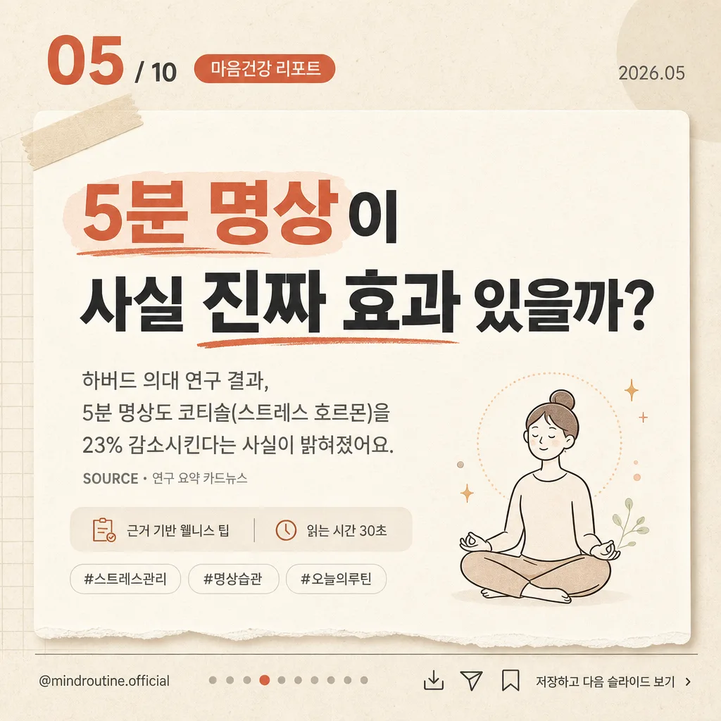
10컷 카드뉴스 중 한 슬라이드 sample. 번호 + 큰 헤드라인 + 본문 + 작은 일러스트.
프로모션 카드뉴스 샘플 슬라이드 summary
Copy this ChatGPT image prompt to create Social/Card News results. Its subject, background, style, and composition are organized for quick iteration.
Related keywords: 프로모션 카드뉴스 샘플 슬라이드, 프로모션 카드뉴스 샘플 슬라이드 프롬프트, Social/Card News 프롬프트, Social/Card News AI 이미지 프롬프트, ChatGPT 이미지 프롬프트, AI 이미지 생성 프롬프트, AI 프롬프트, 이미지 프롬프트
How to use 프로모션 카드뉴스 샘플 슬라이드
Keep the prompt structure and swap the subject, background, palette, or composition to create new variations.
- Keep the main subject and adjust the palette and background for your brand, season, or channel.
- If the result feels busy, simplify the background and make the subject, composition, and lighting more specific.
- After copying, ask ChatGPT to adapt it for your platform, aspect ratio, or text requirements.
Original prompt
[Input]
- language: Korean
- output_size: 1024x1024

[Purpose]
Korean promotional card-news social media slide, single square panel from a 10-slide carousel, designed for high readability, saving, sharing, and mobile scrolling.
Editorial Instagram-style sample slide for a campaign teaser or educational promo content about {주제}, enriched with real carousel details such as category label, source note, save/share micro icons, slide progress, and a small call-to-action.

[Composition]
- Square 1:1 canvas for a social media carousel slide; {슬라이드 번호} sits in the upper-left as the primary navigation cue, paired with a small category chip reading "마음건강 리포트" and a tiny date label "2026.05".
- Main headline block occupies the center of the frame, aligned slightly above midpoint for strong mobile impact, with a highlighted keyword treatment using the accent color.
- Body copy sits directly under the headline in smaller gray text, with readable line spacing and left alignment within a centered editorial text column.
- Add a compact supporting info strip below the body copy: "근거 기반 웰니스 팁" and "읽는 시간 30초" in tiny Korean UI text.
- {작은 일러스트} is placed at the lower-right corner as a compact decorative anchor, sized to about 12–16% of frame width, accompanied by subtle small spark, dot, or breathing-circle graphic accents that support the meditation theme.
- Footer runs along the bottom edge with {브랜드 핸들}, carousel slide dots, tiny save/share/bookmark micro icons, and a CTA label such as "저장하고 10장까지 보기".
- Background should be a warm beige or cream paper-like surface with visible fine paper grain, soft editorial sticker shapes, faint grid marks, and delicate layered card shadows to make the slide feel like a polished real social-media design asset.

[3. CORE STRUCTURE]
1. Top-left corner: render {슬라이드 번호} as a large bold number paired with a smaller "/ 10" indicator, using tight spacing and an editorial badge feel; add the category chip "마음건강 리포트" nearby and a tiny date label "2026.05" on the top-right.
2. Center headline area: set {헤드라인} in large Korean typography with strong contrast, controlled line breaks, and balanced spacing so the phrase reads instantly on mobile; emphasize "5분 명상" or "진짜 효과" with an accent underline, pill highlight, or soft marker stroke.
3. Under-headline copy block: place {본문} in smaller muted gray text, aligned cleanly beneath the headline with comfortable line height; add a tiny source-style footnote line reading "SOURCE · 연구 요약 카드뉴스" without implying official certification.
4. Supporting micro-content: include a small rounded label row under the body copy with Korean tags such as "#스트레스관리", "#명상습관", "#오늘의루틴"; keep these secondary but legible.
5. Lower-right decorative area: place {작은 일러스트} as a neat editorial illustration with thin strokes and soft filled shapes; nearby add small breathing rhythm dots, a tiny leaf, or circular calm-wave marks to connect visually with the meditation topic.
6. Bottom footer strip: place {브랜드 핸들} near the lower-left or center-left, add a row of 10 small dots indicating slide progress with the 5th dot highlighted, include tiny save/share/bookmark icons, and add the CTA text "저장하고 다음 슬라이드 보기" along the lower-right.

[4. STYLE RULES]
- Typography: use Pretendard or Noto Sans KR for headline and body, with headline weight 700–800 at large size and body weight 400–500 at small size; keep letter spacing slightly tight for the headline and normal for body text. Micro labels may use weight 600 in small caps-like Korean UI styling.
- Color palette: beige #F3EBDD or cream #F7F2E8 as the background, charcoal #222222 for headline, muted gray #7A7A7A for body, and one accent color such as muted blue #4C6FFF or terracotta #D97B5A for the slide number, underline, tag chips, and active progress dot.
- Add realistic editorial finishing: fine paper grain, faint off-white layered panels, soft sticker-like rounded labels, subtle marker underline texture, and delicate shadowing around badges or illustration elements.
- Use a coherent Instagram carousel UI language: small handle text, page indicator dots, bookmark/share micro icons, hashtag-like labels, and a short CTA, all secondary to the headline.
- Border/shadow: use soft card-style depth where helpful, such as a 2–4px y-offset shadow with 8–14px blur at low opacity on chips, illustration pieces, or the number badge.

[5. VISUAL STYLE]
- Camera / lens: flat graphic design presentation, no photographic lens look; emulate a clean UI/editorial poster composition with crisp vector-like edges.
- Lighting: even diffuse studio-style illumination across the entire canvas, with soft paper depth and gentle shadow separation for layered labels and decorative elements.
- Color grade: warm cream + muted gray + single accent color, with low saturation and a contemporary Korean social-media editorial finish.
- Finish: high-resolution social post export, sharp Korean typography, tactile paper texture, refined carousel interface details, and polished promotional-card realism.

[6. MOOD]
Premium Korean Instagram editorial card-news — Notion-inspired clean layout meets a contemporary magazine infographic aesthetic, with a warm wellness campaign tone and practical save-worthy carousel details.

[7. CRITICAL]
- Korean text accuracy: 반드시 아래 문구가 정확히 보여야 함.
  - {슬라이드 번호}: "05 / 10"
  - {헤드라인}: "5분 명상이 사실 진짜 효과 있을까?"
  - {본문}: "하버드 의대 연구 결과, 5분 명상도 코티솔(스트레스 호르몬)을 23% 감소시킨다는 사실이 밝혀졌어요."
  - {브랜드 핸들}: 사용자가 지정한 브랜드 핸들이 정확한 한글/영문 문자열로 렌더링되어야 함
- Additional Korean microcopy should be crisp and readable: "마음건강 리포트", "2026.05", "근거 기반 웰니스 팁", "읽는 시간 30초", "#스트레스관리", "#명상습관", "#오늘의루틴", "저장하고 다음 슬라이드 보기".
- Layout invariant: the slide number stays in the upper-left, the headline remains centered and dominant, the illustration stays small in the lower-right, and the footer with dots stays along the bottom.
- All text must be crisp, fully legible, and correctly spaced for a 1:1 square social post.

[8. 🚫 PROHIBITED]
- Fake official seals or certifications
- Broken Korean characters or garbled text