廣告/海報
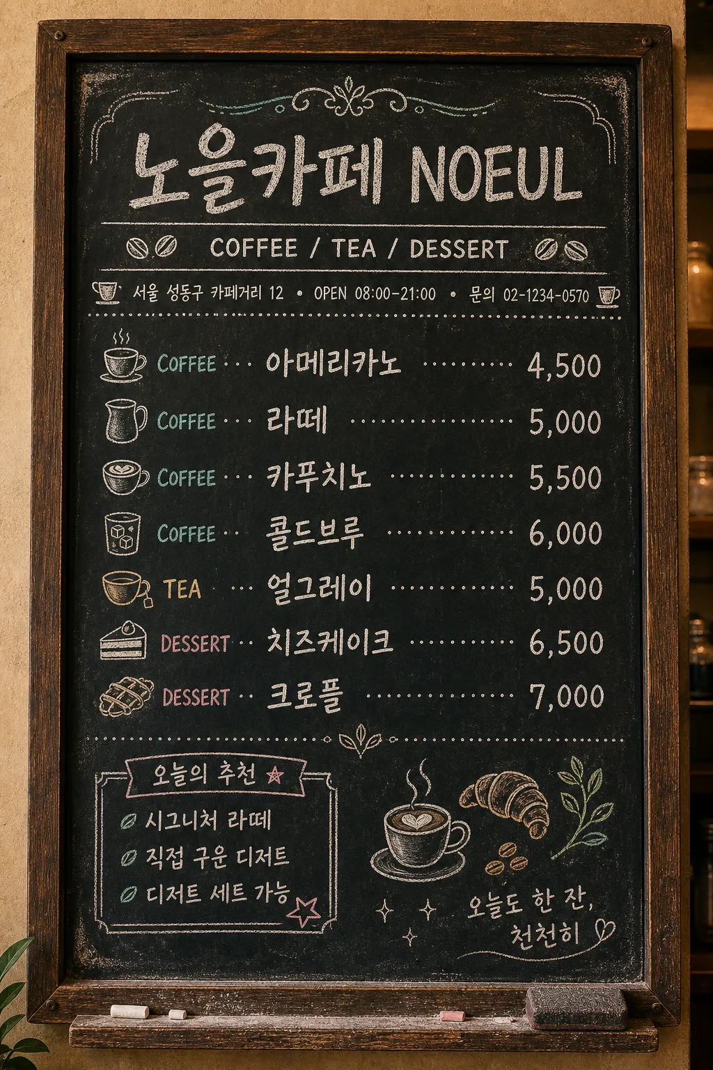
카페 칠판 메뉴판
흑판 + 분필 손글씨. 빈티지 카페·브런치 가게에 어울림. 음료 + 가격 + 작은 일러스트.
카페 칠판 메뉴판摘要
這是用來製作廣告/海報內容的 ChatGPT 圖像提示詞,已整理主題、背景、風格與構圖,方便快速調整。
相關關鍵字: 카페 칠판 메뉴판, 카페 칠판 메뉴판 프롬프트, 廣告/海報 프롬프트, 廣告/海報 AI 이미지 프롬프트, ChatGPT 이미지 프롬프트, AI 이미지 생성 프롬프트, AI 프롬프트, 이미지 프롬프트
카페 칠판 메뉴판使用方式
保留原始結構並替換主體、背景、色彩或構圖,即可延伸出不同版本。
- 保留核心主體,並依品牌、季節或平台調整色彩與背景。
- 如果畫面太複雜,請減少背景元素並具體描述主體、構圖與光線。
- 複製後可要求 ChatGPT 配合平台、長寬比或文字需求調整。
提示詞原文
[Input]
- language: Korean
- output_size: 1024x1536

[Purpose]
Korean cafe chalkboard menu board, vertical 9:13 in-store poster for a real neighborhood cafe. Hand-drawn chalk lettering on a worn blackboard with practical cafe information, prices, decorative dividers, and small chalk illustrations that make it feel like an actual daily menu displayed near the counter.

[Composition]
- A wall-mounted chalkboard menu nearly fills the vertical frame, set inside a dark walnut wooden frame with visible grain, tiny screw heads, chalk dust along the lower ledge, and a slightly worn black surface.
- {카페 이름} appears large at the top as the main store name, with {카테고리} directly below as a smaller menu-category label.
- Add a compact cafe info strip under the header: chalk text reading "서울 성동구 카페거리 12", "OPEN 08:00–21:00", "문의 02-1234-0570", separated by small dots or tiny cup icons.
- The menu list is organized in a clear three-column structure: category label on the left, Korean menu name in the center, price on the right, connected by dotted chalk leaders.
- Use {메뉴 리스트} as the main menu content, with 5–7 items clearly separated, including realistic price alignment and consistent row spacing.
- Add a small chalk box labeled "오늘의 추천" near the lower-left or side margin, containing short Korean copy such as "시그니처 라떼", "직접 구운 디저트", and a tiny star doodle.
- {멘트} sits as a small handwritten quote in the bottom-right corner inside the board margin, with a gentle underline and a tiny heart or leaf mark.
- Include chalk doodles that naturally belong on a cafe menu board: espresso cup, croissant, coffee beans, steam lines, milk pitcher, leaf, dotted separators, and small hand-drawn arrows.
- Around the board, show subtle realistic cafe context: warm plaster wall edge, a narrow shelf lip with chalk dust, a small eraser mark, and faint powder smears, while keeping all menu text readable.

[3. CORE STRUCTURE]
- Top header area (15–18%): {카페 이름} in the largest hand-drawn chalk script, centered, with slightly irregular strokes, soft chalk powder edges, and a thin ornamental flourish above.
- Subheader area (8–10%): place {카테고리} directly under the title, centered, in a neat condensed chalk sans style, with double separator lines and small coffee-bean icons on both sides.
- Cafe information strip (5–7%): add small but legible Korean chalk text: "서울 성동구 카페거리 12 · OPEN 08:00–21:00 · 문의 02-1234-0570"; keep it aligned and integrated into the board design.
- Main menu grid (50–55%): render {메뉴 리스트} as 5–7 rows, each row using left-aligned category labels, center-aligned Korean menu names, and right-aligned prices, linked by dotted chalk leaders; row spacing should feel like a real handwritten menu while remaining tidy and legible.
- Decorative dividers: use thin chalk rules, small laurel leaves, cup icons, bean clusters, and lightly smudged corner flourishes in warm white and pale teal chalk.
- Daily recommendation area (8–10%): include a hand-drawn chalk rectangle or ribbon labeled "오늘의 추천" with short Korean notes such as "부드러운 크림", "고소한 블렌드", "디저트 세트 가능".
- Bottom quote area (8–10%): set {멘트} in a smaller casual chalk handwriting style, aligned to the lower-right corner with a subtle curved underline and tiny sparkle marks.
- Board edges: keep a slightly uneven chalk-dust border, worn corners, rub marks from previous writing, and a realistic wooden frame; do not let texture interfere with the legibility of {카페 이름}, {메뉴 리스트}, or {멘트}.

[4. STYLE RULES]
- Typography: hand-drawn chalk script for {카페 이름}; Pretendard Bold or Noto Sans KR Bold adapted into chalk texture for menu rows; condensed sans for {카테고리}; small handwritten chalk script for {멘트}; tiny cafe information text should look manually written but remain readable.
- Color palette: blackboard charcoal #111111, warm white chalk #F3F0E8, pale teal accent #B7D8D4, light gray chalk dust #8A8A8A, dark walnut frame brown #4A2F1E.
- Texture: visible chalk grain, powder buildup, eraser haze, layered strokes, slight ghost marks from old prices, and subtle pressure variation in the lettering.
- Border/shadow: dark wooden frame with shallow inner shadow, soft vignette around the board, mild chalk smudge shadowing, no glossy reflections; text should look hand-written directly on the board.
- Realism details: include small chalk crumbs on the bottom ledge, tiny rubbed areas near frequently changed prices, slightly imperfect dotted leaders, and hand-drawn divider ornaments.

[5. VISUAL STYLE]
- Camera / lens: straight-on front view, 50mm lens, f/5.6, full-frame document-style capture to keep the board rectangular and readable.
- Lighting: soft diffused ambient light from upper-left at about 45°, with gentle warm cafe ambience; chalk texture should be visible without harsh glare.
- Color grade: matte black + warm white chalk + muted teal accents, slightly desaturated vintage cafe tone with warm wood and cozy wall undertones.
- Rendering: realistic in-store chalkboard photography blended with editorial menu-board design; tactile chalk texture, natural wall-mounted scale, crisp readable Korean lettering.

[6. MOOD]
Vintage neighborhood cafe menu board — feels like a handwritten daily specials chalkboard from a cozy Seoul cafe, with warm counter-side realism, subtle French bistro charm, hand-made chalk personality, and inviting local-cafe detail.

[7. CRITICAL]
- Korean text accuracy: 반드시 아래 문자열이 정확히 보여야 함:
  - {카페 이름}
  - {메뉴 리스트}
  - {멘트}
- Additional Korean text rendered in the image should be clear and plausible, including: "서울 성동구 카페거리 12", "OPEN 08:00–21:00", "문의 02-1234-0570", "오늘의 추천", "시그니처 라떼", "직접 구운 디저트".
- Layout invariants: the menu must use a clear left-middle-right alignment with dotted leaders; prices must be aligned consistently; all menu text should remain fully legible; the board must stay vertical 9:13.
- Keep {카페 이름} as the dominant store header, {카테고리} directly beneath it, {메뉴 리스트} as the central menu content, and {멘트} as the bottom-right handwritten quote.

[8. 🚫 PROHIBITED]
- Fake official seals / certifications
- Broken Korean characters