Ads/Posters
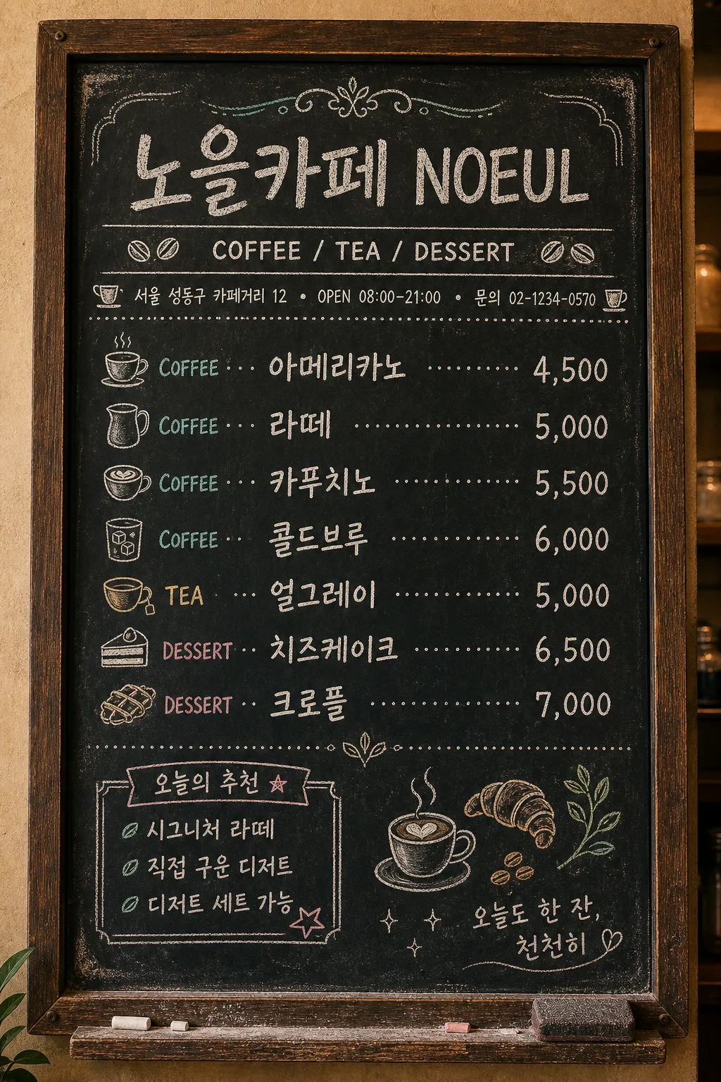
카페 칠판 메뉴판
흑판 + 분필 손글씨. 빈티지 카페·브런치 가게에 어울림. 음료 + 가격 + 작은 일러스트.
카페 칠판 메뉴판 summary
Copy this ChatGPT image prompt to create Ads/Posters results. Its subject, background, style, and composition are organized for quick iteration.
Related keywords: 카페 칠판 메뉴판, 카페 칠판 메뉴판 프롬프트, Ads/Posters 프롬프트, Ads/Posters AI 이미지 프롬프트, ChatGPT 이미지 프롬프트, AI 이미지 생성 프롬프트, AI 프롬프트, 이미지 프롬프트
How to use 카페 칠판 메뉴판
Keep the prompt structure and swap the subject, background, palette, or composition to create new variations.
- Keep the main subject and adjust the palette and background for your brand, season, or channel.
- If the result feels busy, simplify the background and make the subject, composition, and lighting more specific.
- After copying, ask ChatGPT to adapt it for your platform, aspect ratio, or text requirements.
Original prompt
[Input]
- language: Korean
- output_size: 1024x1536

[Purpose]
Korean cafe chalkboard menu board, vertical 9:13 in-store poster for a real neighborhood cafe. Hand-drawn chalk lettering on a worn blackboard with practical cafe information, prices, decorative dividers, and small chalk illustrations that make it feel like an actual daily menu displayed near the counter.

[Composition]
- A wall-mounted chalkboard menu nearly fills the vertical frame, set inside a dark walnut wooden frame with visible grain, tiny screw heads, chalk dust along the lower ledge, and a slightly worn black surface.
- {카페 이름} appears large at the top as the main store name, with {카테고리} directly below as a smaller menu-category label.
- Add a compact cafe info strip under the header: chalk text reading "서울 성동구 카페거리 12", "OPEN 08:00–21:00", "문의 02-1234-0570", separated by small dots or tiny cup icons.
- The menu list is organized in a clear three-column structure: category label on the left, Korean menu name in the center, price on the right, connected by dotted chalk leaders.
- Use {메뉴 리스트} as the main menu content, with 5–7 items clearly separated, including realistic price alignment and consistent row spacing.
- Add a small chalk box labeled "오늘의 추천" near the lower-left or side margin, containing short Korean copy such as "시그니처 라떼", "직접 구운 디저트", and a tiny star doodle.
- {멘트} sits as a small handwritten quote in the bottom-right corner inside the board margin, with a gentle underline and a tiny heart or leaf mark.
- Include chalk doodles that naturally belong on a cafe menu board: espresso cup, croissant, coffee beans, steam lines, milk pitcher, leaf, dotted separators, and small hand-drawn arrows.
- Around the board, show subtle realistic cafe context: warm plaster wall edge, a narrow shelf lip with chalk dust, a small eraser mark, and faint powder smears, while keeping all menu text readable.

[3. CORE STRUCTURE]
- Top header area (15–18%): {카페 이름} in the largest hand-drawn chalk script, centered, with slightly irregular strokes, soft chalk powder edges, and a thin ornamental flourish above.
- Subheader area (8–10%): place {카테고리} directly under the title, centered, in a neat condensed chalk sans style, with double separator lines and small coffee-bean icons on both sides.
- Cafe information strip (5–7%): add small but legible Korean chalk text: "서울 성동구 카페거리 12 · OPEN 08:00–21:00 · 문의 02-1234-0570"; keep it aligned and integrated into the board design.
- Main menu grid (50–55%): render {메뉴 리스트} as 5–7 rows, each row using left-aligned category labels, center-aligned Korean menu names, and right-aligned prices, linked by dotted chalk leaders; row spacing should feel like a real handwritten menu while remaining tidy and legible.
- Decorative dividers: use thin chalk rules, small laurel leaves, cup icons, bean clusters, and lightly smudged corner flourishes in warm white and pale teal chalk.
- Daily recommendation area (8–10%): include a hand-drawn chalk rectangle or ribbon labeled "오늘의 추천" with short Korean notes such as "부드러운 크림", "고소한 블렌드", "디저트 세트 가능".
- Bottom quote area (8–10%): set {멘트} in a smaller casual chalk handwriting style, aligned to the lower-right corner with a subtle curved underline and tiny sparkle marks.
- Board edges: keep a slightly uneven chalk-dust border, worn corners, rub marks from previous writing, and a realistic wooden frame; do not let texture interfere with the legibility of {카페 이름}, {메뉴 리스트}, or {멘트}.

[4. STYLE RULES]
- Typography: hand-drawn chalk script for {카페 이름}; Pretendard Bold or Noto Sans KR Bold adapted into chalk texture for menu rows; condensed sans for {카테고리}; small handwritten chalk script for {멘트}; tiny cafe information text should look manually written but remain readable.
- Color palette: blackboard charcoal #111111, warm white chalk #F3F0E8, pale teal accent #B7D8D4, light gray chalk dust #8A8A8A, dark walnut frame brown #4A2F1E.
- Texture: visible chalk grain, powder buildup, eraser haze, layered strokes, slight ghost marks from old prices, and subtle pressure variation in the lettering.
- Border/shadow: dark wooden frame with shallow inner shadow, soft vignette around the board, mild chalk smudge shadowing, no glossy reflections; text should look hand-written directly on the board.
- Realism details: include small chalk crumbs on the bottom ledge, tiny rubbed areas near frequently changed prices, slightly imperfect dotted leaders, and hand-drawn divider ornaments.

[5. VISUAL STYLE]
- Camera / lens: straight-on front view, 50mm lens, f/5.6, full-frame document-style capture to keep the board rectangular and readable.
- Lighting: soft diffused ambient light from upper-left at about 45°, with gentle warm cafe ambience; chalk texture should be visible without harsh glare.
- Color grade: matte black + warm white chalk + muted teal accents, slightly desaturated vintage cafe tone with warm wood and cozy wall undertones.
- Rendering: realistic in-store chalkboard photography blended with editorial menu-board design; tactile chalk texture, natural wall-mounted scale, crisp readable Korean lettering.

[6. MOOD]
Vintage neighborhood cafe menu board — feels like a handwritten daily specials chalkboard from a cozy Seoul cafe, with warm counter-side realism, subtle French bistro charm, hand-made chalk personality, and inviting local-cafe detail.

[7. CRITICAL]
- Korean text accuracy: 반드시 아래 문자열이 정확히 보여야 함:
  - {카페 이름}
  - {메뉴 리스트}
  - {멘트}
- Additional Korean text rendered in the image should be clear and plausible, including: "서울 성동구 카페거리 12", "OPEN 08:00–21:00", "문의 02-1234-0570", "오늘의 추천", "시그니처 라떼", "직접 구운 디저트".
- Layout invariants: the menu must use a clear left-middle-right alignment with dotted leaders; prices must be aligned consistently; all menu text should remain fully legible; the board must stay vertical 9:13.
- Keep {카페 이름} as the dominant store header, {카테고리} directly beneath it, {메뉴 리스트} as the central menu content, and {멘트} as the bottom-right handwritten quote.

[8. 🚫 PROHIBITED]
- Fake official seals / certifications
- Broken Korean characters