広告・ポスター
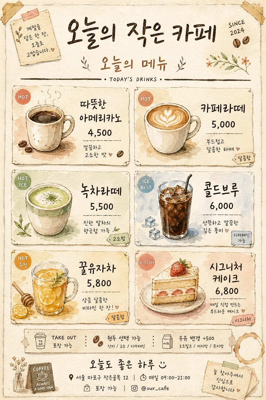
카페 손그림 일러스트 메뉴판
음료별 손그림 일러스트 + 손글씨. 동네 작은 카페·브런치 가게 분위기.
카페 손그림 일러스트 메뉴판の概要
広告・ポスター画像を作るためのChatGPT画像プロンプトです。主題、背景、スタイル、構図を整理し、すぐに試せるよう構成しています。
関連キーワード: 카페 손그림 일러스트 메뉴판, 카페 손그림 일러스트 메뉴판 프롬프트, 広告・ポスター 프롬프트, 広告・ポスター AI 이미지 프롬프트, ChatGPT 이미지 프롬프트, AI 이미지 생성 프롬프트, AI 프롬프트, 이미지 프롬프트
카페 손그림 일러스트 메뉴판の活用方法
元の構造を保ちながら、被写体、背景、色、構図を変更して別案に展開できます。
- 主題を維持し、ブランドや季節、媒体に合わせて色と背景を変更してください。
- 結果が複雑な場合は背景要素を減らし、被写体、構図、照明を具体化してください。
- コピー後、ChatGPTに媒体、アスペクト比、文字の有無を追加で指定できます。
プロンプト原文
[Input]
- language: Korean
- output_size: 1024x1536

[Purpose]
Korean small cafe hand-drawn illustrated menu board, 2x3 drink grid layout, vertical poster for in-store display and Instagram sharing.
Watercolor + ink illustration style with handwritten Korean menu text, realistic paper texture, shop details, small decorative cafe graphics, and readable pricing, designed as a cozy local cafe menu sheet that feels actually posted inside a neighborhood cafe.

[Composition]
- Tall 9:13 vertical composition on warm light cream paper, with {카페 이름} centered at the top and {부제} placed directly underneath as the menu subtitle.
- Main content area uses a 2x3 grid of six menu cards, each cell containing one drink illustration, menu name, price, and a tiny handwritten tasting note or temperature tag such as “HOT”, “ICE”, “고소함”, “달콤함”.
- Add realistic cafe-menu details around the core grid: small “TODAY’S MENU” label, tiny seasonal doodles, coffee bean marks, a hand-drawn spoon or cup stain accent, and subtle divider strokes.
- Footer area includes store information in small handwriting: “서울 마포구 작은골목 12”, “매일 09:00–21:00”, “포장 가능”, “@our_cafe”, and a warm handwritten closing line.
- The poster should feel handmade and used in a real cafe: slight watercolor bleed, pencil guide traces, paper grain, imperfect ink pressure, and gentle taped-corner or pin-mark details.

[3. CORE STRUCTURE]
1) Top header: place {카페 이름} in large expressive hand-drawn Korean lettering at the upper center, with a small “SINCE 2024” note and two tiny coffee-bean doodles beside it.
2) Subtitle block: place {부제} directly below the header, smaller and lighter, centered, followed by a bold hand-drawn divider line with slightly uneven ink texture and a small “TODAY’S DRINKS” micro label.
3) Menu grid: arrange {6개 음료} into a 2x3 grid across the middle 70% of the poster; each item should occupy one illustrated menu cell with a softly tinted background wash, hand-drawn corner marks, and readable spacing.
4) Per-cell rendering: each menu cell should combine a beverage icon in ink line-art, soft watercolor wash fill, handwritten Korean item name, price in KRW, and one tiny note such as “추천”, “ICE BEST”, “달콤한 라떼”, “디카페인 가능”, or “시그니처”.
5) Decorative information band: below the grid, add a narrow hand-drawn strip with small icons and service notes: “TAKE OUT”, “원두 선택 가능”, “우유 변경 +500”, separated by tiny dots or sketchy dividers.
6) Bottom note: near the lower center, add the exact phrase “오늘도 좋은 하루 ☺”, with store address/contact details beneath it in smaller hand lettering.

[4. STYLE RULES]
- Typography: use hand-drawn Korean lettering inspired by brush pen cafe signage, with a secondary clean sans-serif like Pretendard SemiBold for prices if needed for legibility; title around 54-64px, menu names around 24-30px, price around 22-26px, footer details around 14-18px.
- Color palette: warm pastel tones from cream, peach, sage, muted beige, and soft cocoa; use paper base #F6F0E4, peach accent #F5C9B6, sage accent #AFC6B0, cocoa text #4A3B35, with occasional muted caramel #C89463 and milk-white highlights.
- Use hand-painted watercolor fills, uneven ink outlines, small paper fibers, faint graphite sketch traces, and gentle shadows under layered paper/card shapes to create tactile realism.
- Add cafe-appropriate decorative dividers, tiny drink-size labels, beans, steam curls, ice cubes, straw marks, and small hand-drawn sticker-like tags, while keeping the six drink cells clearly readable.

[5. VISUAL STYLE]
- Camera / lens: flat-lay poster design look, equivalent to a 50mm lens with mild top-down perspective, crisp edges and no distortion.
- Lighting: even diffused studio light, like soft daylight from upper-left with gentle natural shadowing around paper texture, taped corners, and illustrated card edges.
- Color grade: warm cream + peach + sage + soft brown grade, slightly desaturated to preserve a handcrafted watercolor stationery aesthetic.
- Rendering: high-resolution printed-menu realism mixed with handmade ink-and-watercolor illustration; visible paper tooth, subtle pigment blooms, imperfect brush edges, and naturally varied handwritten strokes.

[6. MOOD]
Indie neighborhood cafe stationery aesthetic — a cozy Seoul alleyway cafe menu poster with Kinfolk-inspired editorial softness, friendly handwritten charm, and the lived-in feel of a real counter menu at a small local cafe.

[7. CRITICAL]
- Korean text accuracy: 반드시 정확히 보일 문자열: {카페 이름}, {부제}, {6개 음료}, 오늘도 좋은 하루 ☺
- Additional Korean micro text may include: “서울 마포구 작은골목 12”, “매일 09:00–21:00”, “포장 가능”, “우유 변경 +500”, “원두 선택 가능”, “추천”, “시그니처”.
- Each of the 6 menu cells must clearly show one item name and one price, with no duplicated or missing entries.
- If {6개 음료} contains drink names without prices, add plausible readable Korean won prices such as “₩4,500”, “₩5,000”, “₩5,500”, “₩6,000” while keeping the provided drink names intact.
- Handwritten Korean text must remain legible and properly spaced, with no broken syllables or character distortion.

[8. 🚫 PROHIBITED]
- Fake official seals / certifications
- Broken Korean characters
- Celebrity composites / unauthorized likeness