広告・ポスター
동서가구 가성비 광고
동서가구 톤 — 가성비 + 다양 카테
동서가구 가성비 광고の概要
広告・ポスター画像を作るためのChatGPT画像プロンプトです。主題、背景、スタイル、構図を整理し、すぐに試せるよう構成しています。
関連キーワード: 동서가구 가성비 광고, 동서가구 가성비 광고 프롬프트, 広告・ポスター 프롬프트, 広告・ポスター AI 이미지 프롬프트, ChatGPT 이미지 프롬프트, AI 이미지 생성 프롬프트, AI 프롬프트, 이미지 프롬프트
동서가구 가성비 광고の活用方法
元の構造を保ちながら、被写体、背景、色、構図を変更して別案に展開できます。
- 主題を維持し、ブランドや季節、媒体に合わせて色と背景を変更してください。
- 結果が複雑な場合は背景要素を減らし、被写体、構図、照明を具体化してください。
- コピー後、ChatGPTに媒体、アスペクト比、文字の有無を追加で指定できます。
プロンプト原文
[Input]
- language: Korean
- output_size: {비율}

[Purpose]
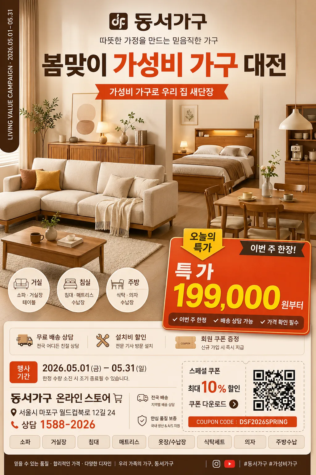
Korean furniture value-for-money advertisement poster, brand-led commercial key visual for social ads and promotional placements.
Retail-focused vertical ad with a realistic showroom hero product presentation, strong price emphasis, sale-event details, product spec chips, and compact store information.

[Composition]
- Main hero occupies the central 55% of the frame, with {주요제품} styled as a warm Korean home showroom display: sofa or bed set, side table, fabric cushion, rug edge, wood cabinet surface, small plant, and subtle family-living cues.
- Top branding zone (about 15%): {브랜드명} and {브랜드톤} appear as the primary identity cue, paired with {행사명} and a small campaign ribbon reading “{시그니처메시지}”.
- Mid-to-lower price zone (about 20%): {대표가격} is placed in a large high-contrast price badge, supported by “가격 혜택”, “오늘의 특가”, and concise product benefit text.
- Bottom retail information zone (about 20%): include {행사기간}, {매장명}, {주소}, {연락처}, delivery/install notes, QR-style coupon box, and small product category tabs.
- Background uses a warm studio-retail showroom with beige wall panels, natural wood texture, soft fabric details, amber highlight, and realistic commercial depth matching {컬러팔레트}.
- Keep the framing stable and poster-like, with the furniture hero clearly readable while allowing natural showroom props and retail labels to make the advertisement feel lived-in and credible.

[3. CORE STRUCTURE]
1. Background layer — Build a studio-style Korean furniture showroom with matte beige wall panels, light wood floor, soft curtain texture, a warm area rug, small ceramic vase, and amber ambience.
2. Hero product layer — Present {주요제품} as the dominant visual element, crisp-edged and premium but approachable, with realistic perspective, visible fabric/wood grain, and tidy retail staging.
3. Brand identity layer — Place “{브랜드명}” near the upper area in a clean ad-header position with a small spine-like vertical credit strip on the left reading “LIVING VALUE CAMPAIGN · {행사기간}”.
4. Value message layer — Emphasize {시그니처메시지} through friendly commercial cues: family-friendly copy, small benefit icons, installment/delivery notes, and category labels such as “거실”, “침실”, “주방”.
5. Pricing emphasis layer — Reserve a bold price callout area connected to {대표가격}; add smaller comparison-style text such as “이번 주 한정”, “배송 상담 가능”, and “가격 확인 필수”.
6. Supporting information layer — Add realistic retail blocks: {혜택문구}, sale-period label, store name, address, contact number, QR coupon square, barcode-like event code, and small divider lines.
7. Decorative commercial polish — Add soft shadows, warm material highlights, rounded price stickers, small arrow tags, coupon perforation details, and catalog-style dividers so the composition feels like a polished furniture advertisement.

[4. STYLE RULES]
- Typography: Pretendard or Noto Sans KR for the main headline and body copy, bold for pricing, medium for supporting text, with sizes roughly 72–110px for the main brand/price hierarchy and 28–40px for details.
- Color palette: use {컬러팔레트} as the base, with beige #E9DDCC, wood brown #A67C52, warm amber #D79A5B, deep text brown #3E2A1E, off-white #F7F2EA, and a red-orange sale accent #E4572E.
- Graphic system: rounded price badges, thin catalog dividers, small benefit icons, QR-style coupon box, barcode-like event code, and retail label stickers should support the product and pricing hierarchy.
- Layout: {레이아웃}; top brand banner, central furniture hero, right or lower price badge, bottom store information strip, and small category tabs arranged in a realistic Korean sale-poster hierarchy.

[5. VISUAL STYLE]
- Camera / lens: full-frame commercial product photography, 50mm lens at f/5.6 for balanced perspective and crisp furniture edges.
- Lighting: studio softbox key light from upper-left at 45°, gentle fill from front-right, subtle warm rim light to separate the hero from the background.
- Color grade: warm cream + wood brown + amber commercial grade with controlled contrast and a slightly polished catalog finish.
- Material rendering: realistic sofa fabric weave, matte wood grain, soft rug fibers, paper-like coupon texture, and printed ink clarity for all Korean text.

[6. MOOD]
Modern Korean furniture retail campaign — warm showroom-commercial aesthetic with practical home-shopping clarity, friendly family value, and credible sale-event energy.

[7. CRITICAL]
- Korean text accuracy: 반드시 아래 한글 문자열이 정확히 보여야 함: “{브랜드명}”, “가성비”, “가구”, “가격”, “오늘의 특가”, “{대표가격}”, “{행사기간}”, “{매장명}”, “{연락처}”.
- Include 2–3 readable feature headlines in Korean: “우리 집 분위기 새로고침”, “거실·침실·주방 가구 모음”, “배송·설치 상담 가능”.
- Include realistic retail microcopy in Korean: “행사코드 DS-247”, “QR 쿠폰 확인”, “상담 후 맞춤 견적”, “일부 품목 조기 마감”.
- Composition invariants: the hero product must remain the dominant center focus, pricing must be visually emphasized, and the layout must retain a family-friendly value-ad structure with store and sale information.
- Maintain clean Korean typography with no broken characters, no misspellings, and no warped text.

[8. 🚫 PROHIBITED]
- Fake official seals / certifications
- Broken Korean characters
- Celebrity composites or fake endorsements
- Misleading government-style badges