グッズ・モックアップ
카페 스탬프·적립 카드 디자인
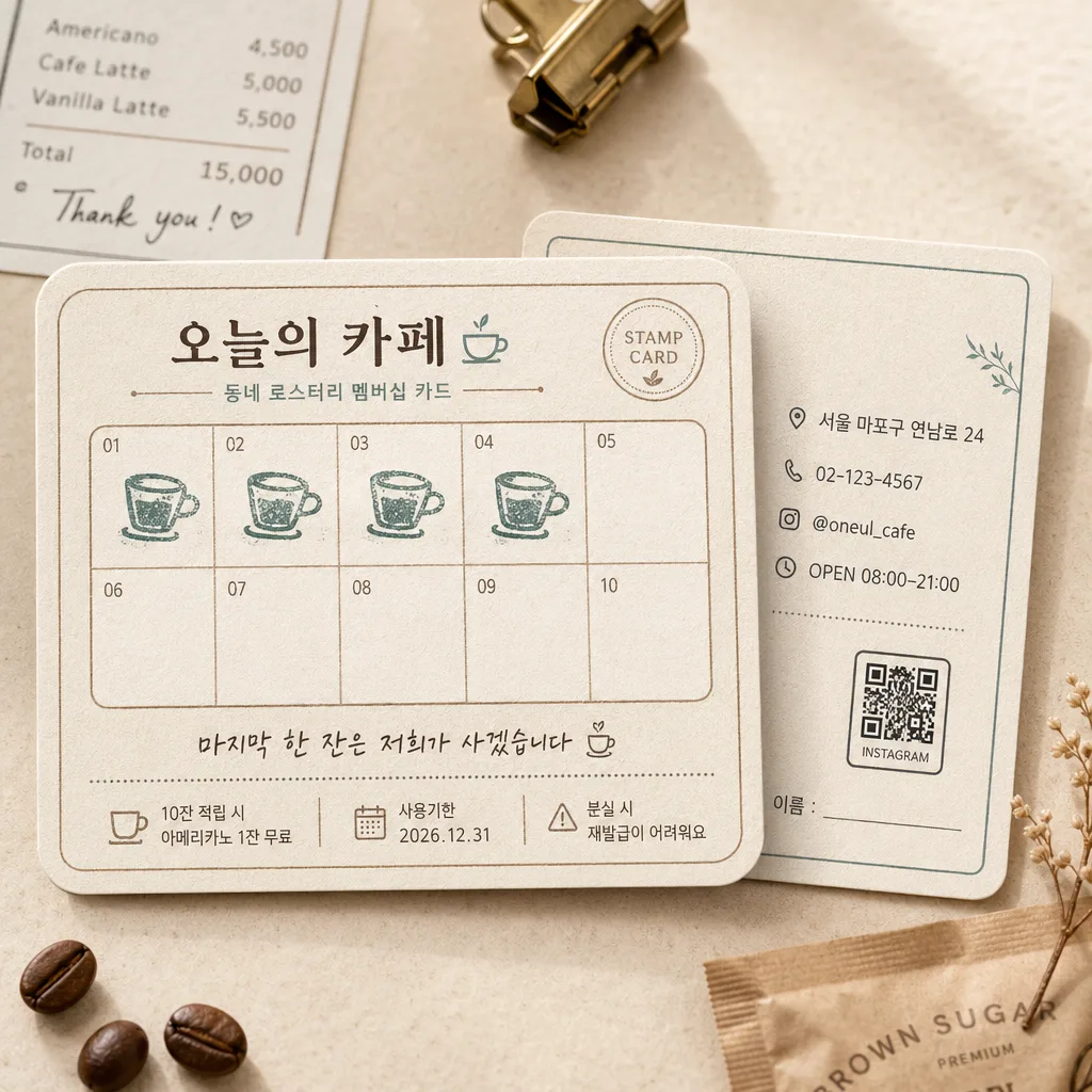
10잔 스탬프 카드 mockup. 카페 로고 + 스탬프 자리 + 작은 일러스트.
카페 스탬프·적립 카드 디자인の概要
グッズ・モックアップ画像を作るためのChatGPT画像プロンプトです。主題、背景、スタイル、構図を整理し、すぐに試せるよう構成しています。
関連キーワード: 카페 스탬프·적립 카드 디자인, 카페 스탬프·적립 카드 디자인 프롬프트, グッズ・モックアップ 프롬프트, グッズ・モックアップ AI 이미지 프롬프트, ChatGPT 이미지 프롬프트, AI 이미지 생성 프롬프트, AI 프롬프트, 이미지 프롬프트
카페 스탬프·적립 카드 디자인の活用方法
元の構造を保ちながら、被写体、背景、色、構図を変更して別案に展開できます。
- 主題を維持し、ブランドや季節、媒体に合わせて色と背景を変更してください。
- 結果が複雑な場合は背景要素を減らし、被写体、構図、照明を具体化してください。
- コピー後、ChatGPTに媒体、アスペクト比、文字の有無を追加で指定できます。
プロンプト原文
[Input]
- language: Korean
- output_size: 1024x1024

[Purpose]
Korean cafe stamp loyalty card design mockup for small business branding, 1:1 square presentation.
Realistic printed stationery scene for social media, print preview, and cafe counter display, showing a believable neighborhood cafe reward card with practical customer information and tactile paper details.

[Composition]
- Main card mockup takes about 72% of the frame, with a single front card as the primary hero and a second back-side card slightly behind it at a 10–15° angle for depth.
- Background is a warm cream cafe tabletop with subtle paper fibers, soft coffee-toned shadows, a small receipt corner, a brass clip, and a few natural coffee-bean or sugar-packet accents kept secondary to the card.
- Keep the card visually centered with the stamp grid clearly readable at a glance; allow realistic printed edges, slight paper thickness, tiny corner rounding, and gentle handling texture.
- Use {카페 이름}, {스탬프 도장}, {칸 수}, {멘트} as the customizable text and design anchors.
- Include small practical loyalty-card details such as an address line, phone number, Instagram handle, open hours, QR-code placeholder, and a short terms line in Korean to make the card feel usable in a real cafe.

[3. CORE STRUCTURE]
- Header zone (top 14%): place {카페 이름} as the cafe name/logo in a refined Korean brand style, with a thin divider line, tiny cup icon, and small subtext such as "동네 로스터리 멤버십 카드".
- Main grid zone (middle 58%): build a stamp grid with exactly {칸 수} presented as a 2x5 or 5x2 layout; each cell should be evenly spaced, numbered subtly 01–10 if appropriate, with 3–4 cells visibly stamped using {스탬프 도장} as sample filled marks and the remaining cells empty.
- Stamp treatment: render {스탬프 도장} as a slightly imperfect rubber-stamp print with soft edges, real ink density variation, tiny misregistration, and overlapping pressure marks, not a flat icon.
- Footer zone (bottom 18%): place {멘트} in smaller Korean handwriting-style text, aligned cleanly within card margins, plus micro copy like "10잔 적립 시 아메리카노 1잔 무료", "사용기한 2026.12.31", and "분실 시 재발급이 어려워요".
- Back card details: show the rear card partially visible with realistic information blocks: "서울 마포구 연남로 24", "02-123-4567", "@oneul_cafe", "OPEN 08:00–21:00", a small QR-code placeholder, and a tiny customer memo line "이름: ______".
- Mockup layering: offset the back card behind the front card with a soft contact shadow, visible paper thickness, and slightly different printed layout so the object reads as a real two-sided loyalty card set.

[4. STYLE RULES]
- Typography: use Pretendard or Noto Sans KR for the main readable text, medium to semibold weight, with a small handwritten accent style for the promotional line; size hierarchy should clearly separate header, grid labels, stamp cells, terms, and contact details.
- Color palette: warm cream #F5EFE6, coffee brown #6B4E3D, beige #D9C7B8, accent dusty teal #6E8C8B; keep contrast high enough for print readability.
- Border/shadow: thin rounded card border with a soft drop shadow, 4px y-offset, 14px blur, 18% opacity, natural card-edge shadow, and subtle letterpress or risograph-like ink texture.
- Add tasteful cafe-stationery decoration: tiny cup line art, dotted dividers, small loyalty badge reading "STAMP CARD", and warm paper grain, while keeping all added elements supportive of the stamp card.

[5. VISUAL STYLE]
- Camera / lens: studio product photography look, 85mm lens at f/4, straight-on front view with slight perspective if a second card is layered behind.
- Lighting: soft diffused window light from upper-left at about 45°, gentle fill from right, even exposure with mild shadow under the card edges.
- Color grade: warm cream + coffee brown + muted dusty teal, clean editorial color balance with slightly lifted highlights.
- Materials: matte uncoated paper stock, faint fiber texture, lightly debossed divider lines, rubber-stamp ink absorption, and realistic printed microtext.

[6. MOOD]
Korean neighborhood cafe stationery mockup — polished indie brand product photo with a Kinfolk-like editorial calm, warm counter-top realism, and the cozy feeling of a regular customer reward card.

[7. CRITICAL]
- Korean text accuracy: "오늘의 카페", "작은 커피잔 모양 도장", "10칸 (10잔 = 무료 1잔)", "마지막 한 잔은 저희가 사겠습니다 ☕"
- Include realistic small Korean details on the card: "동네 로스터리 멤버십 카드", "10잔 적립 시 아메리카노 1잔 무료", "사용기한 2026.12.31", "서울 마포구 연남로 24", "02-123-4567", "@oneul_cafe", "OPEN 08:00–21:00".
- The stamp grid must contain exactly {칸 수} cells, evenly aligned, with 3–4 sample stamps visibly placed using {스탬프 도장}.
- All Korean text must be clean, legible, correctly spaced, and free of broken characters.
- Keep the design as a cafe stamp/loyalty card mockup, not a flyer, poster, coupon sheet, or menu board.

[8. 🚫 PROHIBITED]
- Fake official seals / certifications
- Broken Korean characters