グッズ・モックアップ
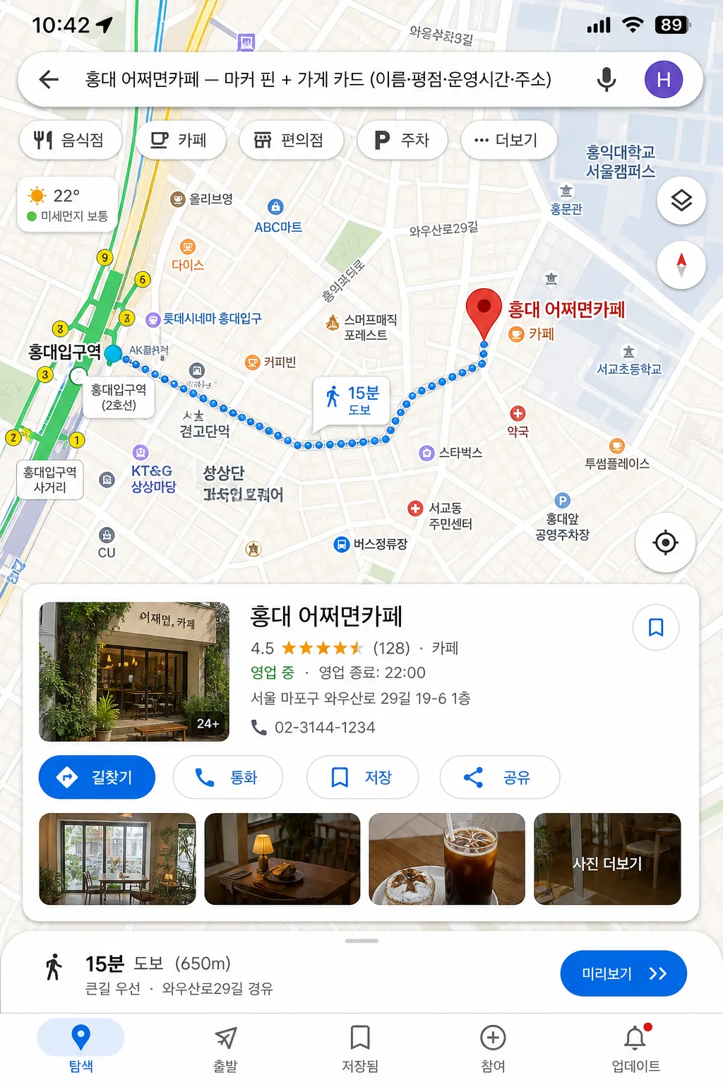
구글 지도 목업 (위치 마커·길찾기 화면)
구글 지도·네이버 지도 mockup. 위치 마커 + 가게 정보 카드 + 길찾기 경로. 매장 안내·SNS 활용.
구글 지도 목업 (위치 마커·길찾기 화면)の概要
グッズ・モックアップ画像を作るためのChatGPT画像プロンプトです。主題、背景、スタイル、構図を整理し、すぐに試せるよう構成しています。
関連キーワード: 구글 지도 목업 (위치 마커·길찾기 화면), 구글 지도 목업 (위치 마커·길찾기 화면) 프롬프트, グッズ・モックアップ 프롬프트, グッズ・モックアップ AI 이미지 프롬프트, ChatGPT 이미지 프롬프트, AI 이미지 생성 프롬프트, AI 프롬프트, 이미지 프롬프트
구글 지도 목업 (위치 마커·길찾기 화면)の活用方法
元の構造を保ちながら、被写体、背景、色、構図を変更して別案に展開できます。
- 主題を維持し、ブランドや季節、媒体に合わせて色と背景を変更してください。
- 結果が複雑な場合は背景要素を減らし、被写体、構図、照明を具体化してください。
- コピー後、ChatGPTに媒体、アスペクト比、文字の有無を追加で指定できます。
プロンプト原文
[Input]
- language: Korean
- output_size: 1024x1536

[Purpose]
Create a vertical mobile-screen mockup of a Google Maps-style location and directions UI, designed to look like a real, information-rich map app screenshot for presentation, review, or concept mockup use.

[Composition]
- Main map view fills about 70% of the frame, with a detailed place info card anchored near the lower third and a route panel integrated into the map overlay.
- Center the scene on {장소·가게}, with the marker pin clearly visible and the surrounding streets, alleys, blocks, crosswalk hints, transit stops, parking icons, and road labels rendered like an authentic navigation interface.
- Background treatment: realistic digital map surface with layered roads, building footprints, pale terrain blocks, POI dots, subway/bus icons, small park and river/stream shapes if appropriate, and app-style interface panels.
- Keep the composition tight and smartphone-like, with readable labels, realistic screen density, status-bar details, and natural UI stacking.

[3. CORE STRUCTURE]
1. Top system area: include a smartphone status bar with time, signal, Wi‑Fi, and battery indicators, plus a search bar reading “{장소·가게}” with back arrow, voice/search icon, and profile dot.
2. Top map area: render a polished map interface in {지도 모드}, with streets, intersections, small blocks, route lines, neighborhood labels, transit-stop markers, parking/restaurant/cafe POI icons, and realistic traffic color accents arranged like a live navigation app.
3. Primary marker zone: place a prominent red location pin directly on {장소·가게}, with a tiny label bubble and nearby venue labels such as “카페”, “약국”, “버스정류장”, “공영주차장” placed naturally around the map.
4. Info card zone: show {추가 정보 카드} in a compact place card with clear hierarchy, app-like padding, rounded corners, rating row, review count, category, opening-hours snippet, address line, call/save/share micro icons, and a small thumbnail strip or photo preview area.
5. Directions overlay: if included, render {길찾기 경로 (선택)} as a blue route line with start and destination markers, turn arrows, ETA bubble, distance label, and a lower route summary such as “자동차 12분 · 4.8km” or “도보 9분 · 650m”, positioned naturally across the map.
6. Bottom app navigation: add a realistic bottom navigation row with small icons and Korean labels such as “탐색”, “저장됨”, “참여”, “업데이트”, plus a floating location button and map-layer button along the right edge.
7. UI fidelity pass: make {UI 톤} feel like an actual screen capture, with crisp edges, accurate map detail density, believable label hierarchy, and practical mobile interaction elements.
8. Aspect treatment: keep the composition fully vertical at {비율}, with the map and overlays scaled for smartphone readability.

[4. STYLE RULES]
- Typography: use Pretendard or Noto Sans KR for Korean UI text, medium to semibold weight, 18–28px for headers and 12–16px for metadata; tiny map labels may be 9–12px but still crisp.
- Color palette: Google Maps-style pale beige, soft gray, off-white cards, muted blue route line, red destination pin, green park blocks, yellow/orange traffic segments, warm neutral shadows; if the map mode leans Naver, introduce restrained green accents from {지도 모드}.
- Border/shadow: use subtle app-card shadows, about 0px x-offset, 4px y-offset, 14px blur, 12–16% opacity, with rounded 18–24px card corners.
- UI details: include believable microcopy like “영업 중”, “리뷰 128개”, “저장”, “공유”, “통화”, “길찾기”, “주변”, “혼잡도 보통”, while keeping the required placeholders as the dominant readable text.
- Map realism: vary road widths, include one or two major roads, several side streets, building blocks, pedestrian paths, transit icons, and POI labels at realistic density for a Korean urban neighborhood.

[5. VISUAL STYLE]
- Camera / lens: front-facing screen mockup look, like a clean smartphone UI capture with flat orthographic framing rather than a photographic lens effect.
- Lighting: neutral studio-style screen presentation, even brightness across the UI, no dramatic highlights, no reflective glare.
- Color grade: crisp digital interface grade with beige-gray Google Maps tones or green Naver Maps tones, balanced contrast, clean whites, and controlled saturation.

[6. MOOD]
Practical app-demo mockup — credible everyday navigation UI with dense but readable map information, helpful place details, and real screenshot fidelity.

[7. CRITICAL]
- Korean text accuracy: 반드시 다음 문구가 정확히 보여야 함: “{장소·가게}”, “{추가 정보 카드}”, “{길찾기 경로 (선택)}”.
- Add realistic Korean UI labels where appropriate, such as “길찾기”, “저장”, “공유”, “통화”, “영업 중”, “리뷰 128개”, “자동차 12분”, “도보 9분”, “공영주차장”, “버스정류장”.
- UI must read as a real map app screenshot, with legible road geometry, marker placement, POI density, route hierarchy, and authentic navigation-card structure.
- Keep all Korean characters crisp and correctly formed.

[8. 🚫 PROHIBITED]
- Fake official seals / certifications
- Broken Korean characters