周邊/模型
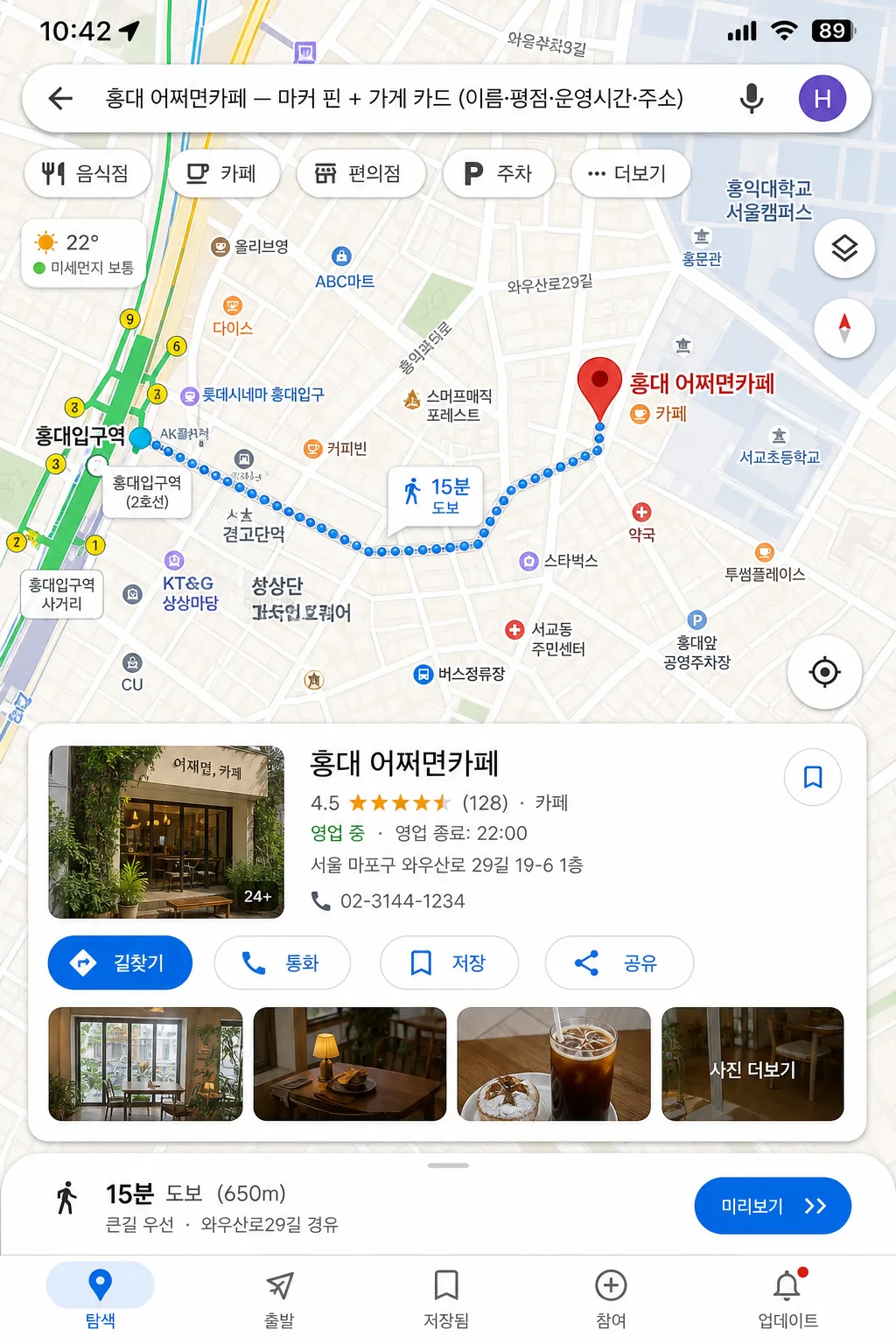
구글 지도 목업 (위치 마커·길찾기 화면)
구글 지도·네이버 지도 mockup. 위치 마커 + 가게 정보 카드 + 길찾기 경로. 매장 안내·SNS 활용.
구글 지도 목업 (위치 마커·길찾기 화면)摘要
這是用來製作周邊/模型內容的 ChatGPT 圖像提示詞,已整理主題、背景、風格與構圖,方便快速調整。
相關關鍵字: 구글 지도 목업 (위치 마커·길찾기 화면), 구글 지도 목업 (위치 마커·길찾기 화면) 프롬프트, 周邊/模型 프롬프트, 周邊/模型 AI 이미지 프롬프트, ChatGPT 이미지 프롬프트, AI 이미지 생성 프롬프트, AI 프롬프트, 이미지 프롬프트
구글 지도 목업 (위치 마커·길찾기 화면)使用方式
保留原始結構並替換主體、背景、色彩或構圖,即可延伸出不同版本。
- 保留核心主體,並依品牌、季節或平台調整色彩與背景。
- 如果畫面太複雜,請減少背景元素並具體描述主體、構圖與光線。
- 複製後可要求 ChatGPT 配合平台、長寬比或文字需求調整。
提示詞原文
[Input]
- language: Korean
- output_size: 1024x1536

[Purpose]
Create a vertical mobile-screen mockup of a Google Maps-style location and directions UI, designed to look like a real, information-rich map app screenshot for presentation, review, or concept mockup use.

[Composition]
- Main map view fills about 70% of the frame, with a detailed place info card anchored near the lower third and a route panel integrated into the map overlay.
- Center the scene on {장소·가게}, with the marker pin clearly visible and the surrounding streets, alleys, blocks, crosswalk hints, transit stops, parking icons, and road labels rendered like an authentic navigation interface.
- Background treatment: realistic digital map surface with layered roads, building footprints, pale terrain blocks, POI dots, subway/bus icons, small park and river/stream shapes if appropriate, and app-style interface panels.
- Keep the composition tight and smartphone-like, with readable labels, realistic screen density, status-bar details, and natural UI stacking.

[3. CORE STRUCTURE]
1. Top system area: include a smartphone status bar with time, signal, Wi‑Fi, and battery indicators, plus a search bar reading “{장소·가게}” with back arrow, voice/search icon, and profile dot.
2. Top map area: render a polished map interface in {지도 모드}, with streets, intersections, small blocks, route lines, neighborhood labels, transit-stop markers, parking/restaurant/cafe POI icons, and realistic traffic color accents arranged like a live navigation app.
3. Primary marker zone: place a prominent red location pin directly on {장소·가게}, with a tiny label bubble and nearby venue labels such as “카페”, “약국”, “버스정류장”, “공영주차장” placed naturally around the map.
4. Info card zone: show {추가 정보 카드} in a compact place card with clear hierarchy, app-like padding, rounded corners, rating row, review count, category, opening-hours snippet, address line, call/save/share micro icons, and a small thumbnail strip or photo preview area.
5. Directions overlay: if included, render {길찾기 경로 (선택)} as a blue route line with start and destination markers, turn arrows, ETA bubble, distance label, and a lower route summary such as “자동차 12분 · 4.8km” or “도보 9분 · 650m”, positioned naturally across the map.
6. Bottom app navigation: add a realistic bottom navigation row with small icons and Korean labels such as “탐색”, “저장됨”, “참여”, “업데이트”, plus a floating location button and map-layer button along the right edge.
7. UI fidelity pass: make {UI 톤} feel like an actual screen capture, with crisp edges, accurate map detail density, believable label hierarchy, and practical mobile interaction elements.
8. Aspect treatment: keep the composition fully vertical at {비율}, with the map and overlays scaled for smartphone readability.

[4. STYLE RULES]
- Typography: use Pretendard or Noto Sans KR for Korean UI text, medium to semibold weight, 18–28px for headers and 12–16px for metadata; tiny map labels may be 9–12px but still crisp.
- Color palette: Google Maps-style pale beige, soft gray, off-white cards, muted blue route line, red destination pin, green park blocks, yellow/orange traffic segments, warm neutral shadows; if the map mode leans Naver, introduce restrained green accents from {지도 모드}.
- Border/shadow: use subtle app-card shadows, about 0px x-offset, 4px y-offset, 14px blur, 12–16% opacity, with rounded 18–24px card corners.
- UI details: include believable microcopy like “영업 중”, “리뷰 128개”, “저장”, “공유”, “통화”, “길찾기”, “주변”, “혼잡도 보통”, while keeping the required placeholders as the dominant readable text.
- Map realism: vary road widths, include one or two major roads, several side streets, building blocks, pedestrian paths, transit icons, and POI labels at realistic density for a Korean urban neighborhood.

[5. VISUAL STYLE]
- Camera / lens: front-facing screen mockup look, like a clean smartphone UI capture with flat orthographic framing rather than a photographic lens effect.
- Lighting: neutral studio-style screen presentation, even brightness across the UI, no dramatic highlights, no reflective glare.
- Color grade: crisp digital interface grade with beige-gray Google Maps tones or green Naver Maps tones, balanced contrast, clean whites, and controlled saturation.

[6. MOOD]
Practical app-demo mockup — credible everyday navigation UI with dense but readable map information, helpful place details, and real screenshot fidelity.

[7. CRITICAL]
- Korean text accuracy: 반드시 다음 문구가 정확히 보여야 함: “{장소·가게}”, “{추가 정보 카드}”, “{길찾기 경로 (선택)}”.
- Add realistic Korean UI labels where appropriate, such as “길찾기”, “저장”, “공유”, “통화”, “영업 중”, “리뷰 128개”, “자동차 12분”, “도보 9분”, “공영주차장”, “버스정류장”.
- UI must read as a real map app screenshot, with legible road geometry, marker placement, POI density, route hierarchy, and authentic navigation-card structure.
- Keep all Korean characters crisp and correctly formed.

[8. 🚫 PROHIBITED]
- Fake official seals / certifications
- Broken Korean characters