インフォグラフィック・案内
스마트스토어 전후 비교 섹션
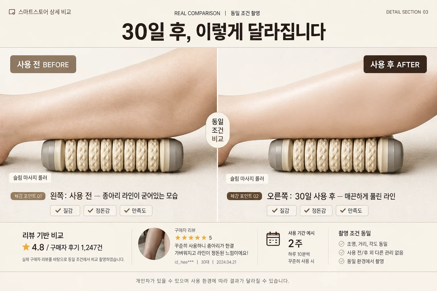
제품 사용 전·후 비교. 화면 분할 또는 양옆 배치. 다이어트·뷰티·생활용품에 효과적.
스마트스토어 전후 비교 섹션の概要
インフォグラフィック・案内画像を作るためのChatGPT画像プロンプトです。主題、背景、スタイル、構図を整理し、すぐに試せるよう構成しています。
関連キーワード: 스마트스토어 전후 비교 섹션, 스마트스토어 전후 비교 섹션 프롬프트, インフォグラフィック・案内 프롬프트, インフォグラフィック・案内 AI 이미지 프롬프트, ChatGPT 이미지 프롬프트, AI 이미지 생성 프롬프트, AI 프롬프트, 이미지 프롬프트
스마트스토어 전후 비교 섹션の活用方法
元の構造を保ちながら、被写体、背景、色、構図を変更して別案に展開できます。
- 主題を維持し、ブランドや季節、媒体に合わせて色と背景を変更してください。
- 結果が複雑な場合は背景要素を減らし、被写体、構図、照明を具体化してください。
- コピー後、ChatGPTに媒体、アスペクト比、文字の有無を追加で指定できます。
プロンプト原文
[Input]
- language: Korean
- output_size: 1536x1024

[Purpose]
Korean smart-store product detail page before/after comparison section, 16:9 horizontal wide layout for high-trust conversion.
Designed as a realistic e-commerce detail-page comparison block that visually contrasts pre-use and post-use results with credible product photography, review-style microcopy, and practical shopping-context information.

[Composition]
- Overall composition: 16:9 wide canvas with an exact center vertical divide line; left half is BEFORE, right half is AFTER, each occupying exactly 50% of the frame.
- Header placement: {헤더} sits centered in the top 12–15% band, large and readable, with small supporting eyebrow text above or beside it such as “REAL COMPARISON” / “동일 조건 촬영”.
- Product placement: {제품} appears as the core visual subject in both halves, matching scale, angle, and camera height for comparison consistency.
- Before/after descriptions: left side follows {Before} and right side follows {After}, with short Korean supporting captions near the lower third and small comparison-point chips.
- E-commerce detail-page realism: include subtle smart-store style elements such as a small product name tag, review snippet strip, star rating micro row, “촬영 조건 동일” note, and a compact comparison table footer without overwhelming the main visual.
- Footer placement: a small disclaimer line centered at the bottom, readable but secondary, e.g. “개인차가 있을 수 있으며 사용 환경에 따라 결과가 달라질 수 있습니다.”
- Background treatment: warm off-white / light beige studio backdrop with real paper-like surface texture, soft shadows, natural contact shadows under the product, and a few relevant comparison-context details such as tiny check icons, measurement ticks, or small label stickers.
- Framing direction: symmetrical, editorial, highly legible, with balanced text hierarchy and a polished Korean smart-store product-detail look.

[3. CORE STRUCTURE]
1. Top header band (12–15% height): place {헤더} centered in bold Korean typography; add a small top-left detail label such as “스마트스토어 상세 비교” and a small top-right issue-style code such as “DETAIL SECTION 03”. Add a thin separator line below in soft beige or white.
2. Left BEFORE panel (50% width): show {제품} in a clearly less favorable pre-use state aligned to {Before}; keep lighting slightly flatter and contrast more restrained than the right side while preserving realistic product detail and texture.
3. Right AFTER panel (50% width): show {제품} in an improved post-use state aligned to {After}; use the same framing and camera angle as the left panel for direct comparison, with cleaner highlights and more polished finish.
4. Center divide: add a thin vertical line at the exact midpoint, 1–2 px visual thickness, in off-white or warm gray; add a small centered vertical badge reading “동일 조건 비교” to clarify that the split is intentional.
5. Label treatment: place large bold labels “사용 전 BEFORE” on the left and “사용 후 AFTER” on the right, both in Korean-friendly typography with strong legibility; use muted taupe on BEFORE and dark brown-gray / warm ivory contrast on AFTER.
6. Supporting text zone: add concise supporting copy beneath each image region. Left: include {Before} with a small tag like “체감 포인트 01”. Right: include {After} with a small tag like “체감 포인트 02”. Add 2–3 tiny checklist chips such as “질감”, “정돈감”, “만족도” as visual comparison cues.
7. Review and info strip: along the lower 15–18% area, add a realistic product-detail micro section: “리뷰 기반 비교”, “★ 4.8 / 구매자 후기 1,247건”, “사용 기간 예시 2주”, and a short caption line. Keep all text small enough to support the main comparison.
8. Footer disclaimer: place the footer line centered along the bottom edge in small type, low contrast, and unobtrusive, but still legible on the beige background.

[4. STYLE RULES]
- Typography: Pretendard or Noto Sans KR for all Korean text, Bold 700–800 for header, Medium 500–600 for labels and chips, Regular 400 for captions and footer; header size should dominate the top band while labels and microcopy create a real product-detail hierarchy.
- Color palette: warm ivory #F6F1E8, soft beige #E7DCCB, muted taupe #B9AA97, dark brown-gray #4B423A, clean white #FFFFFF, with small accent marks in warm caramel #C89F6A for checklist icons or comparison chips.
- Border/shadow: use a subtle 4px y-offset, 10–12px blur, 12–15% opacity soft shadow for product cards, chips, and photo panels when needed; keep the center divider crisp and thin, not heavy.
- Graphic details: add fine hairline rules, rounded rectangular caption chips, tiny check icons, product-detail page markers, and small review metadata to make the layout feel like a finished smart-store sales section.

[5. VISUAL STYLE]
- Camera / lens: high-resolution commercial photo look, 85mm f/1.8 or 50mm f/2.0 for product/body detail consistency, straight-on framing with low distortion.
- Lighting: soft studio softbox at 45° from upper-left, gentle fill from right, slightly more diffused and subdued on the BEFORE side, cleaner and brighter on the AFTER side; include believable contact shadows and material texture.
- Color grade: warm neutral editorial grade with creamy whites, soft beige highlights, and controlled brown-gray shadows; avoid oversaturation and harsh contrast.
- Rendering quality: crisp Korean typography, realistic product texture, clean e-commerce retouching, high-resolution detail-page presentation suitable for a smart-store product page.

[6. MOOD]
Trustworthy Korean smart-store comparison graphic — clean e-commerce editorial feel with a Daiso / Olive Young-style utility presentation, but elevated like a modern product case-study layout. The image should feel like a real product detail-page section from a high-converting Korean online store, with practical captions, review cues, and polished commercial photography.

[7. CRITICAL]
- Korean text accuracy: 반드시 정확히 표시될 문구는 {헤더}, {Before}, {After}.
- Required Korean labels to render clearly: “사용 전 BEFORE”, “사용 후 AFTER”, “동일 조건 비교”, “리뷰 기반 비교”, “개인차가 있을 수 있습니다”.
- Visual comparison rules: left and right panels must use the same camera angle, framing scale, and subject size so the before/after contrast feels credible.
- Layout invariants: 16:9 horizontal wide, exact vertical split, top header, bottom disclaimer, and clear left/right separation must all remain intact.
- The footer disclaimer must stay small and unobtrusive, such as “개인차가 있을 수 있으며 사용 환경에 따라 결과가 달라질 수 있습니다.”
- Make the comparison richer with realistic Korean smart-store detail elements, but keep {제품} as the dominant subject in both panels.

[8. 🚫 PROHIBITED]
- Fake official seals / certifications
- Broken Korean characters
- Celebrity composites / unauthorized likeness