인포그래픽/안내
스마트스토어 전후 비교 섹션
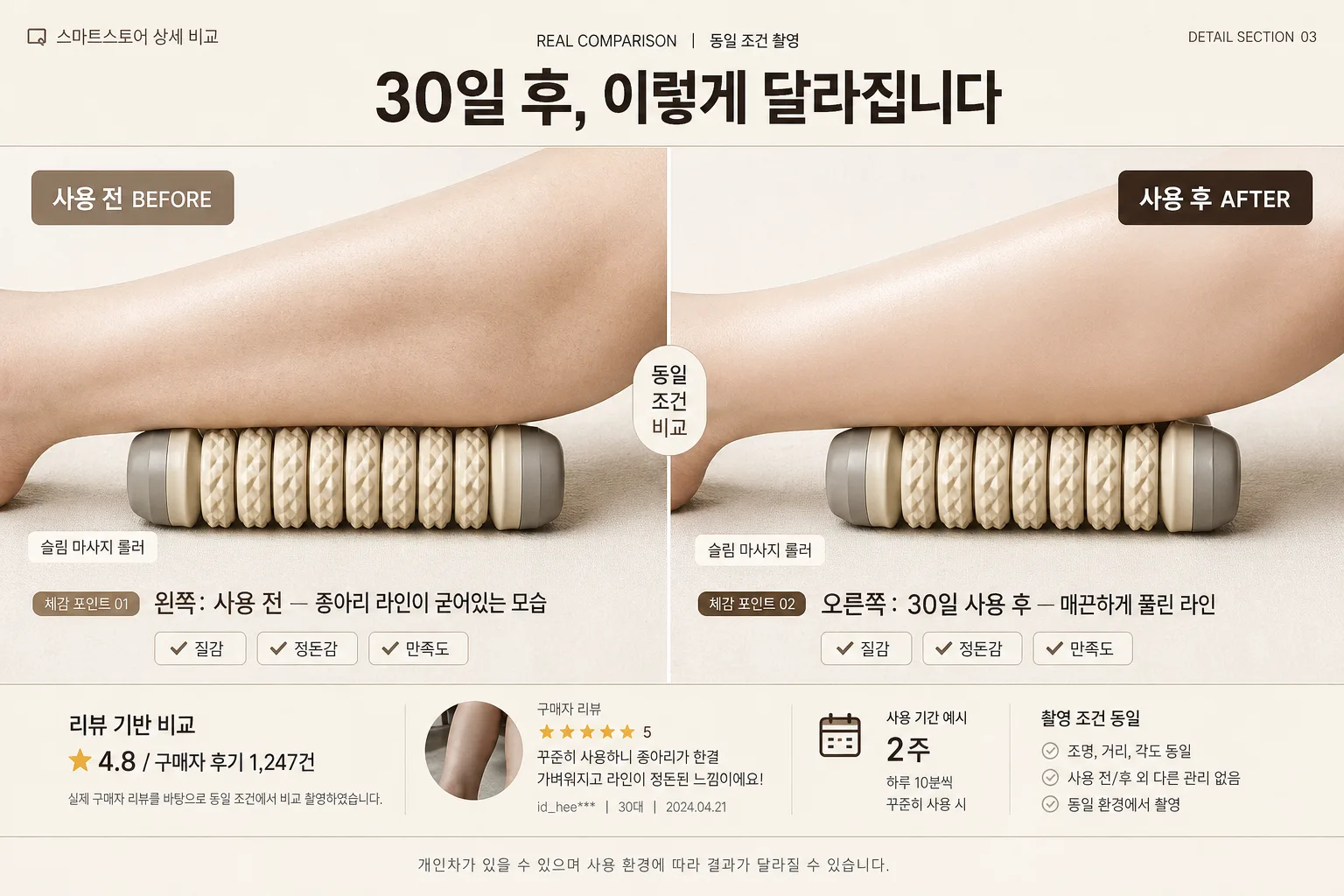
제품 사용 전·후 비교. 화면 분할 또는 양옆 배치. 다이어트·뷰티·생활용품에 효과적.
스마트스토어 전후 비교 섹션 검색 요약
스마트스토어 전후 비교 섹션은 인포그래픽/안내 결과물을 만들 때 바로 복사해 활용할 수 있는 ChatGPT 이미지 프롬프트입니다. 주제, 배경, 스타일, 구도 조건을 함께 담아 빠르게 시안을 만들 수 있도록 구성했습니다.
관련 키워드: 스마트스토어 전후 비교 섹션, 스마트스토어 전후 비교 섹션 프롬프트, 인포그래픽/안내 프롬프트, 인포그래픽/안내 AI 이미지 프롬프트, ChatGPT 이미지 프롬프트, AI 이미지 생성 프롬프트, AI 프롬프트, 이미지 프롬프트
스마트스토어 전후 비교 섹션 활용 포인트
원본 구조를 유지하면서 피사체, 배경, 색감, 구도를 바꿔 다양한 시안으로 확장할 수 있습니다.
- 핵심 소재는 유지하고 브랜드, 계절, 채널 목적에 맞는 색감과 배경을 바꿔보세요.
- 결과가 산만하면 배경 요소를 줄이고 피사체, 구도, 조명 조건을 구체화하세요.
- 복사한 뒤 ChatGPT에서 플랫폼, 화면 비율, 텍스트 포함 여부를 추가로 요청할 수 있습니다.
프롬프트 원문
[Input]
- language: Korean
- output_size: 1536x1024

[Purpose]
Korean smart-store product detail page before/after comparison section, 16:9 horizontal wide layout for high-trust conversion.
Designed as a realistic e-commerce detail-page comparison block that visually contrasts pre-use and post-use results with credible product photography, review-style microcopy, and practical shopping-context information.

[Composition]
- Overall composition: 16:9 wide canvas with an exact center vertical divide line; left half is BEFORE, right half is AFTER, each occupying exactly 50% of the frame.
- Header placement: {헤더} sits centered in the top 12–15% band, large and readable, with small supporting eyebrow text above or beside it such as “REAL COMPARISON” / “동일 조건 촬영”.
- Product placement: {제품} appears as the core visual subject in both halves, matching scale, angle, and camera height for comparison consistency.
- Before/after descriptions: left side follows {Before} and right side follows {After}, with short Korean supporting captions near the lower third and small comparison-point chips.
- E-commerce detail-page realism: include subtle smart-store style elements such as a small product name tag, review snippet strip, star rating micro row, “촬영 조건 동일” note, and a compact comparison table footer without overwhelming the main visual.
- Footer placement: a small disclaimer line centered at the bottom, readable but secondary, e.g. “개인차가 있을 수 있으며 사용 환경에 따라 결과가 달라질 수 있습니다.”
- Background treatment: warm off-white / light beige studio backdrop with real paper-like surface texture, soft shadows, natural contact shadows under the product, and a few relevant comparison-context details such as tiny check icons, measurement ticks, or small label stickers.
- Framing direction: symmetrical, editorial, highly legible, with balanced text hierarchy and a polished Korean smart-store product-detail look.

[3. CORE STRUCTURE]
1. Top header band (12–15% height): place {헤더} centered in bold Korean typography; add a small top-left detail label such as “스마트스토어 상세 비교” and a small top-right issue-style code such as “DETAIL SECTION 03”. Add a thin separator line below in soft beige or white.
2. Left BEFORE panel (50% width): show {제품} in a clearly less favorable pre-use state aligned to {Before}; keep lighting slightly flatter and contrast more restrained than the right side while preserving realistic product detail and texture.
3. Right AFTER panel (50% width): show {제품} in an improved post-use state aligned to {After}; use the same framing and camera angle as the left panel for direct comparison, with cleaner highlights and more polished finish.
4. Center divide: add a thin vertical line at the exact midpoint, 1–2 px visual thickness, in off-white or warm gray; add a small centered vertical badge reading “동일 조건 비교” to clarify that the split is intentional.
5. Label treatment: place large bold labels “사용 전 BEFORE” on the left and “사용 후 AFTER” on the right, both in Korean-friendly typography with strong legibility; use muted taupe on BEFORE and dark brown-gray / warm ivory contrast on AFTER.
6. Supporting text zone: add concise supporting copy beneath each image region. Left: include {Before} with a small tag like “체감 포인트 01”. Right: include {After} with a small tag like “체감 포인트 02”. Add 2–3 tiny checklist chips such as “질감”, “정돈감”, “만족도” as visual comparison cues.
7. Review and info strip: along the lower 15–18% area, add a realistic product-detail micro section: “리뷰 기반 비교”, “★ 4.8 / 구매자 후기 1,247건”, “사용 기간 예시 2주”, and a short caption line. Keep all text small enough to support the main comparison.
8. Footer disclaimer: place the footer line centered along the bottom edge in small type, low contrast, and unobtrusive, but still legible on the beige background.

[4. STYLE RULES]
- Typography: Pretendard or Noto Sans KR for all Korean text, Bold 700–800 for header, Medium 500–600 for labels and chips, Regular 400 for captions and footer; header size should dominate the top band while labels and microcopy create a real product-detail hierarchy.
- Color palette: warm ivory #F6F1E8, soft beige #E7DCCB, muted taupe #B9AA97, dark brown-gray #4B423A, clean white #FFFFFF, with small accent marks in warm caramel #C89F6A for checklist icons or comparison chips.
- Border/shadow: use a subtle 4px y-offset, 10–12px blur, 12–15% opacity soft shadow for product cards, chips, and photo panels when needed; keep the center divider crisp and thin, not heavy.
- Graphic details: add fine hairline rules, rounded rectangular caption chips, tiny check icons, product-detail page markers, and small review metadata to make the layout feel like a finished smart-store sales section.

[5. VISUAL STYLE]
- Camera / lens: high-resolution commercial photo look, 85mm f/1.8 or 50mm f/2.0 for product/body detail consistency, straight-on framing with low distortion.
- Lighting: soft studio softbox at 45° from upper-left, gentle fill from right, slightly more diffused and subdued on the BEFORE side, cleaner and brighter on the AFTER side; include believable contact shadows and material texture.
- Color grade: warm neutral editorial grade with creamy whites, soft beige highlights, and controlled brown-gray shadows; avoid oversaturation and harsh contrast.
- Rendering quality: crisp Korean typography, realistic product texture, clean e-commerce retouching, high-resolution detail-page presentation suitable for a smart-store product page.

[6. MOOD]
Trustworthy Korean smart-store comparison graphic — clean e-commerce editorial feel with a Daiso / Olive Young-style utility presentation, but elevated like a modern product case-study layout. The image should feel like a real product detail-page section from a high-converting Korean online store, with practical captions, review cues, and polished commercial photography.

[7. CRITICAL]
- Korean text accuracy: 반드시 정확히 표시될 문구는 {헤더}, {Before}, {After}.
- Required Korean labels to render clearly: “사용 전 BEFORE”, “사용 후 AFTER”, “동일 조건 비교”, “리뷰 기반 비교”, “개인차가 있을 수 있습니다”.
- Visual comparison rules: left and right panels must use the same camera angle, framing scale, and subject size so the before/after contrast feels credible.
- Layout invariants: 16:9 horizontal wide, exact vertical split, top header, bottom disclaimer, and clear left/right separation must all remain intact.
- The footer disclaimer must stay small and unobtrusive, such as “개인차가 있을 수 있으며 사용 환경에 따라 결과가 달라질 수 있습니다.”
- Make the comparison richer with realistic Korean smart-store detail elements, but keep {제품} as the dominant subject in both panels.

[8. 🚫 PROHIBITED]
- Fake official seals / certifications
- Broken Korean characters
- Celebrity composites / unauthorized likeness