資訊圖表/指南
스마트스토어 사용 방법 4단계
제품 사용법을 4단계 일러스트 + 짧은 설명. 가전·생활용품·뷰티 제품.
스마트스토어 사용 방법 4단계摘要
這是用來製作資訊圖表/指南內容的 ChatGPT 圖像提示詞,已整理主題、背景、風格與構圖,方便快速調整。
相關關鍵字: 스마트스토어 사용 방법 4단계, 스마트스토어 사용 방법 4단계 프롬프트, 資訊圖表/指南 프롬프트, 資訊圖表/指南 AI 이미지 프롬프트, ChatGPT 이미지 프롬프트, AI 이미지 생성 프롬프트, AI 프롬프트, 이미지 프롬프트
스마트스토어 사용 방법 4단계使用方式
保留原始結構並替換主體、背景、色彩或構圖,即可延伸出不同版本。
- 保留核心主體,並依品牌、季節或平台調整色彩與背景。
- 如果畫面太複雜,請減少背景元素並具體描述主體、構圖與光線。
- 複製後可要求 ChatGPT 配合平台、長寬比或文字需求調整。
提示詞原文
[Input]
- language: Korean
- output_size: 1536x1024

[Purpose]
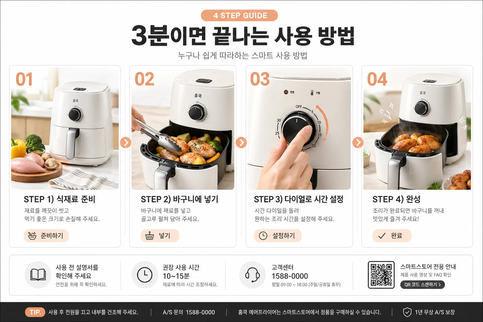
Korean smart-store product detail page section showing a practical 4-step usage guide for a home appliance, designed for a 16:9 wide ecommerce banner.
Realistic, conversion-focused marketplace content that feels like an actual Naver SmartStore / Coupang product-detail image, with helpful micro labels, usage tips, small product callouts, and a polished product photography layout.

[Composition]
- Top header band occupies about 14% of the frame, with {헤더} centered in a prominent Korean headline.
- Add a small supporting label above or beside the header such as “EASY GUIDE”, “처음 사용도 간편하게”, or “4 STEP 사용법” in Korean-friendly ecommerce styling.
- Main content area below is split into 4 equal horizontal columns, each taking roughly 21% width with 3% gutter spacing.
- Each column features a large step number, a realistic usage visual, a bold step title, a short explanatory line, and one small helpful micro-tag such as “준비”, “투입”, “설정”, “완성”.
- Keep the product object {제품} visually consistent across all steps, with realistic highlights, shadows, material texture, buttons, vents, lid edges, reflections, and small functional details appropriate to the product.
- Use {4단계} as the exact step-copy source, preserving the 4-step sequence and concise instructional tone.
- Insert thin dotted dividers, small arrows, or connected progress markers between columns to imply progression left-to-right.
- Add a realistic ecommerce information strip near the bottom with small Korean text such as “사용 전 설명서를 확인해 주세요”, “권장 사용 시간 10~15분”, “고객센터 1588-0000”, and a tiny QR/barcode-style support box, without overpowering the four main steps.

[3. CORE STRUCTURE]
1. Header band: Place {헤더} centered at the top in a bold Korean sans-serif, with a small eyebrow label “4 STEP GUIDE” and a compact sub-copy line like “누구나 쉽게 따라하는 스마트 사용 방법”.
2. Step 1 column: Show a large “01” near the upper-left of the column, then a realistic visual of {제품} in a prep state on a light kitchen counter or tabletop, followed by the first line from {4단계} as the step title and a short Korean subtext beneath. Include a small tag “준비하기”.
3. Step 2 column: Show “02” with a visual of ingredients, parts, water, food, or relevant contents being placed into {제품}, keeping the same visual scale and alignment as step 1 for consistency. Include small motion arrows and a tag “넣기”.
4. Step 3 column: Show “03” with a close, clear usage visual of the dial, touch button, switch, or control panel being adjusted, with the action emphasized by a small arrow, fingertip highlight, or accent glow. Include a tag “설정하기”.
5. Step 4 column: Show “04” with the finished result or completion state, making the final panel feel slightly celebratory with tiny sparkle accents, steam, glow, or a check mark while staying product-first. Include a tag “완료”.
6. Between columns: Use dotted progress lines, small arrowheads, or circular connector nodes aligned around the center height of each column so the sequence reads naturally from left to right.
7. Bottom utility strip: Add small realistic ecommerce details such as “TIP. 사용 후 전원을 끄고 내부를 건조해 주세요”, “A/S 문의 1588-0000”, “스마트스토어 전용 안내”, and a small rectangular barcode/QR support graphic.

[4. STYLE RULES]
- Typography: Pretendard or Noto Sans KR for all Korean text; header weight 700-800, step numbers in extra-bold sans-serif, body text 400-500, with sizes roughly 44-56px for header, 34-40px for step titles, 20-24px for descriptions, and 12-16px for micro labels and footer information.
- Color palette: white #FFFFFF, warm light gray #F6F7F8, charcoal #222222, and one accent color chosen from mint #7ED9C1 or peach #F6B39A.
- Border/shadow: very light card borders 1px #E9ECEF, subtle shadow 0 4px 16px rgba(0,0,0,0.06), clean rounded corners around visual blocks, with realistic contact shadows under the product.
- Use Korean ecommerce editorial styling with layered cards, soft gradient header accents, small info badges, dotted progress connectors, product callout lines, and practical usage notes.
- The design should look like a finished product-detail banner captured from a real smart-store listing, with polished photography, readable Korean copy, and believable appliance-use context.

[5. VISUAL STYLE]
- Camera / lens: 50mm standard product photography look or 35mm hybrid ecommerce composition, straight-on framing with no distortion.
- Lighting: soft diffused studio light from upper-left with gentle fill on the right, even exposure across all four columns, natural contact shadows, and controlled reflections on plastic, metal, glass, or glossy surfaces.
- Color grade: neutral white balance with slight warm tone, crisp blacks, and restrained pastel accent treatment.
- Product rendering: realistic material finish, visible seams, handles, display area, buttons, labels, container edges, and subtle texture appropriate to {제품}.
- Background treatment: bright Korean ecommerce studio setup with light counter texture, gentle depth, soft gradient panels, and small practical visual cues that support the usage guide.

[6. MOOD]
Korean smart-store conversion section — polished Coupang / Naver SmartStore product guide aesthetic with a modern D2C marketplace editorial finish, practical household realism, clear instructional flow, and friendly trust-building details.

[7. CRITICAL]
- Korean text accuracy: 반드시 정확히 보여야 하는 문자열: {헤더}, {4단계}
- Four-step ordering must read clearly from left to right as a sequential usage guide.
- All four columns should keep the same layout structure and consistent spacing.
- The product should remain identifiable as {제품} across all steps.
- Render added Korean microcopy cleanly, for example: “4 STEP 사용법”, “준비하기”, “넣기”, “설정하기”, “완료”, “사용 전 설명서를 확인해 주세요”, “TIP. 사용 후 전원을 끄고 내부를 건조해 주세요”.

[8. 🚫 PROHIBITED]
- Fake official seals / certifications
- Broken Korean characters