廣告/海報
스마트스토어 후기 카드 섹션
5점 만점 별점 + 고객 후기 4-5개 카드 grid. 신뢰도 강조용.
스마트스토어 후기 카드 섹션摘要
這是用來製作廣告/海報內容的 ChatGPT 圖像提示詞,已整理主題、背景、風格與構圖,方便快速調整。
相關關鍵字: 스마트스토어 후기 카드 섹션, 스마트스토어 후기 카드 섹션 프롬프트, 廣告/海報 프롬프트, 廣告/海報 AI 이미지 프롬프트, ChatGPT 이미지 프롬프트, AI 이미지 생성 프롬프트, AI 프롬프트, 이미지 프롬프트
스마트스토어 후기 카드 섹션使用方式
保留原始結構並替換主體、背景、色彩或構圖,即可延伸出不同版本。
- 保留核心主體,並依品牌、季節或平台調整色彩與背景。
- 如果畫面太複雜,請減少背景元素並具體描述主體、構圖與光線。
- 複製後可要求 ChatGPT 配合平台、長寬比或文字需求調整。
提示詞原文
[Input]
- language: Korean
- output_size: 1536x1024

[Purpose]
Korean smart-store product detail page review-card section, 16:9 wide layout for e-commerce trust-building.
Designed as a realistic marketplace social-proof block with one strong header, product context, verified-purchase UI details, and exactly four review cards for a product detail page.

[Composition]
- Canvas: 16:9 horizontal composition with the header and summary UI occupying the top 22%, and the four review-card grid filling the lower 68%.
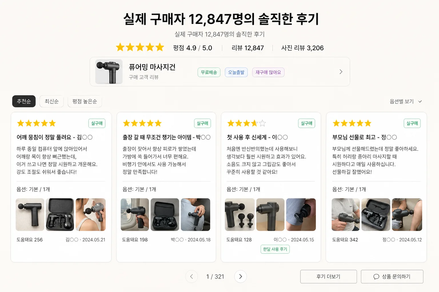
- Header placement: {헤더} centered near the upper third, with the exact sub-line "실제 구매자 12,847명의 솔직한 후기" rendered just beneath it, followed by a compact rating summary.
- Product context: {제품} appears as the review subject in a slim product-info strip or small thumbnail area near the header, with realistic smart-store UI labels such as "베스트 리뷰", "사진 후기", "재구매율 92%".
- Review cards: exactly four evenly spaced cards in a single horizontal grid, each card with consistent padding, rounded corners, star rating, verified-purchase tag, Korean review content, option line, author/date metadata, helpful count, and tiny photo-review thumbnail area where appropriate.
- Background treatment: warm off-white or pale gray matte marketplace page background with subtle section dividers, faint UI chips, small sorting tabs, and realistic commerce-page micro elements.
- Spacing and framing: clear gutters between cards, consistent alignment, and a balanced marketplace-infographic structure with a believable product-detail-page section rhythm.

[3. CORE STRUCTURE]
- Header zone (top 22%): Set {헤더} in a strong Korean sans-serif headline, centered. Directly below, render the exact line "실제 구매자 12,847명의 솔직한 후기" in a lighter weight.
- Rating summary line: Place a compact row of yellow star icons, "평점 4.9 / 5.0", "리뷰 12,847", and "사진 리뷰 3,206" beneath the header, using small but readable UI text.
- Product-info strip: Add a slim rounded strip below the rating summary showing a small square thumbnail placeholder for {제품}, the label "구매 고객 리뷰", and small pill tags such as "무료배송", "오늘출발", "재구매 많아요".
- Review navigation row: Above the cards, include tiny smart-store style sorting chips: "추천순", "최신순", "평점 높은순", and a small filter label "옵션별 보기" with a down arrow.
- Review card 1: White rounded card with a yellow 5-star row at the top, a green "실구매" badge, a bold Korean review title from the provided {4개 후기} set, a short supporting body sentence from the same entry, one option line like "옵션: 기본 / 1개", a small photo-review thumbnail area, and the author initial/date at the lower-right corner.
- Review card 2: Same layout and proportions as card 1, with distinct review copy from the provided {4개 후기} set, preserving the same typography hierarchy, verified badge, option metadata, helpful-count micro text, and thumbnail placement.
- Review card 3: Same card system, maintaining even line breaks, consistent margins, identical icon styling, and realistic UI metadata such as "도움돼요 128" or "한달 사용 후기".
- Review card 4: Same card system, aligned perfectly with the others, preserving a uniform grid, equal spacing, matching card height, and the same internal review hierarchy.
- Footer micro UI: At the bottom of the section, include a small page indicator "1 / 321" and subtle text buttons "후기 더보기" and "상품 문의하기" without adding extra testimonials.
- Product relevance: Use {제품} as a contextual cue through the product strip, option text, and review copy framing, while keeping the primary focus on the review-card section.

[4. STYLE RULES]
- Typography: Pretendard or Noto Sans KR for all UI text; headline semibold to bold 28–34px, body 18–22px, metadata 12–14px, with crisp Korean character rendering.
- Color palette: warm off-white #F4F1EA, soft gray #E9E9E9, charcoal text #222222, muted mid-gray #6B6B6B, review-star yellow #F6C445, card white #FFFFFF, verified green #00A86B, light beige divider #DED8CC.
- Border/shadow: cards with 16px radius, soft drop shadow 0 6px 18px rgba(0,0,0,0.10), subtle 1px border #EFEFEF; product strip and filter chips use lighter borders and soft inset highlights.
- Icon treatment: five-star icons should be flat, clean, and uniformly spaced, using a warm yellow tone with no gloss or 3D effect.
- Marketplace details: Add believable small UI elements such as verified-purchase badges, option labels, helpful counts, photo-review thumbnails, sorting chips, and page indicators while keeping exactly four main review cards.

[5. VISUAL STYLE]
- Camera / lens: front-facing UI mockup style, as if captured with a 50mm equivalent product-design screenshot aesthetic, no perspective distortion.
- Lighting: evenly diffused studio-style illumination from front-top, with soft UI shadows and gentle separation between background, product strip, and cards.
- Color grade: soft beige-neutral UI grade with warm yellow accents, verified green micro badges, and restrained grayscale text, optimized for e-commerce readability.
- Rendering quality: sharp vector-like UI edges, readable Korean typography, realistic smart-store spacing, subtle texture in the matte background, and polished high-resolution commerce-page presentation.

[6. MOOD]
Naver Smart Store / 11st-style review section — trustworthy marketplace UI with a real product-detail-page feeling, warm customer proof, verified purchase signals, and polished Korean e-commerce credibility.

[7. CRITICAL]
- Korean text accuracy: "실제 구매자 12,847명의 솔직한 후기" must appear exactly as written.
- Korean text accuracy: the 4 review entries from {4개 후기} must be rendered in Korean without broken characters, preserving star symbols and author initials/dates as part of the UI.
- Layout invariant: exactly 4 review cards in one horizontal grid, each with the same internal structure and visual hierarchy.
- Rating invariant: each card must show a 5-star row in yellow, with consistent spacing and alignment.
- Required Korean UI labels: include realistic micro text such as "실구매", "추천순", "최신순", "사진 리뷰", "도움돼요", and "후기 더보기" in small readable areas.
- Product reference: {제품} must appear as the reviewed product context in the header/product strip or card metadata.

[8. 🚫 PROHIBITED]
- Fake official seals / certifications
- Broken Korean characters