広告・ポスター
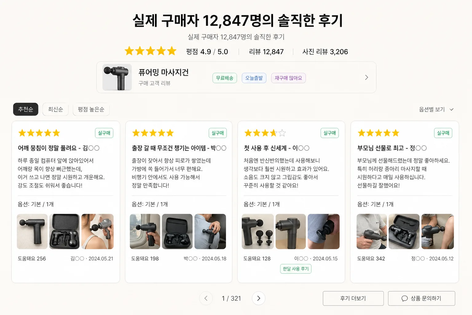
스마트스토어 후기 카드 섹션
5점 만점 별점 + 고객 후기 4-5개 카드 grid. 신뢰도 강조용.
스마트스토어 후기 카드 섹션の概要
広告・ポスター画像を作るためのChatGPT画像プロンプトです。主題、背景、スタイル、構図を整理し、すぐに試せるよう構成しています。
関連キーワード: 스마트스토어 후기 카드 섹션, 스마트스토어 후기 카드 섹션 프롬프트, 広告・ポスター 프롬프트, 広告・ポスター AI 이미지 프롬프트, ChatGPT 이미지 프롬프트, AI 이미지 생성 프롬프트, AI 프롬프트, 이미지 프롬프트
스마트스토어 후기 카드 섹션の活用方法
元の構造を保ちながら、被写体、背景、色、構図を変更して別案に展開できます。
- 主題を維持し、ブランドや季節、媒体に合わせて色と背景を変更してください。
- 結果が複雑な場合は背景要素を減らし、被写体、構図、照明を具体化してください。
- コピー後、ChatGPTに媒体、アスペクト比、文字の有無を追加で指定できます。
プロンプト原文
[Input]
- language: Korean
- output_size: 1536x1024

[Purpose]
Korean smart-store product detail page review-card section, 16:9 wide layout for e-commerce trust-building.
Designed as a realistic marketplace social-proof block with one strong header, product context, verified-purchase UI details, and exactly four review cards for a product detail page.

[Composition]
- Canvas: 16:9 horizontal composition with the header and summary UI occupying the top 22%, and the four review-card grid filling the lower 68%.
- Header placement: {헤더} centered near the upper third, with the exact sub-line "실제 구매자 12,847명의 솔직한 후기" rendered just beneath it, followed by a compact rating summary.
- Product context: {제품} appears as the review subject in a slim product-info strip or small thumbnail area near the header, with realistic smart-store UI labels such as "베스트 리뷰", "사진 후기", "재구매율 92%".
- Review cards: exactly four evenly spaced cards in a single horizontal grid, each card with consistent padding, rounded corners, star rating, verified-purchase tag, Korean review content, option line, author/date metadata, helpful count, and tiny photo-review thumbnail area where appropriate.
- Background treatment: warm off-white or pale gray matte marketplace page background with subtle section dividers, faint UI chips, small sorting tabs, and realistic commerce-page micro elements.
- Spacing and framing: clear gutters between cards, consistent alignment, and a balanced marketplace-infographic structure with a believable product-detail-page section rhythm.

[3. CORE STRUCTURE]
- Header zone (top 22%): Set {헤더} in a strong Korean sans-serif headline, centered. Directly below, render the exact line "실제 구매자 12,847명의 솔직한 후기" in a lighter weight.
- Rating summary line: Place a compact row of yellow star icons, "평점 4.9 / 5.0", "리뷰 12,847", and "사진 리뷰 3,206" beneath the header, using small but readable UI text.
- Product-info strip: Add a slim rounded strip below the rating summary showing a small square thumbnail placeholder for {제품}, the label "구매 고객 리뷰", and small pill tags such as "무료배송", "오늘출발", "재구매 많아요".
- Review navigation row: Above the cards, include tiny smart-store style sorting chips: "추천순", "최신순", "평점 높은순", and a small filter label "옵션별 보기" with a down arrow.
- Review card 1: White rounded card with a yellow 5-star row at the top, a green "실구매" badge, a bold Korean review title from the provided {4개 후기} set, a short supporting body sentence from the same entry, one option line like "옵션: 기본 / 1개", a small photo-review thumbnail area, and the author initial/date at the lower-right corner.
- Review card 2: Same layout and proportions as card 1, with distinct review copy from the provided {4개 후기} set, preserving the same typography hierarchy, verified badge, option metadata, helpful-count micro text, and thumbnail placement.
- Review card 3: Same card system, maintaining even line breaks, consistent margins, identical icon styling, and realistic UI metadata such as "도움돼요 128" or "한달 사용 후기".
- Review card 4: Same card system, aligned perfectly with the others, preserving a uniform grid, equal spacing, matching card height, and the same internal review hierarchy.
- Footer micro UI: At the bottom of the section, include a small page indicator "1 / 321" and subtle text buttons "후기 더보기" and "상품 문의하기" without adding extra testimonials.
- Product relevance: Use {제품} as a contextual cue through the product strip, option text, and review copy framing, while keeping the primary focus on the review-card section.

[4. STYLE RULES]
- Typography: Pretendard or Noto Sans KR for all UI text; headline semibold to bold 28–34px, body 18–22px, metadata 12–14px, with crisp Korean character rendering.
- Color palette: warm off-white #F4F1EA, soft gray #E9E9E9, charcoal text #222222, muted mid-gray #6B6B6B, review-star yellow #F6C445, card white #FFFFFF, verified green #00A86B, light beige divider #DED8CC.
- Border/shadow: cards with 16px radius, soft drop shadow 0 6px 18px rgba(0,0,0,0.10), subtle 1px border #EFEFEF; product strip and filter chips use lighter borders and soft inset highlights.
- Icon treatment: five-star icons should be flat, clean, and uniformly spaced, using a warm yellow tone with no gloss or 3D effect.
- Marketplace details: Add believable small UI elements such as verified-purchase badges, option labels, helpful counts, photo-review thumbnails, sorting chips, and page indicators while keeping exactly four main review cards.

[5. VISUAL STYLE]
- Camera / lens: front-facing UI mockup style, as if captured with a 50mm equivalent product-design screenshot aesthetic, no perspective distortion.
- Lighting: evenly diffused studio-style illumination from front-top, with soft UI shadows and gentle separation between background, product strip, and cards.
- Color grade: soft beige-neutral UI grade with warm yellow accents, verified green micro badges, and restrained grayscale text, optimized for e-commerce readability.
- Rendering quality: sharp vector-like UI edges, readable Korean typography, realistic smart-store spacing, subtle texture in the matte background, and polished high-resolution commerce-page presentation.

[6. MOOD]
Naver Smart Store / 11st-style review section — trustworthy marketplace UI with a real product-detail-page feeling, warm customer proof, verified purchase signals, and polished Korean e-commerce credibility.

[7. CRITICAL]
- Korean text accuracy: "실제 구매자 12,847명의 솔직한 후기" must appear exactly as written.
- Korean text accuracy: the 4 review entries from {4개 후기} must be rendered in Korean without broken characters, preserving star symbols and author initials/dates as part of the UI.
- Layout invariant: exactly 4 review cards in one horizontal grid, each with the same internal structure and visual hierarchy.
- Rating invariant: each card must show a 5-star row in yellow, with consistent spacing and alignment.
- Required Korean UI labels: include realistic micro text such as "실구매", "추천순", "최신순", "사진 리뷰", "도움돼요", and "후기 더보기" in small readable areas.
- Product reference: {제품} must appear as the reviewed product context in the header/product strip or card metadata.

[8. 🚫 PROHIBITED]
- Fake official seals / certifications
- Broken Korean characters