広告・ポスター
브랜드 컬러 가이드 (팔레트·HEX)
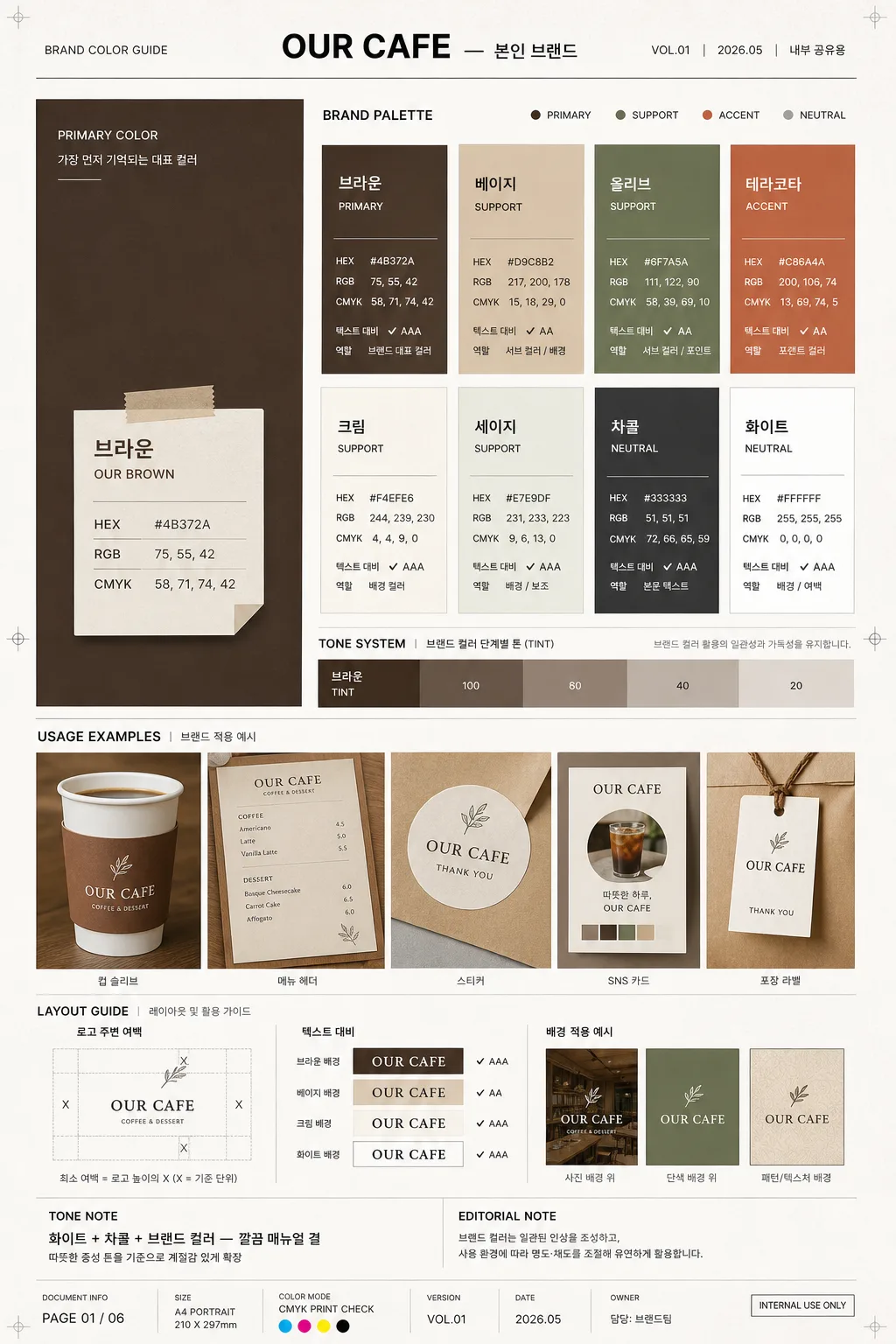
브랜드 컬러 팔레트 가이드. HEX·RGB·CMYK + 사용 예시.
브랜드 컬러 가이드 (팔레트·HEX)の概要
広告・ポスター画像を作るためのChatGPT画像プロンプトです。主題、背景、スタイル、構図を整理し、すぐに試せるよう構成しています。
関連キーワード: 브랜드 컬러 가이드 (팔레트·HEX), 브랜드 컬러 가이드 (팔레트·HEX) 프롬프트, 広告・ポスター 프롬프트, 広告・ポスター AI 이미지 프롬프트, ChatGPT 이미지 프롬프트, AI 이미지 생성 프롬프트, AI 프롬프트, 이미지 프롬프트
브랜드 컬러 가이드 (팔레트·HEX)の活用方法
元の構造を保ちながら、被写体、背景、色、構図を変更して別案に展開できます。
- 主題を維持し、ブランドや季節、媒体に合わせて色と背景を変更してください。
- 結果が複雑な場合は背景要素を減らし、被写体、構図、照明を具体化してください。
- コピー後、ChatGPTに媒体、アスペクト比、文字の有無を追加で指定できます。
プロンプト原文
[Input]
- language: Korean
- output_size: 1024x1536

[Purpose]
Brand color guide poster for a café or small brand, designed as a realistic editorial brand manual page with palette chips, HEX info, usage examples, version details, and practical application notes.
Vertical A4-style reference sheet for internal branding, client presentation, print proofing, or social sharing, with the feel of a real agency-delivered identity guideline page.

[Composition]
- Overall format: tall A4 portrait layout, structured like a premium brand guideline sheet with clear hierarchy, document metadata, strong grid alignment, and realistic print-design details.
- Main hero zone: left side large color block occupying about 34% of the width, featuring the strongest brand color from {컬러 팔레트} as the anchor, with a paper-label overlay containing color specs.
- Right side: multi-row chip grid for the remaining palette, each chip paired with concise color data from {컬러 정보}, small contrast notes, and role labels such as PRIMARY, SUPPORT, ACCENT, NEUTRAL.
- Bottom zone: usage example area spanning the full width, showing {사용 예시} as a realistic application strip: café cup sleeve, menu corner, sticker label, loyalty card, shopping bag tag, or social profile swatch preview depending on the brand context.
- Margin and spacing: professional editorial margins with active header, footer, page number, version label, and small annotation marks; even gutters between modules, aligned to a 12-column editorial grid.
- Background treatment: matte off-white paper surface with subtle fiber texture, faint crop marks, light registration dots, and printed-ink depth so the guide feels like a photographed real brand manual sheet.

[3. CORE STRUCTURE]
1. Header strip at the top: set {브랜드명} in a restrained brand-manual title style, centered or slightly left-aligned, with thin divider lines, compact subtitle behavior, and realistic metadata text such as "BRAND COLOR GUIDE", "VOL.01", "2026.05", "내부 공유용".
2. Hero color block on the left: render the largest swatch as a solid matte field, with the color name, HEX, RGB, and CMYK values placed in a neat overlay box or adjacent label stack; add a small label reading "PRIMARY COLOR" and a short Korean note like "가장 먼저 기억되는 대표 컬러".
3. Palette grid on the right: arrange the remaining colors from {컬러 팔레트} in orderly chips, 2–4 rows depending on count, each chip showing {컬러 정보} in small technical typography; include small labels such as "서브 컬러", "포인트 컬러", "배경 컬러", "텍스트 컬러" where appropriate.
4. Tone system band: visually separate the main brand color, supporting colors, accent colors, and grayscale ladder so the palette reads like a professional manual; add tint steps such as 100 / 80 / 60 / 40 / 20 and a short descriptor using {컬러 톤}.
5. Usage example panel at the bottom: place {사용 예시} as a realistic mockup strip with presentation framing, showing the palette applied to actual branded materials; include small captions like "컵 슬리브", "메뉴 헤더", "스티커", "SNS 카드", "포장 라벨".
6. Layout label area: include {레이아웃} as an explanatory module with simple spacing diagrams, arrows, baseline marks, and proportion notes; add practical labels such as "로고 주변 여백", "텍스트 대비", "배경 적용 예시".
7. Tone note area: present {컬러 톤} as a short descriptor line in the same editorial system, supported by a small editorial note such as "따뜻한 중성 톤을 기준으로 계절감 있게 확장".
8. Size note: show {비율} as a compact technical footer note, aligned with the overall manual aesthetic; add document details such as "PAGE 01", "A4 PORTRAIT", "CMYK PRINT CHECK", "담당: 브랜드팀".

[4. STYLE RULES]
- Typography: use Pretendard or Noto Sans KR for Korean UI text, with Bold 700 for headings and Regular 400 for technical labels; size hints 34–42px for title, 16–22px for labels, 12–14px for specs, and 9–11px for tiny metadata and captions.
- Color palette: use {컬러 팔레트} as the source palette, with neutral supports in off-white #F4F1EA, charcoal #2B2B2B, cool gray #B8B8B8, and light grid gray #E5E2DB.
- Border/shadow: use thin 1px charcoal rules, practical card borders, hairline dividers, small printed crop marks, and very soft drop shadows on mockup elements, around 4px y-offset, 10px blur, 12% opacity.
- Technical labels: make HEX, RGB, and CMYK values look like a real brand manual with tight tracking, small caps feel, crisp alignment, tabular numerals, and consistent separators.
- Realistic document details: include version code, date label, page number, small QR-placeholder box or barcode-like asset code area, proofing notes, and caption text in Korean without introducing new placeholders.

[5. VISUAL STYLE]
- Camera / lens: product-photography editorial look, simulated with a 50mm lens at f/5.6 for the usage mockup area, plus a flat-lay precision feel for the palette grid.
- Lighting: soft diffuse studio light from upper-left at about 45°, with faint fill from right; natural paper shadow along the lower edge, gentle ink texture, and realistic depth on layered mockup cards.
- Color grade: clean neutral paper tone with accurate saturated swatches, balanced whites, precise dark text, and slight warm-gray paper cast.
- Material feel: matte premium paper, printed ink absorption, slight page curl at one corner, crisp vector-like typography, and subtle tactile differences between swatches, labels, and mockup cards.

[6. MOOD]
Premium brand guideline page — a Pantone / identity manual spread with the clarity of a modern agency presentation and the refined warmth of a real café or small-brand design system. It should feel like a finished client handoff sheet photographed for a portfolio, not a blank template.

[7. CRITICAL]
- Korean text accuracy: 반드시 정확히 보여야 하는 문구: "브랜드명", "컬러 팔레트", "컬러 정보", "사용 예시", "레이아웃", "컬러 톤", "비율".
- Also render short Korean guide labels clearly, for example: "대표 컬러", "서브 컬러", "포인트 컬러", "배경 적용", "텍스트 대비", "브랜드 컬러 가이드", "2026.05", "PAGE 01".
- Every color value in HEX, RGB, and CMYK must be rendered clearly and consistently formatted.
- Keep all blocks aligned to a strict grid; swatches must be cleanly separated and visually distinct.
- Maintain portrait A4 composition with a large left hero swatch, right-side palette grid, and bottom usage example band.

[8. 🚫 PROHIBITED]
- Fake official seals / certifications
- Broken Korean characters
- Celebrity composites / unauthorized likeness