廣告/海報
브랜드 컬러 가이드 (팔레트·HEX)
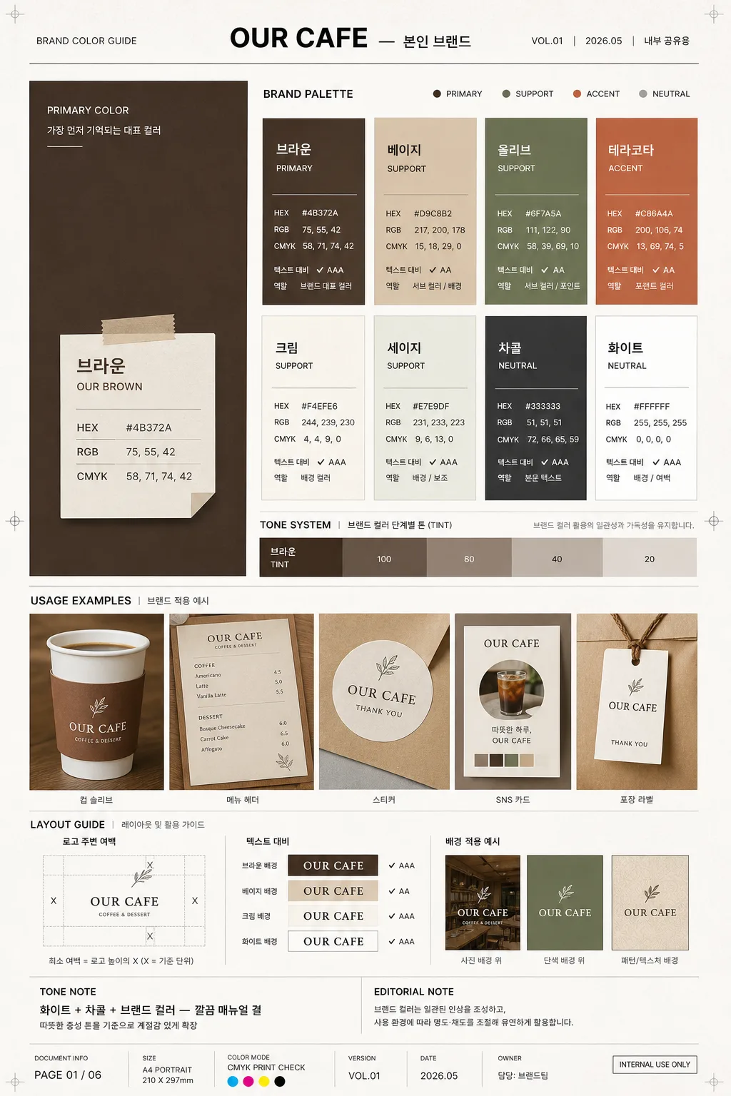
브랜드 컬러 팔레트 가이드. HEX·RGB·CMYK + 사용 예시.
브랜드 컬러 가이드 (팔레트·HEX)摘要
這是用來製作廣告/海報內容的 ChatGPT 圖像提示詞,已整理主題、背景、風格與構圖,方便快速調整。
相關關鍵字: 브랜드 컬러 가이드 (팔레트·HEX), 브랜드 컬러 가이드 (팔레트·HEX) 프롬프트, 廣告/海報 프롬프트, 廣告/海報 AI 이미지 프롬프트, ChatGPT 이미지 프롬프트, AI 이미지 생성 프롬프트, AI 프롬프트, 이미지 프롬프트
브랜드 컬러 가이드 (팔레트·HEX)使用方式
保留原始結構並替換主體、背景、色彩或構圖,即可延伸出不同版本。
- 保留核心主體,並依品牌、季節或平台調整色彩與背景。
- 如果畫面太複雜,請減少背景元素並具體描述主體、構圖與光線。
- 複製後可要求 ChatGPT 配合平台、長寬比或文字需求調整。
提示詞原文
[Input]
- language: Korean
- output_size: 1024x1536

[Purpose]
Brand color guide poster for a café or small brand, designed as a realistic editorial brand manual page with palette chips, HEX info, usage examples, version details, and practical application notes.
Vertical A4-style reference sheet for internal branding, client presentation, print proofing, or social sharing, with the feel of a real agency-delivered identity guideline page.

[Composition]
- Overall format: tall A4 portrait layout, structured like a premium brand guideline sheet with clear hierarchy, document metadata, strong grid alignment, and realistic print-design details.
- Main hero zone: left side large color block occupying about 34% of the width, featuring the strongest brand color from {컬러 팔레트} as the anchor, with a paper-label overlay containing color specs.
- Right side: multi-row chip grid for the remaining palette, each chip paired with concise color data from {컬러 정보}, small contrast notes, and role labels such as PRIMARY, SUPPORT, ACCENT, NEUTRAL.
- Bottom zone: usage example area spanning the full width, showing {사용 예시} as a realistic application strip: café cup sleeve, menu corner, sticker label, loyalty card, shopping bag tag, or social profile swatch preview depending on the brand context.
- Margin and spacing: professional editorial margins with active header, footer, page number, version label, and small annotation marks; even gutters between modules, aligned to a 12-column editorial grid.
- Background treatment: matte off-white paper surface with subtle fiber texture, faint crop marks, light registration dots, and printed-ink depth so the guide feels like a photographed real brand manual sheet.

[3. CORE STRUCTURE]
1. Header strip at the top: set {브랜드명} in a restrained brand-manual title style, centered or slightly left-aligned, with thin divider lines, compact subtitle behavior, and realistic metadata text such as "BRAND COLOR GUIDE", "VOL.01", "2026.05", "내부 공유용".
2. Hero color block on the left: render the largest swatch as a solid matte field, with the color name, HEX, RGB, and CMYK values placed in a neat overlay box or adjacent label stack; add a small label reading "PRIMARY COLOR" and a short Korean note like "가장 먼저 기억되는 대표 컬러".
3. Palette grid on the right: arrange the remaining colors from {컬러 팔레트} in orderly chips, 2–4 rows depending on count, each chip showing {컬러 정보} in small technical typography; include small labels such as "서브 컬러", "포인트 컬러", "배경 컬러", "텍스트 컬러" where appropriate.
4. Tone system band: visually separate the main brand color, supporting colors, accent colors, and grayscale ladder so the palette reads like a professional manual; add tint steps such as 100 / 80 / 60 / 40 / 20 and a short descriptor using {컬러 톤}.
5. Usage example panel at the bottom: place {사용 예시} as a realistic mockup strip with presentation framing, showing the palette applied to actual branded materials; include small captions like "컵 슬리브", "메뉴 헤더", "스티커", "SNS 카드", "포장 라벨".
6. Layout label area: include {레이아웃} as an explanatory module with simple spacing diagrams, arrows, baseline marks, and proportion notes; add practical labels such as "로고 주변 여백", "텍스트 대비", "배경 적용 예시".
7. Tone note area: present {컬러 톤} as a short descriptor line in the same editorial system, supported by a small editorial note such as "따뜻한 중성 톤을 기준으로 계절감 있게 확장".
8. Size note: show {비율} as a compact technical footer note, aligned with the overall manual aesthetic; add document details such as "PAGE 01", "A4 PORTRAIT", "CMYK PRINT CHECK", "담당: 브랜드팀".

[4. STYLE RULES]
- Typography: use Pretendard or Noto Sans KR for Korean UI text, with Bold 700 for headings and Regular 400 for technical labels; size hints 34–42px for title, 16–22px for labels, 12–14px for specs, and 9–11px for tiny metadata and captions.
- Color palette: use {컬러 팔레트} as the source palette, with neutral supports in off-white #F4F1EA, charcoal #2B2B2B, cool gray #B8B8B8, and light grid gray #E5E2DB.
- Border/shadow: use thin 1px charcoal rules, practical card borders, hairline dividers, small printed crop marks, and very soft drop shadows on mockup elements, around 4px y-offset, 10px blur, 12% opacity.
- Technical labels: make HEX, RGB, and CMYK values look like a real brand manual with tight tracking, small caps feel, crisp alignment, tabular numerals, and consistent separators.
- Realistic document details: include version code, date label, page number, small QR-placeholder box or barcode-like asset code area, proofing notes, and caption text in Korean without introducing new placeholders.

[5. VISUAL STYLE]
- Camera / lens: product-photography editorial look, simulated with a 50mm lens at f/5.6 for the usage mockup area, plus a flat-lay precision feel for the palette grid.
- Lighting: soft diffuse studio light from upper-left at about 45°, with faint fill from right; natural paper shadow along the lower edge, gentle ink texture, and realistic depth on layered mockup cards.
- Color grade: clean neutral paper tone with accurate saturated swatches, balanced whites, precise dark text, and slight warm-gray paper cast.
- Material feel: matte premium paper, printed ink absorption, slight page curl at one corner, crisp vector-like typography, and subtle tactile differences between swatches, labels, and mockup cards.

[6. MOOD]
Premium brand guideline page — a Pantone / identity manual spread with the clarity of a modern agency presentation and the refined warmth of a real café or small-brand design system. It should feel like a finished client handoff sheet photographed for a portfolio, not a blank template.

[7. CRITICAL]
- Korean text accuracy: 반드시 정확히 보여야 하는 문구: "브랜드명", "컬러 팔레트", "컬러 정보", "사용 예시", "레이아웃", "컬러 톤", "비율".
- Also render short Korean guide labels clearly, for example: "대표 컬러", "서브 컬러", "포인트 컬러", "배경 적용", "텍스트 대비", "브랜드 컬러 가이드", "2026.05", "PAGE 01".
- Every color value in HEX, RGB, and CMYK must be rendered clearly and consistently formatted.
- Keep all blocks aligned to a strict grid; swatches must be cleanly separated and visually distinct.
- Maintain portrait A4 composition with a large left hero swatch, right-side palette grid, and bottom usage example band.

[8. 🚫 PROHIBITED]
- Fake official seals / certifications
- Broken Korean characters
- Celebrity composites / unauthorized likeness