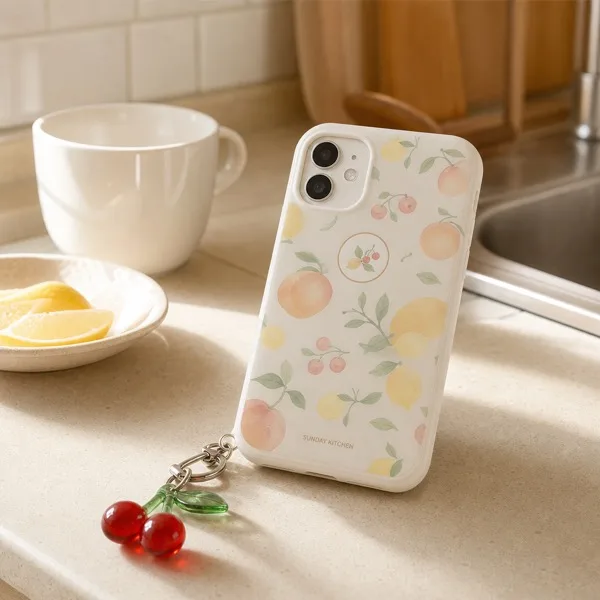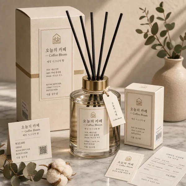
グッズ・モックアップ
소상공인 매장 로고 디자인
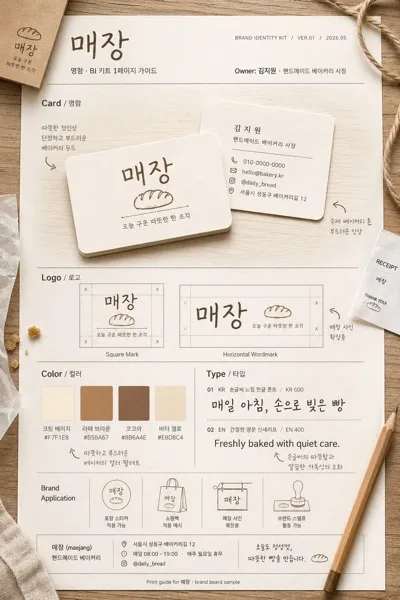
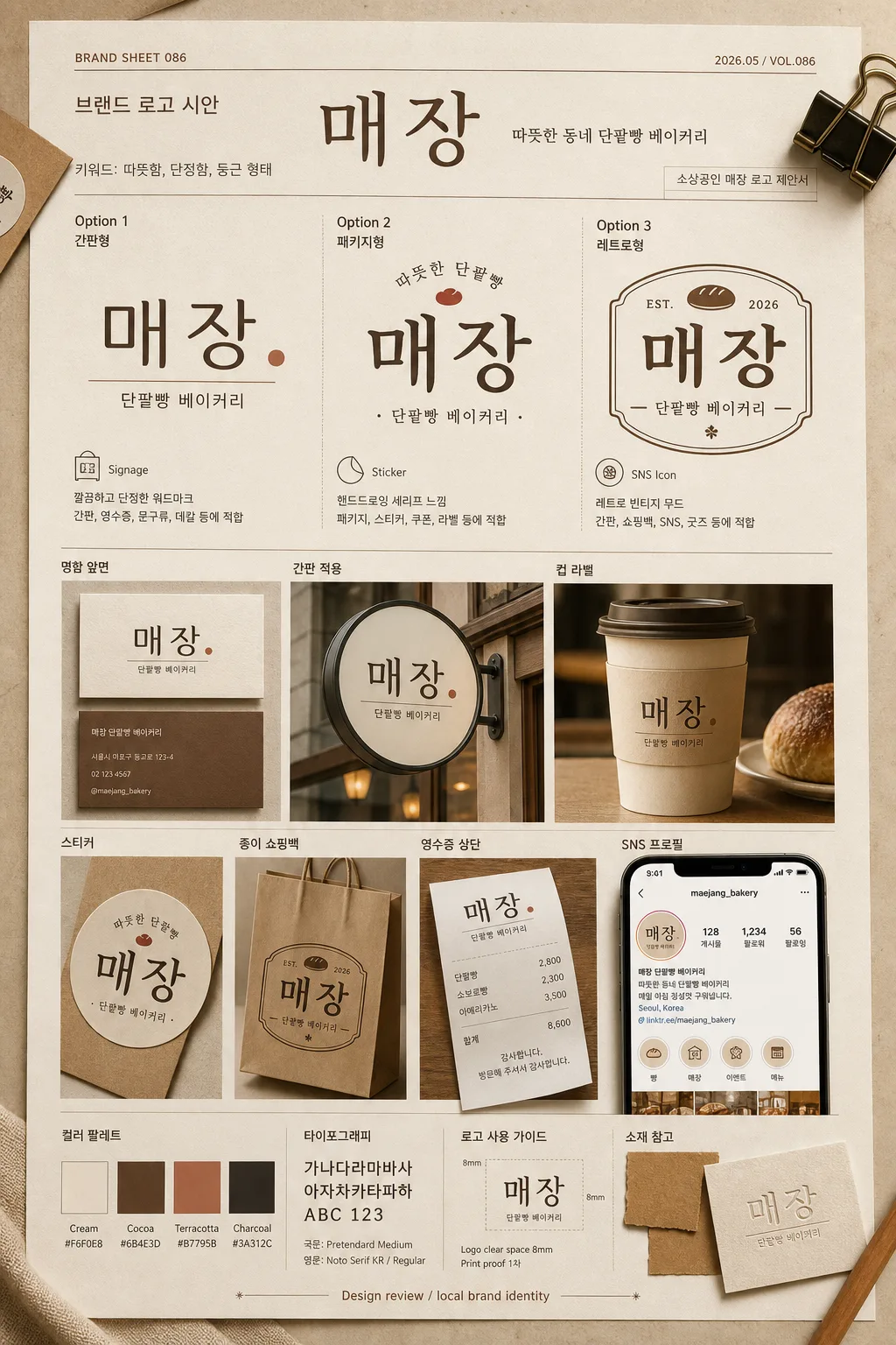
한국 소상공인 매장 로고 시안 — 미니멀·핸드드로잉·레트로 톤 3종 옵션. 매장 컨셉/이름 입력하면 로고 mock-up + 명함·간판 디스플레이 변환.
소상공인 매장 로고 디자인の概要
グッズ・モックアップ画像を作るためのChatGPT画像プロンプトです。主題、背景、スタイル、構図を整理し、すぐに試せるよう構成しています。
関連キーワード: 소상공인 매장 로고 디자인, 소상공인 매장 로고 디자인 프롬프트, グッズ・モックアップ 프롬프트, グッズ・モックアップ AI 이미지 프롬프트, ChatGPT 이미지 프롬프트, AI 이미지 생성 프롬프트, AI 프롬프트, 이미지 프롬프트
소상공인 매장 로고 디자인の活用方法
元の構造を保ちながら、被写体、背景、色、構図を変更して別案に展開できます。
- 主題を維持し、ブランドや季節、媒体に合わせて色と背景を変更してください。
- 結果が複雑な場合は背景要素を減らし、被写体、構図、照明を具体化してください。
- コピー後、ChatGPTに媒体、アスペクト比、文字の有無を追加で指定できます。
プロンプト原文
[Input]
- language: Korean
- output_size: 1024x1536

[Purpose]
한국 소상공인 매장의 브랜드 로고 디자인 시트. One realistic portrait canvas presents 3 logo directions for the same brand, plus practical mockups, color chips, typography notes, and production-ready usage details for a believable local-store identity proposal.

[Composition]
- Single poster-style canvas, portrait orientation, composed like a photographed brand-presentation board on a warm design desk.
- Arrange 3 logo options in the upper and middle area as the main focal point, with supporting mockups, color swatches, typography samples, small annotation labels, and material samples completing the lower area.
- Background treatment: 깔끔한 베이지 톤의 디자인 작업 매트 with subtle paper grain, matte cardstock texture, faint pencil registration marks, soft realistic shadows, a small binder clip, a kraft paper sample, and printed proof edges that make the scene feel like a real design review.
- Keep the composition tidy and systematic, with clear spacing between each option and each mockup, using {매장 이름}, {매장 컨셉}, {매장 키워드}, {로고 디자인 스타일}, {목업 적용 아이템}, {배경 및 연출}, {전체적인 색감 및 분위기}.
- Add realistic brand-sheet metadata: project code “BRAND SHEET 086”, date label “2026.05”, small note “소상공인 매장 로고 제안서”, and a compact designer credit line “Design review / local brand identity”.

[Core Structure]
1. Header area (top 10%): Set a polished brand-sheet title using {매장 이름} as the central wordmark example, with small supporting labels: “브랜드 로고 시안”, “{매장 컨셉}”, “키워드: {매장 키워드}”, “2026.05 / VOL.086”.
2. Logo option row (middle 45%): Present three distinct logo variants side by side, each clearly labeled “Option 1”, “Option 2”, “Option 3” with small Korean subtitles such as “간판형”, “패키지형”, “레트로형”. Include tiny usage notes under each: “Signage”, “Sticker”, “SNS Icon”.
3. Option 1: A refined modern wordmark version, thin-to-medium weight, restrained spacing, geometric balance, suitable for signage, receipt headers, stationery, and storefront decals.
4. Option 2: A hand-drawn serif version, slightly organic strokes, warm personality, subtle vintage flair, legible and refined for packaging, labels, and loyalty cards.
5. Option 3: A retro vintage version, slightly condensed, classic neighborhood-shop feel, with simple ornamental stability, a small emblem variation, and a timeless storefront identity.
6. Mockup strip (lower 35%): Show the same logo system applied to {목업 적용 아이템}, including realistic 명함, 간판, 컵 라벨, 인스타그램 프로필 화면, 스티커, 종이 쇼핑백, 영수증 상단, arranged as product-style mockups with consistent palette and realistic scale.
7. Production details: Add a small color palette block with labeled swatches “Cream”, “Cocoa”, “Terracotta”, “Charcoal”; add typography sample text “가나다라마바사 / ABC 123”; include a micro spec note “Logo clear space 8mm / Print proof 1차”.
8. Surface and framing: Items are aligned to a clear editorial grid, with natural printed-paper edges, subtle overlapping of real materials where appropriate, and believable shadows that reveal card thickness and paper texture.

[Style Rules]
- Typography: Use Pretendard or Noto Sans KR for labels, medium weight 18–24px; use a hand-drawn serif display style for the vintage option; keep English accents in a simple serif or sans-serif that pairs with Korean.
- Color palette: warm beige #E8DDCF, cream #F6F0E8, cocoa brown #6B4E3D, muted terracotta #B7795B, soft charcoal #3A312C.
- Border/shadow: subtle 4px y-offset soft drop shadow, 12px blur, 15% opacity; thin divider lines in light brown for a tidy layout.
- Add tactile material realism: uncoated paper grain, slight ink absorption, debossed logo sample on one card, matte sticker finish, lightly curled receipt paper, and a soft highlight on the cup label.
- Include functional design annotations in Korean, such as “컬러 팔레트”, “간판 적용”, “명함 앞면”, “SNS 프로필”, “패키지 라벨”, while keeping every line short and legible.

[Visual Style]
- Camera / lens: top-down flat lay look, as if shot with a 50mm lens on a high-resolution studio camera, crisp edges and minimal perspective distortion.
- Lighting: soft diffused studio light from upper-left at 45°, gentle fill from the right, even illumination with controlled shadows.
- Color grade: warm cream + beige + cocoa + muted terracotta, with slightly desaturated brand-guide neutrality.
- Rendering quality: photorealistic printed brand board, sharp Korean typography, believable paper depth, realistic scale relationships between business card, cup label, sign mockup, and Instagram profile card.

[Mood]
Premium small-business identity sheet — inspired by a Kinfolk-style brand guidelines spread and the calm restraint of Aesop packaging visuals, but with warmer neighborhood-store realism, practical print samples, and handcrafted local-brand charm.

[Critical]
- Korean text accuracy: 반드시 정확히 보이는 텍스트: {매장 이름}, Option 1, Option 2, Option 3, {목업 적용 아이템}에 해당하는 한글 표기.
- Include clearly readable Korean labels: “브랜드 로고 시안”, “소상공인 매장 로고 제안서”, “컬러 팔레트”, “간판 적용”, “명함 앞면”, “SNS 프로필”, “패키지 라벨”, “키워드: {매장 키워드}”.
- All 3 logo options must represent the same brand name consistently across wordmarks and mockups.
- Korean typography must be clean, fully legible, and properly rendered without broken characters.
- Keep the mockup items matching the same brand identity and color palette across all applications.
- The final image must feel like a real printed logo proposal photographed on a design desk, not a sterile digital template.

[8. 🚫 PROHIBITED]
- Fake official seals / certifications
- Broken Korean characters