グッズ・モックアップ
명함·BI 키트 1페이지 가이드
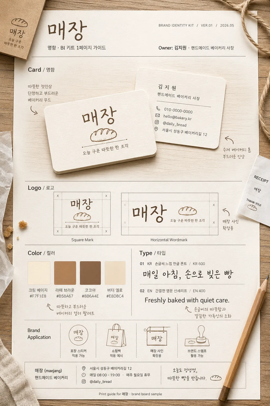
1인 사장·프리랜서의 명함 + BI 키트 한 페이지 시안. 매장·인물 정보 입력하면 명함 앞·뒤 + 로고 + 컬러 팔레트 + 폰트 가이드 mockup.
명함·BI 키트 1페이지 가이드の概要
グッズ・モックアップ画像を作るためのChatGPT画像プロンプトです。主題、背景、スタイル、構図を整理し、すぐに試せるよう構成しています。
関連キーワード: 명함·BI 키트 1페이지 가이드, 명함·BI 키트 1페이지 가이드 프롬프트, グッズ・モックアップ 프롬프트, グッズ・モックアップ AI 이미지 프롬프트, ChatGPT 이미지 프롬프트, AI 이미지 생성 프롬프트, AI 프롬프트, 이미지 프롬프트
명함·BI 키트 1페이지 가이드の活用方法
元の構造を保ちながら、被写体、背景、色、構図を変更して別案に展開できます。
- 主題を維持し、ブランドや季節、媒体に合わせて色と背景を変更してください。
- 結果が複雑な場合は背景要素を減らし、被写体、構図、照明を具体化してください。
- コピー後、ChatGPTに媒体、アスペクト比、文字の有無を追加で指定できます。
プロンプト原文
[Input]
- language: Korean
- output_size: 1024x1536

[Purpose]
1-2 English lines: one-page brand identity guide poster for a handmade bakery owner, showing business card mockups, logo lockups, color palette, typography samples, and practical store-contact details.
Realistic Korean one-person business BI kit page, designed as a polished editorial brand board that feels printed, handled, and ready for a local bakery launch.

[Composition]
- Main canvas: vertical A4-style brand guide layout with a structured editorial grid and four clearly separated zones for Card / Logo / Color / Type, plus a compact header and footer information strip.
- Primary subject: {인물 이름} as the brand owner context, with the page focusing on the visual system while including owner credit, role label, and practical bakery contact information.
- Background treatment: warm off-white paper stock with visible fine grain, cream base, subtle printed ink texture, faint shadowed panel borders, and a realistic tabletop setting.
- Surrounding context: add natural bakery-brand-board details such as a kraft paper sleeve corner, small receipt slip, pencil, cotton twine, tiny pastry crumb, linen edge, or translucent tracing-paper overlay, integrated around the printed guide.
- Spacing and framing: left-aligned labels, organized information hierarchy, editorial section dividers, visible print registration details, and enough tactile detail to feel like a photographed real BI kit sheet.
- Use {브랜드/매장명}, {브랜드 키워드}, {디자인 컨셉}, {컬러 팔레트}, {폰트 스타일} placeholders as the content anchors.

[Core Structure]
1) Top header band: set the brand title area for {브랜드/매장명} with subtitle text “명함·BI 키트 1페이지 가이드”, small guide metadata “BRAND IDENTITY KIT / VER.01 / 2026.05”, and owner line “Owner: {인물 이름} · {직업/역할}”, aligned cleanly to the upper-left with a refined editorial layout.
2) Card section: show front and back business card mockups in a realistic tabletop presentation, one card slightly overlapping the other, with soft paper edges, visible thickness, rounded corners, print grain, and natural shadow on a light wood table; include section label text “Card / 명함”. The front card should show {브랜드/매장명} logo, {브랜드 키워드}, and a small tagline such as “오늘 구운 따뜻한 한 조각”. The back card should include {인물 이름}, {직업/역할}, phone “010-0000-0000”, email “hello@bakery.kr”, Instagram “@daily_bread”, and address line “서울시 성동구 베이커리길 12”.
3) Logo section: display exactly two logo versions for {브랜드/매장명} — one square mark and one horizontal wordmark — each placed inside its own framed sample tile with fine grid ticks, lockup spacing marks, and small captions “Square Mark” and “Horizontal Wordmark”; include section label text “Logo / 로고”.
4) Color section: present 3–4 swatches derived from {컬러 팔레트}, each with a small HEX tag and Korean color name beneath it, arranged in a compact brand palette grid; include section label text “Color / 컬러”. Suggested labels: “크림 베이지 #F7F1E8”, “라떼 브라운 #B58A67”, “코코아 #8B6A4E”, “버터 옐로 #E8D8C4”.
5) Type section: show typography samples using {폰트 스타일}, with one Korean sample and one English sample, aligned on separate lines, sized like a brand board specimen; include section label text “Type / 타입”. Korean sample: “매일 아침, 손으로 빚은 빵”. English sample: “Freshly baked with quiet care.” Include small weight notes like “KR 600 / EN 400”.
6) Supporting notes: add tiny Korean annotations around the board that reinforce {브랜드 키워드} and {디자인 컨셉}, such as “따뜻한 첫인상”, “수제 베이커리 톤”, “포장 스티커 적용 가능”, “매장 사인 확장용”, plus a footer note “Print guide for {브랜드/매장명} · brand board sample”.

[Style Rules]
- Typography: Pretendard or Noto Sans KR for labels and captions, medium weight 500–600, 18–24px for section labels, 12–16px for supporting notes; handwritten Korean sample can use a clean hand-drawn style, English sample a simple sans serif such as Inter or Helvetica Neue.
- Color palette: warm beige, soft brown, cream, and muted latte tones from {컬러 팔레트}; suggested tones like #E8D8C4, #B58A67, #F7F1E8, #8B6A4E, with ink behaving like matte print on textured paper.
- Border/shadow: thin 1px separators in light taupe, soft drop shadow 0 8px 24px at 14% opacity, paper card edges slightly rounded with realistic print texture, tiny paper fibers, and gentle corner wear.
- Printed details: include small crop marks, guide numbers, micro caption lines, footer credits, and realistic alignment labels without making the sheet look like an empty template.
- Bakery identity detail: let the design hint at handmade bread through subtle icon shapes, kraft-label accents, stamp-like logo usage, and warm packaging-inspired graphic dividers.

[Visual Style]
- Camera / lens: top-down flat lay look with a 50mm lens aesthetic, slight perspective correction, realistic print mockup detail, crisp but not overly sharp.
- Lighting: soft window light from upper-left at 45°, gentle fill from lower-right, subtle natural shadow falloff, no harsh reflections.
- Color grade: warm cream + beige + latte + cocoa, slightly desaturated editorial tone, clean neutral white balance.

[Mood]
Premium handmade bakery brand board — Kinfolk-style editorial layout with Aesop-like restraint and a calm Korean lifestyle magazine feel, tactile paper warmth, local-shop sincerity, and ready-to-print professional detail.

[Critical]
- Korean text accuracy: 반드시 정확히 보여야 하는 문자열: “Card”, “Logo”, “Color”, “Type”, “명함”, “로고”, “컬러”, “타입”.
- 반드시 정확히 보여야 하는 추가 문자열: “명함·BI 키트 1페이지 가이드”, “BRAND IDENTITY KIT”, “VER.01”, “2026.05”, “오늘 구운 따뜻한 한 조각”, “매일 아침, 손으로 빚은 빵”.
- {브랜드/매장명} 표기는 BI 제목과 로고/명함 내용에서 일관되게 유지할 것.
- Card mockup must show two sides, logo section must contain exactly two versions, color section must show 3–4 swatches, and type section must show both Korean and English samples.
- Include owner credit using {인물 이름} and role using {직업/역할}; include brand context using {브랜드 키워드}, {디자인 컨셉}, {컬러 팔레트}, {폰트 스타일}.
- All Korean typography must be rendered cleanly without broken syllables or missing jamo.

[8. 🚫 PROHIBITED]
- Fake official seals / certifications
- Broken Korean characters