Merch/Mockups
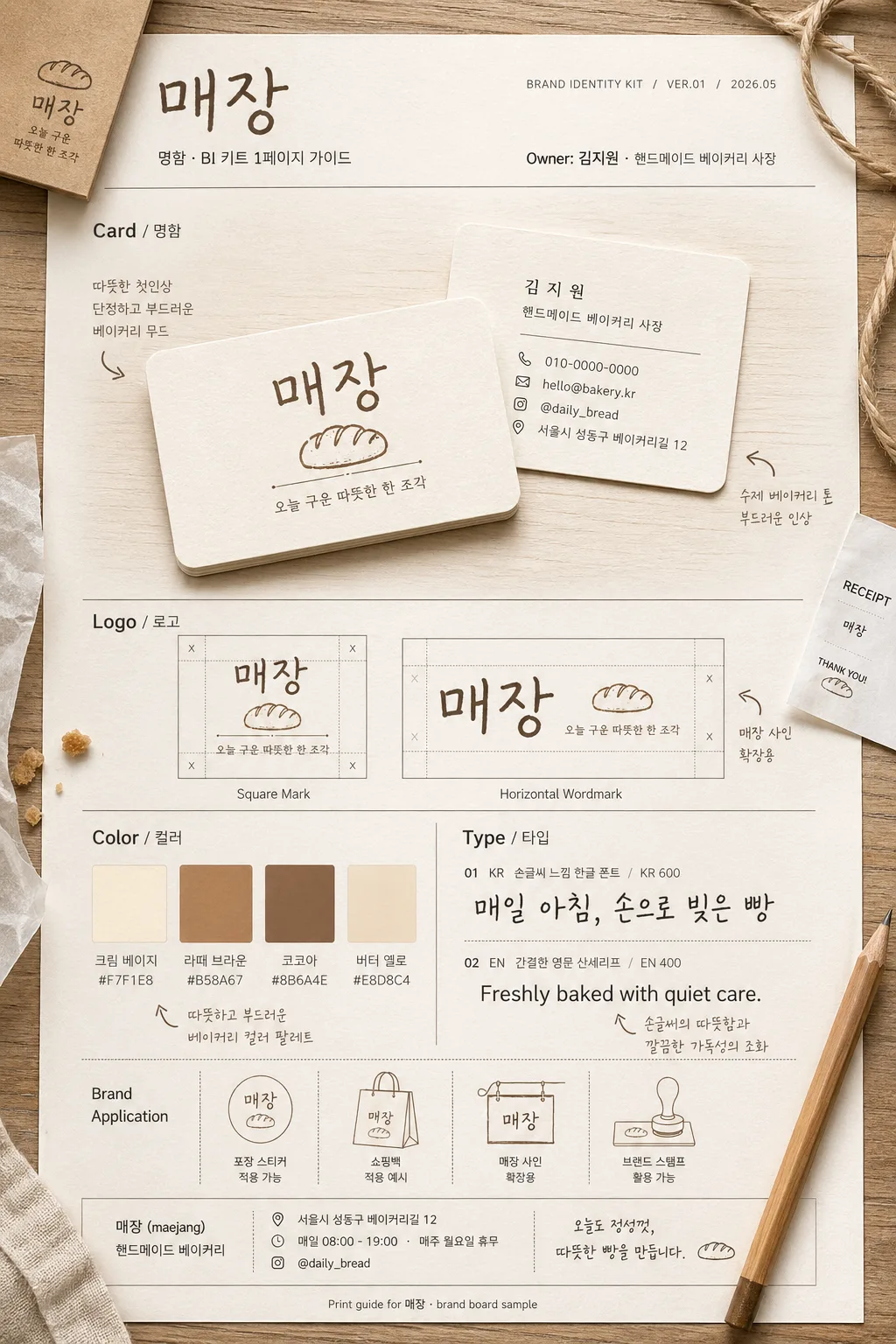
명함·BI 키트 1페이지 가이드
1인 사장·프리랜서의 명함 + BI 키트 한 페이지 시안. 매장·인물 정보 입력하면 명함 앞·뒤 + 로고 + 컬러 팔레트 + 폰트 가이드 mockup.
명함·BI 키트 1페이지 가이드 summary
Copy this ChatGPT image prompt to create Merch/Mockups results. Its subject, background, style, and composition are organized for quick iteration.
Related keywords: 명함·BI 키트 1페이지 가이드, 명함·BI 키트 1페이지 가이드 프롬프트, Merch/Mockups 프롬프트, Merch/Mockups AI 이미지 프롬프트, ChatGPT 이미지 프롬프트, AI 이미지 생성 프롬프트, AI 프롬프트, 이미지 프롬프트
How to use 명함·BI 키트 1페이지 가이드
Keep the prompt structure and swap the subject, background, palette, or composition to create new variations.
- Keep the main subject and adjust the palette and background for your brand, season, or channel.
- If the result feels busy, simplify the background and make the subject, composition, and lighting more specific.
- After copying, ask ChatGPT to adapt it for your platform, aspect ratio, or text requirements.
Original prompt
[Input]
- language: Korean
- output_size: 1024x1536

[Purpose]
1-2 English lines: one-page brand identity guide poster for a handmade bakery owner, showing business card mockups, logo lockups, color palette, typography samples, and practical store-contact details.
Realistic Korean one-person business BI kit page, designed as a polished editorial brand board that feels printed, handled, and ready for a local bakery launch.

[Composition]
- Main canvas: vertical A4-style brand guide layout with a structured editorial grid and four clearly separated zones for Card / Logo / Color / Type, plus a compact header and footer information strip.
- Primary subject: {인물 이름} as the brand owner context, with the page focusing on the visual system while including owner credit, role label, and practical bakery contact information.
- Background treatment: warm off-white paper stock with visible fine grain, cream base, subtle printed ink texture, faint shadowed panel borders, and a realistic tabletop setting.
- Surrounding context: add natural bakery-brand-board details such as a kraft paper sleeve corner, small receipt slip, pencil, cotton twine, tiny pastry crumb, linen edge, or translucent tracing-paper overlay, integrated around the printed guide.
- Spacing and framing: left-aligned labels, organized information hierarchy, editorial section dividers, visible print registration details, and enough tactile detail to feel like a photographed real BI kit sheet.
- Use {브랜드/매장명}, {브랜드 키워드}, {디자인 컨셉}, {컬러 팔레트}, {폰트 스타일} placeholders as the content anchors.

[Core Structure]
1) Top header band: set the brand title area for {브랜드/매장명} with subtitle text “명함·BI 키트 1페이지 가이드”, small guide metadata “BRAND IDENTITY KIT / VER.01 / 2026.05”, and owner line “Owner: {인물 이름} · {직업/역할}”, aligned cleanly to the upper-left with a refined editorial layout.
2) Card section: show front and back business card mockups in a realistic tabletop presentation, one card slightly overlapping the other, with soft paper edges, visible thickness, rounded corners, print grain, and natural shadow on a light wood table; include section label text “Card / 명함”. The front card should show {브랜드/매장명} logo, {브랜드 키워드}, and a small tagline such as “오늘 구운 따뜻한 한 조각”. The back card should include {인물 이름}, {직업/역할}, phone “010-0000-0000”, email “hello@bakery.kr”, Instagram “@daily_bread”, and address line “서울시 성동구 베이커리길 12”.
3) Logo section: display exactly two logo versions for {브랜드/매장명} — one square mark and one horizontal wordmark — each placed inside its own framed sample tile with fine grid ticks, lockup spacing marks, and small captions “Square Mark” and “Horizontal Wordmark”; include section label text “Logo / 로고”.
4) Color section: present 3–4 swatches derived from {컬러 팔레트}, each with a small HEX tag and Korean color name beneath it, arranged in a compact brand palette grid; include section label text “Color / 컬러”. Suggested labels: “크림 베이지 #F7F1E8”, “라떼 브라운 #B58A67”, “코코아 #8B6A4E”, “버터 옐로 #E8D8C4”.
5) Type section: show typography samples using {폰트 스타일}, with one Korean sample and one English sample, aligned on separate lines, sized like a brand board specimen; include section label text “Type / 타입”. Korean sample: “매일 아침, 손으로 빚은 빵”. English sample: “Freshly baked with quiet care.” Include small weight notes like “KR 600 / EN 400”.
6) Supporting notes: add tiny Korean annotations around the board that reinforce {브랜드 키워드} and {디자인 컨셉}, such as “따뜻한 첫인상”, “수제 베이커리 톤”, “포장 스티커 적용 가능”, “매장 사인 확장용”, plus a footer note “Print guide for {브랜드/매장명} · brand board sample”.

[Style Rules]
- Typography: Pretendard or Noto Sans KR for labels and captions, medium weight 500–600, 18–24px for section labels, 12–16px for supporting notes; handwritten Korean sample can use a clean hand-drawn style, English sample a simple sans serif such as Inter or Helvetica Neue.
- Color palette: warm beige, soft brown, cream, and muted latte tones from {컬러 팔레트}; suggested tones like #E8D8C4, #B58A67, #F7F1E8, #8B6A4E, with ink behaving like matte print on textured paper.
- Border/shadow: thin 1px separators in light taupe, soft drop shadow 0 8px 24px at 14% opacity, paper card edges slightly rounded with realistic print texture, tiny paper fibers, and gentle corner wear.
- Printed details: include small crop marks, guide numbers, micro caption lines, footer credits, and realistic alignment labels without making the sheet look like an empty template.
- Bakery identity detail: let the design hint at handmade bread through subtle icon shapes, kraft-label accents, stamp-like logo usage, and warm packaging-inspired graphic dividers.

[Visual Style]
- Camera / lens: top-down flat lay look with a 50mm lens aesthetic, slight perspective correction, realistic print mockup detail, crisp but not overly sharp.
- Lighting: soft window light from upper-left at 45°, gentle fill from lower-right, subtle natural shadow falloff, no harsh reflections.
- Color grade: warm cream + beige + latte + cocoa, slightly desaturated editorial tone, clean neutral white balance.

[Mood]
Premium handmade bakery brand board — Kinfolk-style editorial layout with Aesop-like restraint and a calm Korean lifestyle magazine feel, tactile paper warmth, local-shop sincerity, and ready-to-print professional detail.

[Critical]
- Korean text accuracy: 반드시 정확히 보여야 하는 문자열: “Card”, “Logo”, “Color”, “Type”, “명함”, “로고”, “컬러”, “타입”.
- 반드시 정확히 보여야 하는 추가 문자열: “명함·BI 키트 1페이지 가이드”, “BRAND IDENTITY KIT”, “VER.01”, “2026.05”, “오늘 구운 따뜻한 한 조각”, “매일 아침, 손으로 빚은 빵”.
- {브랜드/매장명} 표기는 BI 제목과 로고/명함 내용에서 일관되게 유지할 것.
- Card mockup must show two sides, logo section must contain exactly two versions, color section must show 3–4 swatches, and type section must show both Korean and English samples.
- Include owner credit using {인물 이름} and role using {직업/역할}; include brand context using {브랜드 키워드}, {디자인 컨셉}, {컬러 팔레트}, {폰트 스타일}.
- All Korean typography must be rendered cleanly without broken syllables or missing jamo.

[8. 🚫 PROHIBITED]
- Fake official seals / certifications
- Broken Korean characters