広告・ポスター
A4 할인·이벤트 POP 포스터
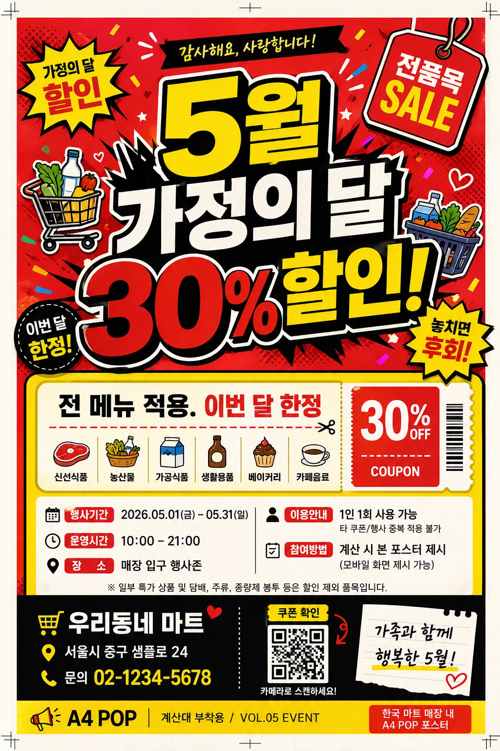
매장 인쇄용 A4 POP 포스터 — 한국 마트·식당·카페 풍 큰 한글·강한 컬러·할인 정보 즉시 인지. 이벤트 내용 + 업종 입력하면 인쇄 가능한 POP 시안 변환.
A4 할인·이벤트 POP 포스터の概要
広告・ポスター画像を作るためのChatGPT画像プロンプトです。主題、背景、スタイル、構図を整理し、すぐに試せるよう構成しています。
関連キーワード: A4 할인·이벤트 POP 포스터, A4 할인·이벤트 POP 포스터 프롬프트, 広告・ポスター 프롬프트, 広告・ポスター AI 이미지 프롬프트, ChatGPT 이미지 프롬프트, AI 이미지 생성 프롬프트, AI 프롬프트, 이미지 프롬프트
A4 할인·이벤트 POP 포스터の活用方法
元の構造を保ちながら、被写体、背景、色、構図を変更して別案に展開できます。
- 主題を維持し、ブランドや季節、媒体に合わせて色と背景を変更してください。
- 結果が複雑な場合は背景要素を減らし、被写体、構図、照明を具体化してください。
- コピー後、ChatGPTに媒体、アスペクト比、文字の有無を追加で指定できます。
プロンプト原文
[Input]
- language: Korean
- output_size: 1024x1536

[Purpose]
A4 printable POP poster for Korean in-store promotion, designed to stop foot traffic and communicate a sale instantly while still feeling like a real poster taped near a checkout counter, menu board, or entrance display.
Retail signage for a local market, restaurant, or cafe, with a high-contrast headline, compact event details, small coupon-style information, and practical store notice elements.

[Composition]
- Poster layout: portrait A4 composition with the main headline occupying 50%–55% of the upper half, supporting copy and event logistics arranged in the lower 40% as realistic retail information blocks.
- Subject placement: {메인 헤드라인 스타일} centered and dominant near the top-middle, with {이벤트 내용} placed below as smaller supporting text in a bright coupon/event panel.
- Background treatment: Korean POP-style backdrop using {주요 색상}, with {배경 요소} distributed around the headline as burst shapes, sale stickers, small product icons, price-tag graphics, confetti dots, and hand-drawn marker accents.
- Framing direction: use a practical A4 print layout with visible 3mm bleed awareness, tiny crop/trim marks, and a slight paper edge impression so it feels like a real printed in-store poster.
- Use {포스터 용도}, {이벤트 내용}, {전체 디자인 컨셉} placeholders as the customizable text/content anchors, supported by realistic store-poster microcopy such as date, venue, ticket/coupon note, and contact line.

[3. CORE STRUCTURE]
1. Top headline zone: render the main promotional phrase in oversized Korean type, bold and highly legible, with thick strokes, a black keyline, and strong contrast against the {주요 색상} background.
2. Accent motif zone: place {배경 요소} as layered graphic shapes, sticker-like illustrations, sale bursts, arrows, coupon tabs, and small product/category icons behind and beside the headline while keeping the characters readable.
3. Event detail zone: under the headline, create a rounded coupon panel containing {이벤트 내용}, plus realistic Korean details such as "행사기간 2026.05.01–05.31", "운영시간 10:00–21:00", "장소 매장 입구 행사존", and "1인 1회 사용 가능".
4. Store information zone: add a small sponsor/store strip near the bottom with "우리동네 마트", "서울시 중구 샘플로 24", "문의 02-1234-5678", and a tiny QR-code-like square labeled "쿠폰 확인".
5. Poster usage cue: integrate {포스터 용도} as a small footer label or corner tag, paired with realistic print text such as "A4 POP / 계산대 부착용 / VOL.05 EVENT".
6. Style anchoring: reinforce {전체 디자인 컨셉} through color balance, icon style, typography hierarchy, sticker labels, decorative dividers, and lively Korean neighborhood retail signage energy.

[4. STYLE RULES]
- Typography: use a bold Korean sans-serif such as Pretendard ExtraBold, Noto Sans KR Black, or Gmarket Sans Bold for the headline; use Pretendard Medium or Noto Sans KR Regular for body copy; headline size should visually dominate at 72–120 px equivalent.
- Color palette: emphasize {주요 색상} with strong print-friendly contrast; use saturated red #E53935, yellow #FDD835, black #111111, and white #FFFFFF for readable panels, price tags, and coupon boxes.
- Border/shadow: add thick black keylines around headline blocks, comic-style sale burst outlines, and a subtle 3px–6px drop shadow with 15%–20% opacity to improve legibility on colorful backgrounds.
- Print finish: use crisp vector edges, sharp Korean lettering, slight warm white paper grain, subtle ink texture, tiny registration/crop marks, and realistic A4 indoor-print appearance.
- Decorative content: include practical retail poster elements such as discount badges, arrow callouts, dotted dividers, small item-category pictograms, barcode-style coupon strip, sponsor area, and bottom contact details.

[5. VISUAL STYLE]
- Camera / lens: if product imagery is used, stage it as a front-facing commercial poster composite with 50mm lens perspective, f/5.6 look, minimal distortion, and flat graphic integration.
- Lighting: bright studio-style even illumination, with soft top-left key light and gentle fill from the right so text, paper texture, sticker graphics, and motifs remain high-contrast.
- Color grade: Korean POP poster grade with vivid red-yellow-black emphasis, slight warm white paper tone, saturated retail flyer color, and controlled contrast to preserve readability.
- Realism details: show the poster as a finished A4 printed sheet with subtle paper fibers, very slight corner curl or tape-shadow impression, and dense but organized in-store promotional information.

[6. MOOD]
Korean neighborhood market POP signage — energetic convenience-store flyer energy, cheerful local-event atmosphere, and practical retail-layout realism with bright discount graphics and clear buying cues.

[7. CRITICAL]
- Korean text accuracy: the following verbatim Korean strings must appear correctly if rendered: "5월 가정의 달 30% 할인!", "전 메뉴 적용.", "이번 달 한정", "한국 마트 매장 내 A4 POP 포스터".
- Additional Korean poster microcopy may appear clearly: "행사기간 2026.05.01–05.31", "운영시간 10:00–21:00", "장소 매장 입구 행사존", "쿠폰 확인", "문의 02-1234-5678".
- Keep all Korean characters fully legible with correct spacing and no broken jamo.
- Maintain a clear hierarchy: headline largest, event details medium, coupon/store/footer information smallest.
- Decorative graphics, price tags, QR-like elements, and sponsor strips should enrich the poster while leaving all main Korean text readable.

[8. 🚫 PROHIBITED]
- Fake official seals / certifications
- Broken Korean characters