Ads/Posters
A4 할인·이벤트 POP 포스터
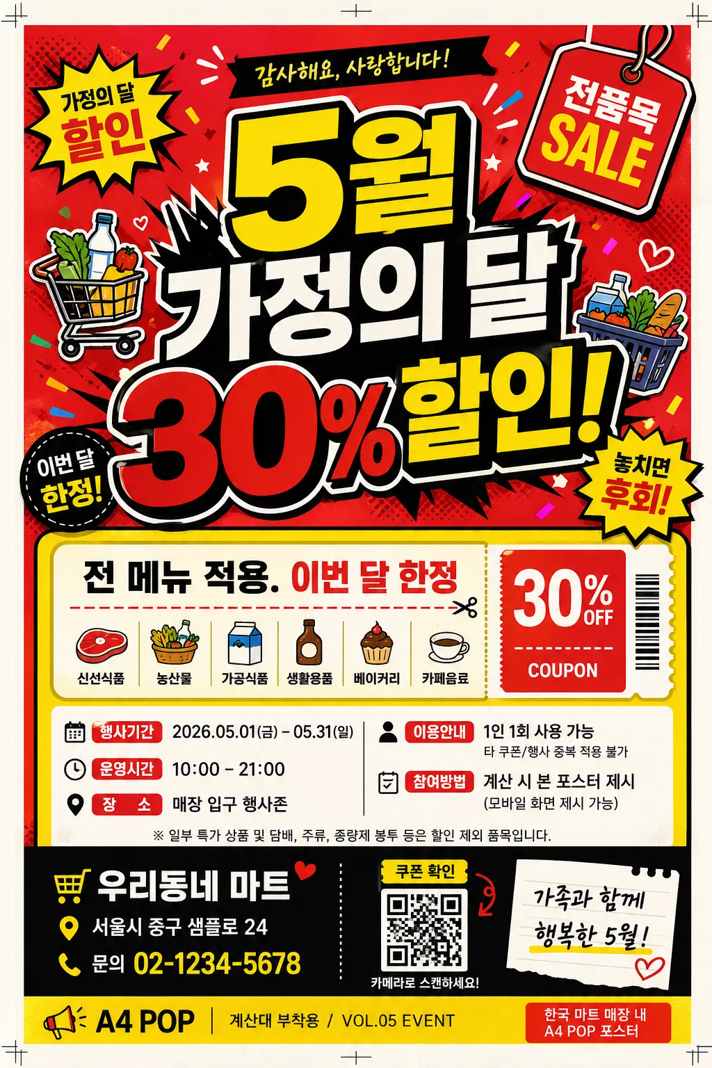
매장 인쇄용 A4 POP 포스터 — 한국 마트·식당·카페 풍 큰 한글·강한 컬러·할인 정보 즉시 인지. 이벤트 내용 + 업종 입력하면 인쇄 가능한 POP 시안 변환.
A4 할인·이벤트 POP 포스터 summary
Copy this ChatGPT image prompt to create Ads/Posters results. Its subject, background, style, and composition are organized for quick iteration.
Related keywords: A4 할인·이벤트 POP 포스터, A4 할인·이벤트 POP 포스터 프롬프트, Ads/Posters 프롬프트, Ads/Posters AI 이미지 프롬프트, ChatGPT 이미지 프롬프트, AI 이미지 생성 프롬프트, AI 프롬프트, 이미지 프롬프트
How to use A4 할인·이벤트 POP 포스터
Keep the prompt structure and swap the subject, background, palette, or composition to create new variations.
- Keep the main subject and adjust the palette and background for your brand, season, or channel.
- If the result feels busy, simplify the background and make the subject, composition, and lighting more specific.
- After copying, ask ChatGPT to adapt it for your platform, aspect ratio, or text requirements.
Original prompt
[Input]
- language: Korean
- output_size: 1024x1536

[Purpose]
A4 printable POP poster for Korean in-store promotion, designed to stop foot traffic and communicate a sale instantly while still feeling like a real poster taped near a checkout counter, menu board, or entrance display.
Retail signage for a local market, restaurant, or cafe, with a high-contrast headline, compact event details, small coupon-style information, and practical store notice elements.

[Composition]
- Poster layout: portrait A4 composition with the main headline occupying 50%–55% of the upper half, supporting copy and event logistics arranged in the lower 40% as realistic retail information blocks.
- Subject placement: {메인 헤드라인 스타일} centered and dominant near the top-middle, with {이벤트 내용} placed below as smaller supporting text in a bright coupon/event panel.
- Background treatment: Korean POP-style backdrop using {주요 색상}, with {배경 요소} distributed around the headline as burst shapes, sale stickers, small product icons, price-tag graphics, confetti dots, and hand-drawn marker accents.
- Framing direction: use a practical A4 print layout with visible 3mm bleed awareness, tiny crop/trim marks, and a slight paper edge impression so it feels like a real printed in-store poster.
- Use {포스터 용도}, {이벤트 내용}, {전체 디자인 컨셉} placeholders as the customizable text/content anchors, supported by realistic store-poster microcopy such as date, venue, ticket/coupon note, and contact line.

[3. CORE STRUCTURE]
1. Top headline zone: render the main promotional phrase in oversized Korean type, bold and highly legible, with thick strokes, a black keyline, and strong contrast against the {주요 색상} background.
2. Accent motif zone: place {배경 요소} as layered graphic shapes, sticker-like illustrations, sale bursts, arrows, coupon tabs, and small product/category icons behind and beside the headline while keeping the characters readable.
3. Event detail zone: under the headline, create a rounded coupon panel containing {이벤트 내용}, plus realistic Korean details such as "행사기간 2026.05.01–05.31", "운영시간 10:00–21:00", "장소 매장 입구 행사존", and "1인 1회 사용 가능".
4. Store information zone: add a small sponsor/store strip near the bottom with "우리동네 마트", "서울시 중구 샘플로 24", "문의 02-1234-5678", and a tiny QR-code-like square labeled "쿠폰 확인".
5. Poster usage cue: integrate {포스터 용도} as a small footer label or corner tag, paired with realistic print text such as "A4 POP / 계산대 부착용 / VOL.05 EVENT".
6. Style anchoring: reinforce {전체 디자인 컨셉} through color balance, icon style, typography hierarchy, sticker labels, decorative dividers, and lively Korean neighborhood retail signage energy.

[4. STYLE RULES]
- Typography: use a bold Korean sans-serif such as Pretendard ExtraBold, Noto Sans KR Black, or Gmarket Sans Bold for the headline; use Pretendard Medium or Noto Sans KR Regular for body copy; headline size should visually dominate at 72–120 px equivalent.
- Color palette: emphasize {주요 색상} with strong print-friendly contrast; use saturated red #E53935, yellow #FDD835, black #111111, and white #FFFFFF for readable panels, price tags, and coupon boxes.
- Border/shadow: add thick black keylines around headline blocks, comic-style sale burst outlines, and a subtle 3px–6px drop shadow with 15%–20% opacity to improve legibility on colorful backgrounds.
- Print finish: use crisp vector edges, sharp Korean lettering, slight warm white paper grain, subtle ink texture, tiny registration/crop marks, and realistic A4 indoor-print appearance.
- Decorative content: include practical retail poster elements such as discount badges, arrow callouts, dotted dividers, small item-category pictograms, barcode-style coupon strip, sponsor area, and bottom contact details.

[5. VISUAL STYLE]
- Camera / lens: if product imagery is used, stage it as a front-facing commercial poster composite with 50mm lens perspective, f/5.6 look, minimal distortion, and flat graphic integration.
- Lighting: bright studio-style even illumination, with soft top-left key light and gentle fill from the right so text, paper texture, sticker graphics, and motifs remain high-contrast.
- Color grade: Korean POP poster grade with vivid red-yellow-black emphasis, slight warm white paper tone, saturated retail flyer color, and controlled contrast to preserve readability.
- Realism details: show the poster as a finished A4 printed sheet with subtle paper fibers, very slight corner curl or tape-shadow impression, and dense but organized in-store promotional information.

[6. MOOD]
Korean neighborhood market POP signage — energetic convenience-store flyer energy, cheerful local-event atmosphere, and practical retail-layout realism with bright discount graphics and clear buying cues.

[7. CRITICAL]
- Korean text accuracy: the following verbatim Korean strings must appear correctly if rendered: "5월 가정의 달 30% 할인!", "전 메뉴 적용.", "이번 달 한정", "한국 마트 매장 내 A4 POP 포스터".
- Additional Korean poster microcopy may appear clearly: "행사기간 2026.05.01–05.31", "운영시간 10:00–21:00", "장소 매장 입구 행사존", "쿠폰 확인", "문의 02-1234-5678".
- Keep all Korean characters fully legible with correct spacing and no broken jamo.
- Maintain a clear hierarchy: headline largest, event details medium, coupon/store/footer information smallest.
- Decorative graphics, price tags, QR-like elements, and sponsor strips should enrich the poster while leaving all main Korean text readable.

[8. 🚫 PROHIBITED]
- Fake official seals / certifications
- Broken Korean characters