Ads/Posters
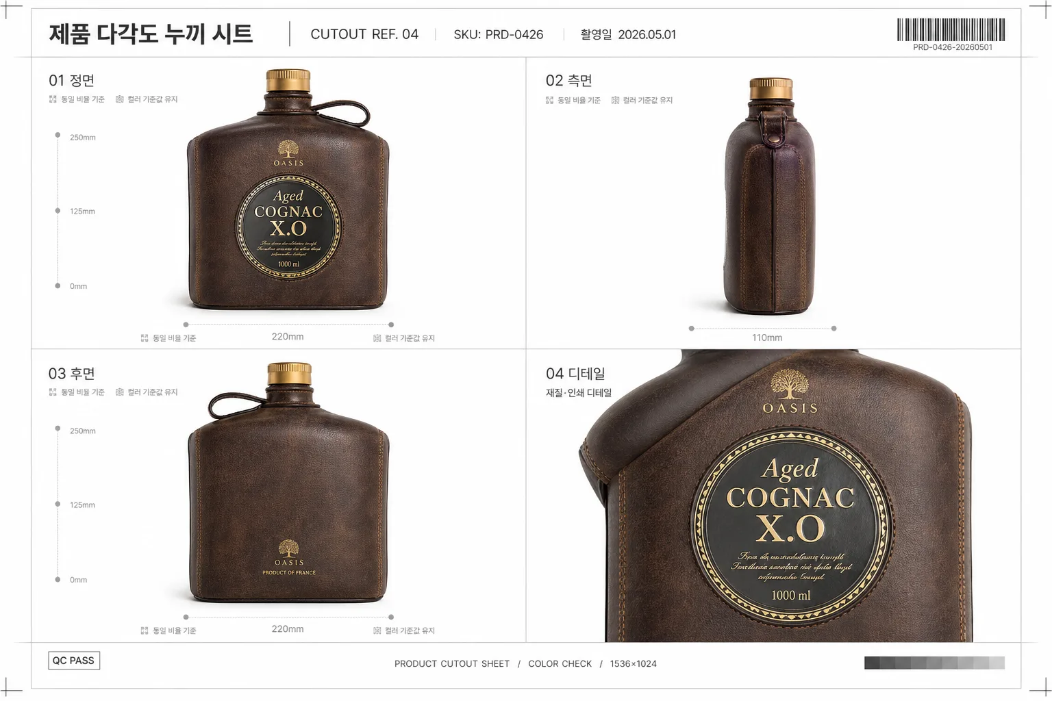
제품 4컷 다각도 누끼 시트
한 제품을 4각도로 — 쿠팡·아마존 다각도 컷.
제품 4컷 다각도 누끼 시트 summary
Copy this ChatGPT image prompt to create Ads/Posters results. Its subject, background, style, and composition are organized for quick iteration.
Related keywords: 제품 4컷 다각도 누끼 시트, 제품 4컷 다각도 누끼 시트 프롬프트, Ads/Posters 프롬프트, Ads/Posters AI 이미지 프롬프트, ChatGPT 이미지 프롬프트, AI 이미지 생성 프롬프트, AI 프롬프트, 이미지 프롬프트
How to use 제품 4컷 다각도 누끼 시트
Keep the prompt structure and swap the subject, background, palette, or composition to create new variations.
- Keep the main subject and adjust the palette and background for your brand, season, or channel.
- If the result feels busy, simplify the background and make the subject, composition, and lighting more specific.
- After copying, ask ChatGPT to adapt it for your platform, aspect ratio, or text requirements.
Original prompt
[Input]
- reference_image: {참고 이미지}
- language: Korean
- output_size: 1536x1024

[Purpose]
1-2 English lines: high-end product photography sheet, 4-cut multi-angle cutout reference grid for e-commerce, catalog QA, and marketplace listing assets.
Show the same physical product from multiple views with studio consistency, realistic catalog metadata, and no product redesign.

[Composition]
- {원본 제품} is the main subject in all four panels, occupying about 65-75% of each product frame with clean cutout separation, natural contact shadow, and no compositing artifacts.
- {레이아웃} arranges the product in a structured 2x2 comparison sheet with equal panel sizes, precise gutters, fine light-gray divider lines, and consistent baseline alignment across all views.
- Use {배경} as a professional white-to-soft-gray studio catalog board: #FFFFFF product area, very subtle paper grain, faint registration marks, small measurement ticks, and realistic sheet metadata.
- Add a slim header strip at the top with catalog-style information: Korean title “제품 다각도 누끼 시트”, “CUTOUT REF. 04”, “SKU: PRD-0426”, “촬영일 2026.05.01”, and a small barcode placeholder area at the far right.
- Add small panel labels in Korean under or above each frame: “01 정면”, “02 측면”, “03 후면”, “04 디테일”, plus tiny scale notes such as “동일 비율 기준” and “컬러 기준값 유지”.
- Use {비율} with balanced product sizing and a realistic reference-board composition that feels like a premium studio production deliverable.

[3. CORE STRUCTURE]
1) Panel 1 (front view): place {원본 제품} centered, facing the camera directly, preserving exact shape, proportion, texture, color, label, logo, branding, and printed text from the reference image. Include a small label “01 정면” and a thin baseline guide.
2) Panel 2 (side view): rotate the same product to the left 90° for a clean profile view, keeping height, thickness, surface finish, and all visible construction details consistent. Include a small label “02 측면” and a subtle width marker.
3) Panel 3 (back view): show the product from a 180° rear angle, aligned to match the first panel’s scale and lighting. Include a small label “03 후면”, a faint vertical centerline, and realistic studio shadow continuity.
4) Panel 4 (detail close-up): crop a macro detail that reveals material texture, seams, printed surface, logo area, cap, edge, handle, port, stitching, embossing, or functional detail that actually exists on {원본 제품}; do not invent product features. Include a small label “04 디테일” and a short technical caption “재질·인쇄 디테일”.
5) All four panels must use the same product scale logic, {각도 일관성}, the same white studio background treatment, identical shadow language, and matching product color so the sheet reads as one coherent catalog reference asset.
6) Add realistic production marks around the board: tiny crop ticks, gray measurement dots, a small “QC PASS” text badge without implying official certification, and a bottom footer line reading “PRODUCT CUTOUT SHEET / COLOR CHECK / 1536×1024”.

[4. STYLE RULES]
- Typography: use Pretendard or Noto Sans KR Regular/Medium for sheet labels and metadata, 14-24px, charcoal #111111 and neutral gray #777777; keep product label text exactly as shown in the reference.
- Color palette: pure white #FFFFFF, soft studio gray #F3F4F6, neutral gray #D9D9D9, charcoal #111111, and the product’s original colors only.
- Panel treatment: thin light-gray dividers, soft natural contact shadows, realistic paper-board surface, tiny barcode block, catalog footer, and subtle measurement guides that support the product reference purpose.
- Maintain a premium commercial packshot feel: crisp edges, accurate reflections, readable material texture, and clean separation between product and background.

[5. VISUAL STYLE]
- Camera / lens: Phase One IQ4 with 120mm Macro at f/8 for front/back/detail fidelity, locked studio framing for consistency; honor {카메라·렌즈} if it specifies an equivalent professional product-photography setup.
- Lighting: {라이팅}; identical studio setup across all panels, left main light at 45° with right-side fill, soft diffused shadows, controlled highlights, and realistic surface reflections without harsh specular clipping.
- Color grade: neutral product-catalog grade with clean whites, accurate product color, natural contrast, calibrated midtones, and no warm or cool tint cast.
- Rendering quality: high-resolution commercial studio photography, realistic cutout edges, believable macro texture in the detail panel, and precise alignment like a professional catalog production sheet.

[6. MOOD]
Premium studio catalog sheet — high-end e-commerce packshot reference with a realistic production-board look, precise product QA annotations, and polished commercial photography finish.

[7. CRITICAL]
- Korean text accuracy: render added sheet text clearly and correctly, including “제품 다각도 누끼 시트”, “01 정면”, “02 측면”, “03 후면”, “04 디테일”, “촬영일 2026.05.01”, and “동일 비율 기준”.
- Preserve the exact product from the reference image: shape, proportion, texture, color, label, logo, branding, and all printed product text must remain unchanged.
- All 4 panels must show the same physical {원본 제품} with consistent scale, {각도 일관성}, and studio lighting; only the viewing angle or macro crop changes.
- Added metadata, dividers, barcode area, measurement ticks, and captions must belong to the catalog sheet design only and must not cover, alter, or reinterpret the product.
- Hands, humans, and lifestyle scenes should not appear because this is a controlled product cutout reference sheet.

[8. 🚫 PROHIBITED]
- Fake official seals / certifications
- Broken Korean characters