Ads/Posters
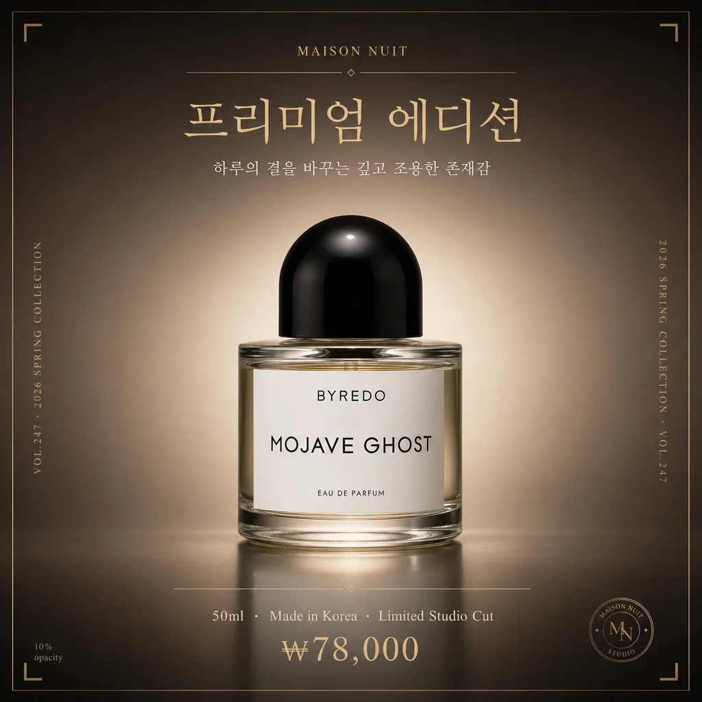
제품 프리미엄 그라디언트 누끼
Aesop·Le Labo 톤 그라디언트 배경 + 럭셔리 라이팅. 프리미엄 브랜드 결.
제품 프리미엄 그라디언트 누끼 summary
Copy this ChatGPT image prompt to create Ads/Posters results. Its subject, background, style, and composition are organized for quick iteration.
Related keywords: 제품 프리미엄 그라디언트 누끼, 제품 프리미엄 그라디언트 누끼 프롬프트, Ads/Posters 프롬프트, Ads/Posters AI 이미지 프롬프트, ChatGPT 이미지 프롬프트, AI 이미지 생성 프롬프트, AI 프롬프트, 이미지 프롬프트
How to use 제품 프리미엄 그라디언트 누끼
Keep the prompt structure and swap the subject, background, palette, or composition to create new variations.
- Keep the main subject and adjust the palette and background for your brand, season, or channel.
- If the result feels busy, simplify the background and make the subject, composition, and lighting more specific.
- After copying, ask ChatGPT to adapt it for your platform, aspect ratio, or text requirements.
Original prompt
[Input]
- reference_image: {참고 이미지}
- language: Korean
- output_size: 1024x1024

[Purpose]
Premium i2i product cutout with luxury gradient background, designed as a square high-end studio product hero for {비율}.
Keep the original product perfectly preserved while upgrading the scene into an editorial catalog presentation with refined Korean product-copy elements and a premium campaign finish.

[Composition]
- Center the {원본 제품} as the hero object, occupying about 42–52% of the frame height, with balanced studio spacing and a stable vertical silhouette.
- Place the product slightly above center if the shape is tall, or centered if the product is compact; let {구도} guide the hero placement and the slight camera angle.
- Background treatment: build a smooth premium gradient using {배경}, with soft tonal depth, subtle vignette falloff, fine studio grain, and a luminous area behind the product for dimensional separation.
- Add a realistic product-grounding treatment with {표면 연출}: soft contact shadow, faint satin reflection, or a translucent acrylic shadow plate that feels like a luxury studio setup.
- Include refined catalog typography around the product: {브랜드명}, {제품명}, {카탈로그 문구}, {에디토리얼 태그}, {제품 정보}, and {가격}. Keep all added text on the background plane, arranged like a premium beauty / lifestyle catalog page.
- Use {그래픽 요소} as subtle editorial decoration, such as thin dividers, small corner ticks, micro-labels, or understated metallic accent lines.

[3. CORE STRUCTURE]
- Hero object area: {원본 제품} preserved exactly as in the reference, cleanly cut out and placed into the gradient studio field, with realistic contact shadow and precise edge separation.
- Background field: create a soft vertical fade from {배경}; place the brightest tonal glow near the product center and deepen the edges to create an expensive campaign atmosphere.
- Surface layer: integrate {표면 연출} under the product so it feels physically photographed rather than pasted, while keeping the product silhouette fully readable.
- Editorial information layer: arrange {브랜드명} as a small top label, {제품명} as the main title, {카탈로그 문구} as a short Korean campaign line, {에디토리얼 태그} as a magazine-like collection marker, {제품 정보} as fine-print catalog metadata, and {가격} as a premium retail detail.
- Light shaping: apply {라이팅} to create a premium rim contour, a gentle top highlight, and controlled shadow falloff that makes the object feel photographed in a luxury studio.
- Perspective handling: follow {카메라·렌즈} to keep the product proportions natural, with the slight oblique presence from {구도} and accurate product geometry.
- Final polish: reinforce the luxury finish implied by {컬러 무드}, ensuring the product remains the visual anchor while typography and accents support the catalog story.

[4. STYLE RULES]
- Typography: use elegant Korean editorial typography with a luxury catalog hierarchy — refined sans-serif or modern serif, small caps for Latin text if needed, tight but readable spacing, and crisp rendering of every Korean character.
- Color palette: follow {컬러 무드} and the gradient specified in {배경}; use rich neutral tones such as mocha, taupe, charcoal, deep navy, nude beige, muted gold, and soft cream if compatible with the original product.
- Graphic accents: apply {그래픽 요소} with low-opacity metallic or tone-on-tone treatment; dividers and registration-style ticks should feel like an editorial layout rather than a decorative frame.
- Shadow / reflection: soft realistic drop shadow directly under the product, about 6–10px vertical offset, 18–25px blur, 18% opacity; add subtle rim separation and a faint surface reflection when it supports the material quality.
- Finish: premium retouching, high contrast control, accurate label readability, natural specular highlights, refined matte blacks, and believable studio color depth.

[5. VISUAL STYLE]
- Camera / lens: Hasselblad H6D-100c with 80mm f/2.8 and macro extension, medium-format product photography look, precise tonal depth and edge fidelity.
- Lighting: rim light emphasis with a top key light and deep luxury tonal field; soft studio source from upper-left at about 45°, plus a controlled fill from front-right to retain label readability and product form.
- Color grade: dark luxury neutrals or nude-beige premium palette, with subtle cinematic contrast, refined matte blacks, gentle metallic accents, and a high-end fashion beauty campaign atmosphere.

[6. MOOD]
Aesop / Le Labo / NUMÉRO-inspired luxury product editorial — polished studio still-life with premium catalog confidence, quiet sophistication, and realistic commercial photography depth.

[7. CRITICAL]
- Render the added Korean / Latin text exactly from these fields: {브랜드명}, {제품명}, {카탈로그 문구}, {에디토리얼 태그}, {제품 정보}, {가격}.
- Exact preservation required: replicate the reference product exactly — preserve precise shape, proportion, texture, color, label, logo, branding, and any printed text already on the product.
- Added typography and graphic accents must sit on the background area only; they must not cover, replace, reinterpret, or compete with the original product label or logo.
- Replace only the surrounding studio environment, lighting, gradient background, surface shadow, and editorial layout elements.
- Keep all product details anatomically and geometrically faithful to the source image, with faithful label placement, intact printed characters, and stable proportions.

[8. 🚫 PROHIBITED]
- Fake official seals / certifications
- Broken Korean characters
- Celebrity composites or unauthorized face swaps
- False safety, medical, award, or approval badges