Merch/Mockups
단골 쿠폰·도장카드 디자인
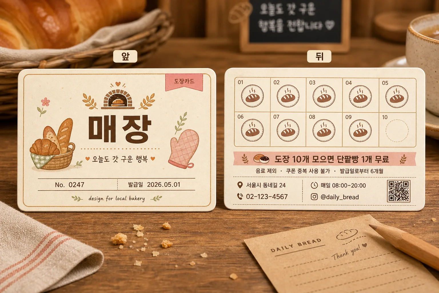
매장에서 쓰는 단골 쿠폰 또는 도장카드 디자인 시안 — 앞·뒤면 같이 보여주는 mockup. 매장 + 혜택 입력하면 인쇄 가능한 시안으로 변환.
단골 쿠폰·도장카드 디자인 summary
Copy this ChatGPT image prompt to create Merch/Mockups results. Its subject, background, style, and composition are organized for quick iteration.
Related keywords: 단골 쿠폰·도장카드 디자인, 단골 쿠폰·도장카드 디자인 프롬프트, Merch/Mockups 프롬프트, Merch/Mockups AI 이미지 프롬프트, ChatGPT 이미지 프롬프트, AI 이미지 생성 프롬프트, AI 프롬프트, 이미지 프롬프트
How to use 단골 쿠폰·도장카드 디자인
Keep the prompt structure and swap the subject, background, palette, or composition to create new variations.
- Keep the main subject and adjust the palette and background for your brand, season, or channel.
- If the result feels busy, simplify the background and make the subject, composition, and lighting more specific.
- After copying, ask ChatGPT to adapt it for your platform, aspect ratio, or text requirements.
Original prompt
[Input]
- language: Korean
- output_size: 1536x1024

[Purpose]
Korean small-business loyalty coupon / stamp card print mockup design, showing front and back sides side by side in a realistic tabletop catalog presentation.
A horizontal business-card format stamp card for a neighborhood bakery, suitable for print preview, local shop branding, and social-media portfolio use, with real printed-card details and customer-facing information.

[Composition]
- Place two printed cards side by side on a warm bakery tabletop, with the left card as the front and the right card as the back; each card should occupy about 38% of the frame width, with a readable center gap of 6–8%.
- Add small rounded labels above or near each card: “앞” on the left card and “뒤” on the right card, using crisp, legible Korean text.
- Use {배경 스타일} as the tabletop context: warm natural wood grain, a softly blurred cafe counter feeling, subtle paper fibers, and natural printed-stock texture.
- Add realistic bakery-stationery surroundings such as a folded linen napkin edge, a kraft paper receipt corner, a wooden pencil, a few tiny bread crumbs, and the partial rim of a coffee cup or ceramic saucer at the frame edge, keeping the cards as the clear main subject.
- Use {카드 사이즈 및 방향} as the physical format reference, showing a true horizontal business-card proportion with slight perspective tilt, soft contact shadows, rounded corners, and visible paper thickness.

[Core Structure]
- Front card area: Show a refined bakery loyalty card front with {매장 이름} as the main brand text, a simple bakery logo mark, and a small illustration that matches {매장 컨셉}, such as a croissant, baguette, wheat sprig, oven mitt, or warm shop-window icon.
- Front card details: Include {카드 종류} as a small label, a short Korean tagline such as “오늘도 갓 구운 행복”, a member number line “No. 0247”, an issue date “발급일 2026.05.01”, and a tiny credit line “design for local bakery”.
- Back card area: Display a 10-slot stamp grid arranged neatly in two rows of five, exactly 10 total stamp slots; show nine slots with warm cocoa-brown bakery stamps and the final slot empty for completion tracking.
- Benefit section: Place {혜택 내용} prominently beneath or beside the stamp grid, in a clear customer-facing notice style; also include the exact benefit line “도장 10개 모으면 단팥빵 1개 무료”.
- Usage notes: Add realistic small Korean guidance text such as “음료 제외 · 쿠폰 중복 사용 불가 · 발급일로부터 6개월”, separated by fine dividers.
- Store info section: Include small, neatly aligned printed fields for address, phone number, opening hours, and Instagram handle, such as “서울시 동네길 24”, “02-123-4567”, “매일 08:00–20:00”, “@daily_bread”.
- Decorative layout: Use dotted separators, tiny wheat icons, stamp-number captions “01–10”, a small QR-code-like square, and subtle flour-dust speckling printed into the card design for realism.
- Visual labeling: Add “앞” and “뒤” labels with small rounded tag styling, positioned so they do not overlap the card artwork.
- Print-mockup treatment: Show subtle paper thickness, rounded corners, a fine paper edge highlight, mild ink texture, and realistic shadowing to make the cards feel like actual printed stock placed on a table.

[Style Rules]
- Typography: Use Pretendard Bold for {매장 이름}, Pretendard Medium for supporting copy, Pretendard SemiBold for benefit and section labels, and a clean handwritten accent only for tiny decorative notes; keep all important Korean text crisp and balanced.
- Color palette: Soft cream #FFF7E8, baked beige #E8D2B1, cocoa brown #6B4A2B, muted orange #E89A5B, pastel pink #F4B7C2, sage #B7C7A1, and warm charcoal #3A2F2A.
- Border/shadow: Rounded card corners with a thin 1.5px outline, soft drop shadow with 4px y-offset, 14px blur, and 18% opacity; add a slightly lighter paper edge highlight and a faint letterpress-like printed ink impression.
- Design tone: Keep the overall look aligned with {디자인 톤}, using small decorative bakery motifs such as bread icons, dotted separators, tiny flourishes, wheat sprigs, stamp rings, and soft background patterning.
- Printed realism: Slightly vary the ink density on stamped marks, include delicate paper grain, and make the mockup feel like a real loyalty card photographed after being placed on a bakery counter.

[Visual Style]
- Camera / lens: Overhead-leaning product mockup shot, captured like a 50mm lens tabletop editorial with mild perspective, f/5.6, sharp print detail and controlled depth.
- Lighting: Soft diffused studio light from upper-left at 45°, with a gentle fill from the right and a subtle warm bounce from the wood surface.
- Color grade: Warm cream and caramel grade with slight pastel emphasis, similar to a lifestyle stationery catalog or Japanese cafe branding shoot.
- Material detail: Matte coated paper, softly rounded die-cut edges, visible paper thickness, natural wood grain, ceramic highlight from the coffee cup edge, and gentle tactile shadows around stationery props.

[Mood]
A boutique bakery stationery mockup — Kinfolk-style product layout meets a Japanese cafe stamp-card design aesthetic, warm, friendly, handcrafted, and believable as a real neighborhood bakery loyalty card.

[Critical]
- Korean text accuracy: 반드시 정확히 렌더링되어야 하는 문구: “앞”, “뒤”, “도장 10개 모으면 단팥빵 1개 무료”, “{매장 이름}”.
- Additional Korean text to render clearly where included: “오늘도 갓 구운 행복”, “발급일 2026.05.01”, “음료 제외”, “쿠폰 중복 사용 불가”, “서울시 동네길 24”, “02-123-4567”, “매일 08:00–20:00”, “@daily_bread”.
- The front and back cards must remain clearly separated, with no overlap that makes either side hard to read.
- Stamp grid invariant: exactly 10 stamp slots, evenly spaced and aligned in a clean two-row layout.
- The card format must stay horizontal and consistent with a business-card proportion.
- {매장 이름}, {매장 컨셉}, {혜택 내용}, {카드 종류}, {카드 사이즈 및 방향}, {디자인 톤}, and {배경 스타일} must be reflected without changing the placeholder names.

[8. 🚫 PROHIBITED]
- Fake official seals / certifications
- Broken Korean characters