グッズ・モックアップ
단골 쿠폰·도장카드 디자인
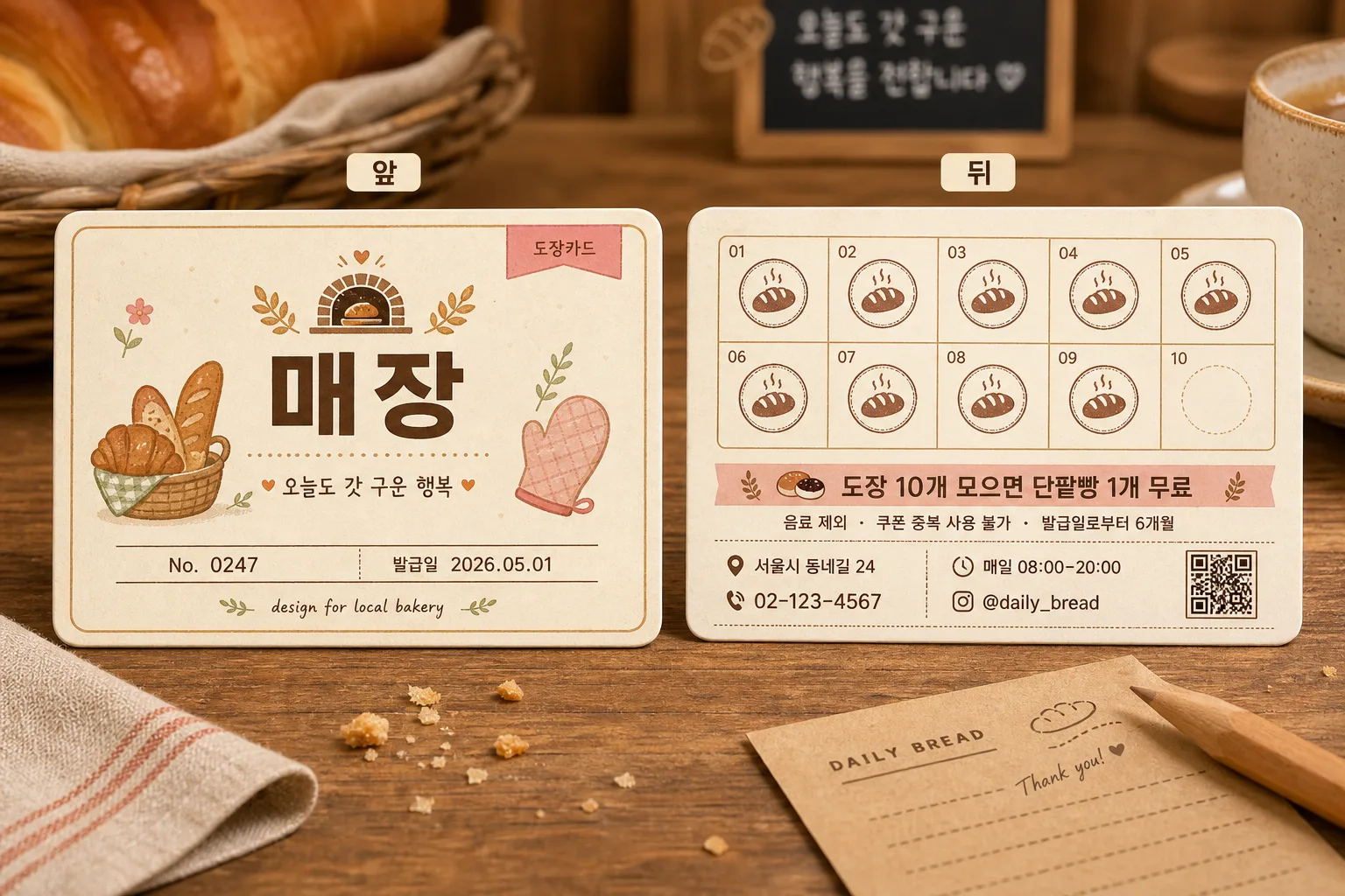
매장에서 쓰는 단골 쿠폰 또는 도장카드 디자인 시안 — 앞·뒤면 같이 보여주는 mockup. 매장 + 혜택 입력하면 인쇄 가능한 시안으로 변환.
단골 쿠폰·도장카드 디자인の概要
グッズ・モックアップ画像を作るためのChatGPT画像プロンプトです。主題、背景、スタイル、構図を整理し、すぐに試せるよう構成しています。
関連キーワード: 단골 쿠폰·도장카드 디자인, 단골 쿠폰·도장카드 디자인 프롬프트, グッズ・モックアップ 프롬프트, グッズ・モックアップ AI 이미지 프롬프트, ChatGPT 이미지 프롬프트, AI 이미지 생성 프롬프트, AI 프롬프트, 이미지 프롬프트
단골 쿠폰·도장카드 디자인の活用方法
元の構造を保ちながら、被写体、背景、色、構図を変更して別案に展開できます。
- 主題を維持し、ブランドや季節、媒体に合わせて色と背景を変更してください。
- 結果が複雑な場合は背景要素を減らし、被写体、構図、照明を具体化してください。
- コピー後、ChatGPTに媒体、アスペクト比、文字の有無を追加で指定できます。
プロンプト原文
[Input]
- language: Korean
- output_size: 1536x1024

[Purpose]
Korean small-business loyalty coupon / stamp card print mockup design, showing front and back sides side by side in a realistic tabletop catalog presentation.
A horizontal business-card format stamp card for a neighborhood bakery, suitable for print preview, local shop branding, and social-media portfolio use, with real printed-card details and customer-facing information.

[Composition]
- Place two printed cards side by side on a warm bakery tabletop, with the left card as the front and the right card as the back; each card should occupy about 38% of the frame width, with a readable center gap of 6–8%.
- Add small rounded labels above or near each card: “앞” on the left card and “뒤” on the right card, using crisp, legible Korean text.
- Use {배경 스타일} as the tabletop context: warm natural wood grain, a softly blurred cafe counter feeling, subtle paper fibers, and natural printed-stock texture.
- Add realistic bakery-stationery surroundings such as a folded linen napkin edge, a kraft paper receipt corner, a wooden pencil, a few tiny bread crumbs, and the partial rim of a coffee cup or ceramic saucer at the frame edge, keeping the cards as the clear main subject.
- Use {카드 사이즈 및 방향} as the physical format reference, showing a true horizontal business-card proportion with slight perspective tilt, soft contact shadows, rounded corners, and visible paper thickness.

[Core Structure]
- Front card area: Show a refined bakery loyalty card front with {매장 이름} as the main brand text, a simple bakery logo mark, and a small illustration that matches {매장 컨셉}, such as a croissant, baguette, wheat sprig, oven mitt, or warm shop-window icon.
- Front card details: Include {카드 종류} as a small label, a short Korean tagline such as “오늘도 갓 구운 행복”, a member number line “No. 0247”, an issue date “발급일 2026.05.01”, and a tiny credit line “design for local bakery”.
- Back card area: Display a 10-slot stamp grid arranged neatly in two rows of five, exactly 10 total stamp slots; show nine slots with warm cocoa-brown bakery stamps and the final slot empty for completion tracking.
- Benefit section: Place {혜택 내용} prominently beneath or beside the stamp grid, in a clear customer-facing notice style; also include the exact benefit line “도장 10개 모으면 단팥빵 1개 무료”.
- Usage notes: Add realistic small Korean guidance text such as “음료 제외 · 쿠폰 중복 사용 불가 · 발급일로부터 6개월”, separated by fine dividers.
- Store info section: Include small, neatly aligned printed fields for address, phone number, opening hours, and Instagram handle, such as “서울시 동네길 24”, “02-123-4567”, “매일 08:00–20:00”, “@daily_bread”.
- Decorative layout: Use dotted separators, tiny wheat icons, stamp-number captions “01–10”, a small QR-code-like square, and subtle flour-dust speckling printed into the card design for realism.
- Visual labeling: Add “앞” and “뒤” labels with small rounded tag styling, positioned so they do not overlap the card artwork.
- Print-mockup treatment: Show subtle paper thickness, rounded corners, a fine paper edge highlight, mild ink texture, and realistic shadowing to make the cards feel like actual printed stock placed on a table.

[Style Rules]
- Typography: Use Pretendard Bold for {매장 이름}, Pretendard Medium for supporting copy, Pretendard SemiBold for benefit and section labels, and a clean handwritten accent only for tiny decorative notes; keep all important Korean text crisp and balanced.
- Color palette: Soft cream #FFF7E8, baked beige #E8D2B1, cocoa brown #6B4A2B, muted orange #E89A5B, pastel pink #F4B7C2, sage #B7C7A1, and warm charcoal #3A2F2A.
- Border/shadow: Rounded card corners with a thin 1.5px outline, soft drop shadow with 4px y-offset, 14px blur, and 18% opacity; add a slightly lighter paper edge highlight and a faint letterpress-like printed ink impression.
- Design tone: Keep the overall look aligned with {디자인 톤}, using small decorative bakery motifs such as bread icons, dotted separators, tiny flourishes, wheat sprigs, stamp rings, and soft background patterning.
- Printed realism: Slightly vary the ink density on stamped marks, include delicate paper grain, and make the mockup feel like a real loyalty card photographed after being placed on a bakery counter.

[Visual Style]
- Camera / lens: Overhead-leaning product mockup shot, captured like a 50mm lens tabletop editorial with mild perspective, f/5.6, sharp print detail and controlled depth.
- Lighting: Soft diffused studio light from upper-left at 45°, with a gentle fill from the right and a subtle warm bounce from the wood surface.
- Color grade: Warm cream and caramel grade with slight pastel emphasis, similar to a lifestyle stationery catalog or Japanese cafe branding shoot.
- Material detail: Matte coated paper, softly rounded die-cut edges, visible paper thickness, natural wood grain, ceramic highlight from the coffee cup edge, and gentle tactile shadows around stationery props.

[Mood]
A boutique bakery stationery mockup — Kinfolk-style product layout meets a Japanese cafe stamp-card design aesthetic, warm, friendly, handcrafted, and believable as a real neighborhood bakery loyalty card.

[Critical]
- Korean text accuracy: 반드시 정확히 렌더링되어야 하는 문구: “앞”, “뒤”, “도장 10개 모으면 단팥빵 1개 무료”, “{매장 이름}”.
- Additional Korean text to render clearly where included: “오늘도 갓 구운 행복”, “발급일 2026.05.01”, “음료 제외”, “쿠폰 중복 사용 불가”, “서울시 동네길 24”, “02-123-4567”, “매일 08:00–20:00”, “@daily_bread”.
- The front and back cards must remain clearly separated, with no overlap that makes either side hard to read.
- Stamp grid invariant: exactly 10 stamp slots, evenly spaced and aligned in a clean two-row layout.
- The card format must stay horizontal and consistent with a business-card proportion.
- {매장 이름}, {매장 컨셉}, {혜택 내용}, {카드 종류}, {카드 사이즈 및 방향}, {디자인 톤}, and {배경 스타일} must be reflected without changing the placeholder names.

[8. 🚫 PROHIBITED]
- Fake official seals / certifications
- Broken Korean characters