グッズ・モックアップ
상품 라벨·스티커 + 박스 패키지 디자인
핸드메이드 잼·소스·간식·차·디퓨저 등 소상공인 상품 라벨·스티커 + 박스/병 mockup. 제품·재료·매장 입력하면 인쇄 가능한 라벨 + 패키지 시안.
상품 라벨·스티커 + 박스 패키지 디자인の概要
グッズ・モックアップ画像を作るためのChatGPT画像プロンプトです。主題、背景、スタイル、構図を整理し、すぐに試せるよう構成しています。
関連キーワード: 상품 라벨·스티커 + 박스 패키지 디자인, 상품 라벨·스티커 + 박스 패키지 디자인 프롬프트, グッズ・モックアップ 프롬프트, グッズ・モックアップ AI 이미지 프롬프트, ChatGPT 이미지 프롬프트, AI 이미지 생성 프롬프트, AI 프롬프트, 이미지 프롬프트
상품 라벨·스티커 + 박스 패키지 디자인の活用方法
元の構造を保ちながら、被写体、背景、色、構図を変更して別案に展開できます。
- 主題を維持し、ブランドや季節、媒体に合わせて色と背景を変更してください。
- 結果が複雑な場合は背景要素を減らし、被写体、構図、照明を具体化してください。
- コピー後、ChatGPTに媒体、アスペクト比、文字の有無を追加で指定できます。
プロンプト原文
[Input]
- language: Korean
- output_size: 1024x1536

[Purpose]
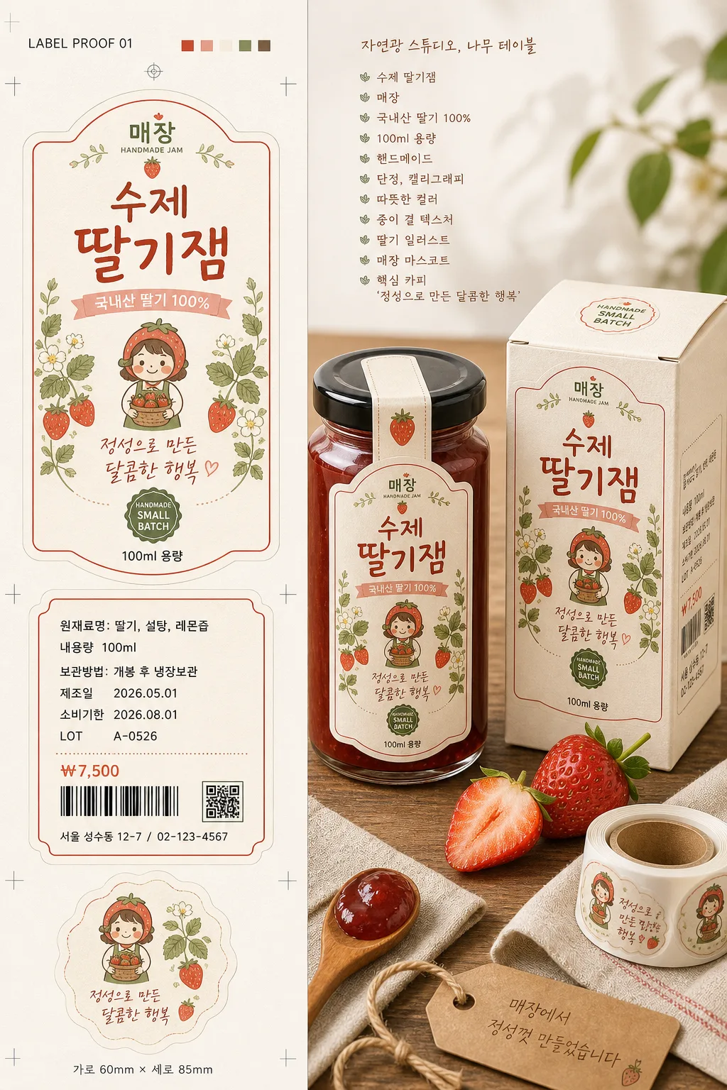
Korean small-business handmade product label, sticker, and box packaging mockup, showing both the flat print artwork and the applied real-world packaging on one vertical canvas.
Print-ready label design guide meets realistic product catalog photography, suitable for brand presentation, online shop listing, market booth promotion, and packaging approval review.

[Composition]
- Two-part layout: left side displays the unfolded label/sticker artwork as a flat design proof sheet, right side displays the same design applied to the finished {용기형태} and matching box package.
- Main subject placement: the packaging mockup occupies about 55% of the frame on the right, while the label design proof occupies about 45% on the left with a clear editorial split and balanced visual weight.
- Background treatment: natural light studio setting with a light wooden table surface, subtle paper grain overlay, warm off-white backdrop, and realistic small-batch product styling elements such as fresh strawberries, a folded linen cloth, kraft paper scraps, twine, a wooden spoon, and a small sticker roll.
- Spacing and framing: straight-on print proof presentation on the left, slight perspective depth on the mockup side, with the packaging set arranged like a real handmade shop catalog photo.
- Include {제품명}, {매장명}, {제품특징}, {디자인컨셉}, {라벨요소}, and {목업배경} as editable content references.

[3. CORE STRUCTURE]
1. Left design sheet area: present the label artwork as a flat print layout with trim edges, crop marks feel, die-cut sticker outlines, small color swatches, registration marks, and a proof-sheet note reading "LABEL PROOF 01".
2. Label hierarchy: place {제품명} as the largest Korean text element, {매장명} as the logo or masthead, {제품특징} as supporting information, and a short slogan area using the core copy from {라벨요소}.
3. Real packaging information: add believable label details including "원재료명: 딸기, 설탕, 레몬즙", "내용량 100ml", "보관방법: 개봉 후 냉장보관", "제조일 2026.05.01", "소비기한 2026.08.01", "LOT A-0526", "₩7,500", a small barcode block, a tiny QR-style square, and a store contact line "서울 성수동 12-7 / 02-123-4567".
4. Decorative details: add botanical and strawberry motif illustrations that match {라벨요소}, with handmade line art, small berry icons, soft sage leaves, dotted divider rules, a scalloped sticker edge, and a non-official decorative badge reading "SMALL BATCH".
5. Right mockup area: show the label wrapped on a realistic {용기형태}, with the same design applied to the front face, plus a matching paper box standing beside it or slightly behind it; include visible box side-panel text, top flap seam, bottom fold line, and a small round sealing sticker on the box lid.
6. Material rendering: use matte paper label texture, subtle emboss/deboss suggestion on the product name, semi-matte sticker surface, box board fiber, slight glue seam, tiny paper edge thickness, realistic reflections on glass or plastic, and soft contact shadows.
7. Background scene: stage the mockup on {목업배경}, with gentle daylight reflections, fresh strawberry pieces near the jar, a teaspoon with a glossy jam smear, folded linen, kraft hang tag, and extra loose stickers to make the setup feel like a real small-batch studio product shoot.
8. Typography rendering: ensure the Korean copy is crisp, evenly kerned, and aligned, with the label version and mockup version matching exactly in wording, color, and layout logic.

[4. STYLE RULES]
- Typography: use a mix of handwritten calligraphy for accent phrases and clean sans-serif fonts such as Pretendard or Noto Sans KR for the product information; headline weight 700-800, body weight 400-500, small size labels around 18-28px equivalent.
- Color palette: warm cream #F6EFE6, strawberry red #D94B4B, muted pink #E9B7B7, soft sage #A9B7A5, cocoa brown #6D4C41, charcoal #2B2B2B.
- Border/shadow: thin 1px outline where needed, soft drop shadow with 4px y-offset, 12px blur, 15% opacity for the mockup objects, natural contact shadows under jar, box, stickers, spoon, and fruit.
- Texture: visible paper fiber texture, lightly recycled paper feel, semi-matte label surface, cardboard box grain, linen weave, strawberry skin texture, glossy jam highlights, and gentle tabletop wood grain.
- Print details: include a barcode area, QR-style square, batch/date stamp, price, ingredient strip, net volume, care instruction line, small decorative dividers, and side-label microcopy while keeping all important Korean readable.

[5. VISUAL STYLE]
- Camera / lens: studio product photography with a 50mm lens at f/5.6 for the flat layout area and a 70mm equivalent look for the mockup, controlled perspective, sharp focus across the packaging.
- Lighting: soft window light from upper-left at about 45°, gentle fill from front-right, slight rim highlight on the bottle edge and box corners, natural daylight with even exposure.
- Color grade: warm cream and strawberry tones with muted natural greens, slightly desaturated editorial packaging color grade, subtle contrast, clean whites without blue cast.
- Realism: believable scale relationships between label sheet, jar, box, loose stickers, fruit, spoon, and tag; label curvature should follow the {용기형태} surface with mild paper thickness visible at the edges.

[6. MOOD]
Boutique handmade food packaging editorial — like a thoughtfully styled Kinfolk product spread mixed with a real small-business catalog shoot, warm market-stall charm, and polished print proof presentation.

[7. CRITICAL]
- Korean text accuracy: 반드시 정확히 렌더링되어야 하는 문자열: "수제 딸기잼", "매장", "국내산 딸기 100%, 100ml 용량", "정성으로 만든 달콤한 행복".
- Additional Korean packaging text should be realistic and legible: "원재료명: 딸기, 설탕, 레몬즙", "내용량 100ml", "보관방법: 개봉 후 냉장보관", "제조일 2026.05.01", "소비기한 2026.08.01", "LOT A-0526", "₩7,500".
- The left flat label design and the right applied mockup must match in wording, color palette, typography, motif placement, and visual identity.
- Packaging anatomy: the {용기형태} must look physically plausible, with label placement aligned to the container curvature, correct box proportions, believable flap seams, and realistic paper thickness.
- All Korean typography must be clean, legible, and free from broken characters or incorrect spacing.

[8. 🚫 PROHIBITED]
- Fake official seals / certifications
- Broken Korean characters
- Celebrity composites / unauthorized likeness