広告・ポスター
사이드 프로젝트 런칭 hero
프로토타입·모형 사진 → 런칭 페이지 hero.
사이드 프로젝트 런칭 heroの概要
広告・ポスター画像を作るためのChatGPT画像プロンプトです。主題、背景、スタイル、構図を整理し、すぐに試せるよう構成しています。
関連キーワード: 사이드 프로젝트 런칭 hero, 사이드 프로젝트 런칭 hero 프롬프트, 広告・ポスター 프롬프트, 広告・ポスター AI 이미지 프롬프트, ChatGPT 이미지 프롬프트, AI 이미지 생성 프롬프트, AI 프롬프트, 이미지 프롬프트
사이드 프로젝트 런칭 heroの活用方法
元の構造を保ちながら、被写体、背景、色、構図を変更して別案に展開できます。
- 主題を維持し、ブランドや季節、媒体に合わせて色と背景を変更してください。
- 結果が複雑な場合は背景要素を減らし、被写体、構図、照明を具体化してください。
- コピー後、ChatGPTに媒体、アスペクト比、文字の有無を追加で指定できます。
プロンプト原文
[Input]
- reference_image: {참고 이미지}
- language: Korean
- output_size: 1024x1536

[Purpose]
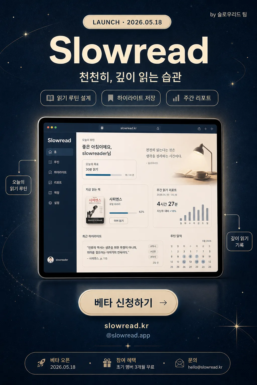
Korean side-project launch hero banner for social sharing and beta-signup conversion.
Editorial product-launch poster with a central demo focus, strong title hierarchy, launch information, feature teasers, and one clear CTA.

[Composition]
- Compose a vertical {비율} poster for 1024x1536 social sharing, with the central product demo occupying about 55–60% of the frame and aligned to the vertical center.
- Background treatment: midnight blue surface using {컬러 팔레트}, subtle paper grain, faint cream halo around the product demo, and delicate launch-themed decorative graphics such as small star dots, thin orbit lines, and tiny annotation arrows.
- Keep {프로젝트 이름} near the upper third with a small launch label above it, then stack {태그라인} and feature chips below for a clear product-story hierarchy.
- Use {참고 이미지} as the main visual anchor, presented like a polished app/browser prototype mockup with realistic depth, soft reflection, and crisp readable UI details.
- Place the CTA area near the lower third with {CTA}, {웹사이트}, {베타 혜택}, and a compact launch-info strip so the design feels like a real launch poster rather than a plain title card.

[3. CORE STRUCTURE]
1. Launch label area (top 10%): Add a small cream capsule reading "LAUNCH · {런칭일}" and a tiny right-aligned credit "by {팀명}".
2. Header area (top 22%): Set {프로젝트 이름} in large bold type, centered, high contrast against the midnight blue field; place {태그라인} directly below in smaller medium weight type.
3. Feature teaser row (upper-middle): Add three compact rounded chips beneath the tagline: "{기능1}", "{기능2}", "{기능3}". Use cream outlines and soft blue-gray text so they read as product benefits.
4. Hero area (mid 55–60%): Place {참고 이미지} cleanly centered as the main product demo, with a soft realistic shadow underneath, slight blur, and a faint cream rim light so it feels lifted from the background.
5. Detail callouts: Add two small editorial callout labels connected with thin lines to the hero image: "오늘의 읽기 루틴" and "깊이 읽기 기록"; keep them secondary to the main demo.
6. CTA area (bottom 18–20%): Place {CTA} inside a cream rounded pill button, centered, with clear padding and thumbnail-safe readability. Under it add "{웹사이트}" and "{SNS핸들}" in small type.
7. Launch info strip (bottom edge): Add a slim footer band with "베타 오픈 {런칭일}", "참여 혜택 {베타 혜택}", and "문의 {문의메일}" separated by small dot dividers.

[4. STYLE RULES]
- Typography: use Pretendard Bold for {프로젝트 이름} at headline scale, Pretendard SemiBold for launch labels and feature chips, and Noto Sans KR Medium/Regular for {태그라인}, {CTA}, footer information, and callouts.
- Color palette: follow {컬러 팔레트}; prioritize Midnight Blue #2c3e50, Cream #f5f5dc, White #ffffff, Soft Blue-Gray #9fb0bf, and a restrained Pale Gold accent #d9c58a for launch highlights.
- Border/shadow: apply a soft drop shadow with 4px y-offset, 12px blur, 15% opacity to the hero and key text; the CTA pill can use a faint inner highlight, a 1px cream border, and a subtle pressed-button shadow.
- Decorative system: use fine editorial lines, small coordinate marks, star-like dots, and soft gradient glows to support the product-launch mood without competing with the title or CTA.
- Layout rhythm: keep all primary text stacked on one centered vertical axis while secondary labels, footer details, and callouts add realistic launch-poster information around the hero.

[5. VISUAL STYLE]
- Camera / lens: Canon EOS 5D Mark IV look with a 50mm lens at f/2.8, producing clean product-shot depth without wide-angle distortion.
- Lighting: softbox key light from upper-left at 45°, with a gentle fill from the right to maintain readable contrast on the hero and typography.
- Color grade: modern warm-cream highlights over deep midnight-blue shadows, with restrained contrast and a polished startup-launch finish.
- Material feel: premium paper-grain poster texture, smooth glassy app mockup surface, soft cream glow accents, and realistic layered shadows.

[6. MOOD]
Modern tech launch aesthetic — sleek Apple keynote energy mixed with a clean Notion / Linear-style product hero, enriched with indie-maker launch details and editorial poster credibility.

[7. CRITICAL]
- Korean text accuracy: the rendered image must show exactly these strings: "{프로젝트 이름}", "{태그라인}", "{CTA}", "{런칭일}", "{팀명}", "{기능1}", "{기능2}", "{기능3}", "{웹사이트}", "{SNS핸들}", "{베타 혜택}", "{문의메일}".
- The launch label must read exactly: "LAUNCH · {런칭일}".
- The footer must include these Korean phrases exactly: "베타 오픈 {런칭일}", "참여 혜택 {베타 혜택}", "문의 {문의메일}".
- Maintain the {비율} aspect ratio and keep the central hero aligned on the vertical axis.
- Ensure the reference image remains clearly recognizable, crisp, and not hidden behind typography or decorative graphics.

[8. 🚫 PROHIBITED]
- Fake official seals or government-style certification marks
- Broken Korean characters
- Celebrity composites or unauthorized celebrity likenesses