廣告/海報
사이드 프로젝트 런칭 hero
프로토타입·모형 사진 → 런칭 페이지 hero.
사이드 프로젝트 런칭 hero摘要
這是用來製作廣告/海報內容的 ChatGPT 圖像提示詞,已整理主題、背景、風格與構圖,方便快速調整。
相關關鍵字: 사이드 프로젝트 런칭 hero, 사이드 프로젝트 런칭 hero 프롬프트, 廣告/海報 프롬프트, 廣告/海報 AI 이미지 프롬프트, ChatGPT 이미지 프롬프트, AI 이미지 생성 프롬프트, AI 프롬프트, 이미지 프롬프트
사이드 프로젝트 런칭 hero使用方式
保留原始結構並替換主體、背景、色彩或構圖,即可延伸出不同版本。
- 保留核心主體,並依品牌、季節或平台調整色彩與背景。
- 如果畫面太複雜,請減少背景元素並具體描述主體、構圖與光線。
- 複製後可要求 ChatGPT 配合平台、長寬比或文字需求調整。
提示詞原文
[Input]
- reference_image: {참고 이미지}
- language: Korean
- output_size: 1024x1536

[Purpose]
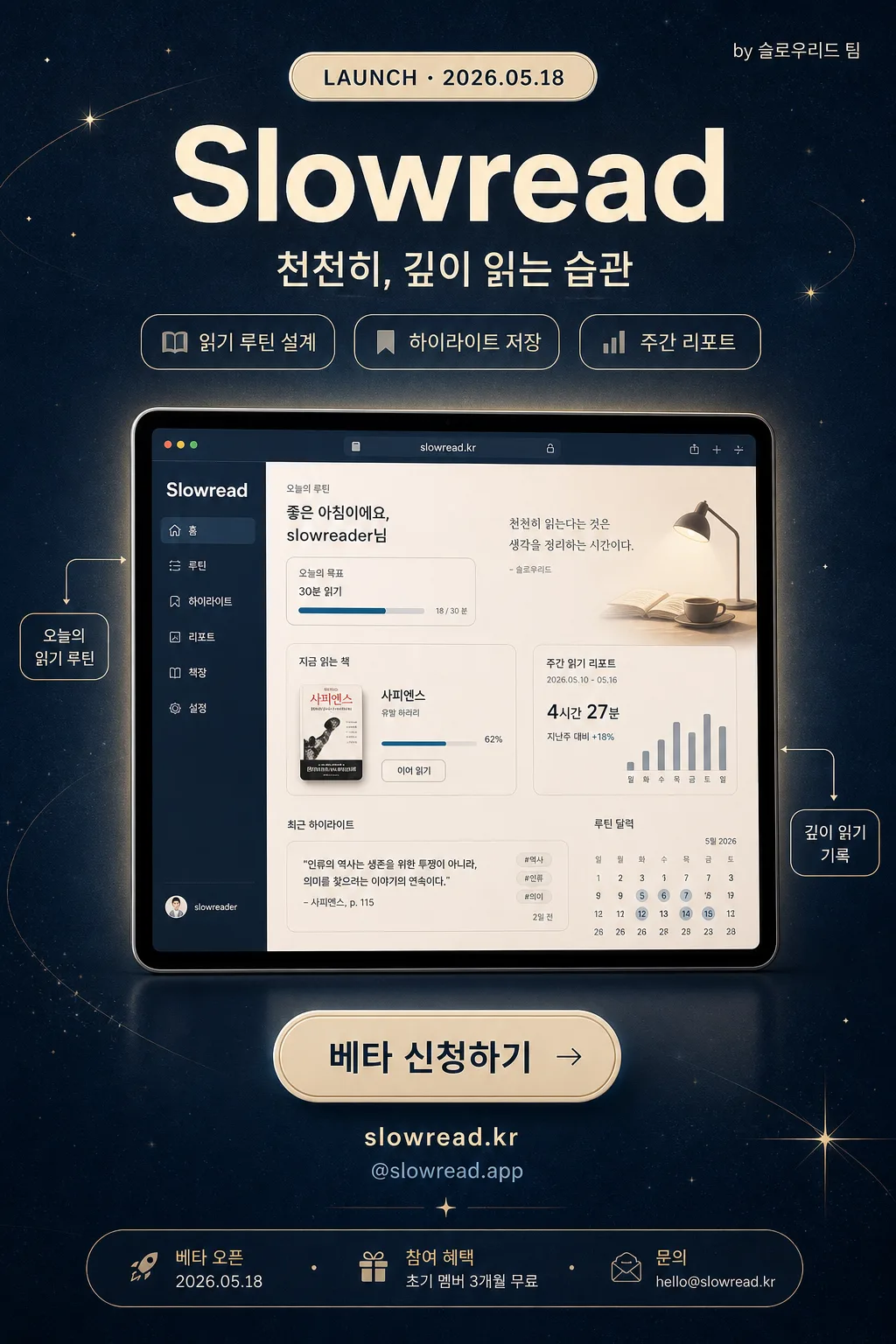
Korean side-project launch hero banner for social sharing and beta-signup conversion.
Editorial product-launch poster with a central demo focus, strong title hierarchy, launch information, feature teasers, and one clear CTA.

[Composition]
- Compose a vertical {비율} poster for 1024x1536 social sharing, with the central product demo occupying about 55–60% of the frame and aligned to the vertical center.
- Background treatment: midnight blue surface using {컬러 팔레트}, subtle paper grain, faint cream halo around the product demo, and delicate launch-themed decorative graphics such as small star dots, thin orbit lines, and tiny annotation arrows.
- Keep {프로젝트 이름} near the upper third with a small launch label above it, then stack {태그라인} and feature chips below for a clear product-story hierarchy.
- Use {참고 이미지} as the main visual anchor, presented like a polished app/browser prototype mockup with realistic depth, soft reflection, and crisp readable UI details.
- Place the CTA area near the lower third with {CTA}, {웹사이트}, {베타 혜택}, and a compact launch-info strip so the design feels like a real launch poster rather than a plain title card.

[3. CORE STRUCTURE]
1. Launch label area (top 10%): Add a small cream capsule reading "LAUNCH · {런칭일}" and a tiny right-aligned credit "by {팀명}".
2. Header area (top 22%): Set {프로젝트 이름} in large bold type, centered, high contrast against the midnight blue field; place {태그라인} directly below in smaller medium weight type.
3. Feature teaser row (upper-middle): Add three compact rounded chips beneath the tagline: "{기능1}", "{기능2}", "{기능3}". Use cream outlines and soft blue-gray text so they read as product benefits.
4. Hero area (mid 55–60%): Place {참고 이미지} cleanly centered as the main product demo, with a soft realistic shadow underneath, slight blur, and a faint cream rim light so it feels lifted from the background.
5. Detail callouts: Add two small editorial callout labels connected with thin lines to the hero image: "오늘의 읽기 루틴" and "깊이 읽기 기록"; keep them secondary to the main demo.
6. CTA area (bottom 18–20%): Place {CTA} inside a cream rounded pill button, centered, with clear padding and thumbnail-safe readability. Under it add "{웹사이트}" and "{SNS핸들}" in small type.
7. Launch info strip (bottom edge): Add a slim footer band with "베타 오픈 {런칭일}", "참여 혜택 {베타 혜택}", and "문의 {문의메일}" separated by small dot dividers.

[4. STYLE RULES]
- Typography: use Pretendard Bold for {프로젝트 이름} at headline scale, Pretendard SemiBold for launch labels and feature chips, and Noto Sans KR Medium/Regular for {태그라인}, {CTA}, footer information, and callouts.
- Color palette: follow {컬러 팔레트}; prioritize Midnight Blue #2c3e50, Cream #f5f5dc, White #ffffff, Soft Blue-Gray #9fb0bf, and a restrained Pale Gold accent #d9c58a for launch highlights.
- Border/shadow: apply a soft drop shadow with 4px y-offset, 12px blur, 15% opacity to the hero and key text; the CTA pill can use a faint inner highlight, a 1px cream border, and a subtle pressed-button shadow.
- Decorative system: use fine editorial lines, small coordinate marks, star-like dots, and soft gradient glows to support the product-launch mood without competing with the title or CTA.
- Layout rhythm: keep all primary text stacked on one centered vertical axis while secondary labels, footer details, and callouts add realistic launch-poster information around the hero.

[5. VISUAL STYLE]
- Camera / lens: Canon EOS 5D Mark IV look with a 50mm lens at f/2.8, producing clean product-shot depth without wide-angle distortion.
- Lighting: softbox key light from upper-left at 45°, with a gentle fill from the right to maintain readable contrast on the hero and typography.
- Color grade: modern warm-cream highlights over deep midnight-blue shadows, with restrained contrast and a polished startup-launch finish.
- Material feel: premium paper-grain poster texture, smooth glassy app mockup surface, soft cream glow accents, and realistic layered shadows.

[6. MOOD]
Modern tech launch aesthetic — sleek Apple keynote energy mixed with a clean Notion / Linear-style product hero, enriched with indie-maker launch details and editorial poster credibility.

[7. CRITICAL]
- Korean text accuracy: the rendered image must show exactly these strings: "{프로젝트 이름}", "{태그라인}", "{CTA}", "{런칭일}", "{팀명}", "{기능1}", "{기능2}", "{기능3}", "{웹사이트}", "{SNS핸들}", "{베타 혜택}", "{문의메일}".
- The launch label must read exactly: "LAUNCH · {런칭일}".
- The footer must include these Korean phrases exactly: "베타 오픈 {런칭일}", "참여 혜택 {베타 혜택}", "문의 {문의메일}".
- Maintain the {비율} aspect ratio and keep the central hero aligned on the vertical axis.
- Ensure the reference image remains clearly recognizable, crisp, and not hidden behind typography or decorative graphics.

[8. 🚫 PROHIBITED]
- Fake official seals or government-style certification marks
- Broken Korean characters
- Celebrity composites or unauthorized celebrity likenesses