Hobbies/Lifestyle
손금 분석 리포트
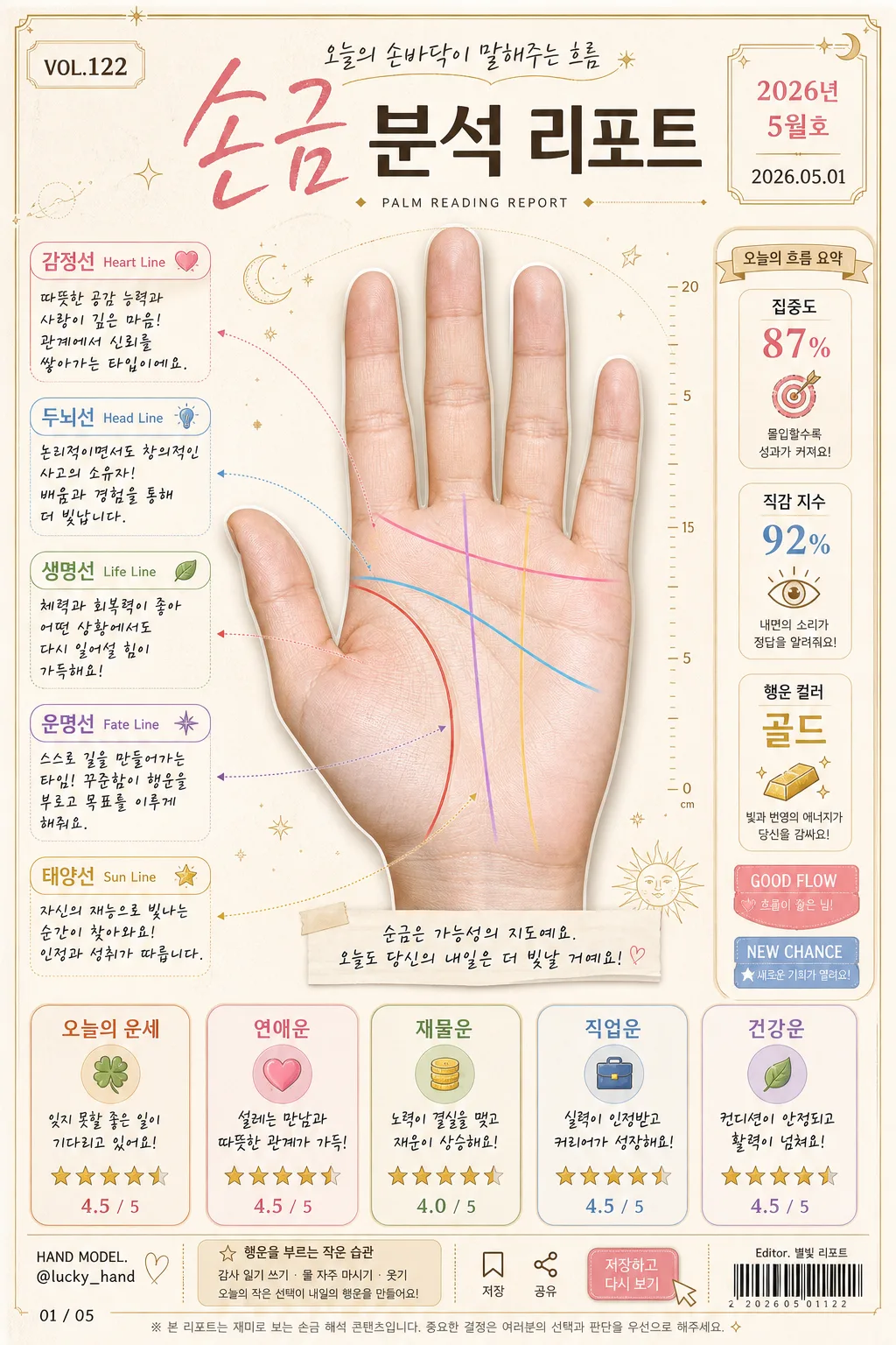
손바닥 사진을 reference로 박으면 생명선·감정선·두뇌선·운명선 등 주요 손금 라인 + 한글 분석 리포트로 변환. 재미용 콘텐츠 톤.
손금 분석 리포트 summary
Copy this ChatGPT image prompt to create Hobbies/Lifestyle results. Its subject, background, style, and composition are organized for quick iteration.
Related keywords: 손금 분석 리포트, 손금 분석 리포트 프롬프트, Hobbies/Lifestyle 프롬프트, Hobbies/Lifestyle AI 이미지 프롬프트, ChatGPT 이미지 프롬프트, AI 이미지 생성 프롬프트, AI 프롬프트, 이미지 프롬프트
How to use 손금 분석 리포트
Keep the prompt structure and swap the subject, background, palette, or composition to create new variations.
- Keep the main subject and adjust the palette and background for your brand, season, or channel.
- If the result feels busy, simplify the background and make the subject, composition, and lighting more specific.
- After copying, ask ChatGPT to adapt it for your platform, aspect ratio, or text requirements.
Original prompt
[Input]
- reference_image: {참고 이미지}
- language: Korean
- output_size: 1024x1536

[Purpose]
Korean palmistry analysis report infographic, vertical fortune-card layout, social-media-friendly editorial poster.
Combine a realistic hand-scan presentation with playful fortune-analysis panels, date-stamped report details, and shareable card-news styling for casual reading and posting.
Apply {메인 디자인 컨셉} as the main design direction while keeping the image polished, warm, and content-rich.

[Composition]
- Center the {참고 이미지} palm photo as the main hero, occupying about 52% of the frame height, naturally masked with a soft shadow and thin highlight edge so the palm texture feels tangible.
- Surround the palm with labeled line callouts, arrow pointers, tiny measurement ticks, and analysis notes, keeping the composition balanced and readable at a glance.
- Use {주요 색상 팔레트} as the overall palette, with warm paper-like background texture, subtle paper fibers, faint astrological marks, dotted guide lines, and small lucky-symbol accents.
- Place the summary analysis boxes along the lower third and right-side margin in a neat card-grid arrangement, with realistic printed-card layering and soft shadows.
- Include editorial metadata: top issue label “VOL.122”, date label “2026.05.01”, small category tag “PALM READING REPORT”, model-name credit “HAND MODEL: @lucky_hand”, and a small barcode-style area near the footer.
- Add subtle social-card UI details such as tiny save/share icons, a page indicator “01 / 05”, and a short CTA chip “저장하고 다시 보기”.
- Apply {분석 톤}, {내용 톤 제약}, and {텍스트 스타일} to all caption text, rating labels, and short Korean report copy.

[3. CORE STRUCTURE]
1) Main header area (top 14%): title “손금 분석 리포트” set in a fortune-card masthead style, with elegant handwritten accent on key words, thin decorative divider lines, issue number “VOL.122”, date “2026년 5월호”, and a small subtitle “오늘의 손바닥이 말해주는 흐름”.
2) Palm hero area (center 52%): {참고 이미지} isolated as a realistic scanned-photo hero, centered on a cream-beige paper surface with soft shadow, visible palm texture, faint scan guide marks, and small decorative celestial symbols around the outer edges.
3) Line annotation layer: draw five distinct colored line overlays with small arrow pointers and compact tags for 생명선, 감정선, 두뇌선, 운명선, 태양선; each label should include Korean and English names, e.g. “생명선 Life Line”.
4) Analysis note layer: next to each line tag, add a short positive interpretive sentence using {분석 톤}, with concise handwritten or rounded sans-serif callouts; include tiny icons such as heart, coin, star, compass, and leaf where appropriate.
5) Summary fortune cards (bottom 24%): create five mini boxes for {종합 분석 항목}, each with a one-line comment, a 5-star rating row, and a small numeric score such as “4.5 / 5”; align consistently for easy comparison.
6) Side report strip: add a narrow right-side vertical strip with three quick stats — “집중도 87%”, “직감 지수 92%”, “행운 컬러 골드” — plus small badge labels “GOOD FLOW” and “NEW CHANCE”.
7) Footer microcopy: add a small disclaimer-style line in subdued gray indicating the content is for entertainment use, plus barcode-style graphic, creator credit “Editor. 별빛 리포트”, and page indicator “01 / 05”.

[4. STYLE RULES]
- Typography: Pretendard Bold for headers, Pretendard Medium for body, and a hand-drawn calligraphy font for emphasis; title around 54-64px, labels 20-24px, notes 16-18px, metadata 11-14px.
- Color palette: warm beige #F4E9D8, gold #C9A24A, blush pink #E9B7C6, soft gray #CFCFD4, deep charcoal #3A3A3A, plus line colors from {표시할 손금 라인}.
- Border/shadow: soft drop shadow 0 6px 18px rgba(0,0,0,0.10), thin gold borders on cards, rounded corners 18px, subtle paper grain overlay, fine dotted dividers, and tiny sticker-like badges.
- Print details: add realistic microtext blocks, small caption strips, light crease texture, faint ink variation, and delicate ornamental corner marks without overpowering the palm.
- Text density should feel like a real Korean lifestyle report card: readable main labels, short blurbs, compact metadata, and layered editorial elements.

[5. VISUAL STYLE]
- Camera / lens: top-lit scanned-photo editorial look, simulated with a 50mm lens feel at f/5.6, sharp detail on palm texture and precise graphic overlays.
- Lighting: soft diffused window light from upper-left with gentle fill from right, low-contrast and evenly readable across the entire poster.
- Color grade: creamy beige, muted gold, soft pink, and cool gray with restrained saturation, like a modern Korean fortune-card infographic printed on premium stationery.
- Rendering quality: realistic paper grain, natural skin texture from the reference palm, crisp vector-like labels, clean print registration, and subtle depth between stickers, cards, and the hand image.

[6. MOOD]
Playful Korean fortune report — trendy card-news infographic mixed with a gentle lifestyle editorial feel, similar to a warm magazine advice spread with collectible fortune-card details.
The overall impression should feel friendly, optimistic, personalized, and share-worthy rather than clinical.

[7. CRITICAL]
- Korean text accuracy: 반드시 정확히 표시할 문구 — “손금 분석 리포트”, “생명선”, “감정선”, “두뇌선”, “운명선”, “태양선”, “오늘의 운세”, “연애운”, “재물운”, “직업운”, “건강운”.
- Additional Korean text to render clearly: “VOL.122”, “2026년 5월호”, “오늘의 손바닥이 말해주는 흐름”, “저장하고 다시 보기”, “집중도 87%”, “직감 지수 92%”, “행운 컬러 골드”, “Editor. 별빛 리포트”, “HAND MODEL: @lucky_hand”, “01 / 05”.
- Each palm line must have the correct arrow direction and matching label color from {표시할 손금 라인}.
- Keep all five summary boxes visible, evenly spaced, and clearly readable with one-line comments and star ratings.
- All analysis wording should follow {분석 톤} and {내용 톤 제약}, staying light, casual, and non-alarming.
- All Korean characters must render cleanly without distortion, clipping, or broken spacing.

[8. 🚫 PROHIBITED]
- Fake official seals / certifications
- Broken Korean characters
- Celebrity composites / unauthorized likeness