興趣/生活
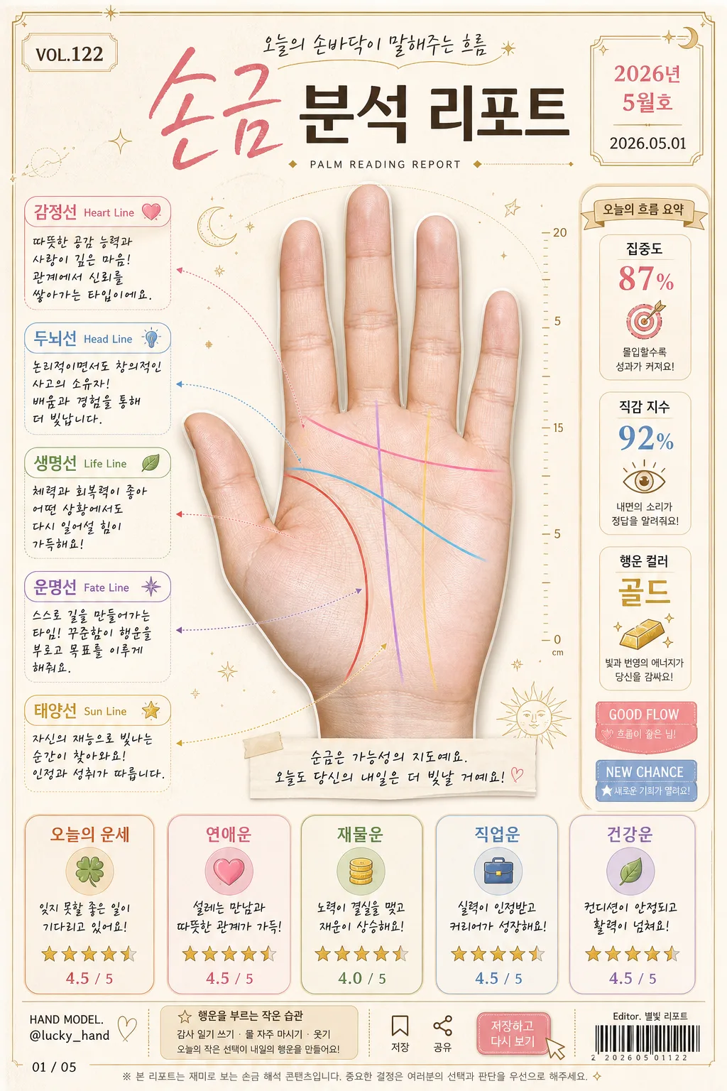
손금 분석 리포트
손바닥 사진을 reference로 박으면 생명선·감정선·두뇌선·운명선 등 주요 손금 라인 + 한글 분석 리포트로 변환. 재미용 콘텐츠 톤.
손금 분석 리포트摘要
這是用來製作興趣/生活內容的 ChatGPT 圖像提示詞,已整理主題、背景、風格與構圖,方便快速調整。
相關關鍵字: 손금 분석 리포트, 손금 분석 리포트 프롬프트, 興趣/生活 프롬프트, 興趣/生活 AI 이미지 프롬프트, ChatGPT 이미지 프롬프트, AI 이미지 생성 프롬프트, AI 프롬프트, 이미지 프롬프트
손금 분석 리포트使用方式
保留原始結構並替換主體、背景、色彩或構圖,即可延伸出不同版本。
- 保留核心主體,並依品牌、季節或平台調整色彩與背景。
- 如果畫面太複雜,請減少背景元素並具體描述主體、構圖與光線。
- 複製後可要求 ChatGPT 配合平台、長寬比或文字需求調整。
提示詞原文
[Input]
- reference_image: {참고 이미지}
- language: Korean
- output_size: 1024x1536

[Purpose]
Korean palmistry analysis report infographic, vertical fortune-card layout, social-media-friendly editorial poster.
Combine a realistic hand-scan presentation with playful fortune-analysis panels, date-stamped report details, and shareable card-news styling for casual reading and posting.
Apply {메인 디자인 컨셉} as the main design direction while keeping the image polished, warm, and content-rich.

[Composition]
- Center the {참고 이미지} palm photo as the main hero, occupying about 52% of the frame height, naturally masked with a soft shadow and thin highlight edge so the palm texture feels tangible.
- Surround the palm with labeled line callouts, arrow pointers, tiny measurement ticks, and analysis notes, keeping the composition balanced and readable at a glance.
- Use {주요 색상 팔레트} as the overall palette, with warm paper-like background texture, subtle paper fibers, faint astrological marks, dotted guide lines, and small lucky-symbol accents.
- Place the summary analysis boxes along the lower third and right-side margin in a neat card-grid arrangement, with realistic printed-card layering and soft shadows.
- Include editorial metadata: top issue label “VOL.122”, date label “2026.05.01”, small category tag “PALM READING REPORT”, model-name credit “HAND MODEL: @lucky_hand”, and a small barcode-style area near the footer.
- Add subtle social-card UI details such as tiny save/share icons, a page indicator “01 / 05”, and a short CTA chip “저장하고 다시 보기”.
- Apply {분석 톤}, {내용 톤 제약}, and {텍스트 스타일} to all caption text, rating labels, and short Korean report copy.

[3. CORE STRUCTURE]
1) Main header area (top 14%): title “손금 분석 리포트” set in a fortune-card masthead style, with elegant handwritten accent on key words, thin decorative divider lines, issue number “VOL.122”, date “2026년 5월호”, and a small subtitle “오늘의 손바닥이 말해주는 흐름”.
2) Palm hero area (center 52%): {참고 이미지} isolated as a realistic scanned-photo hero, centered on a cream-beige paper surface with soft shadow, visible palm texture, faint scan guide marks, and small decorative celestial symbols around the outer edges.
3) Line annotation layer: draw five distinct colored line overlays with small arrow pointers and compact tags for 생명선, 감정선, 두뇌선, 운명선, 태양선; each label should include Korean and English names, e.g. “생명선 Life Line”.
4) Analysis note layer: next to each line tag, add a short positive interpretive sentence using {분석 톤}, with concise handwritten or rounded sans-serif callouts; include tiny icons such as heart, coin, star, compass, and leaf where appropriate.
5) Summary fortune cards (bottom 24%): create five mini boxes for {종합 분석 항목}, each with a one-line comment, a 5-star rating row, and a small numeric score such as “4.5 / 5”; align consistently for easy comparison.
6) Side report strip: add a narrow right-side vertical strip with three quick stats — “집중도 87%”, “직감 지수 92%”, “행운 컬러 골드” — plus small badge labels “GOOD FLOW” and “NEW CHANCE”.
7) Footer microcopy: add a small disclaimer-style line in subdued gray indicating the content is for entertainment use, plus barcode-style graphic, creator credit “Editor. 별빛 리포트”, and page indicator “01 / 05”.

[4. STYLE RULES]
- Typography: Pretendard Bold for headers, Pretendard Medium for body, and a hand-drawn calligraphy font for emphasis; title around 54-64px, labels 20-24px, notes 16-18px, metadata 11-14px.
- Color palette: warm beige #F4E9D8, gold #C9A24A, blush pink #E9B7C6, soft gray #CFCFD4, deep charcoal #3A3A3A, plus line colors from {표시할 손금 라인}.
- Border/shadow: soft drop shadow 0 6px 18px rgba(0,0,0,0.10), thin gold borders on cards, rounded corners 18px, subtle paper grain overlay, fine dotted dividers, and tiny sticker-like badges.
- Print details: add realistic microtext blocks, small caption strips, light crease texture, faint ink variation, and delicate ornamental corner marks without overpowering the palm.
- Text density should feel like a real Korean lifestyle report card: readable main labels, short blurbs, compact metadata, and layered editorial elements.

[5. VISUAL STYLE]
- Camera / lens: top-lit scanned-photo editorial look, simulated with a 50mm lens feel at f/5.6, sharp detail on palm texture and precise graphic overlays.
- Lighting: soft diffused window light from upper-left with gentle fill from right, low-contrast and evenly readable across the entire poster.
- Color grade: creamy beige, muted gold, soft pink, and cool gray with restrained saturation, like a modern Korean fortune-card infographic printed on premium stationery.
- Rendering quality: realistic paper grain, natural skin texture from the reference palm, crisp vector-like labels, clean print registration, and subtle depth between stickers, cards, and the hand image.

[6. MOOD]
Playful Korean fortune report — trendy card-news infographic mixed with a gentle lifestyle editorial feel, similar to a warm magazine advice spread with collectible fortune-card details.
The overall impression should feel friendly, optimistic, personalized, and share-worthy rather than clinical.

[7. CRITICAL]
- Korean text accuracy: 반드시 정확히 표시할 문구 — “손금 분석 리포트”, “생명선”, “감정선”, “두뇌선”, “운명선”, “태양선”, “오늘의 운세”, “연애운”, “재물운”, “직업운”, “건강운”.
- Additional Korean text to render clearly: “VOL.122”, “2026년 5월호”, “오늘의 손바닥이 말해주는 흐름”, “저장하고 다시 보기”, “집중도 87%”, “직감 지수 92%”, “행운 컬러 골드”, “Editor. 별빛 리포트”, “HAND MODEL: @lucky_hand”, “01 / 05”.
- Each palm line must have the correct arrow direction and matching label color from {표시할 손금 라인}.
- Keep all five summary boxes visible, evenly spaced, and clearly readable with one-line comments and star ratings.
- All analysis wording should follow {분석 톤} and {내용 톤 제약}, staying light, casual, and non-alarming.
- All Korean characters must render cleanly without distortion, clipping, or broken spacing.

[8. 🚫 PROHIBITED]
- Fake official seals / certifications
- Broken Korean characters
- Celebrity composites / unauthorized likeness