廣告/海報
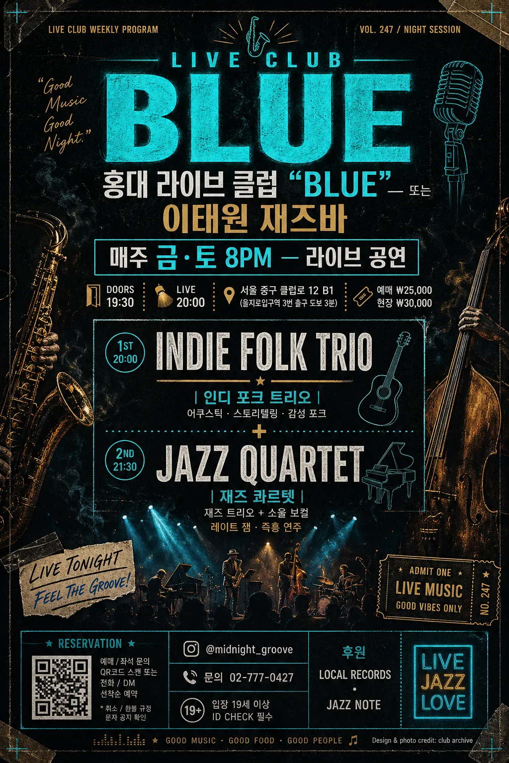
라이브 클럽·재즈바 광고 플라이어
라이브 클럽 광고 플라이어. 공연 일정·아티스트.
라이브 클럽·재즈바 광고 플라이어摘要
這是用來製作廣告/海報內容的 ChatGPT 圖像提示詞,已整理主題、背景、風格與構圖,方便快速調整。
相關關鍵字: 라이브 클럽·재즈바 광고 플라이어, 라이브 클럽·재즈바 광고 플라이어 프롬프트, 廣告/海報 프롬프트, 廣告/海報 AI 이미지 프롬프트, ChatGPT 이미지 프롬프트, AI 이미지 생성 프롬프트, AI 프롬프트, 이미지 프롬프트
라이브 클럽·재즈바 광고 플라이어使用方式
保留原始結構並替換主體、背景、色彩或構圖,即可延伸出不同版本。
- 保留核心主體,並依品牌、季節或平台調整色彩與背景。
- 如果畫面太複雜,請減少背景元素並具體描述主體、構圖與光線。
- 複製後可要求 ChatGPT 配合平台、長寬比或文字需求調整。
提示詞原文
[Input]
- language: Korean
- output_size: 1024x1536

[Purpose]
Live club / jazz bar promotional flyer, vertical poster for nightlife event marketing and social sharing.
Dark urban gig-poster aesthetic with bilingual headline hierarchy, printed-paper realism, venue details, ticket information, and the feeling of a real flyer taped near a club entrance or posted as an Instagram story.

[Composition]
- Center a tall live-club poster design in a 1024x1536 frame, using {비율} as the intended vertical flyer proportion and keeping the design print-ready.
- Place the venue name and weekly schedule in the upper 35%, with {장소} as the primary title and {일정} as a clear date/time band.
- Place {이번 주 라인업} in the middle 30% as the strongest secondary focus, with stacked performer names, small genre notes, and divider marks that feel like a real live schedule.
- Build the background as a dark club wall and printed flyer surface: near-black charcoal paper, visible ink grain, tiny scuffs, tape marks, faint smoke haze, spotlight bloom, and subtle risograph-like texture.
- Use {장소}, {일정}, {이번 주 라인업}, {비주얼}, {컬러}, {타이포} as the core customizable content blocks, surrounded by realistic event metadata such as doors/live time, ticket price, address, reservation contact, sponsor strip, and small social handle.
- Add decorative graphic elements appropriate to a jazz/live club flyer: thin neon rules, small saxophone or microphone icons, dotted rhythm lines, corner registration marks, a small ticket stub box, and a compact QR/barcode-style reservation area.

[3. CORE STRUCTURE]
1. Top header zone: set {장소} as the dominant title in bold condensed uppercase English style with a smaller Korean subtitle treatment, aligned center or slightly above center. Add tiny credit text such as “LIVE CLUB WEEKLY PROGRAM” and “VOL. 247 / NIGHT SESSION” near the top edge.
2. Schedule band: place {일정} directly below the title as a compact event-date line, using smaller but high-contrast text with tight tracking. Add supporting Korean event details: “DOORS 19:30”, “LIVE 20:00”, “서울 중구 클럽로 12 B1”, and “예매 ₩25,000 / 현장 ₩30,000”.
3. Main lineup block: feature {이번 주 라인업} in the midsection as the most legible content block, using stacked typography, plus-sign dividers, small set-time labels, and short Korean tags like “재즈 트리오”, “소울 보컬”, “레이트 잼”.
4. Visual atmosphere: build the scene around {비주얼} with a moody live-stage feel, including microphone silhouettes, saxophone and double-bass outline fragments, partial drum hardware, low crowd silhouettes along the bottom edge, spotlight beams, light haze, and reflections on a dark floor.
5. Color system: apply {컬러} across text accents, thin rules, glow edges, small icons, sponsor dividers, and ticket labels; keep the base mostly dark so neon cyan and muted gold accents read sharply.
6. Typography system: render {타이포} with a bold poster hierarchy, pairing heavy English display type with a clean Korean supporting font for readable event information. Use mixed-size typography to create a real gig-poster rhythm rather than a plain template.
7. Footer treatment: create a detailed bottom information strip with “RESERVATION”, “@midnight_groove”, “문의 02-777-0427”, “후원 LOCAL RECORDS · JAZZ NOTE”, “입장 19세 이상”, a small barcode/QR reservation box, and a tiny poster credit line “Design & photo credit: club archive”.

[4. STYLE RULES]
- Typography: use condensed bold display type similar to Bebas Neue or Anton for the main English title, paired with Pretendard or Noto Sans KR for Korean subtext; title around 72–96px feel, body copy around 22–34px feel, micro info around 12–18px feel.
- Color palette: deep charcoal #0B0D12, black #050608, neon cyan #42E8F4, metallic gold #D7B15D, off-white #F5F1E8.
- Border/shadow: thin glowing edge lines, soft neon bloom around highlights, subtle drop shadow 4px y-offset, 14px blur, 18% opacity on text layers.
- Print realism: include slight paper fibers, ink spread, tiny scratches, dust specks, tape residue, and slight edge curl while keeping all key text readable.
- Layout density: make the flyer feel content-rich and authentic with event labels, section markers, ticket boxes, sponsor marks, and microcopy, while preserving a strong hierarchy around {장소}, {일정}, and {이번 주 라인업}.

[5. VISUAL STYLE]
- Camera / lens: simulated editorial concert poster look, 50mm documentary framing with shallow depth cues, as if shot on a Sony A7R IV with 50mm f/1.4.
- Lighting: strong stage spotlights from upper-left and upper-right, thin beams cutting through haze, slight rim light on edges, dark ambient fill with controlled contrast.
- Color grade: cool noir base with cyan neon and muted gold accents, lifted only on text, paper texture, and stage highlights, no washed-out background.
- Surface treatment: realistic pasted-poster finish on a dark venue wall, with soft specular highlights on ink, tiny imperfections, and a believable nightlife print-ad atmosphere.

[6. MOOD]
Indie live-music venue poster — a mix of Tokyo jazz club flyer energy, modern Berlin gig-poster design, and a real Seoul basement jazz bar announcement board.

[7. CRITICAL]
- Korean text accuracy: 반드시 정확히 보일 텍스트 — {장소}, {일정}, {이번 주 라인업}.
- Additional Korean text should be realistic and readable where used: “예매 ₩25,000”, “현장 ₩30,000”, “서울 중구 클럽로 12 B1”, “후원 LOCAL RECORDS · JAZZ NOTE”, “문의 02-777-0427”.
- Layout invariants: vertical flyer composition, dark club atmosphere, neon accent hierarchy, readable bilingual typography, real event-poster details, no distortion of Korean characters.

[8. 🚫 PROHIBITED]
- Fake official seals / certifications
- Broken Korean characters