廣告/海報
이디야커피 광고
이디야 톤 — 가성비 커피 + 친근
이디야커피 광고摘要
這是用來製作廣告/海報內容的 ChatGPT 圖像提示詞,已整理主題、背景、風格與構圖,方便快速調整。
相關關鍵字: 이디야커피 광고, 이디야커피 광고 프롬프트, 廣告/海報 프롬프트, 廣告/海報 AI 이미지 프롬프트, ChatGPT 이미지 프롬프트, AI 이미지 생성 프롬프트, AI 프롬프트, 이미지 프롬프트
이디야커피 광고使用方式
保留原始結構並替換主體、背景、色彩或構圖,即可延伸出不同版本。
- 保留核心主體,並依品牌、季節或平台調整色彩與背景。
- 如果畫面太複雜,請減少背景元素並具體描述主體、構圖與光線。
- 複製後可要求 ChatGPT 配合平台、長寬比或文字需求調整。
提示詞原文
[Input]
- language: Korean
- output_size: 1024x1536

[Purpose]
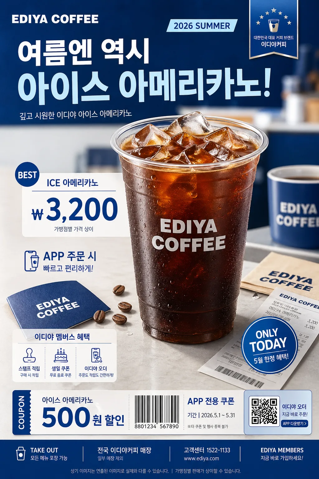
Korean coffee brand promotional ad poster, beverage hero + price-led layout, social-media vertical ad.
Create a realistic EDIYA COFFEE–style retail campaign poster with friendly everyday affordability, recognizable blue café branding, rich product detail, and believable in-store promotional information.

[Composition]
- Main subject placement: drink hero occupies the center 55–60% of the frame, with pricing and copy stacked below or beside it depending on {레이아웃}.
- Background treatment: polished studio café backdrop in {컬러 팔레트}, using blue-white gradient panels, soft tabletop reflections, subtle paper texture, and faint café counter cues to make the advertisement feel real and printed.
- Framing direction: vertical poster composition with clear top-to-bottom hierarchy; allow realistic supporting details such as condensation droplets, ice cubes, straw sleeve, napkin, coffee beans, receipt corner, and small promotional stickers around the hero without overpowering it.
- Brand tone and feel: apply {브랜드 톤} and {시그니처 결} consistently across the entire poster so the ad reads as a familiar Korean café campaign.
- Product handling: showcase {제품·소재} as the main visual asset, polished but realistic, with visible beverage texture, cup rim highlights, transparent ice, foam or cream detail if relevant, and a crisp EDIYA-style logo/wordmark area on the cup.

[3. CORE STRUCTURE]
- Top zone: place the main brand copy area in a strong commercial header zone with an EDIYA COFFEE wordmark, small campaign label, and bold Korean headline text. Include a short date label such as “2026 SUMMER” or “5월 한정 프로모션”.
- Hero zone (middle 55%): render {제품·소재} as the focal point, centered or slightly offset per {레이아웃}, with realistic studio shadow, tabletop contact shadow, condensation, detailed ice/foam, and a premium beverage finish.
- Price zone: place the price or value message directly under the hero or in a compact side block, using strong hierarchy so {카피·타이포} remains readable at a glance. Add believable retail details such as “ICE 아메리카노”, “₩3,200”, “앱 주문 가능”, or “멤버스 적립”.
- Accent zone: add brand accent shapes, blue ribbon tags, coupon-like labels, small arrows, circular price badges, and color bars using {컬러 팔레트}; align them to the ad’s commercial identity.
- Footer zone: reserve the lower area for secondary copy, store/app information, QR-code-like promo box, barcode-style coupon strip, contact line, and a tiny legal notice. Example footer text: “전국 이디야커피 매장”, “일부 매장 제외”, “EDIYA MEMBERS”.

[4. STYLE RULES]
- Typography: use Pretendard Bold for the main Korean headline, Noto Sans KR Medium for supporting copy, and a clean sans-serif English pairing; headline size large and compact, price numerals oversized and instantly readable.
- Color palette: use Ediya Blue, white, soft cool gray, and a warm accent tone from {컬러 팔레트}; keep contrast crisp and commercial while adding realistic print texture and subtle depth.
- Border/shadow: apply a soft studio drop shadow with 4px y-offset, 12px blur, and 15% opacity; cup edges, ice, and typography should feel like a finished Korean café poster prepared for both storefront print and mobile feed placement.
- Graphic detail: include small but legible promotional modules such as “NEW”, “BEST”, “TAKE OUT”, “ONLY TODAY”, price badge, coupon strip, and app-order icon treatment, all styled in the same blue-white retail language.

[5. VISUAL STYLE]
- Camera / lens: commercial product photography look, Canon EOS R5 with 85mm f/1.4 for the hero drink or 50mm f/1.8 for a tighter poster-friendly product crop.
- Lighting: studio key light from upper-left at 45° with softbox diffusion, gentle fill from front-right, and a faint rim light to define the cup silhouette; follow {무드·라이팅} for the final lighting mood.
- Color grade: clean blue-white café ad grade with slightly warm highlights, controlled contrast, fresh retail-poster clarity, glossy condensation highlights, and believable printed-poster finish.
- Composition ratio: maintain the vertical ad feel suitable for {비율}, with the hero beverage dominating the center and readable commercial information arranged around it.

[6. MOOD]
Korean café chain campaign poster — polished retail advertising aesthetic with an everyday value-driven commercial feel, realistic beverage freshness, friendly blue branding, and lively store-promotion energy.

[7. CRITICAL]
- Korean text accuracy: the rendered image must correctly show Korean brand text and promotional copy without broken characters. Include short Korean lines such as “오늘도 가볍게, 이디야”, “시원한 한 잔의 시작”, “ICE 아메리카노”, “₩3,200”, “5월 한정”, “앱 주문 가능”, and “전국 매장 진행”.
- Typography accuracy: keep the commercial hierarchy sharp and legible, with exact spacing and aligned text blocks suitable for a beverage ad; the price, product name, and headline must be readable at thumbnail size.
- Layout invariants: maintain the hero drink + price-led structure, with brand-forward composition, EDIYA-style blue identity, realistic product texture, and believable Korean café promotional modules.
- Detail realism: show natural cup material, printed logo area, ice translucency, condensation droplets, straw or lid detail, tabletop shadow, and small coupon/footer text so the poster feels like a real retail campaign rather than a sterile mockup.

[8. 🚫 PROHIBITED]
- Fake official seals / certifications
- Broken Korean characters
- Celebrity composites / unauthorized likeness