Ads/Posters
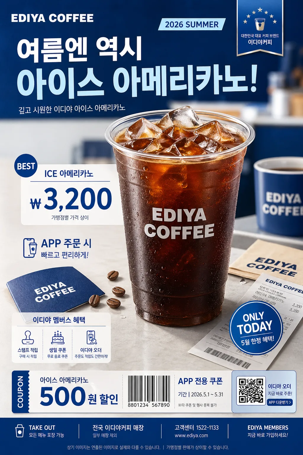
이디야커피 광고
이디야 톤 — 가성비 커피 + 친근
이디야커피 광고 summary
Copy this ChatGPT image prompt to create Ads/Posters results. Its subject, background, style, and composition are organized for quick iteration.
Related keywords: 이디야커피 광고, 이디야커피 광고 프롬프트, Ads/Posters 프롬프트, Ads/Posters AI 이미지 프롬프트, ChatGPT 이미지 프롬프트, AI 이미지 생성 프롬프트, AI 프롬프트, 이미지 프롬프트
How to use 이디야커피 광고
Keep the prompt structure and swap the subject, background, palette, or composition to create new variations.
- Keep the main subject and adjust the palette and background for your brand, season, or channel.
- If the result feels busy, simplify the background and make the subject, composition, and lighting more specific.
- After copying, ask ChatGPT to adapt it for your platform, aspect ratio, or text requirements.
Original prompt
[Input]
- language: Korean
- output_size: 1024x1536

[Purpose]
Korean coffee brand promotional ad poster, beverage hero + price-led layout, social-media vertical ad.
Create a realistic EDIYA COFFEE–style retail campaign poster with friendly everyday affordability, recognizable blue café branding, rich product detail, and believable in-store promotional information.

[Composition]
- Main subject placement: drink hero occupies the center 55–60% of the frame, with pricing and copy stacked below or beside it depending on {레이아웃}.
- Background treatment: polished studio café backdrop in {컬러 팔레트}, using blue-white gradient panels, soft tabletop reflections, subtle paper texture, and faint café counter cues to make the advertisement feel real and printed.
- Framing direction: vertical poster composition with clear top-to-bottom hierarchy; allow realistic supporting details such as condensation droplets, ice cubes, straw sleeve, napkin, coffee beans, receipt corner, and small promotional stickers around the hero without overpowering it.
- Brand tone and feel: apply {브랜드 톤} and {시그니처 결} consistently across the entire poster so the ad reads as a familiar Korean café campaign.
- Product handling: showcase {제품·소재} as the main visual asset, polished but realistic, with visible beverage texture, cup rim highlights, transparent ice, foam or cream detail if relevant, and a crisp EDIYA-style logo/wordmark area on the cup.

[3. CORE STRUCTURE]
- Top zone: place the main brand copy area in a strong commercial header zone with an EDIYA COFFEE wordmark, small campaign label, and bold Korean headline text. Include a short date label such as “2026 SUMMER” or “5월 한정 프로모션”.
- Hero zone (middle 55%): render {제품·소재} as the focal point, centered or slightly offset per {레이아웃}, with realistic studio shadow, tabletop contact shadow, condensation, detailed ice/foam, and a premium beverage finish.
- Price zone: place the price or value message directly under the hero or in a compact side block, using strong hierarchy so {카피·타이포} remains readable at a glance. Add believable retail details such as “ICE 아메리카노”, “₩3,200”, “앱 주문 가능”, or “멤버스 적립”.
- Accent zone: add brand accent shapes, blue ribbon tags, coupon-like labels, small arrows, circular price badges, and color bars using {컬러 팔레트}; align them to the ad’s commercial identity.
- Footer zone: reserve the lower area for secondary copy, store/app information, QR-code-like promo box, barcode-style coupon strip, contact line, and a tiny legal notice. Example footer text: “전국 이디야커피 매장”, “일부 매장 제외”, “EDIYA MEMBERS”.

[4. STYLE RULES]
- Typography: use Pretendard Bold for the main Korean headline, Noto Sans KR Medium for supporting copy, and a clean sans-serif English pairing; headline size large and compact, price numerals oversized and instantly readable.
- Color palette: use Ediya Blue, white, soft cool gray, and a warm accent tone from {컬러 팔레트}; keep contrast crisp and commercial while adding realistic print texture and subtle depth.
- Border/shadow: apply a soft studio drop shadow with 4px y-offset, 12px blur, and 15% opacity; cup edges, ice, and typography should feel like a finished Korean café poster prepared for both storefront print and mobile feed placement.
- Graphic detail: include small but legible promotional modules such as “NEW”, “BEST”, “TAKE OUT”, “ONLY TODAY”, price badge, coupon strip, and app-order icon treatment, all styled in the same blue-white retail language.

[5. VISUAL STYLE]
- Camera / lens: commercial product photography look, Canon EOS R5 with 85mm f/1.4 for the hero drink or 50mm f/1.8 for a tighter poster-friendly product crop.
- Lighting: studio key light from upper-left at 45° with softbox diffusion, gentle fill from front-right, and a faint rim light to define the cup silhouette; follow {무드·라이팅} for the final lighting mood.
- Color grade: clean blue-white café ad grade with slightly warm highlights, controlled contrast, fresh retail-poster clarity, glossy condensation highlights, and believable printed-poster finish.
- Composition ratio: maintain the vertical ad feel suitable for {비율}, with the hero beverage dominating the center and readable commercial information arranged around it.

[6. MOOD]
Korean café chain campaign poster — polished retail advertising aesthetic with an everyday value-driven commercial feel, realistic beverage freshness, friendly blue branding, and lively store-promotion energy.

[7. CRITICAL]
- Korean text accuracy: the rendered image must correctly show Korean brand text and promotional copy without broken characters. Include short Korean lines such as “오늘도 가볍게, 이디야”, “시원한 한 잔의 시작”, “ICE 아메리카노”, “₩3,200”, “5월 한정”, “앱 주문 가능”, and “전국 매장 진행”.
- Typography accuracy: keep the commercial hierarchy sharp and legible, with exact spacing and aligned text blocks suitable for a beverage ad; the price, product name, and headline must be readable at thumbnail size.
- Layout invariants: maintain the hero drink + price-led structure, with brand-forward composition, EDIYA-style blue identity, realistic product texture, and believable Korean café promotional modules.
- Detail realism: show natural cup material, printed logo area, ice translucency, condensation droplets, straw or lid detail, tabletop shadow, and small coupon/footer text so the poster feels like a real retail campaign rather than a sterile mockup.

[8. 🚫 PROHIBITED]
- Fake official seals / certifications
- Broken Korean characters
- Celebrity composites / unauthorized likeness