Photo Edits/Filters
성형 전후 비교 리포트
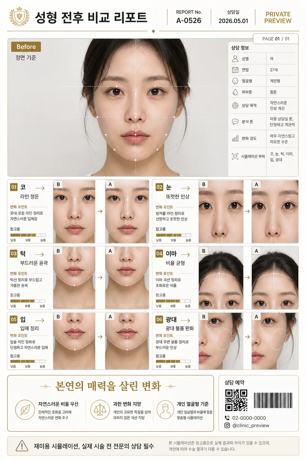
얼굴 사진을 reference로 박으면 부위별 (코·눈·턱·이마 등) 성형 시뮬레이션 Before/After 비교 + 한글 분석. 미용 상담 톤. 재미·참고용.
성형 전후 비교 리포트 summary
Copy this ChatGPT image prompt to create Photo Edits/Filters results. Its subject, background, style, and composition are organized for quick iteration.
Related keywords: 성형 전후 비교 리포트, 성형 전후 비교 리포트 프롬프트, Photo Edits/Filters 프롬프트, Photo Edits/Filters AI 이미지 프롬프트, ChatGPT 이미지 프롬프트, AI 이미지 생성 프롬프트, AI 프롬프트, 이미지 프롬프트
How to use 성형 전후 비교 리포트
Keep the prompt structure and swap the subject, background, palette, or composition to create new variations.
- Keep the main subject and adjust the palette and background for your brand, season, or channel.
- If the result feels busy, simplify the background and make the subject, composition, and lighting more specific.
- After copying, ask ChatGPT to adapt it for your platform, aspect ratio, or text requirements.
Original prompt
[Input]
- reference_image: {참고 이미지}
- language: Korean
- output_size: 1024x1536

[Purpose]
Korean cosmetic consultation infographic, before/after comparison report with multiple facial-area simulation cells, editorial medical-aesthetic layout.
Designed for clear side-by-side review of subtle facial refinement concepts, suitable for beauty consultation presentation and social-media sharing, with realistic report metadata, clinic-document details, annotations, and readable Korean microcopy.

[Composition]
- Top hero zone (about 26%): the original face photo stays natural and unchanged as the Before reference, framed with a thin report-style border, small label area, date stamp, report number, and consultation metadata.
- Main grid zone (about 54%): multiple simulation cells for {시뮬레이션 부위} arranged in a precise 2-column or 3-column grid, each cell with a Korean label, arrow indicator, one-line change note, tiny measurement guide marks, and a small confidence-style visual bar labeled as 참고용.
- Bottom summary zone (about 20%): a boxed headline for {종합 메시지}, followed by compact checklist notes, a small QR/barcode-style appointment block, and a clear disclaimer line for {면책 문구}.
- Overall spacing should feel like a premium clinic report: balanced margins, crisp alignment, layered panels, realistic document density, and no crowded overlaps.
- Use {분석 톤}, keeping the layout objective and calm rather than promotional.
- Use {디자인 색상} across background, panels, dividers, accent details, small icons, tag labels, and chart lines.

[3. CORE STRUCTURE]
1. Header area: set a compact title block with a clinic-report feel, using a subtle gold rule and restrained typography above the hero image. Include Korean title text “성형 전후 비교 리포트”, “REPORT No. A-0526”, “상담일 2026.05.01”, “PRIVATE PREVIEW”, and a small page marker “PAGE 01 / 01”.
2. Before reference area: place the original face photo at the top in a clean rectangular frame, with a small “Before” tag, a tiny crop/angle note “정면 기준”, and no heavy filters or beauty retouching. Add light facial guide lines or semi-transparent landmark dots around nose bridge, jawline, cheekbone, eye line, and lip center so it reads as a real consultation analysis sheet.
3. Simulation grid: create separate cells for 코, 눈, 턱, 이마, 입, 광대; each cell should contain a tiny left-to-right arrow, a labeled Korean 부위명, and a short natural-change description. Example cell notes: “라인 정돈”, “또렷한 인상”, “부드러운 윤곽”, “비율 균형”, “입매 정리”, “광대 볼륨 완화”.
4. Per-cell visual treatment: show each simulated result as a refined, slightly altered concept, with the face geometry staying realistic and the changes staying within a subtle range. Add miniature before/after thumbnails inside each cell, small corner labels “B” and “A”, and fine dotted guides that align with the relevant facial area.
5. Comparison logic: keep all cells visually consistent in size, padding, and label placement so the report reads like a systematic consultation sheet. Add small sublabels such as “변화 강도: {변화 강도}”, “분석 톤: {분석 톤}”, and “시뮬레이션 부위: {시뮬레이션 부위}” where appropriate.
6. Summary box: place {종합 메시지} in a prominent rounded rectangle or clean bordered panel, using slightly larger type and a soft gold accent line. Surround it with three compact supporting notes: “자연스러운 비율 우선”, “과한 변화 지양”, “개인 얼굴형 기준”.
7. Disclaimer strip: place {면책 문구} in small text at the bottom edge or side strip, clearly readable but secondary to the main content. Include the exact line “재미용 시뮬레이션, 실제 시술 전 전문의 상담 필수” and a small footer with “상담 예약 02-0000-0000”, “@clinic_preview”, and a simple barcode/QR-like graphic block without claiming certification.

[4. STYLE RULES]
- Typography: Pretendard or Noto Sans KR for body and labels, Medium to SemiBold for section titles, Regular for notes; title size around 36–44px, body around 20–26px, disclaimer around 14–16px, micro metadata around 11–13px.
- Color palette: {디자인 색상} with off-white #FAFAF7, warm beige #EFE5D6, soft gray #D9D9D9, muted gold #C8A96A, charcoal #2E2E2E for readable text.
- Border/shadow: thin 1px–2px dividers, soft drop shadow 0px 6px 18px at 12% opacity, rounded corners with a restrained clinic-document look.
- Graphic details: use fine gold rules, soft beige section tabs, pale gray measurement ticks, tiny dot markers, discreet iconography for calendar / memo / camera angle, and a realistic report footer.
- Text hierarchy: title, report metadata, panel labels, per-cell notes, and disclaimer should all be legible in Korean, with visual emphasis on the comparison grid and summary message.

[5. VISUAL STYLE]
- Camera / lens: clean front-facing portrait capture, 85mm f/1.8 look for the face reference, and crisp infographic framing for the comparison cells; keep perspective natural and undistorted.
- Lighting: soft studio light from upper-left at about 45°, gentle fill from front-right, low-contrast and even across all panels to preserve medical-consultation clarity.
- Color grade: neutral cream and beige base with controlled gold accents, slightly desaturated skin-tone presentation, no oversaturated makeup look.
- Material realism: make the report look like a premium printed consultation sheet or high-resolution tablet document, with subtle paper grain, soft panel shadows, and realistic photographic texture in every portrait thumbnail.

[6. MOOD]
Premium Korean aesthetic-clinic consultation report — a restrained editorial medical infographic with the calm clarity of a high-end dermatology brochure and magazine-style layout discipline. The image should feel like a real client-facing preview sheet prepared after a consultation, polished, informative, and content-rich without becoming chaotic.

[7. CRITICAL]
- Korean text accuracy: 반드시 정확히 렌더링되어야 하는 문구: "코", "눈", "턱", "이마", "입", "광대", "본연의 매력을 살린 변화", "재미용 시뮬레이션, 실제 시술 전 전문의 상담 필수", "Before".
- Additional Korean text should be clean and readable: "성형 전후 비교 리포트", "REPORT No. A-0526", "상담일 2026.05.01", "정면 기준", "변화 강도: {변화 강도}", "분석 톤: {분석 톤}", "자연스러운 비율 우선", "과한 변화 지양", "개인 얼굴형 기준".
- All comparison cells must keep a consistent layout and subtle-change scale; no exaggerated facial distortion, no duplicate anatomy errors, and no mismatched labels.
- The original face photo must remain natural in the Before area and should not be beautified beyond a clean report presentation.
- Keep {종합 메시지}, {면책 문구}, {시뮬레이션 부위}, {분석 톤}, {변화 강도}, and {디자인 색상} visibly integrated as report content or styling references.

[8. 🚫 PROHIBITED]
- Fake official seals / certifications
- Broken Korean characters
- Celebrity composites / unauthorized likeness