Hobbies/Lifestyle
AI 프롬프트 사이트 캐릭터 비주얼
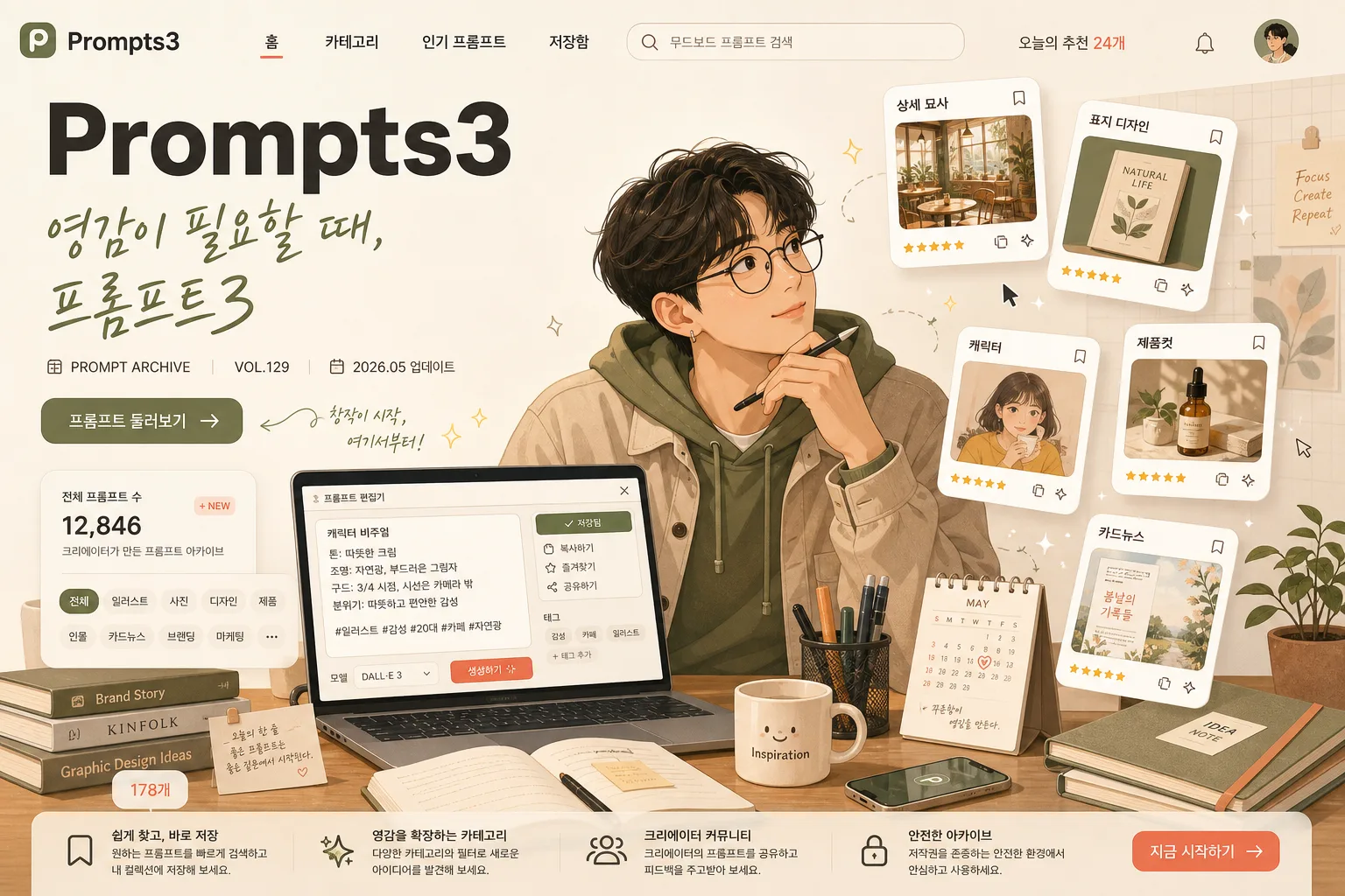
한국 크리에이터·디자이너가 책상에서 떠있는 카드들을 보는 일러스트 톤 hero. 친근하고 따뜻한 사이트 컨셉 비주얼.
AI 프롬프트 사이트 캐릭터 비주얼 summary
Copy this ChatGPT image prompt to create Hobbies/Lifestyle results. Its subject, background, style, and composition are organized for quick iteration.
Related keywords: AI 프롬프트 사이트 캐릭터 비주얼, AI 프롬프트 사이트 캐릭터 비주얼 프롬프트, Hobbies/Lifestyle 프롬프트, Hobbies/Lifestyle AI 이미지 프롬프트, ChatGPT 이미지 프롬프트, AI 이미지 생성 프롬프트, AI 프롬프트, 이미지 프롬프트
How to use AI 프롬프트 사이트 캐릭터 비주얼
Keep the prompt structure and swap the subject, background, palette, or composition to create new variations.
- Keep the main subject and adjust the palette and background for your brand, season, or channel.
- If the result feels busy, simplify the background and make the subject, composition, and lighting more specific.
- After copying, ask ChatGPT to adapt it for your platform, aspect ratio, or text requirements.
Original prompt
[Input]
- language: Korean
- output_size: 1536x1024

[Purpose]
AI prompt archive site hero illustration for a landing page, 3:2 horizontal banner.
A modern flat editorial illustration that communicates creativity, inspiration, and a professional prompt-library service through a believable creator workspace, rich UI details, and Korean-first content.

[Composition]
- Center the Korean creator character in the mid-right 40% of the frame, seated at a desk and gazing thoughtfully toward floating thumbnail cards.
- Place the main site wordmark in the upper-left zone as a strong landing-page brand anchor, with the subtitle just below it in a softer calligraphic Korean tone.
- Build the scene around {배경 / 장면} with the desk as the visual anchor, the laptop screen as a live prompt editor, and the floating cards as the secondary focal cluster.
- Use {사이트/서비스 이름}, {한국어 부제 또는 카피}, {캐릭터}, {떠있는 카드 종류}, {컬러 팔레트} as the core content elements.
- Add realistic service-page details: a small top navigation row, search pill, category chips, prompt-count badge, bookmark icons, and a subtle CTA button in Korean, all integrated into the hero illustration.
- Create a layered left-to-right reading flow: brand and copy first, then workspace details, then character expression, then floating prompt-category cards.

[3. CORE STRUCTURE]
1. Header zone (upper-left 20%): place {사이트/서비스 이름} as the primary wordmark in bold English sans-serif, with {한국어 부제 또는 카피} directly beneath it in a lighter handwritten/calligraphy-inspired Korean tone. Add small supporting UI text nearby: "PROMPT ARCHIVE", "VOL.129", "2026.05 업데이트", and a compact pill button reading "프롬프트 둘러보기".
2. Navigation / service layer (upper-left to upper-middle): include a slim landing-page navigation strip with short Korean menu labels such as "홈", "카테고리", "인기 프롬프트", "저장함", plus a search bar containing "무드보드 프롬프트 검색" and a tiny count label "오늘의 추천 24개".
3. Character zone (center-right 40%): draw {캐릭터} seated at the desk, body angled slightly toward the cards, with a reflective, curious expression and relaxed posture. Add believable details such as soft hair strands, a cardigan or casual work shirt, warm skin-tone shading, small glasses or earrings if fitting the character, and one hand near a stylus or keyboard.
4. Desk zone (lower-middle 35%): render {배경 / 장면} with a laptop open, desk lamp, small plant, stacked books, notebook, pen cup, sticky notes, coffee mug, phone, and a small calendar card. On the laptop screen, show a prompt editor interface with readable Korean snippets like "캐릭터 비주얼", "톤: 따뜻한 크림", "저장됨" and tiny UI buttons.
5. Floating card cluster (upper-middle to right 30%): show {떠있는 카드 종류} as 4–5 small rounded thumbnails hovering with subtle tilt, each with a tiny Korean label and different concept illustration inside. Suggested labels: "상세 묘사", "표지 디자인", "제품컷", "캐릭터", "카드뉴스". Include micro-icons for bookmark, copy, sparkle, and rating stars so the cards feel like usable prompt-library items.
6. Background field: use a soft cream base with gentle beige gradients, olive accents in props, coral highlights on cards or UI accents, faint grid-paper texture, translucent interface panels, tiny floating cursor marks, and decorative sparkles that support the creative-tech theme.
7. Information hierarchy: ensure the wordmark reads first, then the subtitle, then the CTA/search details, then the character, then the floating cards; all elements should feel integrated as a polished site hero rather than isolated assets.

[4. STYLE RULES]
- Typography: use a bold geometric sans-serif for the main wordmark, such as Pretendard ExtraBold or Noto Sans KR Bold; subtitle in a lighter calligraphy or hand-drawn Korean style, medium size, with slightly relaxed tracking. UI labels should use small clean Korean sans-serif text with strong legibility.
- Color palette: {컬러 팔레트}; include cream #F5EFE3, beige #DCCDB8, olive #8A9B6E, and coral #F08A7B as accent touches.
- Border/shadow: use soft vector-style shading with a 2–4px offset shadow, 10–14px blur, and about 15% opacity; cards should have crisp rounded corners and a subtle paper-like edge.
- Surface detail: add tactile but refined textures such as paper grain, matte desk finish, soft fabric folds, translucent UI glass layers, and warm lamp gradients while keeping the illustration web-hero friendly.
- Icon and UI treatment: use consistent rounded icons, small copy/bookmark/save symbols, category chips, tiny progress bars, and Korean labels that make the service look active and content-rich.

[5. VISUAL STYLE]
- Camera / lens: isometric editorial illustration feel, digitally painted flat-vector composition with a 35mm documentary framing logic and a slightly elevated top-front viewpoint.
- Lighting: soft window light from upper-left at 45°, gentle fill from the right, balanced shadow contrast, with a warm desk-lamp glow near the laptop and subtle highlights along the floating cards.
- Color grade: warm cream + beige + olive + coral with a soft pastel saturation curve, clean web-friendly contrast, and no harsh neon tones.
- Rendering approach: modern flat illustration with layered editorial detail, believable workspace proportions, soft painterly gradients, crisp vector edges, and readable Korean UI microcopy.

[6. MOOD]
Premium creative tech landing page — the friendly clarity of Notion meets the editorial polish of a Behance showcase, with the warm lived-in feel of a Korean creator’s desk during an inspired late-afternoon work session.

[7. CRITICAL]
- Korean text accuracy: 반드시 정확히 렌더할 문자열: "영감이 필요할 때, 프롬프트3".
- Include readable Korean UI strings in the image: "프롬프트 둘러보기", "오늘의 추천 24개", "무드보드 프롬프트 검색", "캐릭터 비주얼", "저장됨".
- Card labels: each floating thumbnail must include a small, legible Korean label rendered clearly without broken characters.
- Layout invariant: the character must be looking toward the floating cards, and the main wordmark must remain readable in the upper-left area.
- All cards should feel like slightly different prompt-category thumbnails, not duplicated copies.
- Keep {사이트/서비스 이름}, {한국어 부제 또는 카피}, {캐릭터}, {배경 / 장면}, {떠있는 카드 종류}, {컬러 팔레트}, {비율/사이즈} conceptually intact and visibly represented where applicable.

[8. 🚫 PROHIBITED]
- Fake official seals / certifications
- Broken Korean characters