興趣/生活
AI 프롬프트 사이트 캐릭터 비주얼
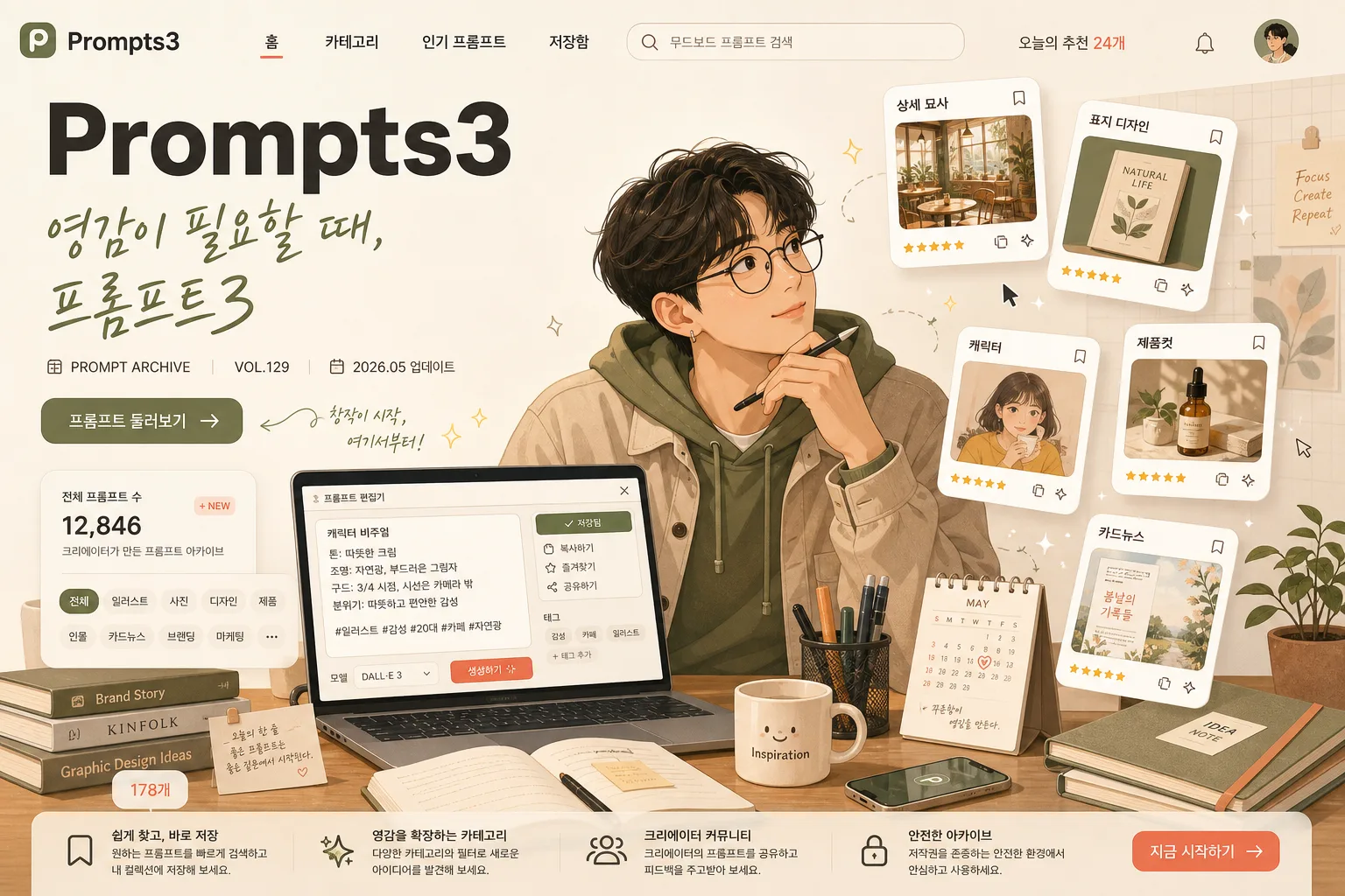
한국 크리에이터·디자이너가 책상에서 떠있는 카드들을 보는 일러스트 톤 hero. 친근하고 따뜻한 사이트 컨셉 비주얼.
AI 프롬프트 사이트 캐릭터 비주얼摘要
這是用來製作興趣/生活內容的 ChatGPT 圖像提示詞,已整理主題、背景、風格與構圖,方便快速調整。
相關關鍵字: AI 프롬프트 사이트 캐릭터 비주얼, AI 프롬프트 사이트 캐릭터 비주얼 프롬프트, 興趣/生活 프롬프트, 興趣/生活 AI 이미지 프롬프트, ChatGPT 이미지 프롬프트, AI 이미지 생성 프롬프트, AI 프롬프트, 이미지 프롬프트
AI 프롬프트 사이트 캐릭터 비주얼使用方式
保留原始結構並替換主體、背景、色彩或構圖,即可延伸出不同版本。
- 保留核心主體,並依品牌、季節或平台調整色彩與背景。
- 如果畫面太複雜,請減少背景元素並具體描述主體、構圖與光線。
- 複製後可要求 ChatGPT 配合平台、長寬比或文字需求調整。
提示詞原文
[Input]
- language: Korean
- output_size: 1536x1024

[Purpose]
AI prompt archive site hero illustration for a landing page, 3:2 horizontal banner.
A modern flat editorial illustration that communicates creativity, inspiration, and a professional prompt-library service through a believable creator workspace, rich UI details, and Korean-first content.

[Composition]
- Center the Korean creator character in the mid-right 40% of the frame, seated at a desk and gazing thoughtfully toward floating thumbnail cards.
- Place the main site wordmark in the upper-left zone as a strong landing-page brand anchor, with the subtitle just below it in a softer calligraphic Korean tone.
- Build the scene around {배경 / 장면} with the desk as the visual anchor, the laptop screen as a live prompt editor, and the floating cards as the secondary focal cluster.
- Use {사이트/서비스 이름}, {한국어 부제 또는 카피}, {캐릭터}, {떠있는 카드 종류}, {컬러 팔레트} as the core content elements.
- Add realistic service-page details: a small top navigation row, search pill, category chips, prompt-count badge, bookmark icons, and a subtle CTA button in Korean, all integrated into the hero illustration.
- Create a layered left-to-right reading flow: brand and copy first, then workspace details, then character expression, then floating prompt-category cards.

[3. CORE STRUCTURE]
1. Header zone (upper-left 20%): place {사이트/서비스 이름} as the primary wordmark in bold English sans-serif, with {한국어 부제 또는 카피} directly beneath it in a lighter handwritten/calligraphy-inspired Korean tone. Add small supporting UI text nearby: "PROMPT ARCHIVE", "VOL.129", "2026.05 업데이트", and a compact pill button reading "프롬프트 둘러보기".
2. Navigation / service layer (upper-left to upper-middle): include a slim landing-page navigation strip with short Korean menu labels such as "홈", "카테고리", "인기 프롬프트", "저장함", plus a search bar containing "무드보드 프롬프트 검색" and a tiny count label "오늘의 추천 24개".
3. Character zone (center-right 40%): draw {캐릭터} seated at the desk, body angled slightly toward the cards, with a reflective, curious expression and relaxed posture. Add believable details such as soft hair strands, a cardigan or casual work shirt, warm skin-tone shading, small glasses or earrings if fitting the character, and one hand near a stylus or keyboard.
4. Desk zone (lower-middle 35%): render {배경 / 장면} with a laptop open, desk lamp, small plant, stacked books, notebook, pen cup, sticky notes, coffee mug, phone, and a small calendar card. On the laptop screen, show a prompt editor interface with readable Korean snippets like "캐릭터 비주얼", "톤: 따뜻한 크림", "저장됨" and tiny UI buttons.
5. Floating card cluster (upper-middle to right 30%): show {떠있는 카드 종류} as 4–5 small rounded thumbnails hovering with subtle tilt, each with a tiny Korean label and different concept illustration inside. Suggested labels: "상세 묘사", "표지 디자인", "제품컷", "캐릭터", "카드뉴스". Include micro-icons for bookmark, copy, sparkle, and rating stars so the cards feel like usable prompt-library items.
6. Background field: use a soft cream base with gentle beige gradients, olive accents in props, coral highlights on cards or UI accents, faint grid-paper texture, translucent interface panels, tiny floating cursor marks, and decorative sparkles that support the creative-tech theme.
7. Information hierarchy: ensure the wordmark reads first, then the subtitle, then the CTA/search details, then the character, then the floating cards; all elements should feel integrated as a polished site hero rather than isolated assets.

[4. STYLE RULES]
- Typography: use a bold geometric sans-serif for the main wordmark, such as Pretendard ExtraBold or Noto Sans KR Bold; subtitle in a lighter calligraphy or hand-drawn Korean style, medium size, with slightly relaxed tracking. UI labels should use small clean Korean sans-serif text with strong legibility.
- Color palette: {컬러 팔레트}; include cream #F5EFE3, beige #DCCDB8, olive #8A9B6E, and coral #F08A7B as accent touches.
- Border/shadow: use soft vector-style shading with a 2–4px offset shadow, 10–14px blur, and about 15% opacity; cards should have crisp rounded corners and a subtle paper-like edge.
- Surface detail: add tactile but refined textures such as paper grain, matte desk finish, soft fabric folds, translucent UI glass layers, and warm lamp gradients while keeping the illustration web-hero friendly.
- Icon and UI treatment: use consistent rounded icons, small copy/bookmark/save symbols, category chips, tiny progress bars, and Korean labels that make the service look active and content-rich.

[5. VISUAL STYLE]
- Camera / lens: isometric editorial illustration feel, digitally painted flat-vector composition with a 35mm documentary framing logic and a slightly elevated top-front viewpoint.
- Lighting: soft window light from upper-left at 45°, gentle fill from the right, balanced shadow contrast, with a warm desk-lamp glow near the laptop and subtle highlights along the floating cards.
- Color grade: warm cream + beige + olive + coral with a soft pastel saturation curve, clean web-friendly contrast, and no harsh neon tones.
- Rendering approach: modern flat illustration with layered editorial detail, believable workspace proportions, soft painterly gradients, crisp vector edges, and readable Korean UI microcopy.

[6. MOOD]
Premium creative tech landing page — the friendly clarity of Notion meets the editorial polish of a Behance showcase, with the warm lived-in feel of a Korean creator’s desk during an inspired late-afternoon work session.

[7. CRITICAL]
- Korean text accuracy: 반드시 정확히 렌더할 문자열: "영감이 필요할 때, 프롬프트3".
- Include readable Korean UI strings in the image: "프롬프트 둘러보기", "오늘의 추천 24개", "무드보드 프롬프트 검색", "캐릭터 비주얼", "저장됨".
- Card labels: each floating thumbnail must include a small, legible Korean label rendered clearly without broken characters.
- Layout invariant: the character must be looking toward the floating cards, and the main wordmark must remain readable in the upper-left area.
- All cards should feel like slightly different prompt-category thumbnails, not duplicated copies.
- Keep {사이트/서비스 이름}, {한국어 부제 또는 카피}, {캐릭터}, {배경 / 장면}, {떠있는 카드 종류}, {컬러 팔레트}, {비율/사이즈} conceptually intact and visibly represented where applicable.

[8. 🚫 PROHIBITED]
- Fake official seals / certifications
- Broken Korean characters