興趣/生活
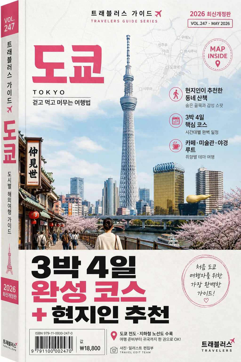
도시별 해외여행 가이드북 표지
해외여행 가이드북 표지. 도쿄·파리·뉴욕·방콕·발리 시리즈 결.
도시별 해외여행 가이드북 표지摘要
這是用來製作興趣/生活內容的 ChatGPT 圖像提示詞,已整理主題、背景、風格與構圖,方便快速調整。
相關關鍵字: 도시별 해외여행 가이드북 표지, 도시별 해외여행 가이드북 표지 프롬프트, 興趣/生活 프롬프트, 興趣/生活 AI 이미지 프롬프트, ChatGPT 이미지 프롬프트, AI 이미지 생성 프롬프트, AI 프롬프트, 이미지 프롬프트
도시별 해외여행 가이드북 표지使用方式
保留原始結構並替換主體、背景、色彩或構圖,即可延伸出不同版本。
- 保留核心主體,並依品牌、季節或平台調整色彩與背景。
- 如果畫面太複雜,請減少背景元素並具體描述主體、構圖與光線。
- 複製後可要求 ChatGPT 配合平台、長寬比或文字需求調整。
提示詞原文
[Input]
- language: Korean
- output_size: 1024x1536

[Purpose]
Korean travel guidebook cover for a specific city/country, vertical B6-style book jacket for bookstore shelves and online thumbnail use.
Realistic editorial cover that combines a city landmark illustration/photo with bold Korean headline typography, publisher branding, edition information, short travel feature blurbs, and practical guidebook retail details.

[Composition]
- Single-book cover composition in a strict vertical frame: the main landmark artwork occupies about 55% of the upper-middle area, the headline copy sits in the lower third, and the series title anchors the top area like a real bookstore travel guide.
- Background is a tactile print-style field with subtle paper grain, faint ink texture, and layered city-map or transit-line motifs using the palette from {컬러 팔레트}; the cover should feel like a finished printed book jacket, not a blank mockup.
- Maintain strong editorial hierarchy on all sides, with the publisher mark, barcode/ISBN area, price label, small edition note, and travel-guide metadata placed naturally around the bottom and side zones.
- Add 2–3 short Korean feature blurbs that fit the destination, such as “현지인이 추천한 동네 산책”, “3박 4일 핵심 코스”, “카페·미술관·야경 루트”, set smaller than the main headline.
- Include realistic book-cover microcopy: “2026 최신개정판”, “MAP INSIDE”, “VOL.247”, “₩18,800”, “ISBN 979-11-0000-247-0”, and a small barcode box near the lower-left or lower-right.
- Use {도시·국가}, {가이드북 시리즈}, {표지 일러}, {헤드라인 카피}, {출판사·시리즈}, {컬러 팔레트}, {비율} as customizable placeholders.

[3. CORE STRUCTURE]
1. Top area (about 12%): set {가이드북 시리즈} in small series-title type, centered or slightly upper-left depending on the cover layout, with generous tracking and a compact editorial feel. Add a small edition/date label nearby, for example “2026 최신개정판” or “VOL.247 · MAY 2026”.
2. Main visual area (mid 55%): place {표지 일러} as the hero artwork, framed with crisp edges and a polished travel-poster treatment; if the artwork is photographic, keep it cover-ready with a believable cutout or printed-photo panel, and if illustrative, preserve flat graphic clarity while adding small contextual city details such as street signs, skyline silhouettes, café awnings, transit lines, river shapes, foliage, or neighborhood textures that match {도시·국가}.
3. City label layer: integrate {도시·국가} as a prominent destination cue near the hero art, either as a subtitle, ribbon, capsule label, or large typographic layer behind/around the landmark. Add a small Korean descriptor such as “도시별 해외여행 가이드” or “걷고 먹고 머무는 여행법”.
4. Feature blurb layer: place 2–3 short Korean blurbs around the main visual or between the visual and headline, using compact editorial typography. Example blurbs: “현지 맛집 48곳”, “반나절 근교 코스”, “초보 여행자 체크리스트”. Keep them clearly secondary to {헤드라인 카피}.
5. Headline block (lower 18%): set {헤드라인 카피} in bold Korean display type, large enough to dominate the lower third, with strong contrast against the background and tight line breaks for a commercial cover look.
6. Bottom strip (about 8%): place {출판사·시리즈} as a small publisher mark in the lower-right corner. Add a practical retail block with barcode/ISBN, price “₩18,800”, and a tiny credit line such as “사진·일러스트 편집부” or “TRAVEL EDIT TEAM”.
7. Side/spine cue: include a very thin visible book-spine edge or vertical side text if the composition allows, with small text such as “{가이드북 시리즈} · {도시·국가}” to make the cover feel like a real printed guidebook.
8. Overall layout: keep the cover visually stable and instantly readable at thumbnail size, while adding authentic guidebook details, destination texture, map fragments, route markers, and printed production marks that support the travel concept.

[4. STYLE RULES]
- Typography: use Pretendard ExtraBold or Noto Sans KR Black for {헤드라인 카피}, 42–64px visual scale; use Pretendard Medium or Noto Sans KR Regular for {가이드북 시리즈}, {출판사·시리즈}, edition labels, feature blurbs, ISBN, and price, 12–24px scale; add subtle tracking to the series title for a professional book-cover look.
- Color palette: follow {컬러 팔레트} precisely, typically combining city-specific accent tones with white and charcoal; examples include Tokyo pink, Paris blue, Bali green, clean white, and deep charcoal. Use accent colors for labels, route lines, map pins, and small typographic dividers.
- Print finish: create a realistic matte-coated book-cover finish with visible paper grain, faint ink registration texture, subtle edge shadow, and a soft drop shadow under the hero artwork if needed, about 4px y-offset, 12px blur, 15% opacity; avoid heavy bevels or glossy plastic effects.
- Layout details: include a small barcode area, edition/date label, price, ISBN-style number, destination category tag, and short travel blurbs. These details should look printed on the cover, aligned to a professional editorial grid.

[5. VISUAL STYLE]
- Camera / lens: if using photography for {표지 일러}, emulate a full-frame 85mm f/1.8 or 50mm f/1.4 travel/editorial shot, crisp and cover-ready; for illustration, keep perspective clean like a travel poster with controlled depth.
- Lighting: soft daylight from upper-left at roughly 45°, with mild fill from the front and no harsh specular highlights; if the scene suggests a real city view, use overcast diffused light or late-afternoon golden-hour warmth depending on the city palette.
- Color grade: print-friendly editorial grading with clean whites, controlled contrast, and city-specific accent color emphasis; keep saturation moderate and avoid neon overshoot.
- Material realism: show slight paper tooth, printed ink density, tiny alignment marks or microtext where appropriate, and a believable book-cover surface so the result reads as an actual published travel guide.

[6. MOOD]
Premium bookstore travel-guide editorial — the polished, practical feel of a Lonely Planet / National Geographic Traveler cover with clean Korean typography, destination-first clarity, and the lived-in richness of a guidebook packed with routes, places, maps, and travel tips.

[7. CRITICAL]
- Korean text accuracy: 반드시 아래 문자열이 정확히 보여야 함:
  - {도시·국가}
  - {가이드북 시리즈}
  - {헤드라인 카피}
  - {출판사·시리즈}
- Additional Korean cover text may include: “2026 최신개정판”, “도시별 해외여행 가이드”, “현지인이 추천한 동네 산책”, “3박 4일 핵심 코스”, “카페·미술관·야경 루트”, “MAP INSIDE”, “₩18,800”.
- All Korean characters must render cleanly with no broken glyphs, no spacing corruption, and no incorrect line breaks inside the key headline.
- Keep the city landmark and headline hierarchy consistent with a real guidebook cover: main artwork dominant, headline bold, feature blurbs secondary, publisher mark small, barcode/ISBN and price readable but not distracting.

[8. 🚫 PROHIBITED]
- Fake official seals / certifications
- Broken Korean characters