Ads/Posters
채용 공고 포스터 (스타트업·대기업 톤)
스타트업·대기업 채용 공고 포스터. 직무·인재상·복지·키컬러 입력하면 인스타·잡사이트 공유 가능한 채용 비주얼.
채용 공고 포스터 (스타트업·대기업 톤) summary
Copy this ChatGPT image prompt to create Ads/Posters results. Its subject, background, style, and composition are organized for quick iteration.
Related keywords: 채용 공고 포스터 (스타트업·대기업 톤), 채용 공고 포스터 (스타트업·대기업 톤) 프롬프트, Ads/Posters 프롬프트, Ads/Posters AI 이미지 프롬프트, ChatGPT 이미지 프롬프트, AI 이미지 생성 프롬프트, AI 프롬프트, 이미지 프롬프트
How to use 채용 공고 포스터 (스타트업·대기업 톤)
Keep the prompt structure and swap the subject, background, palette, or composition to create new variations.
- Keep the main subject and adjust the palette and background for your brand, season, or channel.
- If the result feels busy, simplify the background and make the subject, composition, and lighting more specific.
- After copying, ask ChatGPT to adapt it for your platform, aspect ratio, or text requirements.
Original prompt
[Input]
- language: Korean
- output_size: 1024x1536
- ratio_size: {비율/사이즈}

[Purpose]
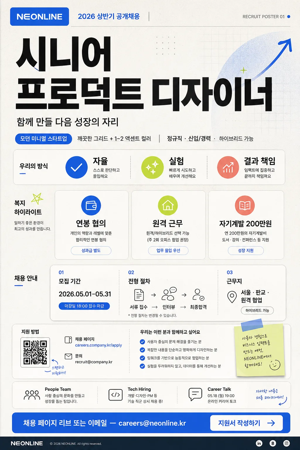
Korean startup and enterprise-style recruitment poster, vertical hiring announcement for social media, campus boards, office elevators, and careers landing pages.
Create a realistic content-rich hiring poster with a polished corporate design system: company branding, large role title, practical hiring details, benefit cards, application timeline, QR-style apply area, contact line, and clear CTA.

[Composition]
- Centered vertical poster with a strong top-to-bottom reading flow: company and campaign header at top 12%, role title hero at 22%, keyword and benefits grid in the middle 38%, application details and CTA block at bottom 18%.
- Background treatment: matte off-white base with subtle warm gray paper texture, fine printed grain, faint geometric grid accents, soft color panels, and a few tasteful recruitment-themed graphic marks such as arrows, rounded stickers, timeline dots, and small check icons.
- Layout should feel like a real Korean hiring poster: scannable, editorial, information-rich, with believable HR details and printed poster depth.
- Use {회사명}, {채용 직무}, {인재상 키워드}, {주요 복지}, {컨셉 톤}, {CTA} placeholders.

[3. CORE STRUCTURE]
- Header zone (top 12%): place a compact company wordmark or logo placeholder for {회사명} in a clean rounded rectangle or wordmark area. Add a small campaign label: "2026 상반기 공개채용" and a tiny issue-style tag such as "RECRUIT POSTER 01".
- Hero zone (upper-middle 22%): render {채용 직무} in very large bold sans-serif Korean type, using the highest contrast on the page; this is the primary focal point. Add a short supportive hiring line below: "함께 만들 다음 성장의 자리".
- Sub-hero line: place {컨셉 톤} as a small direction label or tone badge, paired with realistic details like "정규직 · 신입/경력 · 하이브리드 가능".
- Keyword strip (middle-left or middle row): show {인재상 키워드} as 3 spaced key tags or chips with small icons; make each chip feel like a real applicant-fit badge, such as checkmark, spark, graph, or team icon.
- Benefits area (middle 38%): present {주요 복지} as 3 concise icon-text rows or cards. Add realistic supporting labels around them: "복지 하이라이트", "성장 지원", "업무 환경".
- Hiring details module: include a compact schedule card with "모집 기간 2026.05.01–05.31", "전형 절차 서류 → 인터뷰 → 최종합격", and "근무지 서울 · 판교 · 원격 협업".
- Info footer module: add an application guide area with a small QR-code style square, a short URL label "careers.company.kr/apply", contact line "문의 recruit@company.kr", and a tiny map-pin or link icon.
- Sponsor / partner area: create a small footer strip with subtle labels like "People Team", "Tech Hiring", "Career Talk 05.18 19:00"; keep it like a real HR poster footer rather than an official certificate.
- CTA zone (bottom 12%): place {CTA} inside a prominent button-like pill or outlined box with high readability, paired with a small arrow, QR cue, or "지원서 작성하기" label.

[4. STYLE RULES]
- Typography: Pretendard or Noto Sans KR for all Korean text; title weight 800~900 at very large size, section labels 600~700, body 400~500, tight but readable line spacing. Use realistic hierarchy like a premium recruitment campaign page.
- Color palette: off-white #F6F3EE base, charcoal #1F2328 text, accent blue #3B82F6, accent lime #A3E635 or coral #FF6B6B for key chips, timeline dots, and CTA highlights; maintain a corporate-clean palette with richer printed detail.
- Border/shadow: thin 1px dividers in cool gray #D7DCE2, soft card shadows around benefit and schedule modules, gentle paper-edge shading, and subtle depth for the CTA card.
- Add believable micro-layout elements: small section numbers, divider labels, application deadline badge, tiny navigation dots, and footer metadata, while keeping all important text legible.

[5. VISUAL STYLE]
- Camera / lens: front-facing graphic poster composition, equivalent to a 50mm normal-perspective editorial layout, straight-on orthographic presentation with no distortion.
- Lighting: studio-flat, evenly lit paper-poster look with subtle top-left highlight, natural printed-paper texture, soft ambient shadow at the poster edges, and crisp digital-print clarity.
- Color grade: crisp cool-neutral corporate grade with off-white, graphite, blue accent, and a small fresh secondary accent; refined Korean tech-company recruitment aesthetic.

[6. MOOD]
Modern Korean startup and enterprise recruiting poster — feels like a polished careers campaign from a fast-growing tech company or large corporate innovation team, informative enough to be real and stylish enough for social media sharing.

[7. CRITICAL]
- Korean text accuracy: the following verbatim strings must appear correctly in the rendered image:
  - {회사명}
  - {채용 직무}
  - {인재상 키워드}
  - {주요 복지}
  - {CTA}
  - "2026 상반기 공개채용"
  - "함께 만들 다음 성장의 자리"
  - "정규직 · 신입/경력 · 하이브리드 가능"
  - "모집 기간 2026.05.01–05.31"
  - "전형 절차 서류 → 인터뷰 → 최종합격"
  - "문의 recruit@company.kr"
- Korean text must be clean, fully legible, and rendered with correct Hangul syllables and spacing.
- All text should look like a real hiring poster, with clear hierarchy, readable details, and no decorative distortion.

[8. 🚫 PROHIBITED]
- Fake official seals / certifications
- Broken Korean characters