廣告/海報
채용 공고 포스터 (스타트업·대기업 톤)
스타트업·대기업 채용 공고 포스터. 직무·인재상·복지·키컬러 입력하면 인스타·잡사이트 공유 가능한 채용 비주얼.
채용 공고 포스터 (스타트업·대기업 톤)摘要
這是用來製作廣告/海報內容的 ChatGPT 圖像提示詞,已整理主題、背景、風格與構圖,方便快速調整。
相關關鍵字: 채용 공고 포스터 (스타트업·대기업 톤), 채용 공고 포스터 (스타트업·대기업 톤) 프롬프트, 廣告/海報 프롬프트, 廣告/海報 AI 이미지 프롬프트, ChatGPT 이미지 프롬프트, AI 이미지 생성 프롬프트, AI 프롬프트, 이미지 프롬프트
채용 공고 포스터 (스타트업·대기업 톤)使用方式
保留原始結構並替換主體、背景、色彩或構圖,即可延伸出不同版本。
- 保留核心主體,並依品牌、季節或平台調整色彩與背景。
- 如果畫面太複雜,請減少背景元素並具體描述主體、構圖與光線。
- 複製後可要求 ChatGPT 配合平台、長寬比或文字需求調整。
提示詞原文
[Input]
- language: Korean
- output_size: 1024x1536
- ratio_size: {비율/사이즈}

[Purpose]
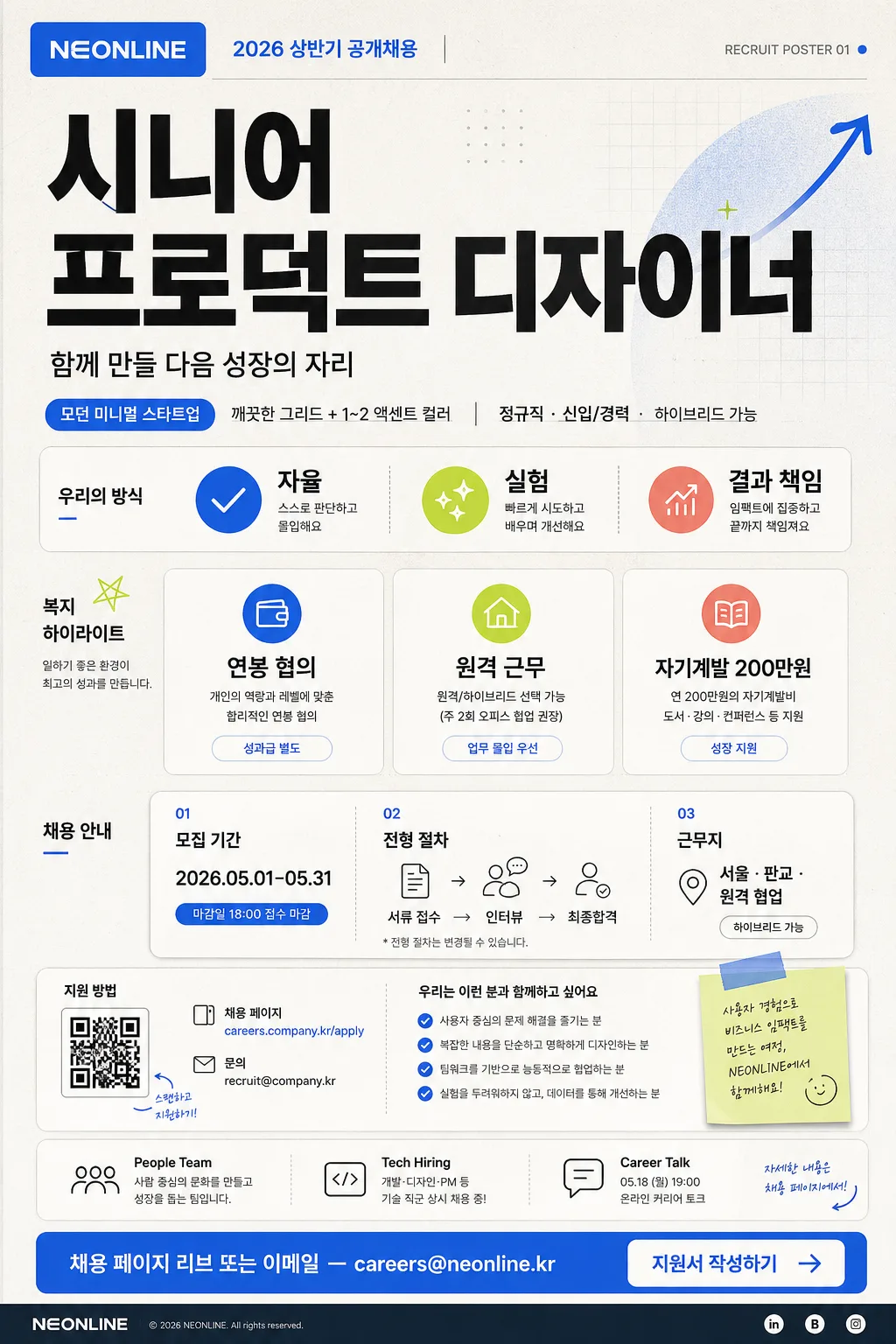
Korean startup and enterprise-style recruitment poster, vertical hiring announcement for social media, campus boards, office elevators, and careers landing pages.
Create a realistic content-rich hiring poster with a polished corporate design system: company branding, large role title, practical hiring details, benefit cards, application timeline, QR-style apply area, contact line, and clear CTA.

[Composition]
- Centered vertical poster with a strong top-to-bottom reading flow: company and campaign header at top 12%, role title hero at 22%, keyword and benefits grid in the middle 38%, application details and CTA block at bottom 18%.
- Background treatment: matte off-white base with subtle warm gray paper texture, fine printed grain, faint geometric grid accents, soft color panels, and a few tasteful recruitment-themed graphic marks such as arrows, rounded stickers, timeline dots, and small check icons.
- Layout should feel like a real Korean hiring poster: scannable, editorial, information-rich, with believable HR details and printed poster depth.
- Use {회사명}, {채용 직무}, {인재상 키워드}, {주요 복지}, {컨셉 톤}, {CTA} placeholders.

[3. CORE STRUCTURE]
- Header zone (top 12%): place a compact company wordmark or logo placeholder for {회사명} in a clean rounded rectangle or wordmark area. Add a small campaign label: "2026 상반기 공개채용" and a tiny issue-style tag such as "RECRUIT POSTER 01".
- Hero zone (upper-middle 22%): render {채용 직무} in very large bold sans-serif Korean type, using the highest contrast on the page; this is the primary focal point. Add a short supportive hiring line below: "함께 만들 다음 성장의 자리".
- Sub-hero line: place {컨셉 톤} as a small direction label or tone badge, paired with realistic details like "정규직 · 신입/경력 · 하이브리드 가능".
- Keyword strip (middle-left or middle row): show {인재상 키워드} as 3 spaced key tags or chips with small icons; make each chip feel like a real applicant-fit badge, such as checkmark, spark, graph, or team icon.
- Benefits area (middle 38%): present {주요 복지} as 3 concise icon-text rows or cards. Add realistic supporting labels around them: "복지 하이라이트", "성장 지원", "업무 환경".
- Hiring details module: include a compact schedule card with "모집 기간 2026.05.01–05.31", "전형 절차 서류 → 인터뷰 → 최종합격", and "근무지 서울 · 판교 · 원격 협업".
- Info footer module: add an application guide area with a small QR-code style square, a short URL label "careers.company.kr/apply", contact line "문의 recruit@company.kr", and a tiny map-pin or link icon.
- Sponsor / partner area: create a small footer strip with subtle labels like "People Team", "Tech Hiring", "Career Talk 05.18 19:00"; keep it like a real HR poster footer rather than an official certificate.
- CTA zone (bottom 12%): place {CTA} inside a prominent button-like pill or outlined box with high readability, paired with a small arrow, QR cue, or "지원서 작성하기" label.

[4. STYLE RULES]
- Typography: Pretendard or Noto Sans KR for all Korean text; title weight 800~900 at very large size, section labels 600~700, body 400~500, tight but readable line spacing. Use realistic hierarchy like a premium recruitment campaign page.
- Color palette: off-white #F6F3EE base, charcoal #1F2328 text, accent blue #3B82F6, accent lime #A3E635 or coral #FF6B6B for key chips, timeline dots, and CTA highlights; maintain a corporate-clean palette with richer printed detail.
- Border/shadow: thin 1px dividers in cool gray #D7DCE2, soft card shadows around benefit and schedule modules, gentle paper-edge shading, and subtle depth for the CTA card.
- Add believable micro-layout elements: small section numbers, divider labels, application deadline badge, tiny navigation dots, and footer metadata, while keeping all important text legible.

[5. VISUAL STYLE]
- Camera / lens: front-facing graphic poster composition, equivalent to a 50mm normal-perspective editorial layout, straight-on orthographic presentation with no distortion.
- Lighting: studio-flat, evenly lit paper-poster look with subtle top-left highlight, natural printed-paper texture, soft ambient shadow at the poster edges, and crisp digital-print clarity.
- Color grade: crisp cool-neutral corporate grade with off-white, graphite, blue accent, and a small fresh secondary accent; refined Korean tech-company recruitment aesthetic.

[6. MOOD]
Modern Korean startup and enterprise recruiting poster — feels like a polished careers campaign from a fast-growing tech company or large corporate innovation team, informative enough to be real and stylish enough for social media sharing.

[7. CRITICAL]
- Korean text accuracy: the following verbatim strings must appear correctly in the rendered image:
  - {회사명}
  - {채용 직무}
  - {인재상 키워드}
  - {주요 복지}
  - {CTA}
  - "2026 상반기 공개채용"
  - "함께 만들 다음 성장의 자리"
  - "정규직 · 신입/경력 · 하이브리드 가능"
  - "모집 기간 2026.05.01–05.31"
  - "전형 절차 서류 → 인터뷰 → 최종합격"
  - "문의 recruit@company.kr"
- Korean text must be clean, fully legible, and rendered with correct Hangul syllables and spacing.
- All text should look like a real hiring poster, with clear hierarchy, readable details, and no decorative distortion.

[8. 🚫 PROHIBITED]
- Fake official seals / certifications
- Broken Korean characters