廣告/海報
매장 테이블 매트 디자인 (1회용·재활용)
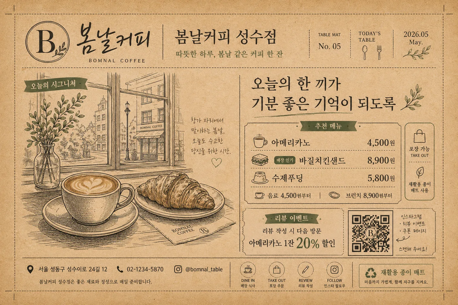
테이블 매트 디자인. 매장 로고 + 일러스트 + QR.
매장 테이블 매트 디자인 (1회용·재활용)摘要
這是用來製作廣告/海報內容的 ChatGPT 圖像提示詞,已整理主題、背景、風格與構圖,方便快速調整。
相關關鍵字: 매장 테이블 매트 디자인 (1회용·재활용), 매장 테이블 매트 디자인 (1회용·재활용) 프롬프트, 廣告/海報 프롬프트, 廣告/海報 AI 이미지 프롬프트, ChatGPT 이미지 프롬프트, AI 이미지 생성 프롬프트, AI 프롬프트, 이미지 프롬프트
매장 테이블 매트 디자인 (1회용·재활용)使用方式
保留原始結構並替換主體、背景、色彩或構圖,即可延伸出不同版本。
- 保留核心主體,並依品牌、季節或平台調整色彩與背景。
- 如果畫面太複雜,請減少背景元素並具體描述主體、構圖與光線。
- 複製後可要求 ChatGPT 配合平台、長寬比或文字需求調整。
提示詞原文
[Input]
- language: Korean
- output_size: 1536x1024

[Purpose]
Korean store table mat design for dine-in use, one-time-use or recyclable print layout.
A horizontal branded placemat that works as tableware, mini menu, store promotion, and QR call-to-action in one realistic printed sheet.

[Composition]
- The sheet fills the full landscape canvas in a {레이아웃} proportion, with tiny crop ticks, realistic paper edges, and a practical print-safe area for disposable/recyclable table mat production.
- Main visual area uses {시그니처 비주얼} as the focal illustration block, placed slightly left of center with small caption tags and menu dividers around it.
- {매장}, {매장 영문명}, and {로고 문구} are integrated as a branded in-store goods piece, like a premium café or casual dining placemat.
- Add functional restaurant-mat information: {대표 메뉴}, {가격대}, {매장 주소}, {연락처}, {이벤트 문구}, and a clear {QR 안내} zone in the lower-right corner.
- Background uses kraft-paper texture, soy-ink grain, warm off-white panels, small tableware icons, dotted divider lines, coupon-style tabs, and a soft recycled paper fiber feel.
- The design should feel actually printed and used on a tabletop: flat paper surface, slight ink absorption, crisp Korean typography, and a balanced mix of illustration, menu text, event notice, and QR block.

[3. CORE STRUCTURE]
- Header area (top 15%): place {매장} as the main store label, pair it with {매장 영문명}, add {로고 문구}, and include small issue-like details such as “TABLE MAT No. 05”, “TODAY’S TABLE”, and a small date label “2026.05”.
- Hero visual area (left-mid 42%): display {시그니처 비주얼} as the largest element, with a caption reading “오늘의 시그니처” and a small handwritten note beside the illustration.
- Copy and menu area (center-right 26%): set {한 줄 카피} as the main slogan, then add a compact menu/pricelist block using {대표 메뉴} and {가격대}; use clear dividers, bullet dots, and tiny labels like “추천 메뉴”, “포장 가능”, and “매장 인기”.
- QR and event area (bottom-right 14%): place {QR 안내} inside a clearly scannable square zone; below or beside it, add {이벤트 문구} as a coupon-style CTA with small arrows pointing toward the QR.
- Footer strip (bottom 10%): include {매장 주소}, {연락처}, a small recycling note “재활용 종이 매트”, and tiny icon-style marks for dine-in, take-out, review, and social follow.
- Base layer: use kraft brown, deep black, muted accent ink, and warm paper tones from {컬러 톤}, making the placemat readable from an overhead dining-table view.

[4. STYLE RULES]
- Typography: {타이포}; combine Nanum Myeongjo for Korean headline emphasis with Pretendard or Noto Sans KR for menu, address, QR instructions, and event details; use bold weights for prices and CTA labels.
- Color palette: {컬러 톤} should translate into kraft brown paper, deep black ink, muted store-brand accent color, warm off-white menu panels, and print-friendly contrast.
- Graphic system: use thin framing rules, dotted dividers, small stamp-box shapes, map-pin icons, cup/plate/chopstick line icons, and coupon-tab graphics to make it feel like a real shop placemat.
- Print texture: show natural paper fiber, slight ink spread, small halftone accents, and subtle soy-ink irregularity while keeping all Korean letters and prices sharp.
- Brand layout: logo, menu, address, contact, event, and QR should feel intentionally designed as a cohesive store identity system rather than isolated text blocks.

[5. VISUAL STYLE]
- Camera / lens: top-down flat-lay composition, 35mm lens look, f/5.6, sharp printed-paper detail across the whole mat.
- Lighting: even overhead studio lighting with slight softbox falloff, no harsh specular glare, designed to resemble a photographed packaging and tableware print mockup.
- Color grade: warm kraft brown + black + muted signature accent, with natural paper texture, edible dining warmth, and restrained editorial contrast.

[6. MOOD]
Premium café tableware editorial — polished retail-brand placemat design with independent neighborhood-store warmth, practical menu information, and eco-conscious recyclable paper character.

[7. CRITICAL]
- Korean text accuracy: 반드시 정확히 보여야 하는 문자열: “{매장}”, “{매장 영문명}”, “{로고 문구}”, “{한 줄 카피}”, “{대표 메뉴}”, “{가격대}”, “{매장 주소}”, “{연락처}”, “{QR 안내}”, “{이벤트 문구}”.
- Additional readable Korean microcopy: “오늘의 시그니처”, “추천 메뉴”, “포장 가능”, “매장 인기”, “재활용 종이 매트”, “식사 후 QR로 리뷰 남기기”.
- Layout invariant: horizontal placemat composition only; QR must stay in the lower-right zone and remain clearly scannable with a realistic quiet zone around the code.
- Print clarity: all Korean characters, prices, address, contact, and menu labels must be clean, complete, and fully legible with no warped or broken glyphs.

[8. 🚫 PROHIBITED]
- Fake official seals / certifications
- Broken Korean characters
- Celebrity composites or recognizable public-figure likenesses