Ads/Posters
매장 테이블 매트 디자인 (1회용·재활용)
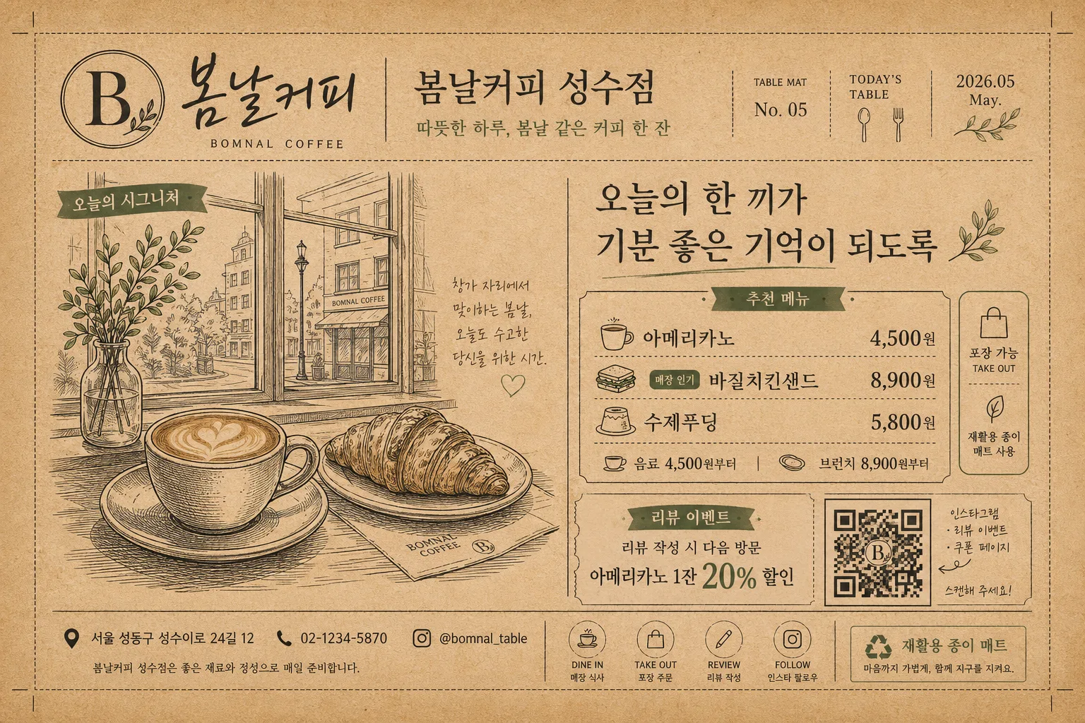
테이블 매트 디자인. 매장 로고 + 일러스트 + QR.
매장 테이블 매트 디자인 (1회용·재활용) summary
Copy this ChatGPT image prompt to create Ads/Posters results. Its subject, background, style, and composition are organized for quick iteration.
Related keywords: 매장 테이블 매트 디자인 (1회용·재활용), 매장 테이블 매트 디자인 (1회용·재활용) 프롬프트, Ads/Posters 프롬프트, Ads/Posters AI 이미지 프롬프트, ChatGPT 이미지 프롬프트, AI 이미지 생성 프롬프트, AI 프롬프트, 이미지 프롬프트
How to use 매장 테이블 매트 디자인 (1회용·재활용)
Keep the prompt structure and swap the subject, background, palette, or composition to create new variations.
- Keep the main subject and adjust the palette and background for your brand, season, or channel.
- If the result feels busy, simplify the background and make the subject, composition, and lighting more specific.
- After copying, ask ChatGPT to adapt it for your platform, aspect ratio, or text requirements.
Original prompt
[Input]
- language: Korean
- output_size: 1536x1024

[Purpose]
Korean store table mat design for dine-in use, one-time-use or recyclable print layout.
A horizontal branded placemat that works as tableware, mini menu, store promotion, and QR call-to-action in one realistic printed sheet.

[Composition]
- The sheet fills the full landscape canvas in a {레이아웃} proportion, with tiny crop ticks, realistic paper edges, and a practical print-safe area for disposable/recyclable table mat production.
- Main visual area uses {시그니처 비주얼} as the focal illustration block, placed slightly left of center with small caption tags and menu dividers around it.
- {매장}, {매장 영문명}, and {로고 문구} are integrated as a branded in-store goods piece, like a premium café or casual dining placemat.
- Add functional restaurant-mat information: {대표 메뉴}, {가격대}, {매장 주소}, {연락처}, {이벤트 문구}, and a clear {QR 안내} zone in the lower-right corner.
- Background uses kraft-paper texture, soy-ink grain, warm off-white panels, small tableware icons, dotted divider lines, coupon-style tabs, and a soft recycled paper fiber feel.
- The design should feel actually printed and used on a tabletop: flat paper surface, slight ink absorption, crisp Korean typography, and a balanced mix of illustration, menu text, event notice, and QR block.

[3. CORE STRUCTURE]
- Header area (top 15%): place {매장} as the main store label, pair it with {매장 영문명}, add {로고 문구}, and include small issue-like details such as “TABLE MAT No. 05”, “TODAY’S TABLE”, and a small date label “2026.05”.
- Hero visual area (left-mid 42%): display {시그니처 비주얼} as the largest element, with a caption reading “오늘의 시그니처” and a small handwritten note beside the illustration.
- Copy and menu area (center-right 26%): set {한 줄 카피} as the main slogan, then add a compact menu/pricelist block using {대표 메뉴} and {가격대}; use clear dividers, bullet dots, and tiny labels like “추천 메뉴”, “포장 가능”, and “매장 인기”.
- QR and event area (bottom-right 14%): place {QR 안내} inside a clearly scannable square zone; below or beside it, add {이벤트 문구} as a coupon-style CTA with small arrows pointing toward the QR.
- Footer strip (bottom 10%): include {매장 주소}, {연락처}, a small recycling note “재활용 종이 매트”, and tiny icon-style marks for dine-in, take-out, review, and social follow.
- Base layer: use kraft brown, deep black, muted accent ink, and warm paper tones from {컬러 톤}, making the placemat readable from an overhead dining-table view.

[4. STYLE RULES]
- Typography: {타이포}; combine Nanum Myeongjo for Korean headline emphasis with Pretendard or Noto Sans KR for menu, address, QR instructions, and event details; use bold weights for prices and CTA labels.
- Color palette: {컬러 톤} should translate into kraft brown paper, deep black ink, muted store-brand accent color, warm off-white menu panels, and print-friendly contrast.
- Graphic system: use thin framing rules, dotted dividers, small stamp-box shapes, map-pin icons, cup/plate/chopstick line icons, and coupon-tab graphics to make it feel like a real shop placemat.
- Print texture: show natural paper fiber, slight ink spread, small halftone accents, and subtle soy-ink irregularity while keeping all Korean letters and prices sharp.
- Brand layout: logo, menu, address, contact, event, and QR should feel intentionally designed as a cohesive store identity system rather than isolated text blocks.

[5. VISUAL STYLE]
- Camera / lens: top-down flat-lay composition, 35mm lens look, f/5.6, sharp printed-paper detail across the whole mat.
- Lighting: even overhead studio lighting with slight softbox falloff, no harsh specular glare, designed to resemble a photographed packaging and tableware print mockup.
- Color grade: warm kraft brown + black + muted signature accent, with natural paper texture, edible dining warmth, and restrained editorial contrast.

[6. MOOD]
Premium café tableware editorial — polished retail-brand placemat design with independent neighborhood-store warmth, practical menu information, and eco-conscious recyclable paper character.

[7. CRITICAL]
- Korean text accuracy: 반드시 정확히 보여야 하는 문자열: “{매장}”, “{매장 영문명}”, “{로고 문구}”, “{한 줄 카피}”, “{대표 메뉴}”, “{가격대}”, “{매장 주소}”, “{연락처}”, “{QR 안내}”, “{이벤트 문구}”.
- Additional readable Korean microcopy: “오늘의 시그니처”, “추천 메뉴”, “포장 가능”, “매장 인기”, “재활용 종이 매트”, “식사 후 QR로 리뷰 남기기”.
- Layout invariant: horizontal placemat composition only; QR must stay in the lower-right zone and remain clearly scannable with a realistic quiet zone around the code.
- Print clarity: all Korean characters, prices, address, contact, and menu labels must be clean, complete, and fully legible with no warped or broken glyphs.

[8. 🚫 PROHIBITED]
- Fake official seals / certifications
- Broken Korean characters
- Celebrity composites or recognizable public-figure likenesses