광고/포스터
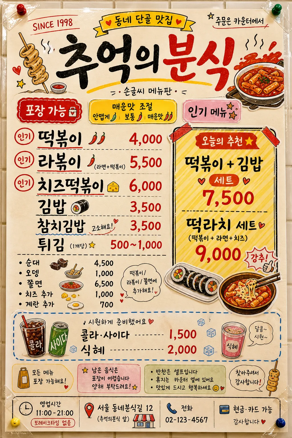
한국 분식집 메뉴판 (알록달록 손글씨)
떡볶이·라볶이·김밥·튀김 등 한국 분식집 메뉴판. 알록달록 컬러 + 손글씨 캘리그래피 + 친근한 일러스트.
한국 분식집 메뉴판 (알록달록 손글씨) 검색 요약
한국 분식집 메뉴판 (알록달록 손글씨)은 광고/포스터 결과물을 만들 때 바로 복사해 활용할 수 있는 ChatGPT 이미지 프롬프트입니다. 주제, 배경, 스타일, 구도 조건을 함께 담아 빠르게 시안을 만들 수 있도록 구성했습니다.
관련 키워드: 한국 분식집 메뉴판 (알록달록 손글씨), 한국 분식집 메뉴판 (알록달록 손글씨) 프롬프트, 광고/포스터 프롬프트, 광고/포스터 AI 이미지 프롬프트, ChatGPT 이미지 프롬프트, AI 이미지 생성 프롬프트, AI 프롬프트, 이미지 프롬프트
한국 분식집 메뉴판 (알록달록 손글씨) 활용 포인트
원본 구조를 유지하면서 피사체, 배경, 색감, 구도를 바꿔 다양한 시안으로 확장할 수 있습니다.
- 핵심 소재는 유지하고 브랜드, 계절, 채널 목적에 맞는 색감과 배경을 바꿔보세요.
- 결과가 산만하면 배경 요소를 줄이고 피사체, 구도, 조명 조건을 구체화하세요.
- 복사한 뒤 ChatGPT에서 플랫폼, 화면 비율, 텍스트 포함 여부를 추가로 요청할 수 있습니다.
프롬프트 원문
[Input]
- language: Korean
- output_size: 1024x1536

[Purpose]
Korean snack bar menu board for in-store display, vertical poster layout, bright hand-lettered commercial design.
Designed to feel like a lively neighborhood bunsik shop menu seen at the counter: laminated paper taped to a tiled shop wall, full of handwritten prices, small notices, food doodles, and warm local familiarity for quick ordering.

[Composition]
- Vertical {비율/사이즈} menu poster photographed straight-on, with a large top masthead occupying about 14% of the frame, a dense main menu column in the middle 45%, a boxed set-menu recommendation panel on the right or lower-middle side, a drinks and add-on section near the bottom, and shop information along the footer.
- Background should be a cream paper menu sheet with visible laminated sheen, light paper grain, tiny marker bleed, transparent tape corners, pushpin marks, and a hint of pale shop tile behind the board.
- Use colorful sticker-like accents in saturated red, yellow, pink, and orange, plus hand-drawn arrows, price bursts, chili icons, steam doodles, stars, hearts, and tteokbokki sauce splashes.
- Use {매장명} as the main title, {메인 메뉴} and {가격대} as the main pricing list, {세트 메뉴} in a highlighted recommendation box, {음료} in a smaller lower section, and {컨셉 톤} as the overall styling direction.
- Add realistic in-store menu details: small label strips reading "포장 가능", "매운맛 조절", "인기", "오늘의 추천", an address/contact footer, operating hours, and a compact notice area, all in Korean and visually secondary to the required menu text.

[3. CORE STRUCTURE]
- Top header: Place {매장명} in the largest hand-drawn Korean calligraphy, slightly arched and playful, with small food doodles around it like steam, stars, hearts, chili peppers, fish-cake skewers, and tteokbokki sauce splashes.
- Header micro details: Add small shop-board text near the masthead such as "SINCE 1998", "동네 단골 맛집", "주문은 카운터에서", and a tiny handwritten credit line "손글씨 메뉴판".
- Main menu area: Set {메인 메뉴} in bold, highly legible handwritten list format, with each item paired clearly to {가격대}; emphasize popular items using red underlines, yellow highlight blocks, small circle stamps reading "인기", and tiny spice-level chili marks.
- Add secondary menu rows around the main list to make it feel like a real bunsik pricelist: "순대 4,500", "오뎅 1,000", "쫄면 6,500", "치즈 추가 1,000", "계란 추가 700", while keeping the required {메인 메뉴} and {가격대} text most prominent and readable.
- Set menu box: Put {세트 메뉴} inside a rounded rectangle or sticker-style box with a stronger hand-drawn border, diagonal yellow fill, red corner tape, and a tiny “추천” callout drawn like a shop sticker, not an official seal.
- Drink section: Display {음료} in a slightly smaller but clear handwritten style near the bottom, separated by a playful dashed divider line; add small illustrated cups, ice cubes, and a side note "시원하게 준비했어요".
- Footer info: Add a small but legible store-info strip at the very bottom with Korean text such as "영업시간 11:00–21:00", "브레이크타임 없음", "서울 동네분식길 12", "전화 02-123-4567", "현금·카드 가능".
- Decorative illustrations: Add marker-style icons of tteokbokki, gimbap, tempura, fish cake, sauce bowls, chopsticks, napkin packs, sauce splatters, and small receipt-like price tags around the edge and between sections.
- Overall layout rhythm: Make the page energetic, colorful, and packed like a real Korean bunsik menu behind a counter, with strong hierarchy so the title, main menu, set menu, and drinks remain instantly readable.

[4. STYLE RULES]
- Typography: Use a mix of hand-lettered Korean calligraphy and rounded display fonts such as Nanum Brush Script, Cafe24 Ssurround Air, and Pretendard Bold for prices; title around 72–96 px, menu items around 34–44 px, prices around 30–38 px, footer notices around 16–22 px.
- Color palette: Use saturated red #E53935, bright yellow #FDD835, hot pink #EC407A, orange #FB8C00, and cream background #FFF6E8, with black text #1F1F1F for readability.
- Border/shadow: Use thick marker-like outlines 3–5 px, mild paper-cut sticker shadows with 4 px y-offset, 10 px blur, 18% opacity, occasional hand-drawn dashed separators, taped-corner shadows, and laminated-paper highlights.
- Pricing style: Align prices in a practical shop-menu rhythm, using red price numerals, black item names, small won-style commas, and occasional highlight tabs for best sellers.
- Texture and realism: Include marker strokes, slightly uneven hand lettering, paper curl at corners, transparent tape glints, tiny sauce-dot decorations, and a few believable handwritten correction stickers, while keeping all required Korean text crisp.

[5. VISUAL STYLE]
- Camera / lens: Front-facing poster capture aesthetic, as if photographed straight-on with a 50mm lens at f/5.6 for a natural printed-sign look.
- Lighting: Soft even daylight from front-left with gentle shop-interior reflections on the laminated surface and soft shadows from taped corners.
- Color grade: High-saturation retro snack-shop palette with warm cream paper, tomato red, sunflower yellow, bubblegum pink accents, and a cozy fluorescent-counter warmth.
- Material feel: Printed-and-handwritten hybrid menu board, laminated poster on a tiled wall, slightly glossy but readable, with handmade marker outlines and sticker overlays.

[6. MOOD]
Warm neighborhood bunsik counter menu — a cheerful Korean local shop signboard with the playful energy of a hand-painted street café display, packed with familiar prices, quick-order cues, and nostalgic after-school snack-shop charm.

[7. CRITICAL]
- Korean text accuracy: 반드시 아래 문자열이 정확히 보여야 함: "추억의분식", "떡볶이 / 라볶이 / 치즈떡볶이 / 김밥 / 참치김밥 / 튀김", "떡볶이 4,000 / 라볶이 5,500 / 치즈떡볶이 6,000 / 김밥 3,500 / 튀김 500~1,000", "떡볶이 + 김밥 세트 7,500 / 떡라치 세트 9,000", "콜라·사이다 1,500 / 식혜 2,000".
- Additional Korean shop details may appear, such as "포장 가능", "매운맛 조절", "오늘의 추천", "영업시간 11:00–21:00", "서울 동네분식길 12", "전화 02-123-4567", but they must be smaller than the main menu information.
- Hangul must be crisp and correctly formed, with no broken syllables, garbled spacing, or misspelled prices.
- The hierarchy must clearly separate title, main menu, set menu, drinks, and footer shop information, with the set menu visibly boxed.

[8. 🚫 PROHIBITED]
- Fake official seals / certifications
- Broken Korean characters