Ads/Posters
도시락·반찬가게 메뉴판
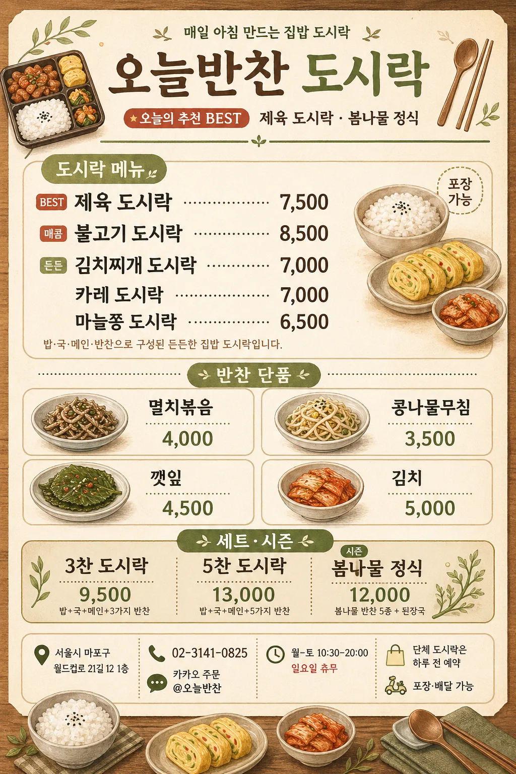
도시락·집밥·반찬·계절 메뉴 등 한국 가정식·반찬가게 메뉴판. 베이지+따뜻 톤 + 가정식 일러스트.
도시락·반찬가게 메뉴판 summary
Copy this ChatGPT image prompt to create Ads/Posters results. Its subject, background, style, and composition are organized for quick iteration.
Related keywords: 도시락·반찬가게 메뉴판, 도시락·반찬가게 메뉴판 프롬프트, Ads/Posters 프롬프트, Ads/Posters AI 이미지 프롬프트, ChatGPT 이미지 프롬프트, AI 이미지 생성 프롬프트, AI 프롬프트, 이미지 프롬프트
How to use 도시락·반찬가게 메뉴판
Keep the prompt structure and swap the subject, background, palette, or composition to create new variations.
- Keep the main subject and adjust the palette and background for your brand, season, or channel.
- If the result feels busy, simplify the background and make the subject, composition, and lighting more specific.
- After copying, ask ChatGPT to adapt it for your platform, aspect ratio, or text requirements.
Original prompt
[Input]
- language: Korean
- output_size: 1024x1536
- ratio_note: {비율/사이즈}

[Purpose]
Korean lunchbox and side-dish shop menu board, portrait poster for in-store display, counter signage, delivery insert, and Instagram sharing.
Create a warm neighborhood banchan-store price list with a large lunchbox menu section, side-dish price grid, seasonal set promotion, store information, order guidance, and small illustrated food motifs.

[Composition]
- Poster is vertically stacked with a top title band (14%), a main lunchbox menu zone (36%), a side-dish grid zone (22%), a bottom set/seasonal promo and store-info zone (20%), plus slim divider areas between sections.
- Center the shop name {매장명} in the header, add {상단 배지} above or beside it, and place {추천 문구} as a friendly subtitle under the title.
- Background should feel like light beige menu paper with subtle warm wood texture accents, faint rice-grain speckles, and soft olive divider lines, using small illustrated lunchbox and side-dish motifs.
- Organize the layout like a real printed shop menu: category labels, item rows, prices aligned on the right, small notes, contact line, address line, and ordering information at the bottom.

[3. CORE STRUCTURE]
- Header band: place {매장명} as the largest text, centered, with a small illustrated lunchbox icon, spoon/chopsticks icon, and a thin olive divider line below. Include the visible text {상단 배지} and {추천 문구}.
- Main lunchbox menu block: add a category heading “도시락 메뉴”, show {도시락 메뉴} in bold stacked lines, and place {가격} directly aligned to the right of each item for quick comparison. Add tiny tags such as “BEST”, “매콤”, “든든” where natural.
- Side-dish grid block: add a category heading “반찬 단품”, arrange {반찬 단품} as a 2x2 rounded-card grid, each card with a tiny line-drawn side-dish bowl illustration, item name, and price.
- Seasonal/set block: add a category heading “세트·시즌”, set {세트·시즌} inside a highlighted rounded rectangle with a slightly darker beige fill, a soft olive accent bar, and a small leaf/season motif.
- Store information footer: include {매장 주소}, {연락처}, {영업시간}, and {주문 안내} in a realistic lower information strip with small phone, map-pin, clock, and shopping-bag icons.
- Decorative menu details: add thin dividers, dotted separators between item names and prices, a small “포장 가능” label, a hand-drawn rice bowl, rolled omelet, kimchi bowl, lunchbox tray, spoon, chopsticks, and leaf graphics that support the home-style concept.

[4. STYLE RULES]
- Typography: use Pretendard or Noto Sans KR for all body text, Bold 700 for headings, Medium 500 for menu lines, and 42–64 px equivalent for the title depending on section.
- Color palette: follow {컨셉 톤}; use beige #F4EBDD, warm cream #FFF8EF, olive #7A8B5A, muted brown #8B6B4A, dark charcoal #2E2A27, soft sage #B7C6A1, and a muted red accent #B85C4A for BEST or seasonal labels.
- Border/shadow: use 1.5px olive dividers, rounded corners 18px, and a soft drop shadow with 0px x-offset, 4px y-offset, 12px blur, 12% opacity.
- Menu realism: prices should use Korean won formatting with commas, item rows should have dotted leader lines or right-aligned price columns, and footer information should resemble a real local shop menu flyer.

[5. VISUAL STYLE]
- Camera / lens: front-facing graphic poster composition with an orthographic layout feel, like a clean menu board photographed with a 50mm lens at f/5.6 for minimal distortion.
- Lighting: even soft indoor light, as if lit by a large diffused window from upper-left with very mild fill on the right, no harsh highlights.
- Color grade: warm beige + olive + wood brown with slightly muted saturation, print-friendly and calm, similar to a modern Korean neighborhood deli menu.
- Material feel: matte printed paper, subtle fiber texture, gentle wood-counter warmth behind the poster edges, crisp vector-style food illustrations.

[6. MOOD]
A tidy Korean home-style lunchbox shop menu board with a gentle editorial retail feel, like a warm neighborhood banchan store that prepares fresh lunchboxes every morning, with approachable pricing and friendly in-store signage.

[7. CRITICAL]
- Korean text accuracy: the following strings must appear exactly as written: {매장명}, {도시락 메뉴}, {가격}, {반찬 단품}, {세트·시즌}, {매장 주소}, {연락처}, {영업시간}, {주문 안내}.
- Render these Korean labels clearly where appropriate: “도시락 메뉴”, “반찬 단품”, “세트·시즌”, “오늘의 추천”, “포장 가능”, “전화 주문”.
- Keep all Korean characters crisp and correctly formed; no broken jamo, no mixed-up spacing, and no illegible price formatting.
- Maintain a clear hierarchy: title largest, lunchbox menu next, side-dish cards smaller, seasonal set and store information clearly readable at the bottom.

[8. 🚫 PROHIBITED]
- Fake official seals / certifications
- Broken Korean characters
- Missing or malformed Korean prices
- Photographic food realism that conflicts with the illustrated home-style concept