광고/포스터
도시락·반찬가게 메뉴판
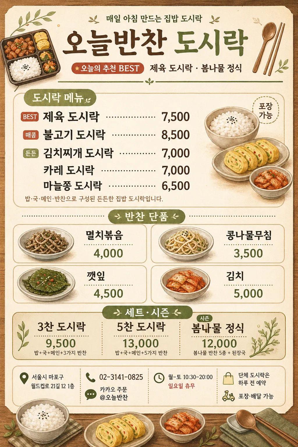
도시락·집밥·반찬·계절 메뉴 등 한국 가정식·반찬가게 메뉴판. 베이지+따뜻 톤 + 가정식 일러스트.
도시락·반찬가게 메뉴판 검색 요약
도시락·반찬가게 메뉴판은 광고/포스터 결과물을 만들 때 바로 복사해 활용할 수 있는 ChatGPT 이미지 프롬프트입니다. 주제, 배경, 스타일, 구도 조건을 함께 담아 빠르게 시안을 만들 수 있도록 구성했습니다.
관련 키워드: 도시락·반찬가게 메뉴판, 도시락·반찬가게 메뉴판 프롬프트, 광고/포스터 프롬프트, 광고/포스터 AI 이미지 프롬프트, ChatGPT 이미지 프롬프트, AI 이미지 생성 프롬프트, AI 프롬프트, 이미지 프롬프트
도시락·반찬가게 메뉴판 활용 포인트
원본 구조를 유지하면서 피사체, 배경, 색감, 구도를 바꿔 다양한 시안으로 확장할 수 있습니다.
- 핵심 소재는 유지하고 브랜드, 계절, 채널 목적에 맞는 색감과 배경을 바꿔보세요.
- 결과가 산만하면 배경 요소를 줄이고 피사체, 구도, 조명 조건을 구체화하세요.
- 복사한 뒤 ChatGPT에서 플랫폼, 화면 비율, 텍스트 포함 여부를 추가로 요청할 수 있습니다.
프롬프트 원문
[Input]
- language: Korean
- output_size: 1024x1536
- ratio_note: {비율/사이즈}

[Purpose]
Korean lunchbox and side-dish shop menu board, portrait poster for in-store display, counter signage, delivery insert, and Instagram sharing.
Create a warm neighborhood banchan-store price list with a large lunchbox menu section, side-dish price grid, seasonal set promotion, store information, order guidance, and small illustrated food motifs.

[Composition]
- Poster is vertically stacked with a top title band (14%), a main lunchbox menu zone (36%), a side-dish grid zone (22%), a bottom set/seasonal promo and store-info zone (20%), plus slim divider areas between sections.
- Center the shop name {매장명} in the header, add {상단 배지} above or beside it, and place {추천 문구} as a friendly subtitle under the title.
- Background should feel like light beige menu paper with subtle warm wood texture accents, faint rice-grain speckles, and soft olive divider lines, using small illustrated lunchbox and side-dish motifs.
- Organize the layout like a real printed shop menu: category labels, item rows, prices aligned on the right, small notes, contact line, address line, and ordering information at the bottom.

[3. CORE STRUCTURE]
- Header band: place {매장명} as the largest text, centered, with a small illustrated lunchbox icon, spoon/chopsticks icon, and a thin olive divider line below. Include the visible text {상단 배지} and {추천 문구}.
- Main lunchbox menu block: add a category heading “도시락 메뉴”, show {도시락 메뉴} in bold stacked lines, and place {가격} directly aligned to the right of each item for quick comparison. Add tiny tags such as “BEST”, “매콤”, “든든” where natural.
- Side-dish grid block: add a category heading “반찬 단품”, arrange {반찬 단품} as a 2x2 rounded-card grid, each card with a tiny line-drawn side-dish bowl illustration, item name, and price.
- Seasonal/set block: add a category heading “세트·시즌”, set {세트·시즌} inside a highlighted rounded rectangle with a slightly darker beige fill, a soft olive accent bar, and a small leaf/season motif.
- Store information footer: include {매장 주소}, {연락처}, {영업시간}, and {주문 안내} in a realistic lower information strip with small phone, map-pin, clock, and shopping-bag icons.
- Decorative menu details: add thin dividers, dotted separators between item names and prices, a small “포장 가능” label, a hand-drawn rice bowl, rolled omelet, kimchi bowl, lunchbox tray, spoon, chopsticks, and leaf graphics that support the home-style concept.

[4. STYLE RULES]
- Typography: use Pretendard or Noto Sans KR for all body text, Bold 700 for headings, Medium 500 for menu lines, and 42–64 px equivalent for the title depending on section.
- Color palette: follow {컨셉 톤}; use beige #F4EBDD, warm cream #FFF8EF, olive #7A8B5A, muted brown #8B6B4A, dark charcoal #2E2A27, soft sage #B7C6A1, and a muted red accent #B85C4A for BEST or seasonal labels.
- Border/shadow: use 1.5px olive dividers, rounded corners 18px, and a soft drop shadow with 0px x-offset, 4px y-offset, 12px blur, 12% opacity.
- Menu realism: prices should use Korean won formatting with commas, item rows should have dotted leader lines or right-aligned price columns, and footer information should resemble a real local shop menu flyer.

[5. VISUAL STYLE]
- Camera / lens: front-facing graphic poster composition with an orthographic layout feel, like a clean menu board photographed with a 50mm lens at f/5.6 for minimal distortion.
- Lighting: even soft indoor light, as if lit by a large diffused window from upper-left with very mild fill on the right, no harsh highlights.
- Color grade: warm beige + olive + wood brown with slightly muted saturation, print-friendly and calm, similar to a modern Korean neighborhood deli menu.
- Material feel: matte printed paper, subtle fiber texture, gentle wood-counter warmth behind the poster edges, crisp vector-style food illustrations.

[6. MOOD]
A tidy Korean home-style lunchbox shop menu board with a gentle editorial retail feel, like a warm neighborhood banchan store that prepares fresh lunchboxes every morning, with approachable pricing and friendly in-store signage.

[7. CRITICAL]
- Korean text accuracy: the following strings must appear exactly as written: {매장명}, {도시락 메뉴}, {가격}, {반찬 단품}, {세트·시즌}, {매장 주소}, {연락처}, {영업시간}, {주문 안내}.
- Render these Korean labels clearly where appropriate: “도시락 메뉴”, “반찬 단품”, “세트·시즌”, “오늘의 추천”, “포장 가능”, “전화 주문”.
- Keep all Korean characters crisp and correctly formed; no broken jamo, no mixed-up spacing, and no illegible price formatting.
- Maintain a clear hierarchy: title largest, lunchbox menu next, side-dish cards smaller, seasonal set and store information clearly readable at the bottom.

[8. 🚫 PROHIBITED]
- Fake official seals / certifications
- Broken Korean characters
- Missing or malformed Korean prices
- Photographic food realism that conflicts with the illustrated home-style concept