인포그래픽/안내
카운터 주문·결제 안내 사인
매장 카운터·주문 카운터에 두는 안내 사인. 주문·결제·QR 정보 입력하면 단정한 안내판 시안.
카운터 주문·결제 안내 사인 검색 요약
카운터 주문·결제 안내 사인은 인포그래픽/안내 결과물을 만들 때 바로 복사해 활용할 수 있는 ChatGPT 이미지 프롬프트입니다. 주제, 배경, 스타일, 구도 조건을 함께 담아 빠르게 시안을 만들 수 있도록 구성했습니다.
관련 키워드: 카운터 주문·결제 안내 사인, 카운터 주문·결제 안내 사인 프롬프트, 인포그래픽/안내 프롬프트, 인포그래픽/안내 AI 이미지 프롬프트, ChatGPT 이미지 프롬프트, AI 이미지 생성 프롬프트, AI 프롬프트, 이미지 프롬프트
카운터 주문·결제 안내 사인 활용 포인트
원본 구조를 유지하면서 피사체, 배경, 색감, 구도를 바꿔 다양한 시안으로 확장할 수 있습니다.
- 핵심 소재는 유지하고 브랜드, 계절, 채널 목적에 맞는 색감과 배경을 바꿔보세요.
- 결과가 산만하면 배경 요소를 줄이고 피사체, 구도, 조명 조건을 구체화하세요.
- 복사한 뒤 ChatGPT에서 플랫폼, 화면 비율, 텍스트 포함 여부를 추가로 요청할 수 있습니다.
프롬프트 원문
[Input]
- language: Korean
- output_size: {비율/사이즈}

[Purpose]
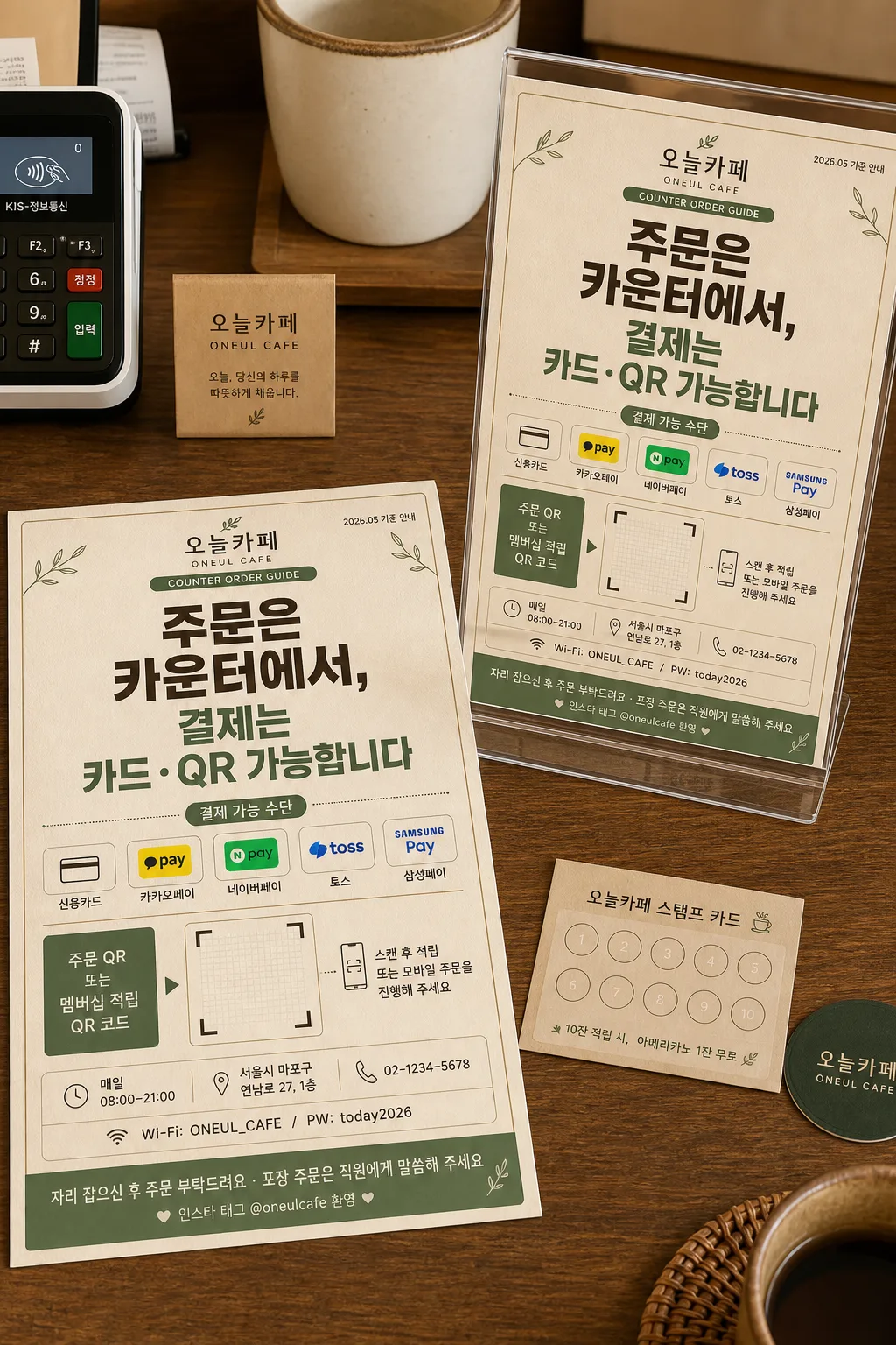
Korean store counter order/payment 안내 사인, one canvas showing both a flat printed design and a standing countertop mockup.
Print-ready BI signage for a café counter, with large Korean notice text, payment method icon row, QR code area, store information, and practical counter-use details.

[Composition]
- Left side (about 58% width): a fully 펼친 안내 사인 시안 laid out flat on a café counter tabletop, seen from a slight top-down angle, with paper grain, printed ink texture, and realistic edge shadows.
- Right side (about 42% width): the same sign standing on the counter in a clear acrylic holder, angled slightly toward camera for easy reading, with realistic paper thickness and reflection on the holder.
- 전체 캔버스와 출력물 비율은 {비율/사이즈}에 맞춰 구성하고, 카운터 위 안내 사인으로 실제 인쇄 가능한 여백과 정보 간격을 유지한다.
- Use {매장명} as the main brand name, {안내 메시지} as the dominant headline, {결제 방법} as the payment row, {QR 코드 자리} as the QR placeholder label, and {추가 안내} as the small footer note.
- Add realistic café-counter context around the mockup: a partial POS card reader, receipt roll edge, small loyalty stamp card, a ceramic cup rim, and warm wood surface details, all secondary to the sign.
- Background: calm café counter surface with beige paper texture, subtle wood grain, printed stationery feel, and {컨셉 톤} as the visual direction.
- Maintain a clear professional information hierarchy while allowing practical store details, small icons, dividers, badges, and café counter objects that naturally exist in this scene.

[3. CORE STRUCTURE]
- Top header area: place {매장명} in a compact brand mark zone, with a small caption line reading {안내 배지}; include a tiny date/store label such as {날짜 라벨} near the top corner.
- Main notice area: set {안내 메시지} as the largest text block, occupying the visual center of the sign; use bold, highly legible Korean typography with strong contrast.
- Payment information area: beneath the main notice, place {결제 방법} in a neat row with small rounded payment pictogram-style separators and a short label reading “결제 가능 수단”.
- QR zone: allocate a clearly boxed square/rectangle area labeled for {QR 코드 자리}, with a visible code-frame grid placeholder and a small instruction line reading {멤버십 안내}; position it near the lower-right or lower-center depending on balance.
- Store info band: add a slim lower information band with {영업시간}, {매장 주소}, {연락처}, and {와이파이 안내}, separated by thin dividers and tiny service icons.
- Footer note: place {추가 안내} as a smaller supporting line at the bottom with polite café guidance styling, plus a small SNS tag line {SNS 태그}.
- Mockup treatment: the standing version should show the exact same layout, same text hierarchy, same Korean wording, realistic thickness, paper edge shadow, and a transparent acrylic sign holder resting on the counter.

[4. STYLE RULES]
- Typography: Pretendard ExtraBold for the main headline, Pretendard SemiBold for subtext and section labels, Noto Sans KR Regular for footer notes and store details; headline size should dominate clearly, with balanced tracking and crisp anti-aliased edges.
- Color palette: beige #F5EBDD, warm wood brown #8B6B4A, soft green accent #6F8F6A, dark charcoal #2E2E2E, off-white #FFFDF8; apply {컨셉 톤} consistently across both the flat design and mockup.
- Graphic system: thin 1px to 2px divider lines, rounded rectangle information chips, subtle green accent dots, payment icon capsules, small QR instruction arrow, and a gentle café-stationery pattern in the header or footer area.
- Border/shadow: thin printed border lines, soft drop shadow with 4px y-offset, 14px blur, 14% opacity for the standing mockup, natural contact shadows under the acrylic holder and nearby counter items.

[5. VISUAL STYLE]
- Camera / lens: 50mm full-frame lens, f/5.6, editorial product-display framing with the flat design and the mockup both fully visible.
- Lighting: soft diffused window light from upper-left at about 45°, gentle fill from right, subtle shadow under the standing sign for realism, mild highlight on acrylic edges.
- Color grade: warm beige and muted green with natural wood tones, slightly desaturated for a clean print-design presentation, preserving realistic paper fibers and ink edges.
- Material detail: matte coated paper, faint risograph-like ink density variation, clear acrylic holder with beveled edges, wood counter pores, small printed receipt texture, and soft reflections from the POS device.

[6. MOOD]
Warm Korean café stationery and retail signage — feels like a thoughtful studio mockup from a design portfolio, practical for a real counter, friendly, readable, and quietly premium.

[7. CRITICAL]
- Korean text accuracy: 반드시 아래 문구가 이미지에 정확히 보여야 함
  - {매장명}
  - {안내 배지}
  - {날짜 라벨}
  - {안내 메시지}
  - 결제 가능 수단
  - {결제 방법}
  - {QR 코드 자리}
  - {멤버십 안내}
  - {영업시간}
  - {매장 주소}
  - {연락처}
  - {와이파이 안내}
  - {추가 안내}
  - {SNS 태그}
  - {비율/사이즈}
- The flat sign and the standing mockup must show the same layout, same text hierarchy, and same Korean wording.
- Korean characters must be crisp and correctly formed; no broken jamo, no swapped syllables, no garbled line breaks.
- The sign should remain the primary subject even with realistic counter objects and café texture around it.

[8. 🚫 PROHIBITED]
- Fake official seals / certifications
- Broken Korean characters or garbled Hangul jamo
- Incorrect or mismatched wording between flat design and standing mockup
- Celebrity composites or unauthorized portrait likeness