インフォグラフィック・案内
카운터 주문·결제 안내 사인
매장 카운터·주문 카운터에 두는 안내 사인. 주문·결제·QR 정보 입력하면 단정한 안내판 시안.
카운터 주문·결제 안내 사인の概要
インフォグラフィック・案内画像を作るためのChatGPT画像プロンプトです。主題、背景、スタイル、構図を整理し、すぐに試せるよう構成しています。
関連キーワード: 카운터 주문·결제 안내 사인, 카운터 주문·결제 안내 사인 프롬프트, インフォグラフィック・案内 프롬프트, インフォグラフィック・案内 AI 이미지 프롬프트, ChatGPT 이미지 프롬프트, AI 이미지 생성 프롬프트, AI 프롬프트, 이미지 프롬프트
카운터 주문·결제 안내 사인の活用方法
元の構造を保ちながら、被写体、背景、色、構図を変更して別案に展開できます。
- 主題を維持し、ブランドや季節、媒体に合わせて色と背景を変更してください。
- 結果が複雑な場合は背景要素を減らし、被写体、構図、照明を具体化してください。
- コピー後、ChatGPTに媒体、アスペクト比、文字の有無を追加で指定できます。
プロンプト原文
[Input]
- language: Korean
- output_size: {비율/사이즈}

[Purpose]
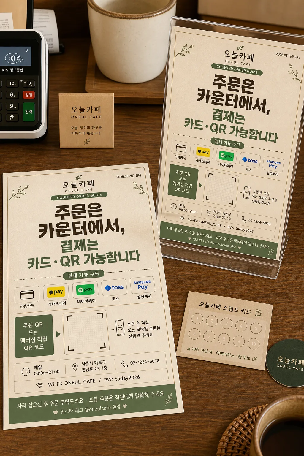
Korean store counter order/payment 안내 사인, one canvas showing both a flat printed design and a standing countertop mockup.
Print-ready BI signage for a café counter, with large Korean notice text, payment method icon row, QR code area, store information, and practical counter-use details.

[Composition]
- Left side (about 58% width): a fully 펼친 안내 사인 시안 laid out flat on a café counter tabletop, seen from a slight top-down angle, with paper grain, printed ink texture, and realistic edge shadows.
- Right side (about 42% width): the same sign standing on the counter in a clear acrylic holder, angled slightly toward camera for easy reading, with realistic paper thickness and reflection on the holder.
- 전체 캔버스와 출력물 비율은 {비율/사이즈}에 맞춰 구성하고, 카운터 위 안내 사인으로 실제 인쇄 가능한 여백과 정보 간격을 유지한다.
- Use {매장명} as the main brand name, {안내 메시지} as the dominant headline, {결제 방법} as the payment row, {QR 코드 자리} as the QR placeholder label, and {추가 안내} as the small footer note.
- Add realistic café-counter context around the mockup: a partial POS card reader, receipt roll edge, small loyalty stamp card, a ceramic cup rim, and warm wood surface details, all secondary to the sign.
- Background: calm café counter surface with beige paper texture, subtle wood grain, printed stationery feel, and {컨셉 톤} as the visual direction.
- Maintain a clear professional information hierarchy while allowing practical store details, small icons, dividers, badges, and café counter objects that naturally exist in this scene.

[3. CORE STRUCTURE]
- Top header area: place {매장명} in a compact brand mark zone, with a small caption line reading {안내 배지}; include a tiny date/store label such as {날짜 라벨} near the top corner.
- Main notice area: set {안내 메시지} as the largest text block, occupying the visual center of the sign; use bold, highly legible Korean typography with strong contrast.
- Payment information area: beneath the main notice, place {결제 방법} in a neat row with small rounded payment pictogram-style separators and a short label reading “결제 가능 수단”.
- QR zone: allocate a clearly boxed square/rectangle area labeled for {QR 코드 자리}, with a visible code-frame grid placeholder and a small instruction line reading {멤버십 안내}; position it near the lower-right or lower-center depending on balance.
- Store info band: add a slim lower information band with {영업시간}, {매장 주소}, {연락처}, and {와이파이 안내}, separated by thin dividers and tiny service icons.
- Footer note: place {추가 안내} as a smaller supporting line at the bottom with polite café guidance styling, plus a small SNS tag line {SNS 태그}.
- Mockup treatment: the standing version should show the exact same layout, same text hierarchy, same Korean wording, realistic thickness, paper edge shadow, and a transparent acrylic sign holder resting on the counter.

[4. STYLE RULES]
- Typography: Pretendard ExtraBold for the main headline, Pretendard SemiBold for subtext and section labels, Noto Sans KR Regular for footer notes and store details; headline size should dominate clearly, with balanced tracking and crisp anti-aliased edges.
- Color palette: beige #F5EBDD, warm wood brown #8B6B4A, soft green accent #6F8F6A, dark charcoal #2E2E2E, off-white #FFFDF8; apply {컨셉 톤} consistently across both the flat design and mockup.
- Graphic system: thin 1px to 2px divider lines, rounded rectangle information chips, subtle green accent dots, payment icon capsules, small QR instruction arrow, and a gentle café-stationery pattern in the header or footer area.
- Border/shadow: thin printed border lines, soft drop shadow with 4px y-offset, 14px blur, 14% opacity for the standing mockup, natural contact shadows under the acrylic holder and nearby counter items.

[5. VISUAL STYLE]
- Camera / lens: 50mm full-frame lens, f/5.6, editorial product-display framing with the flat design and the mockup both fully visible.
- Lighting: soft diffused window light from upper-left at about 45°, gentle fill from right, subtle shadow under the standing sign for realism, mild highlight on acrylic edges.
- Color grade: warm beige and muted green with natural wood tones, slightly desaturated for a clean print-design presentation, preserving realistic paper fibers and ink edges.
- Material detail: matte coated paper, faint risograph-like ink density variation, clear acrylic holder with beveled edges, wood counter pores, small printed receipt texture, and soft reflections from the POS device.

[6. MOOD]
Warm Korean café stationery and retail signage — feels like a thoughtful studio mockup from a design portfolio, practical for a real counter, friendly, readable, and quietly premium.

[7. CRITICAL]
- Korean text accuracy: 반드시 아래 문구가 이미지에 정확히 보여야 함
  - {매장명}
  - {안내 배지}
  - {날짜 라벨}
  - {안내 메시지}
  - 결제 가능 수단
  - {결제 방법}
  - {QR 코드 자리}
  - {멤버십 안내}
  - {영업시간}
  - {매장 주소}
  - {연락처}
  - {와이파이 안내}
  - {추가 안내}
  - {SNS 태그}
  - {비율/사이즈}
- The flat sign and the standing mockup must show the same layout, same text hierarchy, and same Korean wording.
- Korean characters must be crisp and correctly formed; no broken jamo, no swapped syllables, no garbled line breaks.
- The sign should remain the primary subject even with realistic counter objects and café texture around it.

[8. 🚫 PROHIBITED]
- Fake official seals / certifications
- Broken Korean characters or garbled Hangul jamo
- Incorrect or mismatched wording between flat design and standing mockup
- Celebrity composites or unauthorized portrait likeness