SNS・カードニュース
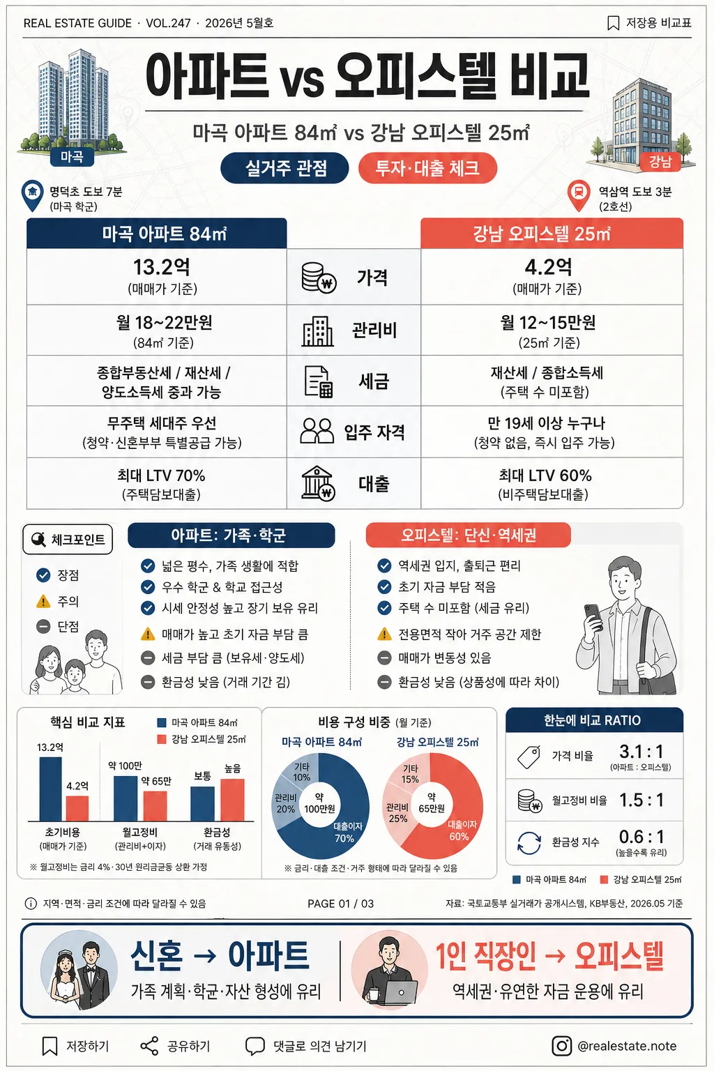
아파트 vs 오피스텔 비교 인포그래픽
아파트 vs 오피스텔 비교 카드. 가격·관리비·세금·장단점.
아파트 vs 오피스텔 비교 인포그래픽の概要
SNS・カードニュース画像を作るためのChatGPT画像プロンプトです。主題、背景、スタイル、構図を整理し、すぐに試せるよう構成しています。
関連キーワード: 아파트 vs 오피스텔 비교 인포그래픽, 아파트 vs 오피스텔 비교 인포그래픽 프롬프트, SNS・カードニュース 프롬프트, SNS・カードニュース AI 이미지 프롬프트, ChatGPT 이미지 프롬프트, AI 이미지 생성 프롬프트, AI 프롬프트, 이미지 프롬프트
아파트 vs 오피스텔 비교 인포그래픽の活用方法
元の構造を保ちながら、被写体、背景、色、構図を変更して別案に展開できます。
- 主題を維持し、ブランドや季節、媒体に合わせて色と背景を変更してください。
- 結果が複雑な場合は背景要素を減らし、被写体、構図、照明を具体化してください。
- コピー後、ChatGPTに媒体、アスペクト比、文字の有無を追加で指定できます。
プロンプト原文
[Input]
- language: Korean
- output_size: 1024x1536

[Purpose]
Korean apartment vs officetel comparison infographic, vertical social-media editorial poster, designed for quick reading and practical real-estate decision-making.
Content-rich side-by-side analysis card with table-like structure, compact mini charts, editorial labels, realistic housing-context details, and clear recommendation cues.

[Composition]
- Vertical poster with a strong top header occupying about 15% of the frame, central comparison body taking 70%, and a compact recommendation footer around 15%.
- Main comparison split into two equal columns with a clear center divider; left side for {비교 대상} as apartment, right side for the officetel side of the comparison.
- Background should feel like a polished Korean real-estate editorial print card: warm white paper base, subtle light-gray grid texture, faint city-map contour lines, and soft paper grain while keeping all text highly readable.
- Add contextual housing visuals: small apartment tower icon on the left, compact officetel building icon on the right, tiny subway-pin and school-pin markers, simple money/tax/loan pictograms, and a small source-note strip.
- Use {비교 대상}, {비교 항목}, {장단점}, {추천}, {비주얼}, {컬러}, {비율} as the editable content fields.

[3. CORE STRUCTURE]
- Header area (top 15%): Set the title “아파트 vs 오피스텔 비교” in a bold modern Korean headline, centered, with thin divider lines beneath it.
- Add an editorial metadata row near the title: “REAL ESTATE GUIDE · VOL.247 · 2026년 5월호” on the left and “저장용 비교표” on the right in small Korean text.
- Subheader line: Place {비교 대상} directly under the title in smaller medium-weight text, acting as the main context line.
- Add two small pill labels under the subheader: “실거주 관점” and “투자·대출 체크” with navy/coral accents.
- Comparison body (middle 45%): Build a two-column table with {비교 항목} listed as row labels down the center-left, and the two property types compared across left/right cells.
- Table rows should include visible Korean row labels such as “가격”, “관리비”, “세금”, “입주 자격”, “대출”; add tiny matching icons inside each row for quick recognition.
- Pros/cons block (middle-lower 20%): Present {장단점} as concise bullet points with small check, caution, and minus icons, keeping each side visually balanced.
- Add realistic editorial side notes: a small callout tag reading “체크포인트” beside the pros/cons area, a tiny caption line “지역·면적·금리 조건에 따라 달라질 수 있음”, and a thin page-marker label “PAGE 01 / 03”.
- Mini chart cluster: Include {비주얼} as a small bar chart or donut chart cluster near the lower-middle area, using the same color family as the table accents; label chart segments with short Korean tags like “초기비용”, “월고정비”, “환금성”.
- Add a compact ratio badge using {비율}, styled like a finance dashboard indicator, with a tiny legend using {컬러}.
- Recommendation footer (bottom 15%): Display {추천} inside a highlighted rounded rectangle, with strongest contrast and slightly larger type for decision emphasis.
- Footer should also include a brief decision line: “신혼 → 아파트 / 1인 직장인 → 오피스텔”, plus tiny save/share micro icons and a small handle-style credit “@realestate.note”.
- Overall layout should feel like a structured editorial infographic, with careful alignment, equal spacing, clear hierarchy, and readable content density.

[4. STYLE RULES]
- Typography: Use Pretendard or Noto Sans KR for all Korean text; title in Bold 42–52px, section labels in SemiBold 22–28px, body text in Regular 18–22px, recommendation in Bold 24–30px.
- Color palette: White background, charcoal #2B2B2B, navy #1F4E79, coral #FF6B6B, and soft neutral gray #E9EDF2 for lines and table fill; allow warm off-white #FAFAF7 and pale blue-gray #F3F6FA for realistic paper/card depth.
- Border/shadow: Thin 1px charcoal or gray rules, subtle card shadows like 0px 4px 10px rgba(0,0,0,0.08), plus delicate divider ticks, tab labels, and chart outlines.
- Use {컬러} as the main accent family while maintaining navy/coral contrast between the apartment and officetel columns.
- Include fine editorial details such as section labels, caption rules, page indicator dots, miniature legend boxes, and small credit text without reducing legibility.

[5. VISUAL STYLE]
- Camera / lens: Flat graphic layout, top-down infographic presentation, no photographic perspective; if any rendered objects appear, keep them as clean vector-style shapes.
- Lighting: Even studio-like illumination with crisp screen-print style contrast and very soft printed-paper depth.
- Color grade: Clean white-canvas infographic grading with navy/coral accent balance, cool neutral grays, and a lightly textured editorial print finish.
- Render as a realistic Korean social-media real-estate card rather than a blank template: visible microcopy, chart numbers, grid rules, building icons, location pins, and source/caption strips should make the poster feel complete.

[6. MOOD]
Practical Korean real-estate editorial infographic — like a Naver Finance / The New York Times comparison card blended with a polished Korean property newsletter, precise, trustworthy, and easy to scan.

[7. CRITICAL]
- Korean text accuracy: 반드시 정확히 표시해야 하는 문구: “아파트 vs 오피스텔 비교”, “가격”, “관리비”, “세금”, “입주 자격”, “대출”, “아파트: 가족·학군”, “오피스텔: 단신·역세권”, “신혼 → 아파트 / 1인 직장인 → 오피스텔”.
- Additional Korean text that should appear naturally in the image: “REAL ESTATE GUIDE · VOL.247 · 2026년 5월호”, “실거주 관점”, “투자·대출 체크”, “체크포인트”, “초기비용”, “월고정비”, “환금성”, “PAGE 01 / 03”, “@realestate.note”.
- All comparison rows must remain in a clean two-column alignment; do not swap the left/right structure.
- Typography must stay crisp, fully legible, and free of broken Korean characters.

[8. 🚫 PROHIBITED]
- Fake official seals / certifications
- Broken Korean characters
- Celebrity composites / unauthorized likenesses